Vertical Lines Gradient Purple Yellow
Topics
Details
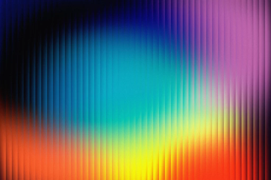
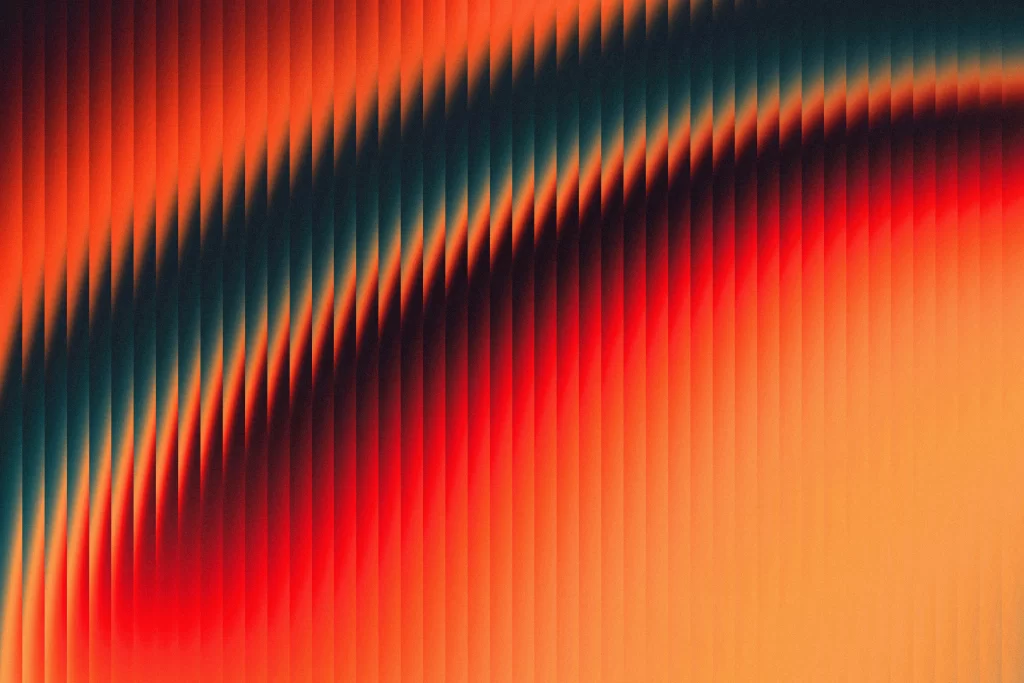
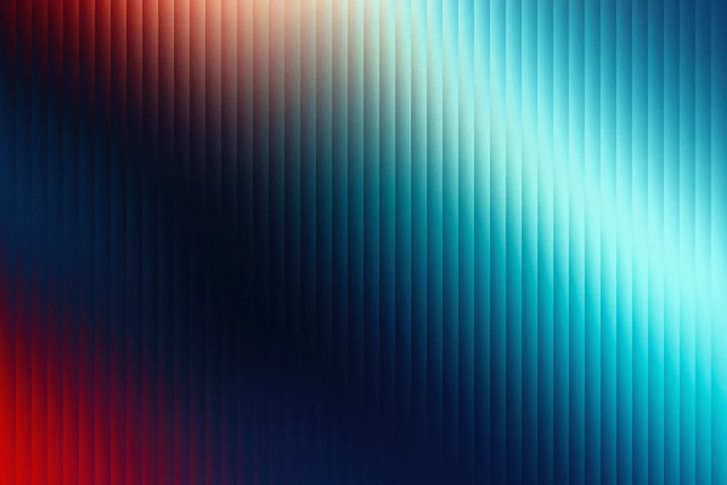
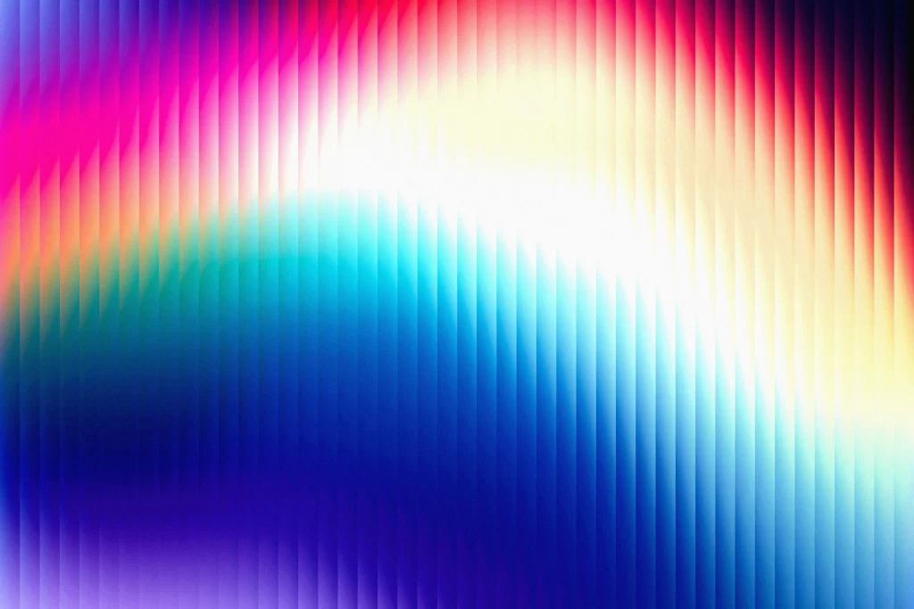
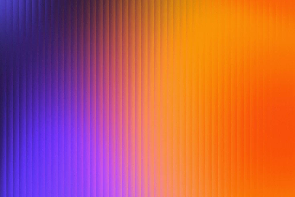
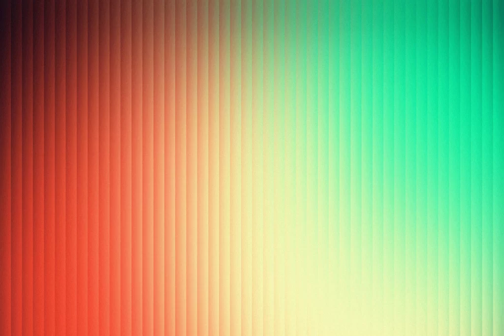
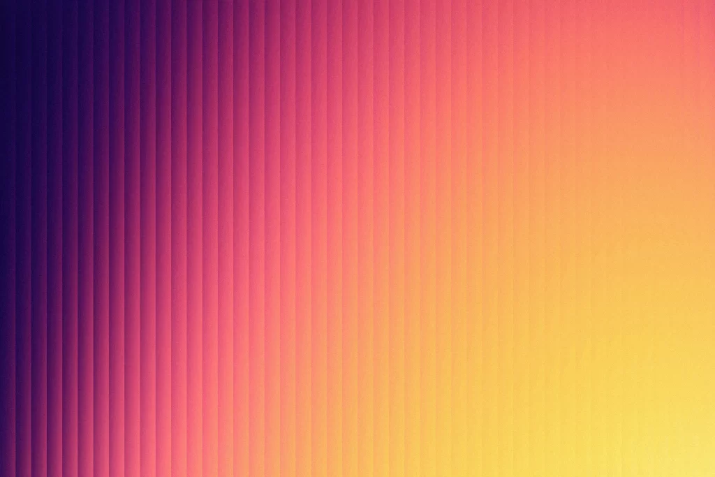
Narrow vertical stripes march across the frame from left to right, each one a solid band of color that shifts gradually from deep indigo through magenta and coral before settling into warm golden yellow on the far right. The composition fills the entire view with these parallel lines, creating a rhythmic texture where the color transitions happen in discrete steps rather than a smooth blend. Subtle variations in tone between adjacent stripes give the surface a faint sense of depth, as if each colored bar sits slightly recessed or raised from its neighbors.
What makes this gradient particularly compelling is the deliberate quantization of the color shift—instead of a continuous blur, the eye catches distinct vertical segments that force you to notice the journey from cool purple to warm amber. The stepped progression creates an almost digital or pixel-art aesthetic while maintaining organic warmth, and the uniform stripe width establishes a satisfying visual tempo that draws the gaze horizontally across the spectrum. This structured approach to color transition offers more graphic punch than a traditional soft gradient, turning a simple hue shift into a textural pattern.
UI designers might employ this as a dynamic background for dashboard headers or landing page hero sections, where the vertical rhythm adds subtle movement without competing with foreground content. Brand identity projects could extract specific color stops from this sequence to build cohesive palettes for tech startups or creative agencies seeking vibrant yet sophisticated tones. Motion graphics artists could also animate these stripes individually to create loading sequences or transitional effects that feel both modern and playful.