Vigor Sage Dog Food Salmon Salmonella Grain Free White Illustration
Topics
Details
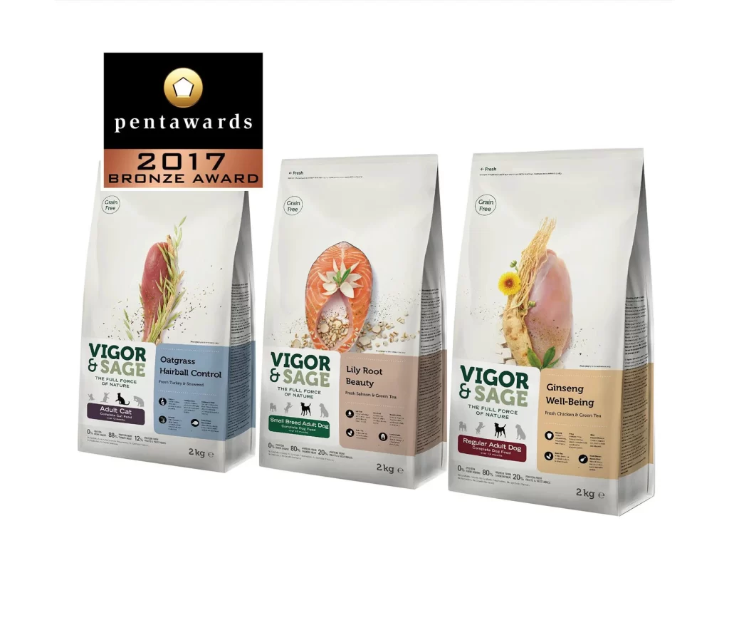
Three upright 2kg bags of Vigor & Sage pet food stand in a row, each featuring a distinct color-coded lower panel—blue for the cat formula with oatgrass and turkey, beige for the small breed dog food with salmon and lily root, and tan for the regular adult dog option containing chicken and ginseng. The packaging employs a clean, photographic style where raw ingredients like salmon steaks, chicken breasts, and botanical elements appear to float against a light gray upper field, accompanied by crisp sans-serif typography detailing nutritional percentages. A black and bronze Pentawards 2017 Bronze Award badge anchors the upper left corner, while circular 'Grain Free' icons punctuate the top of each bag.
Visual hierarchy relies on the strategic use of negative space to isolate the protein sources, creating a premium, almost clinical aesthetic that distinguishes these products from cluttered supermarket alternatives. The consistent brand architecture across all three variants allows for immediate product differentiation through color psychology alone, while the inclusion of whole botanicals rather than abstract graphics reinforces the 'full force of nature' positioning. Subtle shadowing beneath the floating ingredients adds dimensional depth without compromising the minimalist composition.
Brand strategists analyzing award-winning packaging structures would examine this layout to understand how regulatory information can coexist with lifestyle imagery without visual congestion. Packaging engineers might reference the structural proportions and fold patterns evident in the bag silhouettes when developing similar stand-up pouch formats for natural food categories. Marketing teams could study the color-coding system to devise SKU differentiation strategies for their own product lines.