Walwari Dog Balance Salmon Sweet Potato Packaging
Topics
Details
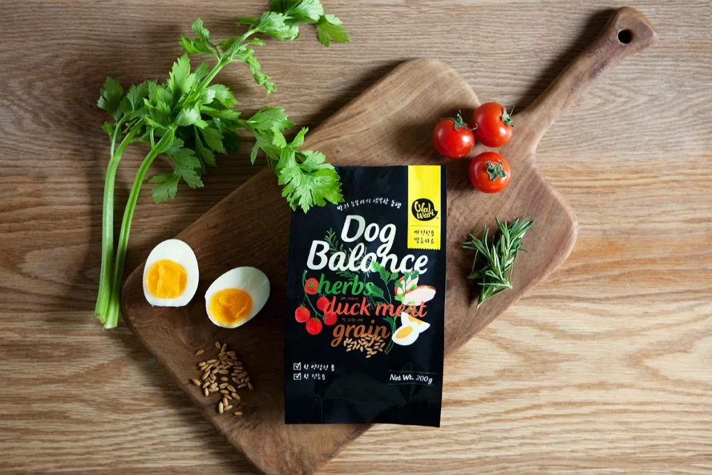
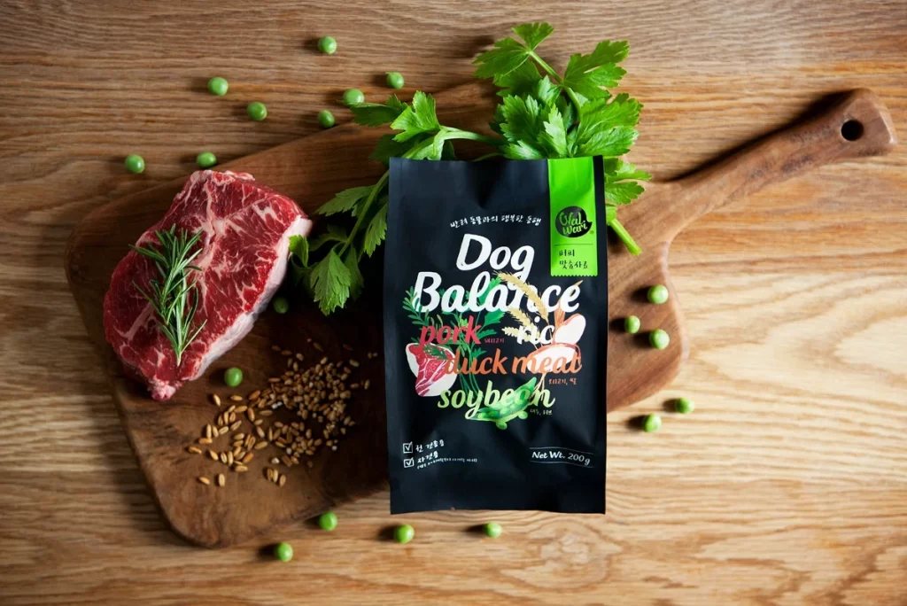
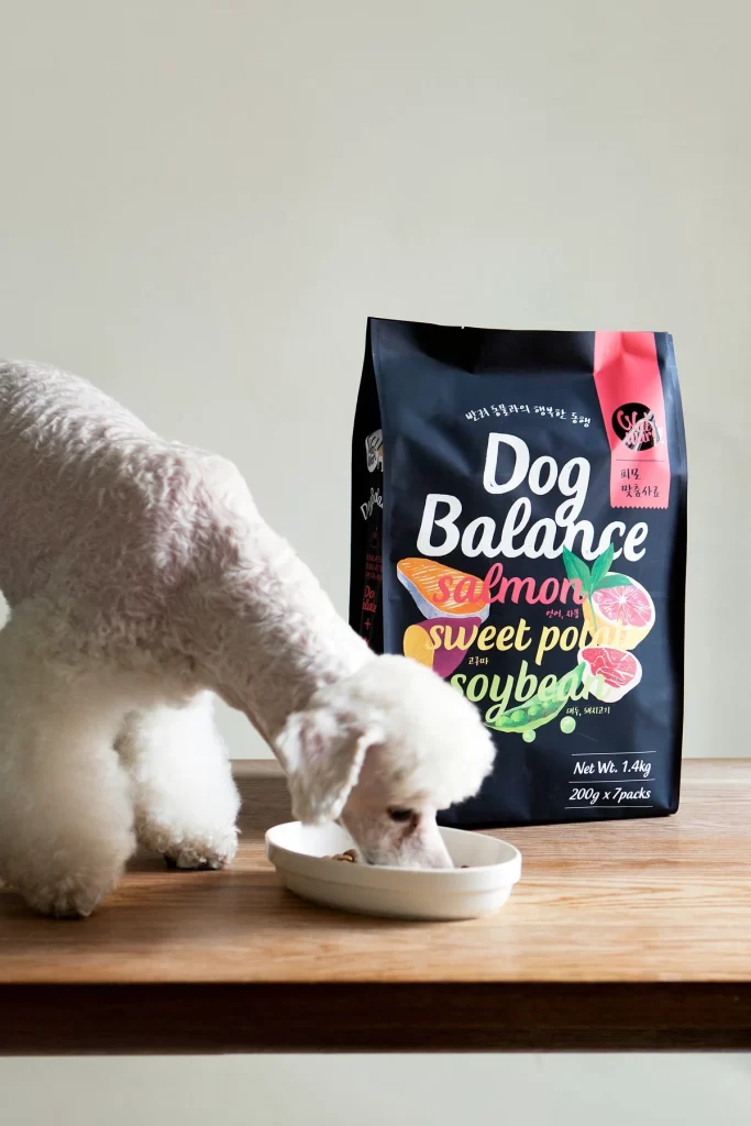
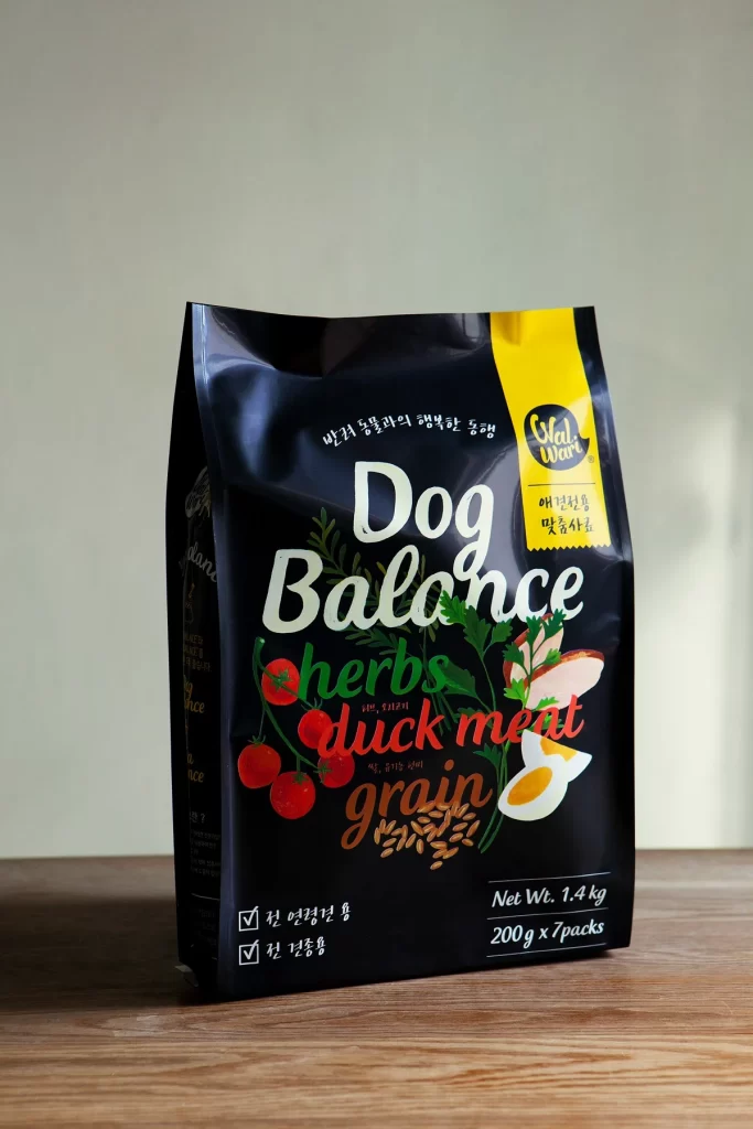
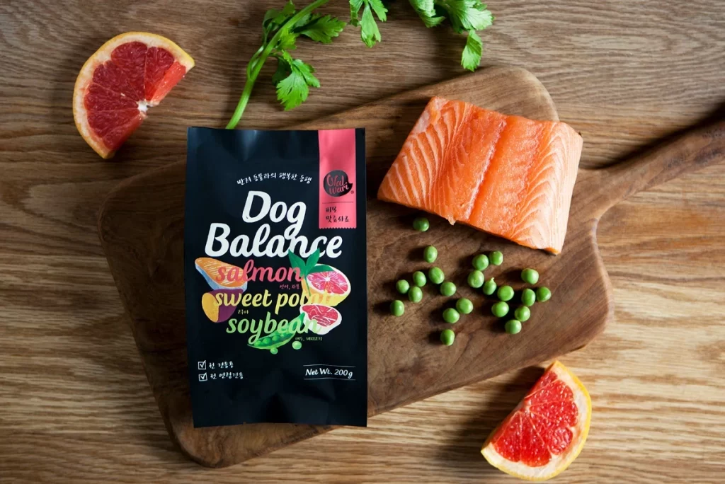
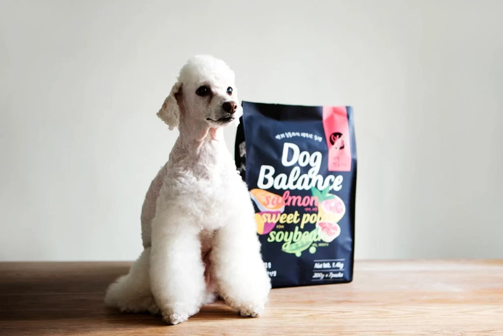
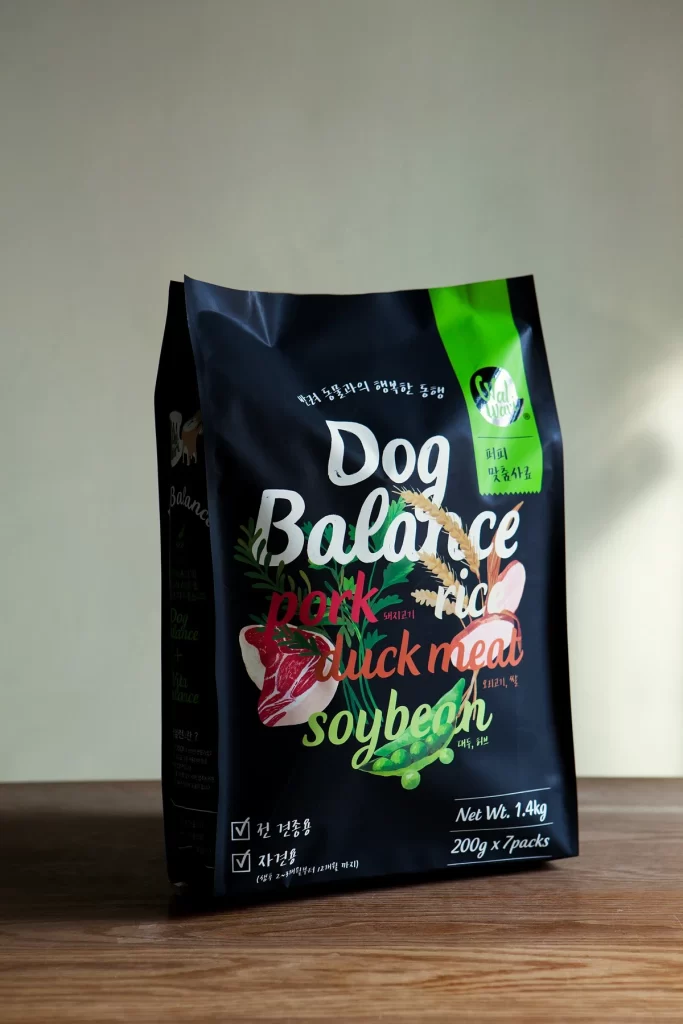
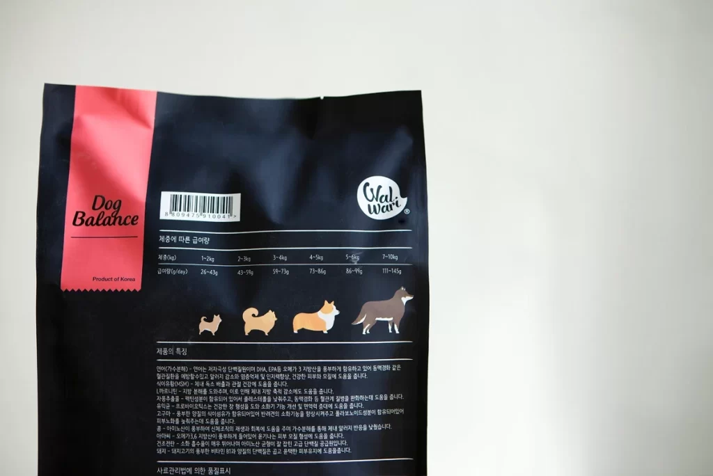
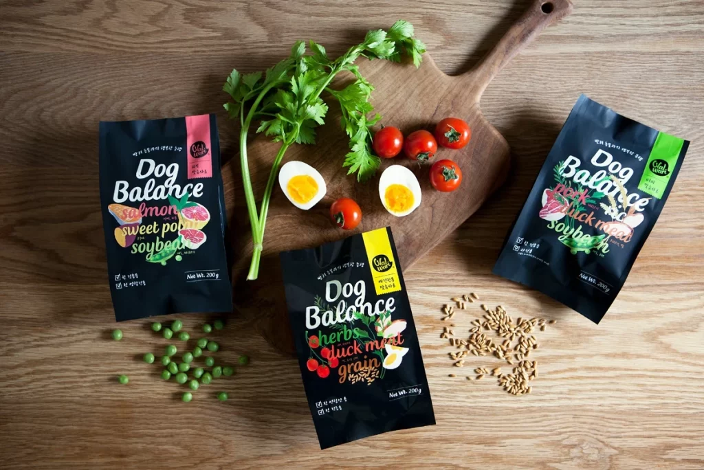
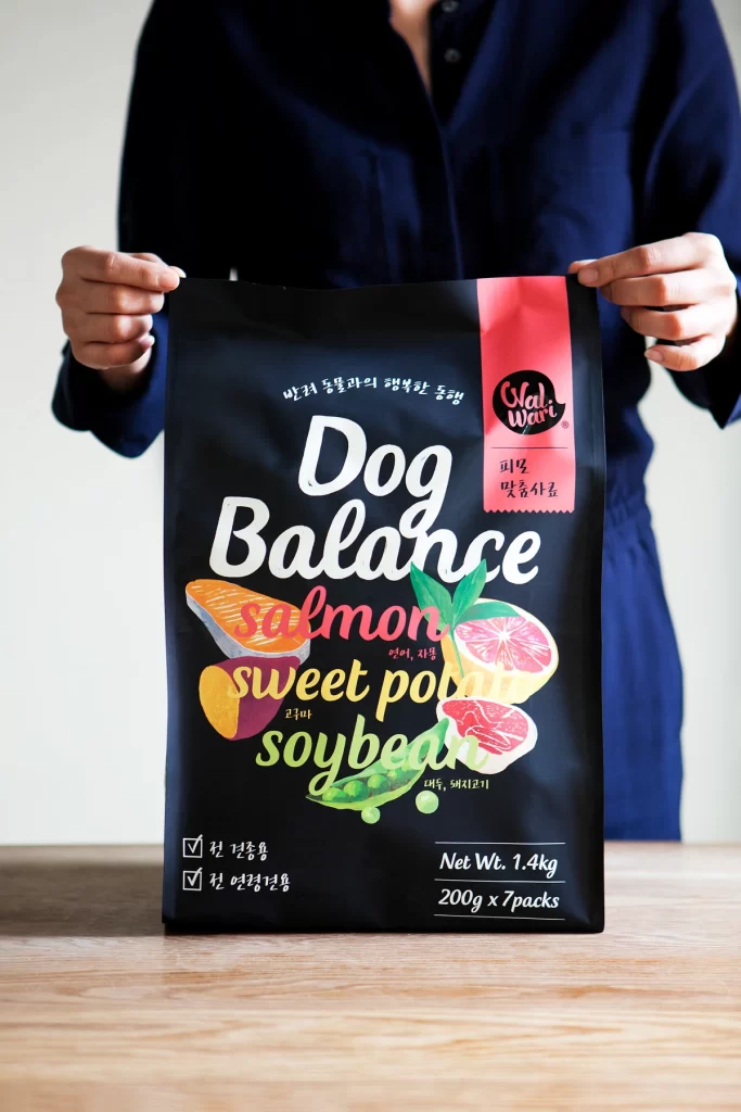
A matte black pouch stands upright on a light wooden surface, held at the top corners by hands emerging from a navy blue shirt. The packaging features bold white brush-script lettering spelling 'Dog Balance' above ingredient names rendered in playful, multicolored cursive—salmon in coral, sweet potato in golden yellow, and soybean in lime green. Realistic food illustrations including a salmon fillet, sliced sweet potato, grapefruit half, and pea pods cluster in the center, while a vertical magenta strip on the right edge displays the 'Olalwari' brand logo in white script alongside Korean text. Checkboxes marked with ticks appear on the lower left, and the bottom right corner specifies 'Net Wt. 1.4kg' and '200g x 7 packs' in clean sans-serif typography.
The visual contrast between the deep black substrate and the vibrant, food-specific color palette creates immediate shelf presence while maintaining an artisanal, health-conscious aesthetic. Mixing hand-drawn typography styles—from the authoritative white main title to the casual, organic ingredient labels—establishes a friendly yet premium tone that distinguishes it from conventional pet food packaging. Layering photographic-quality illustrations of raw ingredients directly onto the dark background emphasizes freshness and transparency without cluttering the composition.
Brand designers developing premium pet nutrition lines could study how this layout balances nutritional information with appetizing visuals to communicate quality. Packaging teams might reference the way ingredient hierarchy is established through scale and color temperature when creating their own product variants. Marketing professionals planning e-commerce photography sessions could adapt the human-scale presentation technique to show actual package dimensions while keeping focus on the front-of-pack messaging.