Wolf Typography
Topics
Details
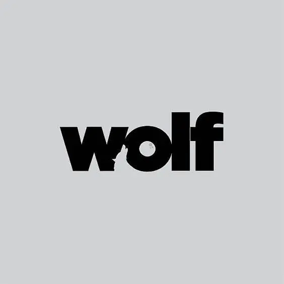
Heavy, lowercase sans-serif letters spelling 'wolf' dominate the composition in solid black. A subtle negative-space silhouette of a wolf's head emerges from the junction of the 'w' and the circular counter of the 'o'. The text sits centered on a uniform light gray field, presenting a flat graphic with no discernible texture or shadow.
Clever integration of figurative imagery within typographic structure distinguishes this mark from standard wordmarks. The designer exploits the counter space and stroke connections to embed animal anatomy without disrupting legibility. Such dual-function typography demands careful kerning and weight balance to maintain both textual clarity and visual metaphor.
Brand identity specialists developing logos for wildlife organizations or outdoor apparel companies might study this interplay of text and icon. Typography instructors could employ the example when teaching students about gestalt principles and hidden imagery within letterforms. Editorial illustrators seeking compact visual metaphors for publication headers would find the technique applicable to similar conceptual challenges.