Women Typography
Topics
Details
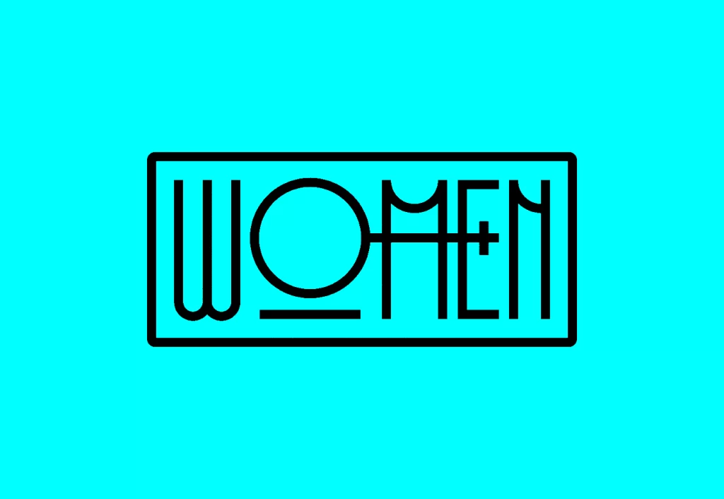
Bold, geometric sans-serif letterforms spelling 'WOMEN' are constructed from uniform black lines and enclosed within a thick rectangular border. The 'O' appears as a perfect circle while the 'E' features a small crossbar extension resembling a gender symbol, and a single horizontal underscore sits beneath the lettering on a solid cyan background.
Visual interest emerges from the clever integration of typographic structure and symbolic notation, where the horizontal stroke of the ‘H’ extends to form a plus sign, subtly embedding meaning within the letterforms. The high-contrast pairing of electric cyan and deep black creates immediate legibility, while the rounded terminals on the ‘W’ and ‘N’ soften the otherwise rigid, architectural quality of the stencil-like construction. Such deliberate modulation between curved and angular elements demonstrates how typography can carry conceptual weight beyond mere linguistic function.
Branding specialists developing identity systems for gender-focused organizations or events might employ this compositional approach to communicate inclusivity through letterform modification. Educators teaching semiotics or visual communication could reference this example when demonstrating how punctuation and symbolic marks can be absorbed into wordmarks without disrupting readability. Additionally, signage designers requiring maximum clarity at distance would benefit from studying the generous negative space maintained within each character’s counter.