Xiaowen Jiacha Tea Box Detail
Topics
Details
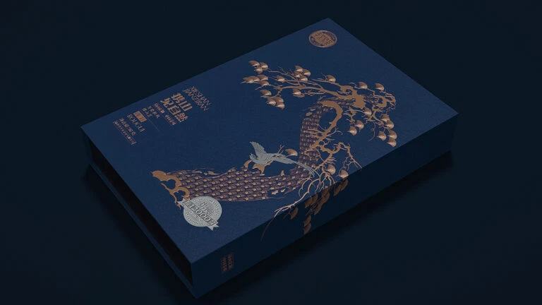
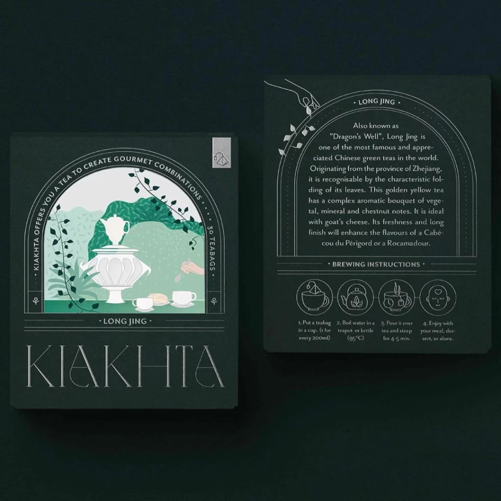
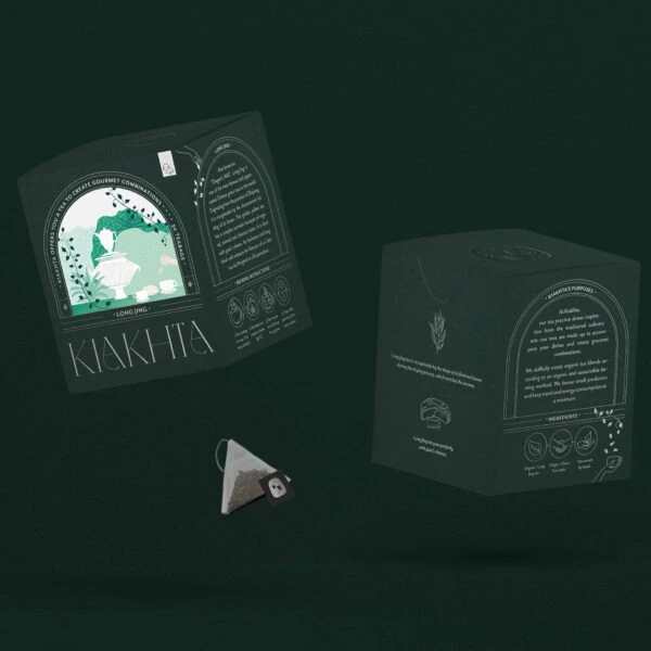
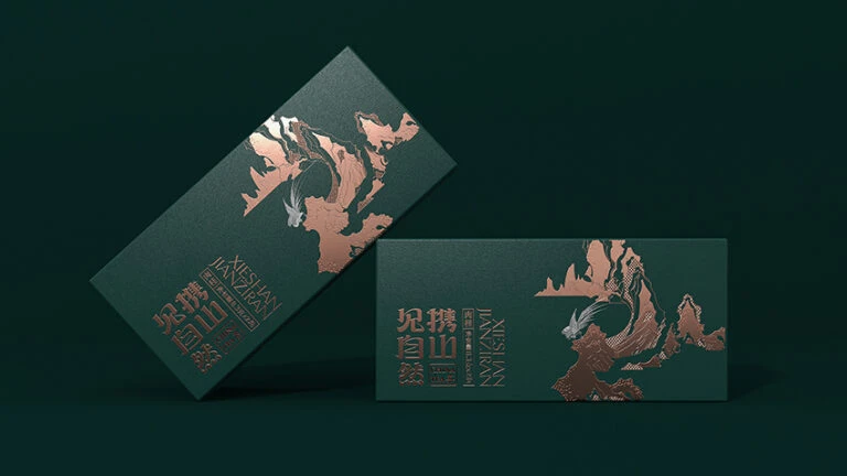
Deep forest green surfaces define the two rectangular boxes, which rest at opposing angles against a dark, uniform backdrop. Rose-gold foil stamping renders the intricate mountain silhouettes and the vertical Chinese characters, creating a metallic sheen that contrasts sharply with the matte base material. Soft directional lighting catches the embossed edges of the landscape graphics and the English text 'XIAOWEN JIACHA', while a subtle shadow anchors the composition to the lower right.
Visual tension arises from the interplay between the organic, flowing lines of the topographical artwork and the rigid geometric structure of the packaging format. The choice of copper-toned metallic ink against the somber green substrate suggests a premium positioning, elevating a standard rectangular prism into a luxury object through texture alone. By orienting the units in a dynamic, non-parallel arrangement, the presentation emphasizes the three-dimensionality and physical weight of the final product.
Brand strategists might study this composition to understand how foil stamping techniques can be applied to traditional tea packaging for a modern aesthetic upgrade. Print production specialists could utilize this visual data to calibrate color separation between matte substrates and reflective metallic inks. Furthermore, art directors working on high-end consumer goods may reference the typographic hierarchy here when balancing bilingual text elements within a constrained vertical layout.