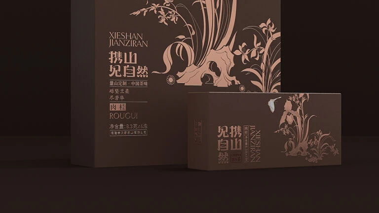
Xiaowen Jiacha Tea Box Lineup
Topics
Details
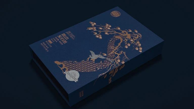
Deep espresso brown dominates the scene, where two rectangular cartons sit against a void-like black background. The larger box on the left displays the brand name XIESHAN JIANZIRAN in a clean serif font, followed by the prominent Chinese characters 携山见自然 and the product designation ROUGUI. Delicate, copper-toned line art depicting orchids and organic rock formations adorns the packaging surface, while soft directional lighting from the upper left casts subtle shadows that emphasize the matte texture of the material.
Visual distinction emerges from the sophisticated interplay between the dark substrate and the metallic rose-gold illustrations. The botanical motifs are rendered with an elegant minimalism that suggests traditional Chinese ink wash painting techniques adapted for modern print production. Typography is arranged in a clear vertical hierarchy that balances the boldness of the main logotype with the finer details of the descriptive text regarding origin and net weight specifications.
Brand identity developers studying premium tea market aesthetics will find the color palette and typographic arrangement particularly instructive for luxury goods projects. Packaging engineers can analyze the structural proportions and spatial relationships between the primary outer container and the secondary inner unit shown here. Art directors seeking to understand how cultural symbolism integrates into contemporary commercial design should examine the specific way natural elements are stylized without losing their recognizable forms.