Zula Coffee Tins Packaging Design
Topics
Details
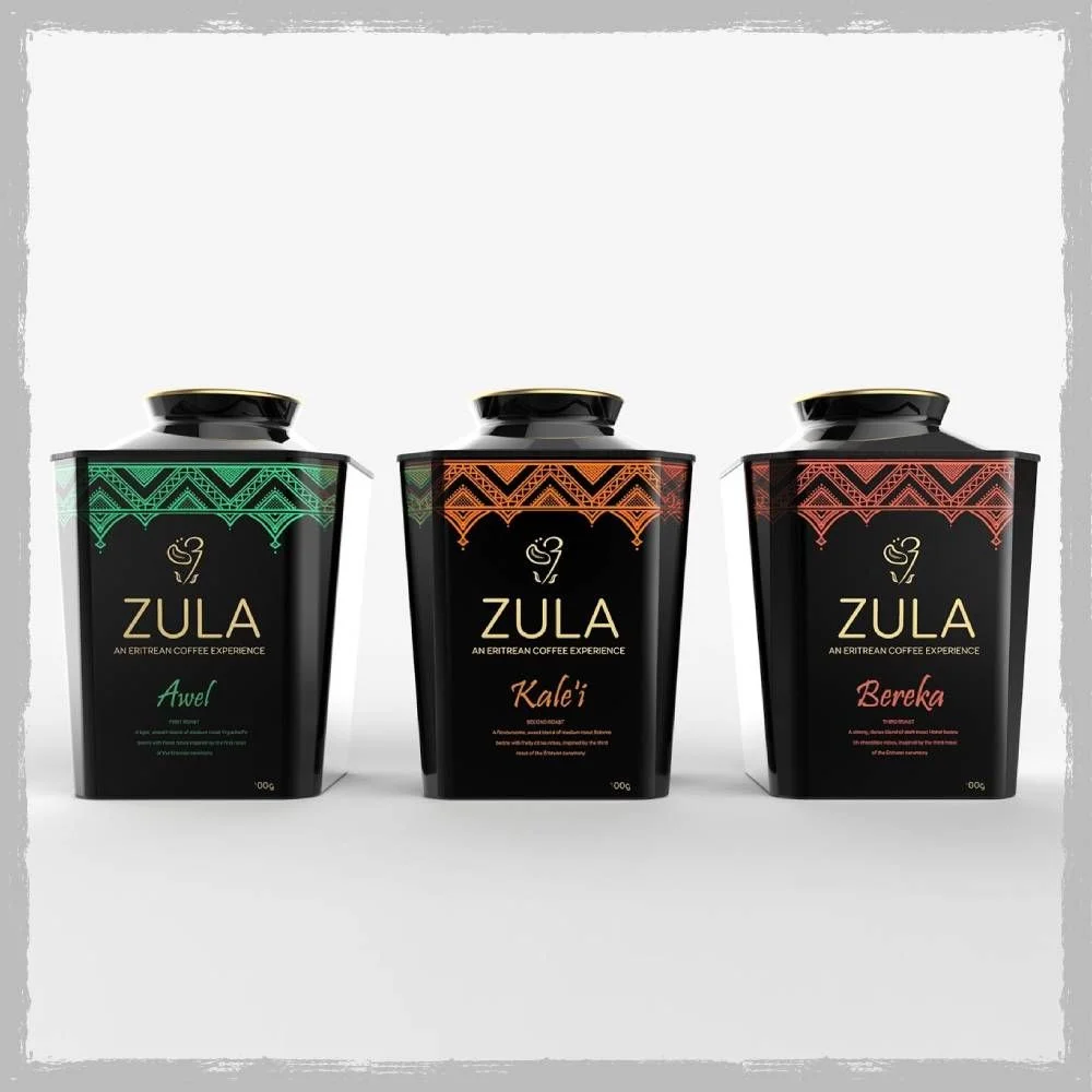
Three matte black rectangular tins with rounded shoulders and gold-rimmed lids stand in a horizontal row, each featuring a distinct geometric border pattern in emerald green, burnt orange, or deep red. The brand name ZULA appears in gold sans-serif capitals above the tagline 'AN ERITREAN COFFEE EXPERIENCE' and a stylized coffee cup icon, while individual product names—Awel, Kale'i, and Bereka—are rendered in matching script colors below. Soft studio lighting creates subtle highlights on the glossy lid surfaces and casts faint shadows beneath each container against a neutral light-gray backdrop.
Visual distinction emerges from the interplay between the uniform black substrate and the vibrant ethnic-inspired chevron motifs that crown each package, creating an immediate color-coded differentiation system for the product line. The typographic hierarchy balances the authoritative weight of the gold brand lettering against the organic fluidity of the handwritten-style variety names, while the consistent placement of the 100g weight indicator and descriptive micro-text maintains structural coherence across all three variants.
Brand strategists developing premium coffee or tea product lines could analyze this layout to understand how geometric patterns can replace photography as the primary visual differentiator in minimalist packaging systems. Packaging engineers might reference these proportions when designing square-format containers that require both shelf stability and tactile elegance, while color theorists could study how the limited palette of black, metallic gold, and single accent hues creates perceived luxury without excessive ornamentation.