
DS-Digital Font Free Download: LCD Styles — Font Finds Vol. 2
Some typefaces you hear before you read. DS-Digital is one of them — the segmented letterform style of LCD alarm clocks, microwave ovens, calculator screens, and stadium scoreboards. Every character is built from straight, angular strokes that echo the seven-segment displays of late-20th-century electronics, giving any design an instant hit of retro-tech atmosphere.
This installment of Font Finds is a deep dive on a single family: DS-Digital in all four styles — Normal, Bold, Italic, and Bold Italic — every one available as a free download on Gropicture. We’ll look at how the font works, what each style is for, and where it earns its place in modern design.
What Makes DS-Digital Work
Real seven-segment displays could only draw digits and a handful of letters — that was their charm and their limit. DS-Digital takes that visual grammar and extends it to the full alphabet: squared bowls, blunt terminals, and letterforms that look lit from behind. The lowercase mirrors the capitals, keeping the rhythm strictly mechanical, exactly like a piece of consumer electronics.
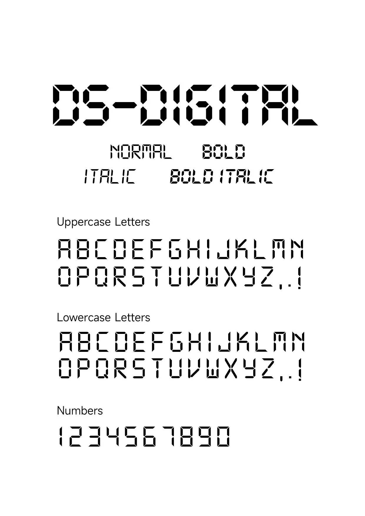
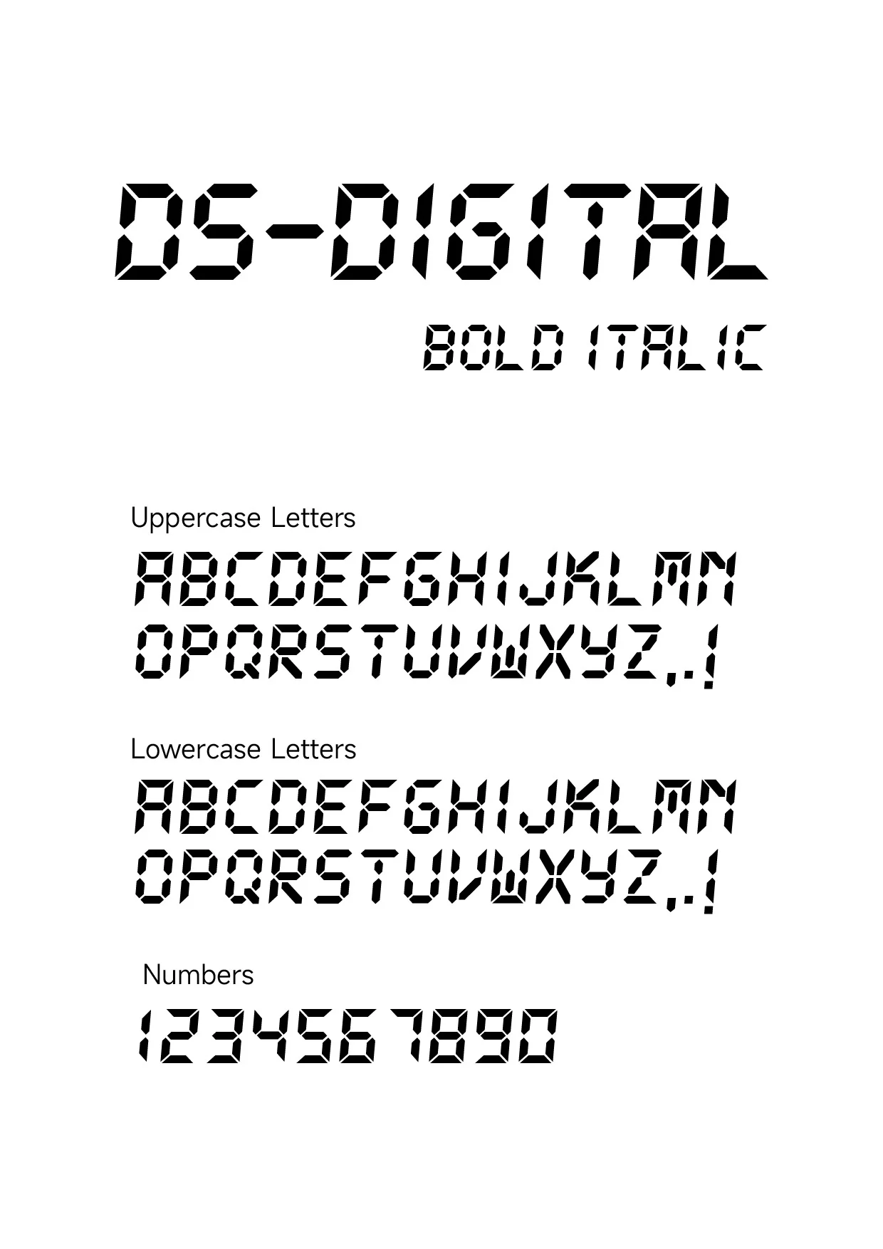
The family specimen above shows the complete system: four weights, full character set, numbers that still look like they belong on a clock face. That balance — display novelty with genuine legibility — is why the font has survived decades of design trends.
The Four Styles, and When to Use Each
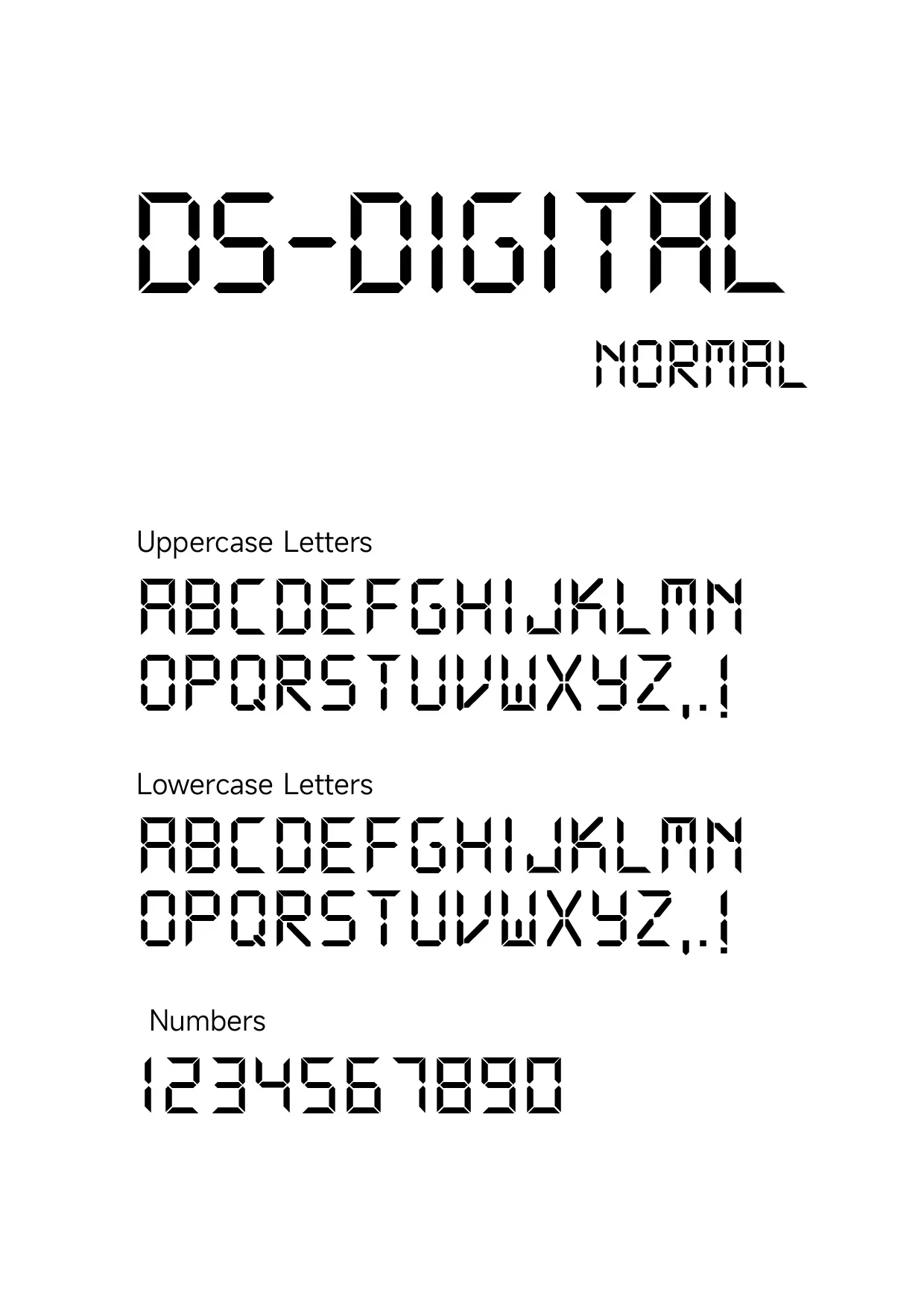
Normal
The regular weight is the authentic LCD look: hairline segments, open counters, maximum period-correct flavor. It reads as a clock display, not a headline — ideal when you want the electronics metaphor to stay subtle.
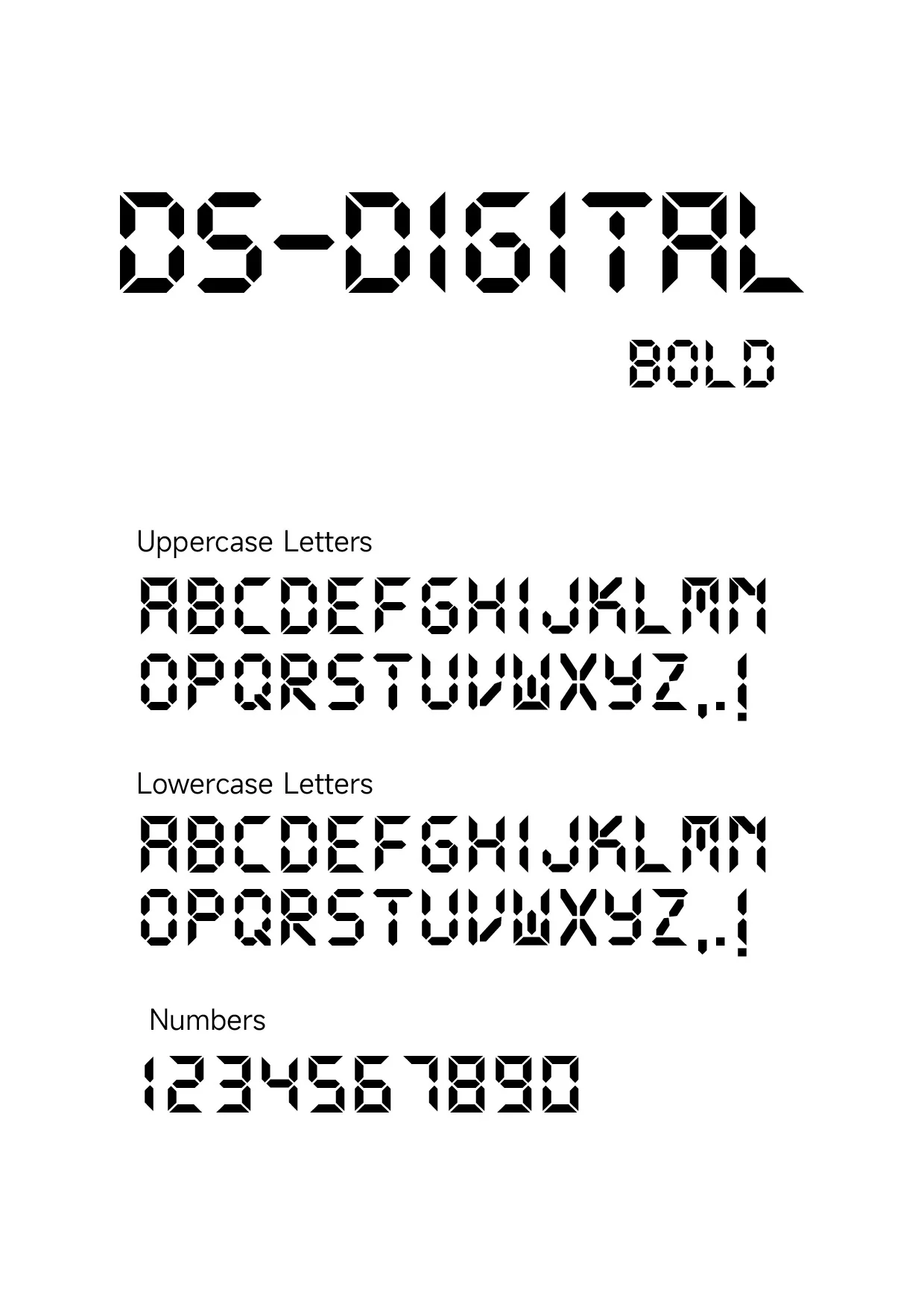
Bold
Bold thickens every segment until the letterforms glow like an LED in bright daylight. This is the weight for headlines, countdown timers, and price displays — anywhere the digital readout must carry the design on its own.
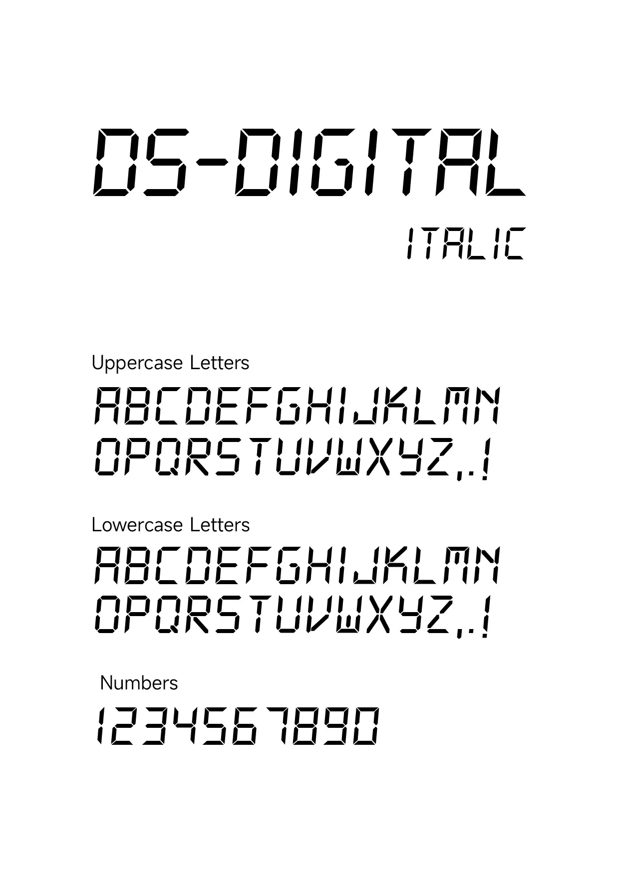
Italic
A slanted cut does something clever: it suggests motion and urgency while keeping the mechanical skeleton. Use it for tickers, loading states, speedometers, or any “live data” moment in an interface.
Bold Italic
The heaviest, fastest-looking cut: thick segments, forward lean, zero patience. Reserve it for big single-purpose moments — a giant countdown number, a promotional badge, a gaming HUD element — where maximum energy is the point.
Where DS-Digital Shines in Real Projects
- Timers and countdowns — landing pages for launches, sales, and events; the font was practically born for “00:59” moments.
- Tech and gaming UI — HUD elements, scoreboards, load screens, and cyberpunk or Y2K-revival interfaces.
- Retro product branding — anything that wants 1980s–90s consumer-electronics nostalgia, from gadget shops to synthwave record labels.
- Data readouts — price tags, temperature displays, step counters, crypto tickers: anywhere numbers should feel machine-reported.
- Poster accents — a single digital-style date or ticket number can anchor an entire layout’s retro theme.
How to Pair It
DS-Digital is a display font — treat it like a special effect, not a workhorse. The classic pairing is a clean, neutral sans for body text (something like Inter, which we covered in Font Finds Vol. 1) with DS-Digital reserved for numbers, timers, and short labels. Keep it on dark backgrounds where its segment-style letterforms can “light up,” add a subtle glow if the concept calls for it, and step away — one digital voice per design is plenty.
All four styles are free downloads below — grab the full family and start building your clock face.
Explore More
- DS Digital Font (Full Family) — free download
- DS Digital Normal — free download
- DS Digital Bold — free download
- DS Digital Italic — free download
- DS Digital Bold Italic — free download
- Font Download — the full free font collection