
Packaging Picks — Quaker Oats: The Face That Built a 150-Year Brand
The Quaker Oats man is one of the oldest brand mascots in the world. Since 1877 — nearly 150 years — this friendly figure in a Quaker hat has appeared on every Quaker product, from traditional oat canisters to modern protein drinks and rice cakes. He has been refreshed and refined over the decades, but never replaced. That kind of brand consistency is almost unheard of in the food industry.
At Gropicture, we have Quaker packaging images available as design reference — covering instant oatmeal, overnight oats, protein oatmeal, oat drinks, cereal squares, rice cakes, and historical packaging. Together, they tell a story of how a single visual idea can carry a brand for nearly a century and a half.
The Quaker Man: Mascot as Brand Anchor
Unlike most food mascots — which tend to be cartoon animals or exaggerated characters — the Quaker man is a portrait of dignity. He represents trust, honesty, and quality: the values associated with the Quaker religious community. Whether this was a deliberate branding strategy or a happy accident of the 19th century is debated, but the effect is undeniable. The Quaker man makes the brand feel established, reliable, and wholesome.
You can see the strategy working as early as 1896. In a Victorian-era newspaper advertisement, the Quaker man stands in full engraved detail, holding a box of rolled white oats in one hand and a scroll reading “PURE” in the other — the mascot introduced as a guarantee before the brand was twenty years old.

More than a century later, the same face anchors the brand’s heritage banner: the Quaker man beside “ESTD 1877” in bold navy, a bowl of berries and oats below, and the line “Every Bowl Is A Fresh Beginning” over a family of international products. His hairstyle modernized, his expression softened, his rendering simplified — but the core identity has never changed. This teaches a crucial lesson in mascot design: evolution, not revolution. Consumers form emotional bonds with mascots. Radically changing one feels like meeting a stranger wearing a friend’s clothes.

The Classic Rolled Oats Pack: Red, Blue, White
The traditional Quaker Oats pack is one of the most recognized packages in American grocery stores. The color combination — red, blue, and white — is deeply embedded in the brand’s identity. These colors do double duty: they communicate patriotism and trust (important for a heritage American brand), while also creating a strong visual signature that stands out on the cereal aisle.
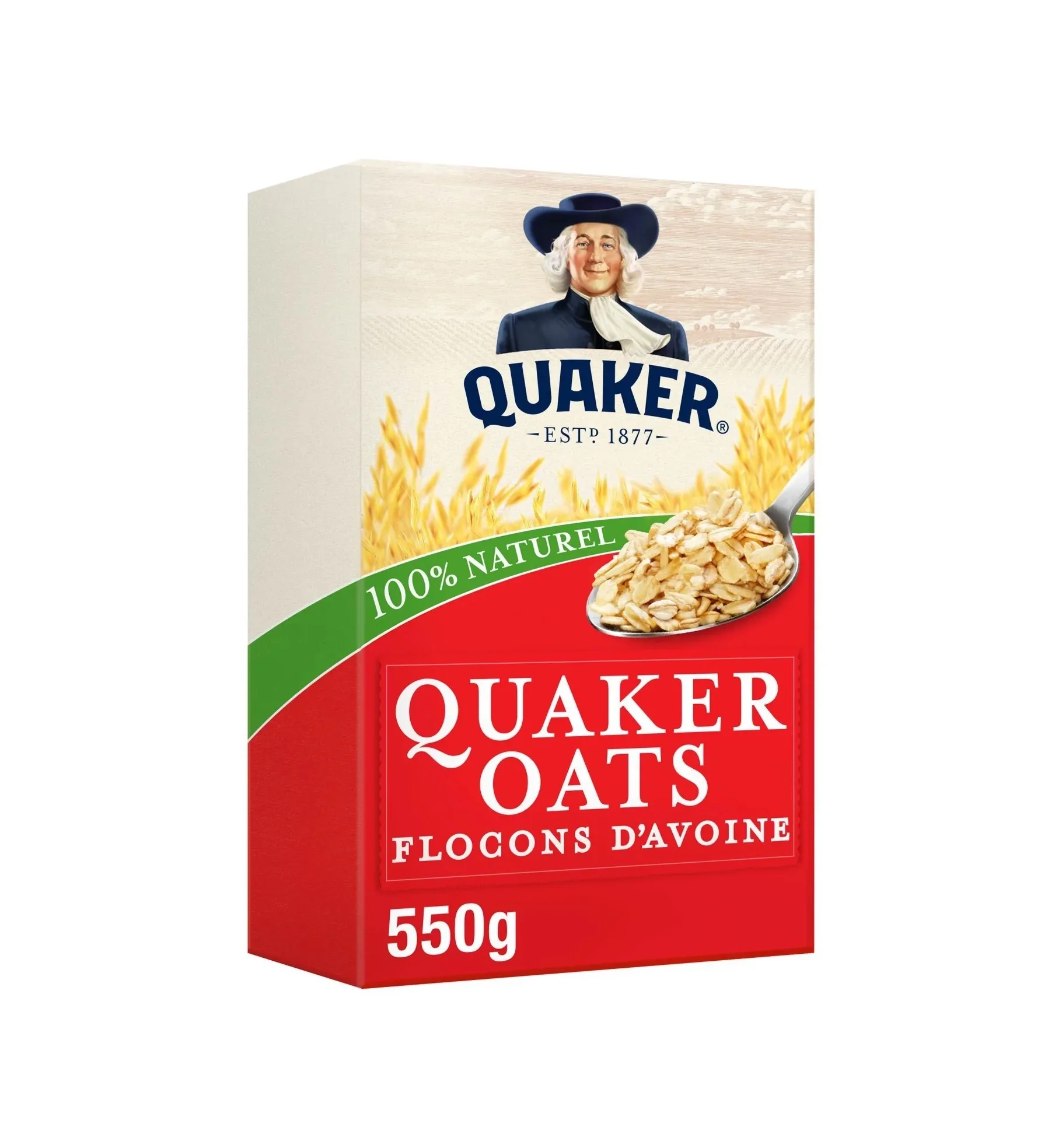
Notice how the hierarchy travels intact across markets. This French-market rolled oats box keeps the exact grammar: the Quaker man at the top as the largest element, “QUAKER” in bold blue beneath him, then the product information — wheat illustration, oat imagery, weight, and a green “100% Naturel” band localized for the shelf. Consumers in any country know exactly where to look for what information.
The Product Line Expansion: One Mascot, Many Formats
Quaker has expanded far beyond traditional rolled oats. Today the brand includes instant oatmeal packets, overnight oats, protein oatmeal, oat drinks, cereal squares, rice cakes, and breakfast cookies. Each format requires different packaging, but the Quaker man anchors every one of them.
Instant Oatmeal: Flavor as Color
Quaker’s instant oatmeal line uses the same Quaker man logo but introduces flavor-based color coding. Maple Brown Sugar gets warm brown and gold tones. Apples & Cinnamon uses red and green. Strawberry is pink. Chocolate is deep brown. The Quaker man appears on every packet, but the background color changes to match the flavor — an efficient system for helping shoppers find their favorite in a variety pack.
The Oat So Simple Golden Syrup “Big Bowl” edition shows the system at its warmest: a golden-brown gradient, a bright yellow bowl with a syrup drizzle, and convenience claims — “ready in 2½ mins”, “33% bigger portion” — set in their own callout chips. Flavor color plus portion claims, all on one face.

Kids and Seasons: Dinosaur Eggs
The most playful corner of the range proves the mascot can share a stage. On the Dinosaur Eggs “Spring Edition” box, cartoon dinosaurs wear bunny ears beside a white rabbit holding a seasonal sign, colorful egg-shaped pieces spill across the bowl, and daisies dot the green band — while the Quaker man keeps his dignified watch above, “ESTD 1877” underneath. Whimsy below, heritage on top: parents get the trust signal, kids get the fun.

Fruit & Summer Fruits: Premium Flavor Variations
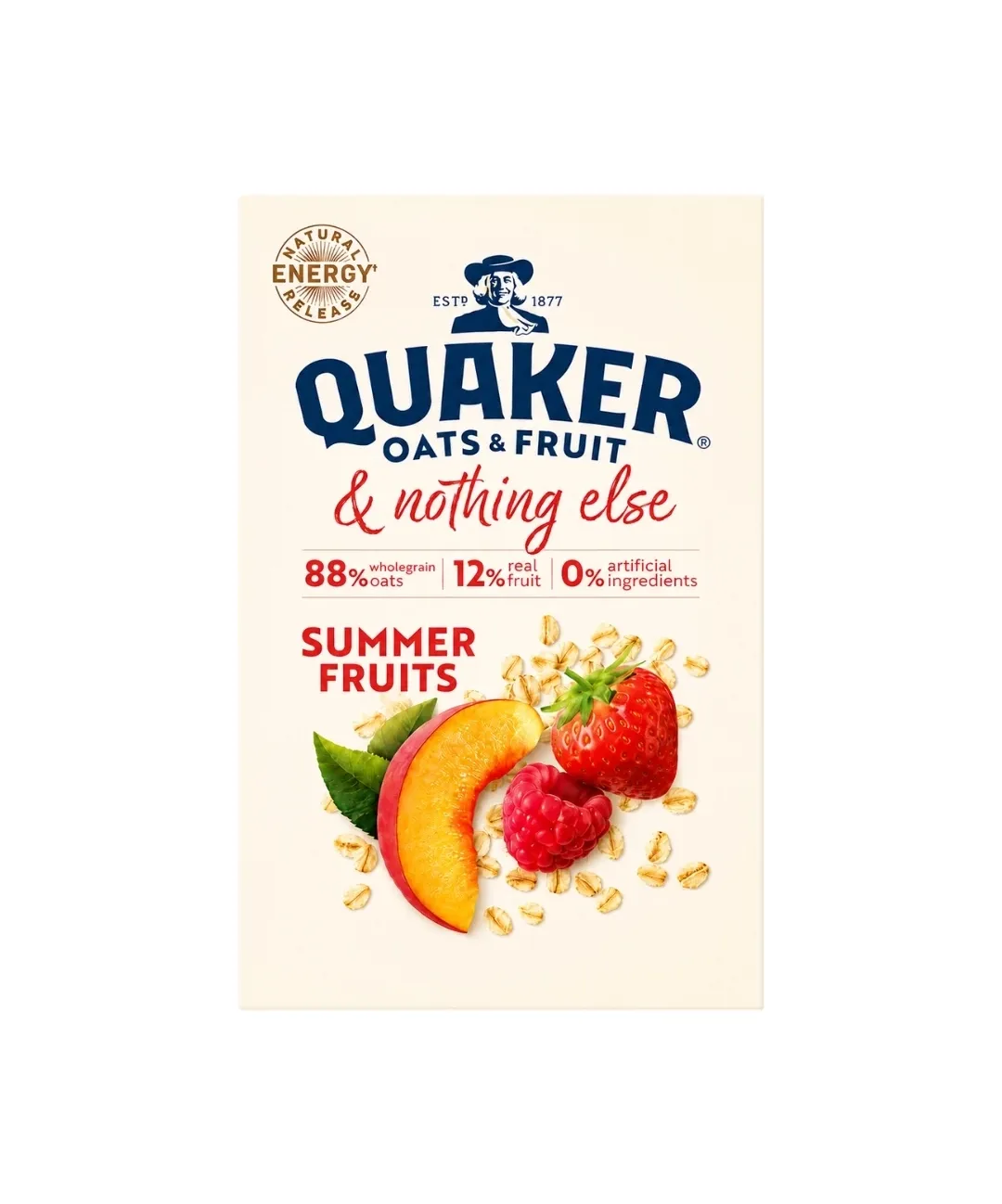
Quaker’s Fruit and Summer Fruits line showcases how the brand elevates standard oatmeal into a premium experience. A cream background, a red cursive “& nothing else”, and clean stat blocks — 88% wholegrain oats, 12% real fruit, 0% artificial ingredients — carry the honesty story, while a peach, strawberry and raspberry still life supplies the appetite. These products target consumers willing to pay more for gourmet flavors while still trusting the Quaker name.
Protein: Functional Positioning
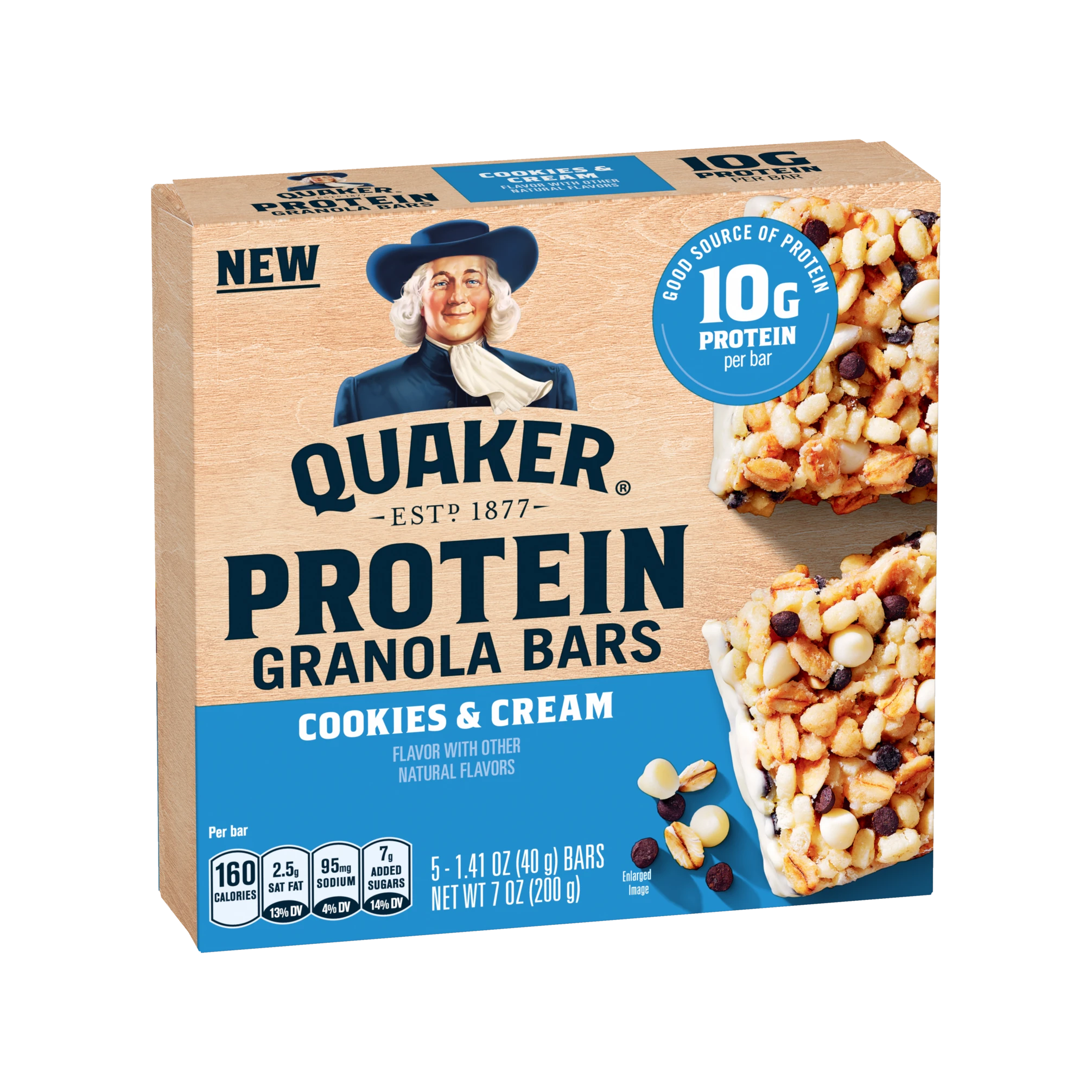
The Protein line shifts to blue and orange — colors associated with energy and athletic performance — and now extends from oatmeal into granola bars. On the Cookies & Cream box, a circular badge dominates the right half: “10g protein per bar”, with the bars and their chocolate chips photographed in close-up below a “NEW” flag. The Quaker man is still present, but the functional benefit takes dominant position: heritage brand, gym-shelf message.
Oat Drinks: Crossing Into Beverages
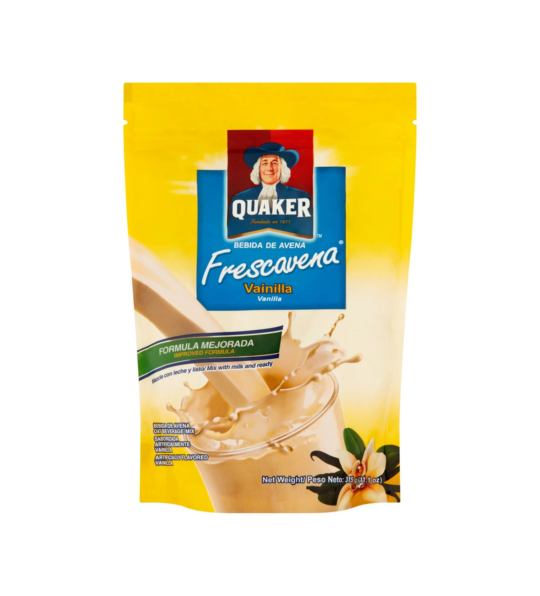
Quaker’s oat-based drinks move into the beverage category — a completely different retail environment. The Frescavena vanilla oat drink, from the brand’s Latin American line, arrives in a stand-up pouch: brilliant yellow, a pouring glass with splash, a vanilla flower, and a green “improved formula” banner in Spanish. The format rules change in the drink aisle, but the blue-and-red Quaker crest with “Fundado en 1877” provides the trust signal that connects the product back to the mother brand — in any language.
Rice Crisps: The Snack Aisle
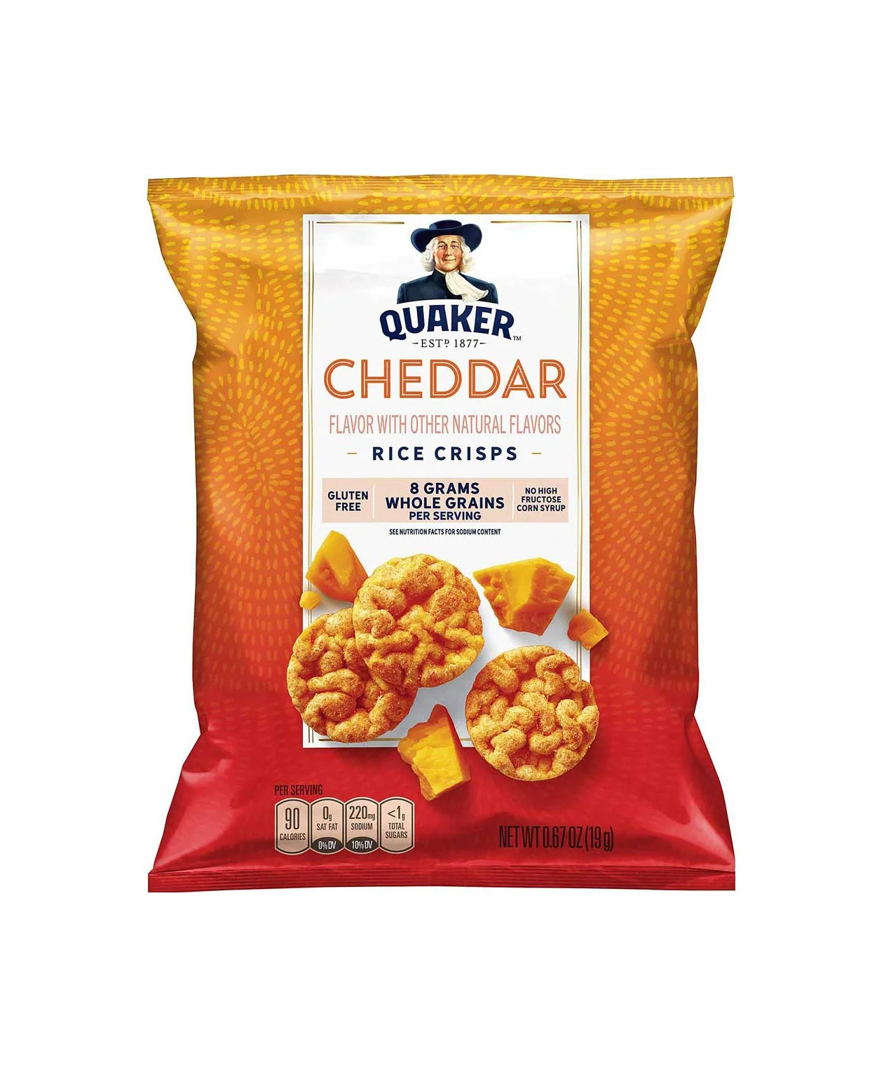
Quaker’s rice snacks sit in a different aisle entirely from oatmeal, competing with chips and crackers rather than cereal. The Cheddar Rice Crisps bag answers with pure appetite design: a yellow-to-red gradient that tastes of cheese before you read a word, textured crisps and chunks of cheddar photographed mid-scatter, and claims — gluten free, 8g whole grains — tucked into a clean white panel. The Quaker man keeps his post at the top, maintaining brand continuity in enemy territory.
Health Positioning: Fiber, Cholesterol, Trust
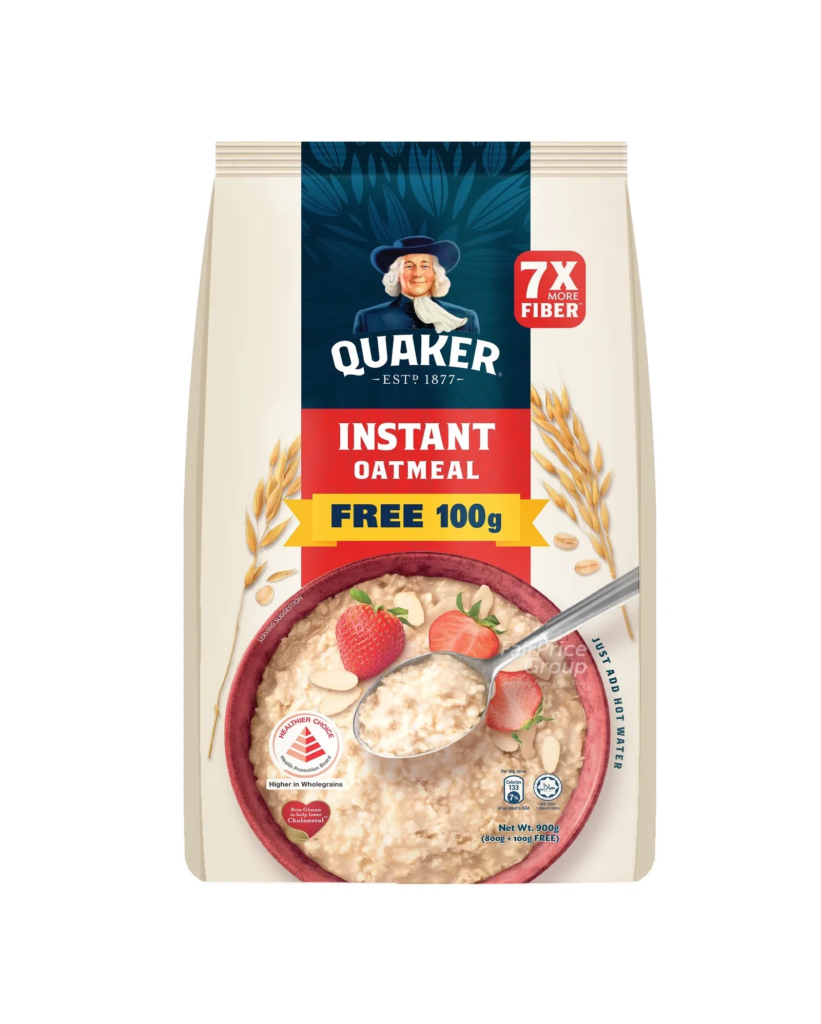
Quaker’s health-focused lines put nutrition claims at the center of the design language. The 7X More Fiber instant oatmeal pouch stacks them like a checklist: a red “7X MORE FIBER” badge, a “Higher in Wholegrains” healthier-choice seal, a heart-shaped “Beta Glucan to help lower cholesterol” mark, and calorie transparency — all arranged around a strawberry-and-almond bowl with the Quaker man’s “ESTD 1877” anchor. The message to health-conscious consumers: this isn’t a trendy startup’s functional food — it’s Quaker, a brand you’ve trusted your whole life. That heritage is a trust signal no new competitor can print.
Brand Collaborations: Quaker Meets Almond Breeze
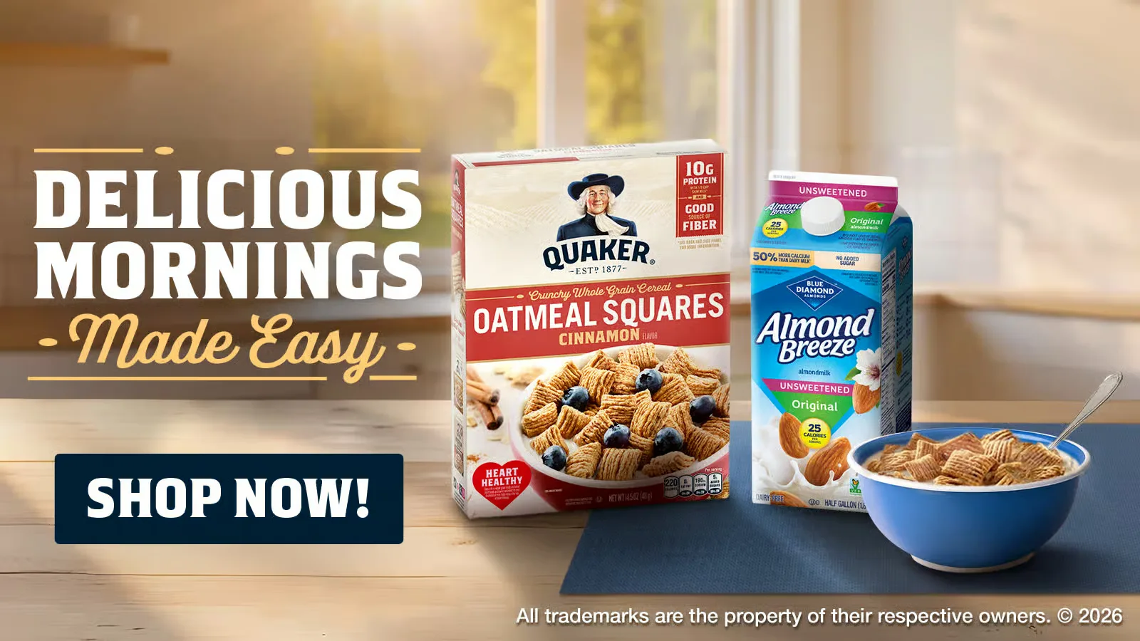
Quaker also partners with complementary brands. In this campaign advertisement, Quaker Oatmeal Squares cinnamon cereal is paired with Almond Breeze almond milk from Blue Diamond: a warm sunlit kitchen scene, the headline “Delicious Mornings Made Easy” in bold white with golden cursive, a navy “SHOP NOW!” button, and the two packages beside a prepared bowl. The co-branding benefits both sides — Quaker brings breakfast heritage, Almond Breeze brings plant-based credibility — while the Quaker man keeps his post on the cereal box, proving a 150-year-old brand can share a stage without losing its identity.
5 Brand Consistency Lessons from Quaker
1. A Mascot Is Forever
The Quaker man has outlasted every design trend of the past 150 years. Art Nouveau, Art Deco, Mid-Century Modern, Minimalism — he survived them all. Why? Because he represents values (trust, honesty, quality) rather than aesthetics. A mascot built on values is timeless. A mascot built on a visual trend has an expiration date.
2. Color Systems Aid Navigation
Quaker uses flavor-based color coding across its instant oatmeal line: brown for maple, red for apple, pink for strawberry. This system lets shoppers find their preferred flavor in seconds without reading a single word. Color coding is one of the most user-friendly packaging strategies available.
3. Heritage Builds Trust in New Categories
When Quaker enters a new category — oat drinks, rice crisps, overnight oats — the Quaker man’s presence immediately communicates “you can trust this.” Heritage brands have a massive advantage in new categories: they bring decades of accumulated trust that startups can’t replicate.
4. Subtle Evolution Beats Radical Change
The Quaker man has been updated many times — his face has been redrawn, his hat adjusted, his colors refreshed. But each change is subtle enough that consumers barely notice. This is the art of brand evolution: change just enough to stay current, never enough to feel like a different brand.
5. One Identity Works Across Every Aisle
Quaker products appear in the cereal aisle, the snack aisle, the beverage aisle, and the health food aisle. The packaging changes format for each context, but the brand identity stays constant. This proves that a strong visual anchor — the Quaker man — can work in any retail environment.
Explore the Full Quaker Collection
Browse all Quaker packaging images for design reference:
- Quaker Packaging Collection — every pack, canister and advertisement
- Packaging Design — broader packaging collection
- Food & Beverage Photography — product photography