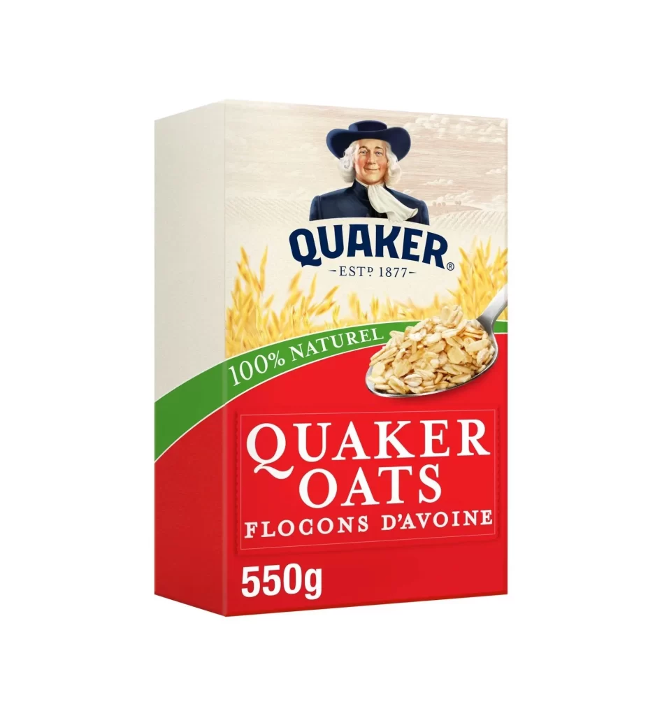
Quaker Oats French Rolled Oats Box Packaging
Topics
Details
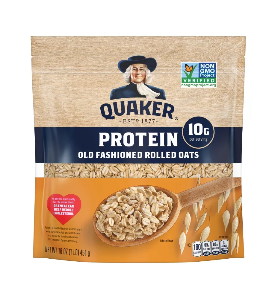
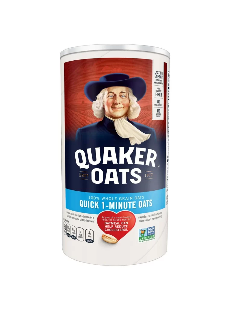
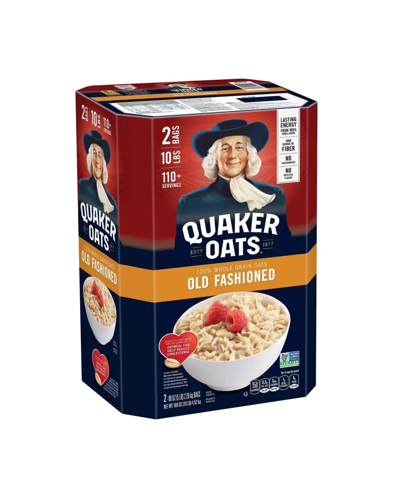
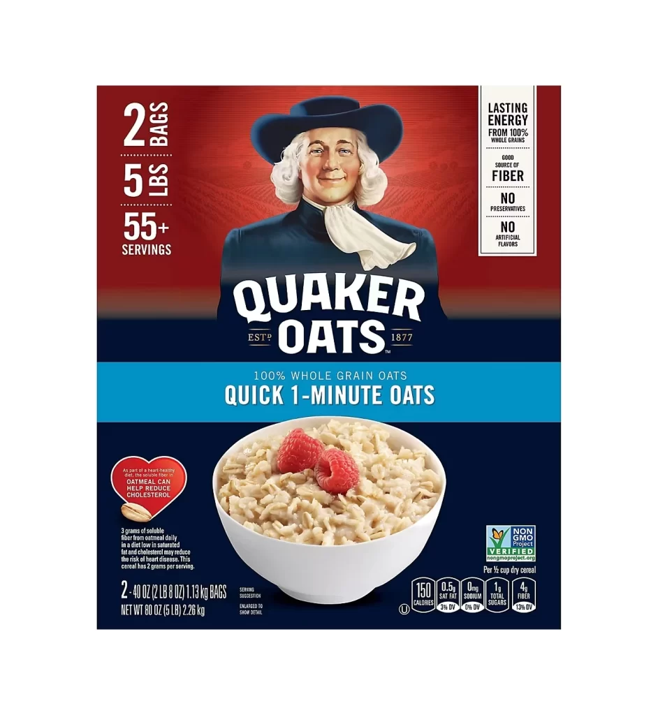
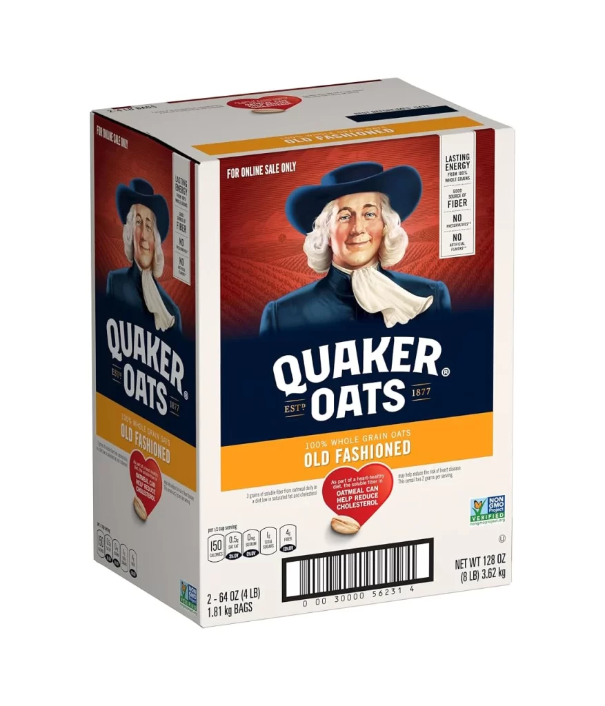
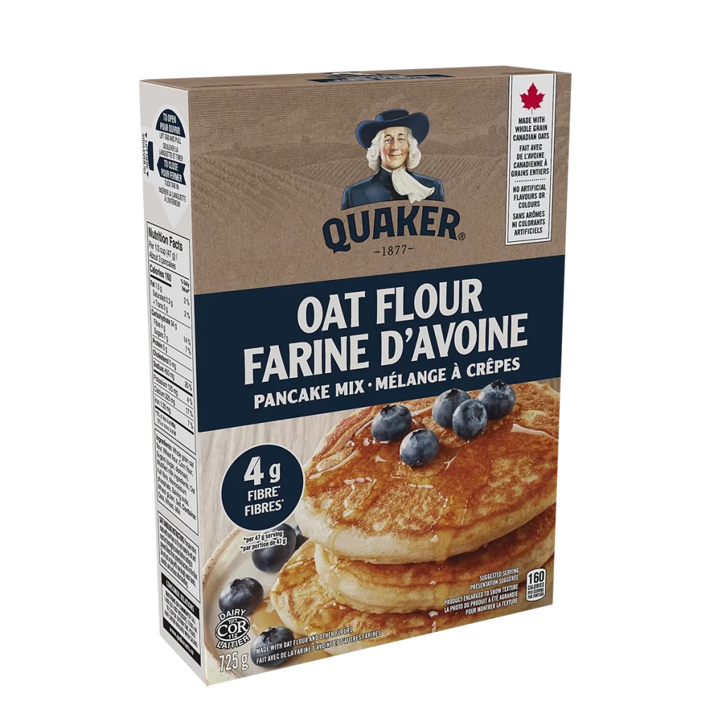
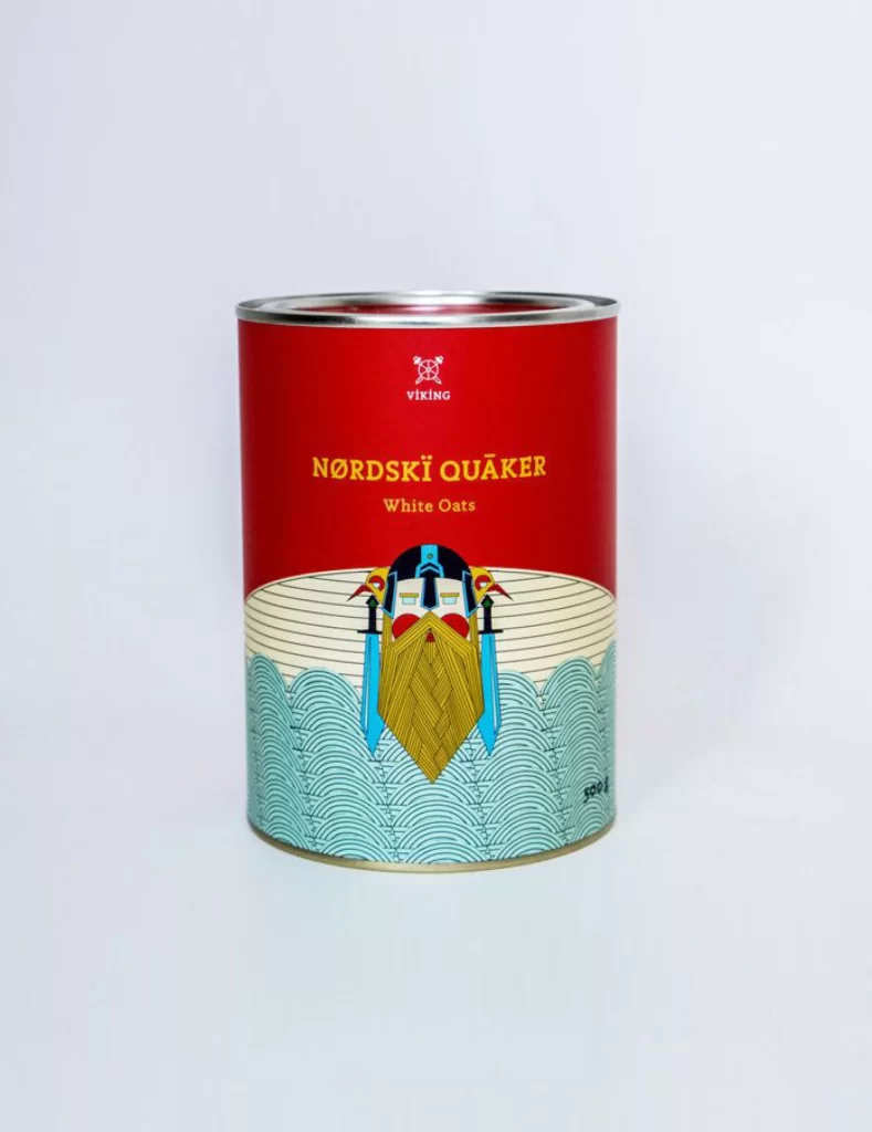
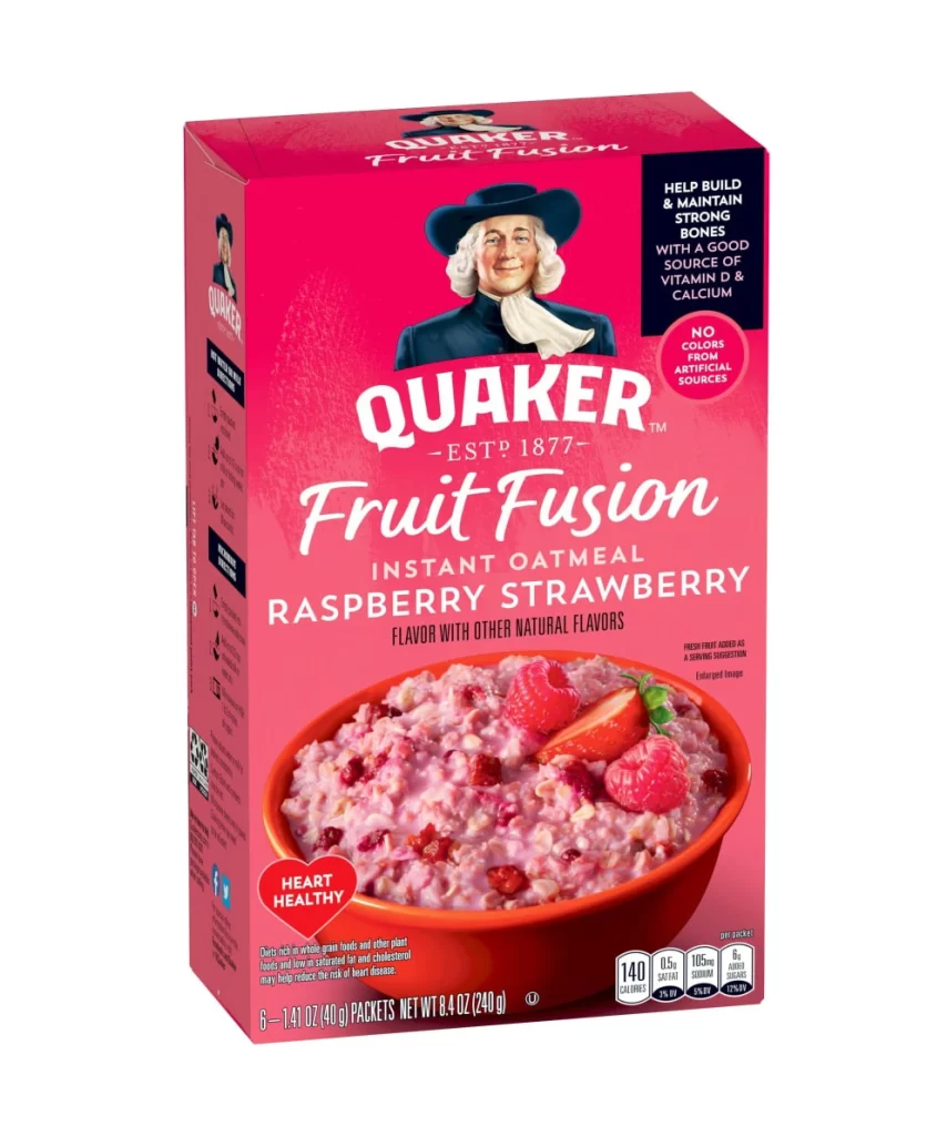
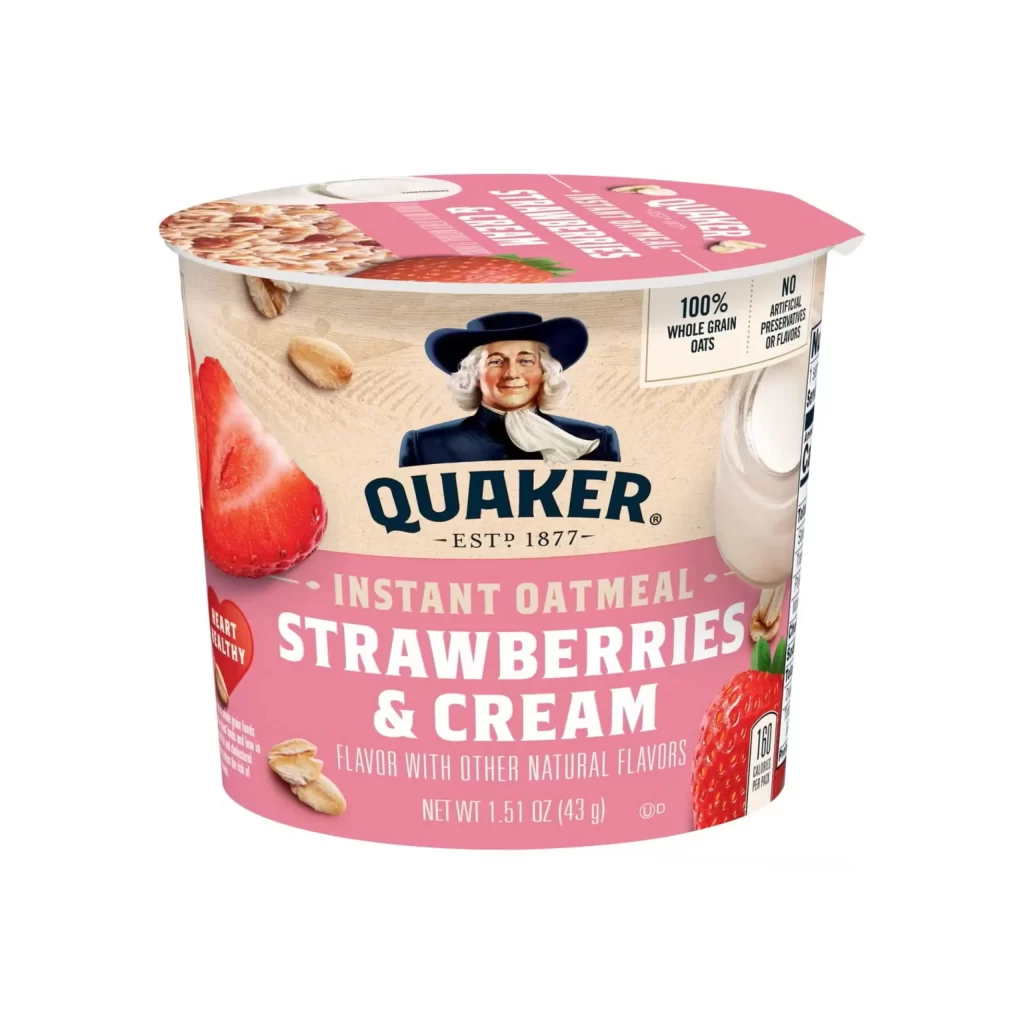
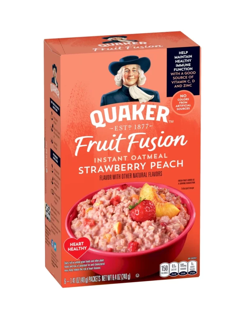
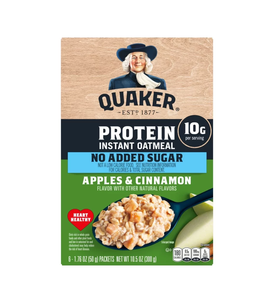
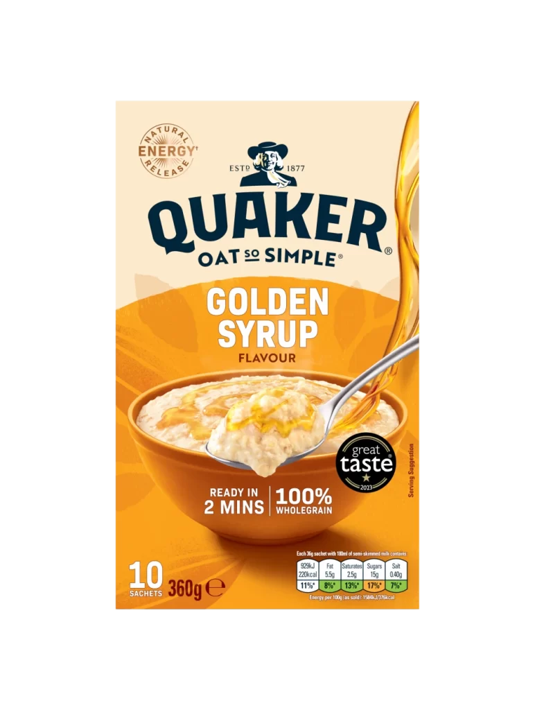
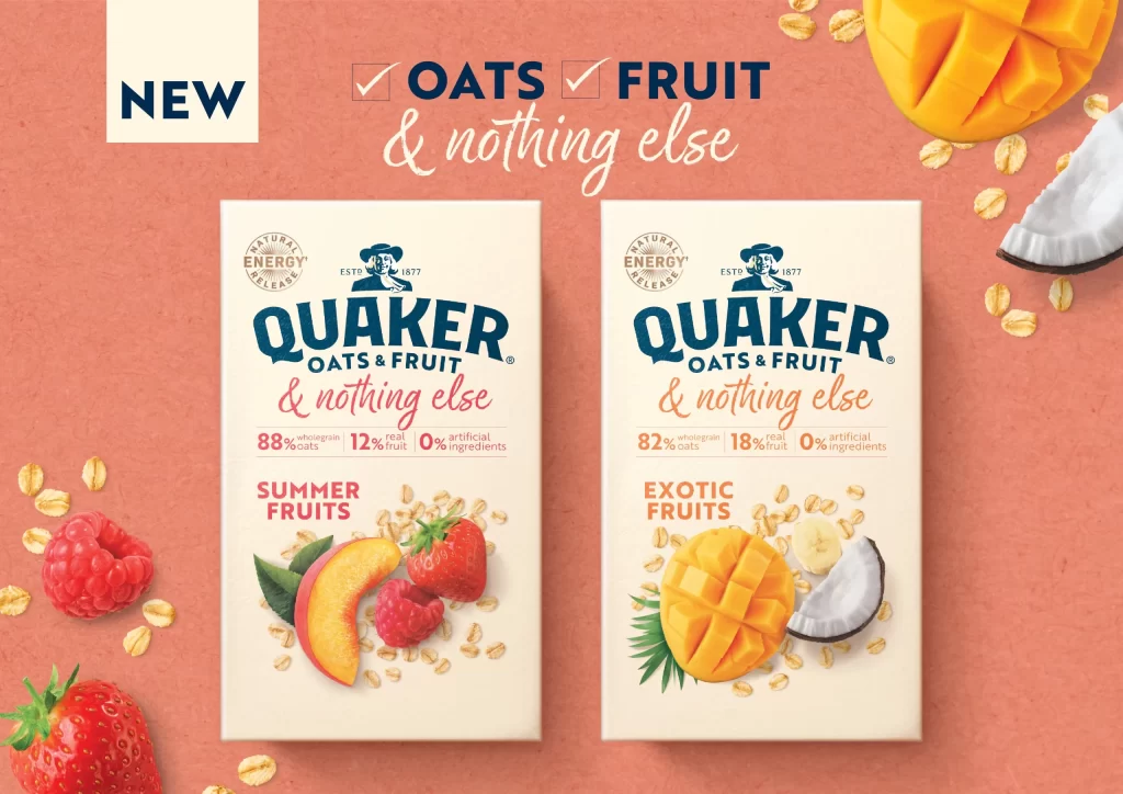
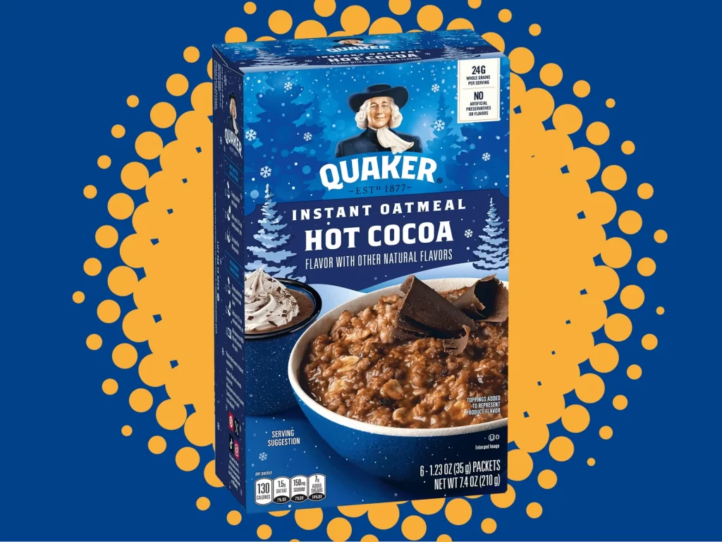
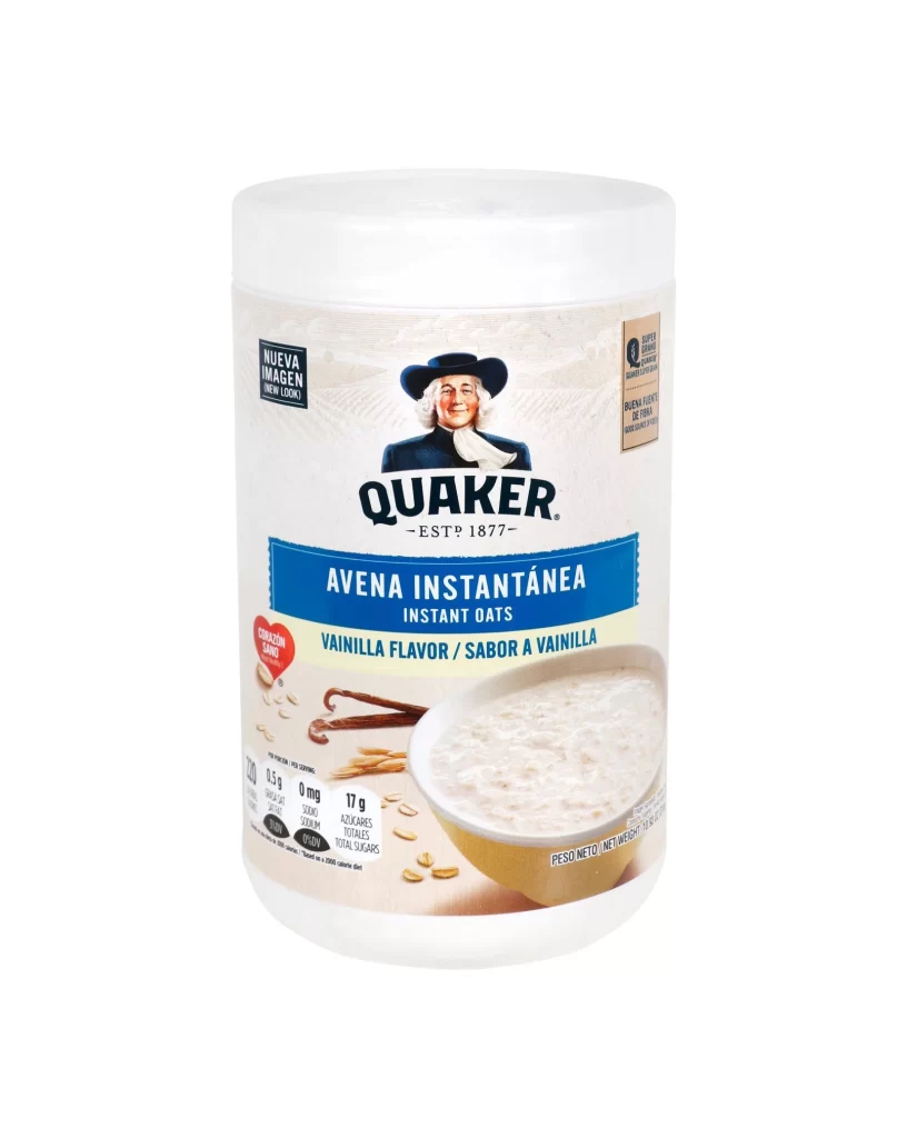
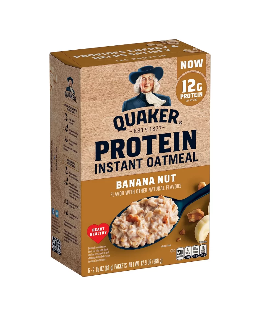
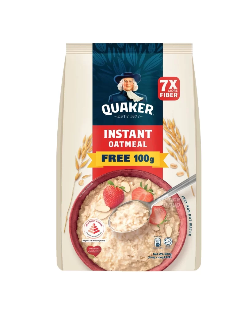
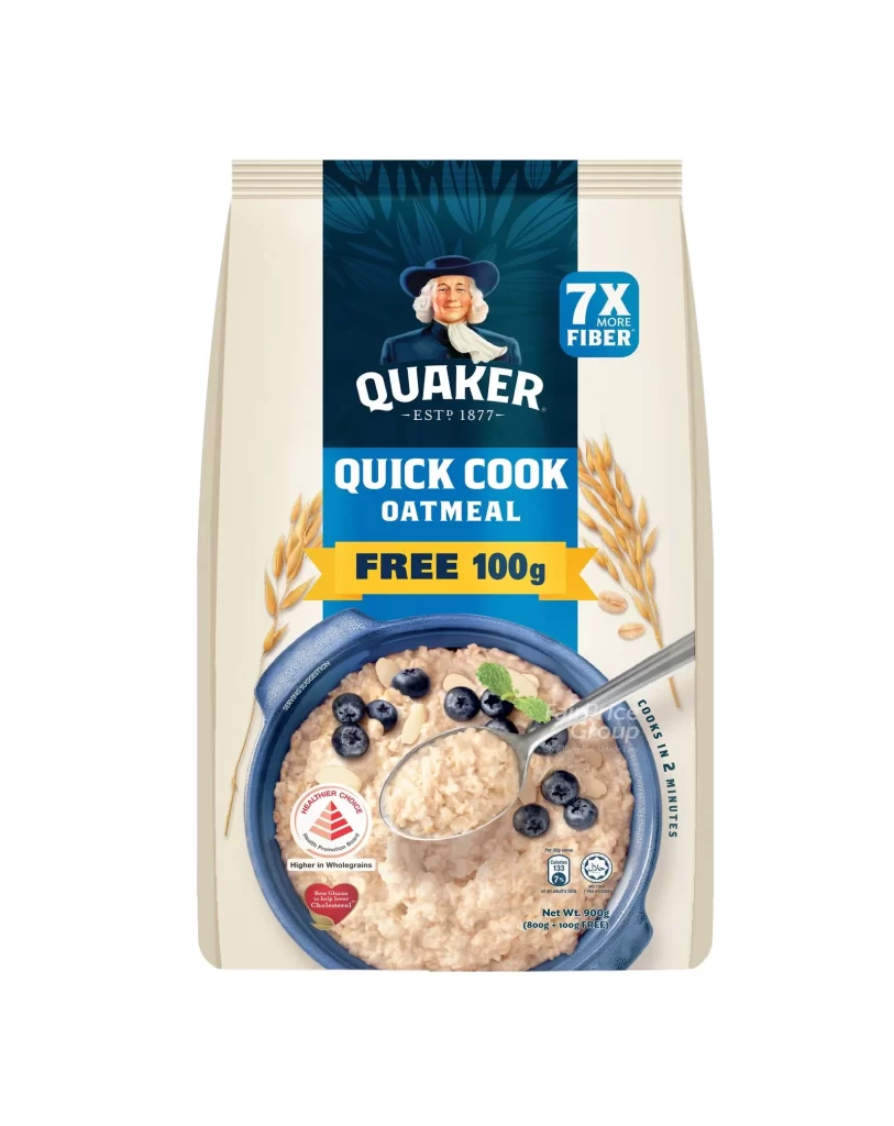
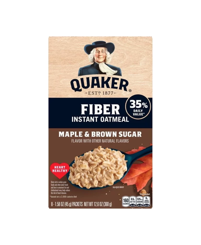
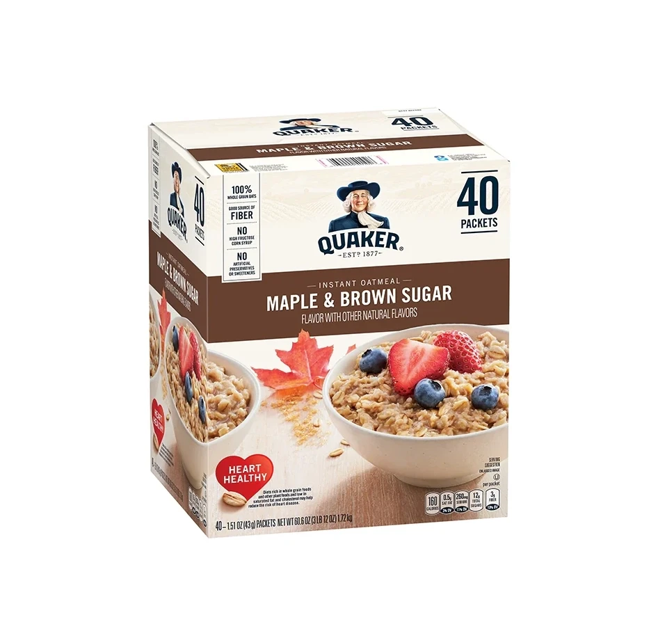
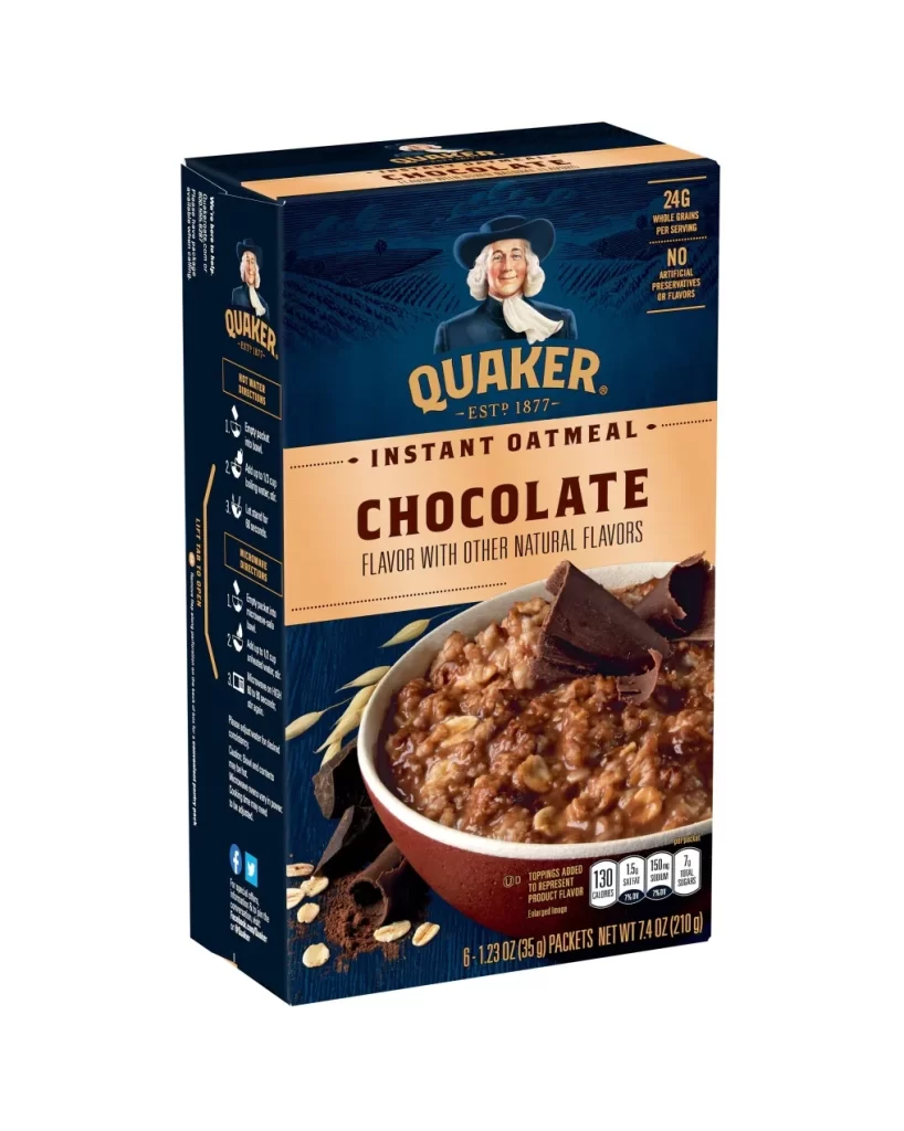
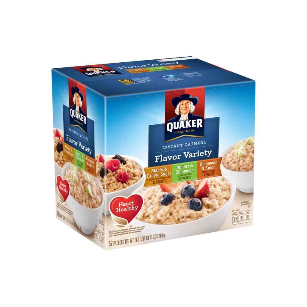
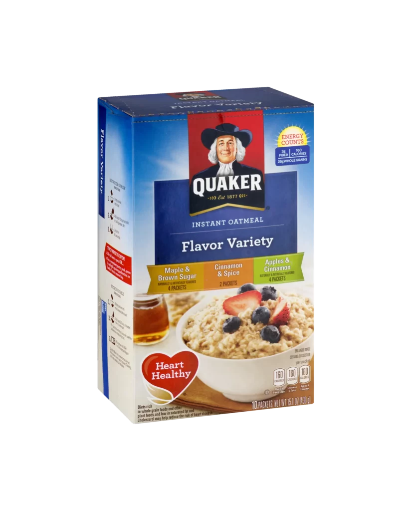
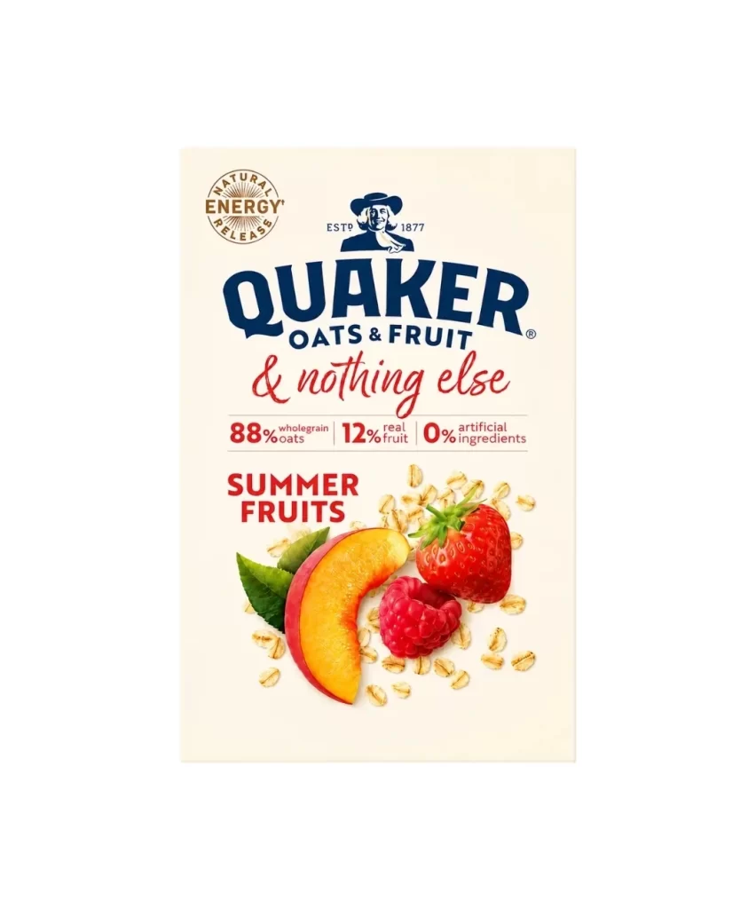
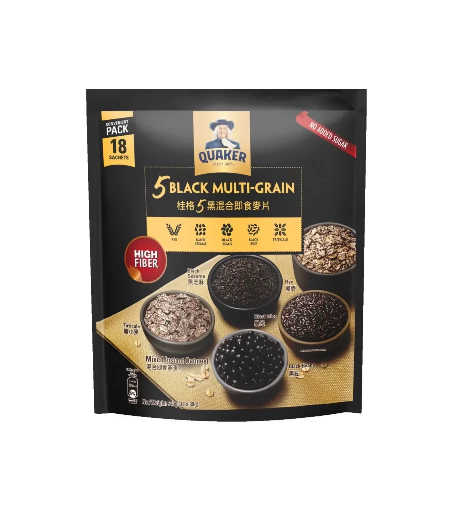
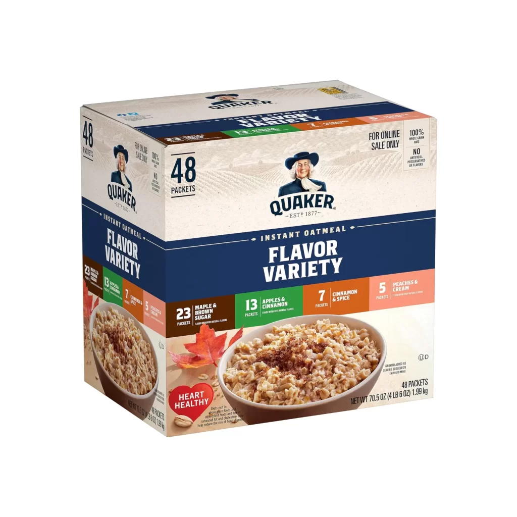
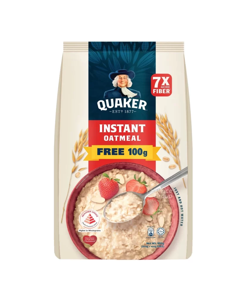
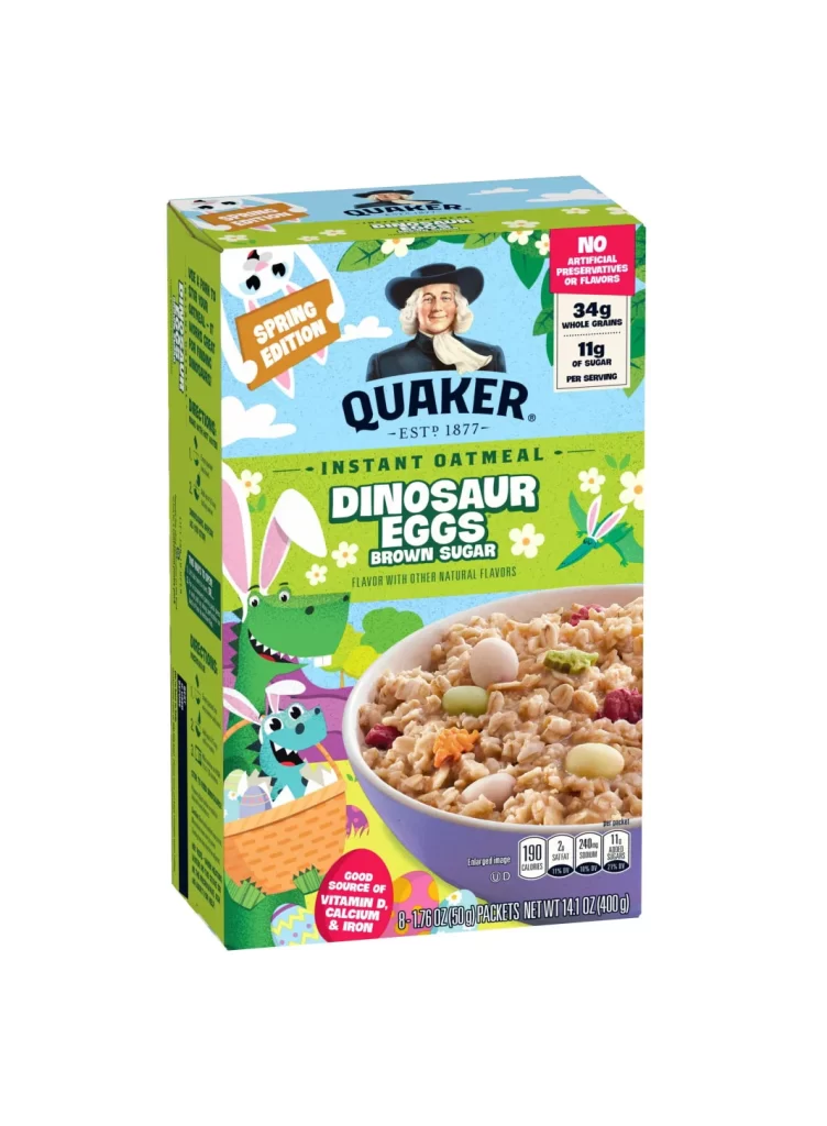
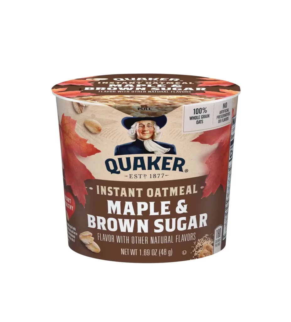
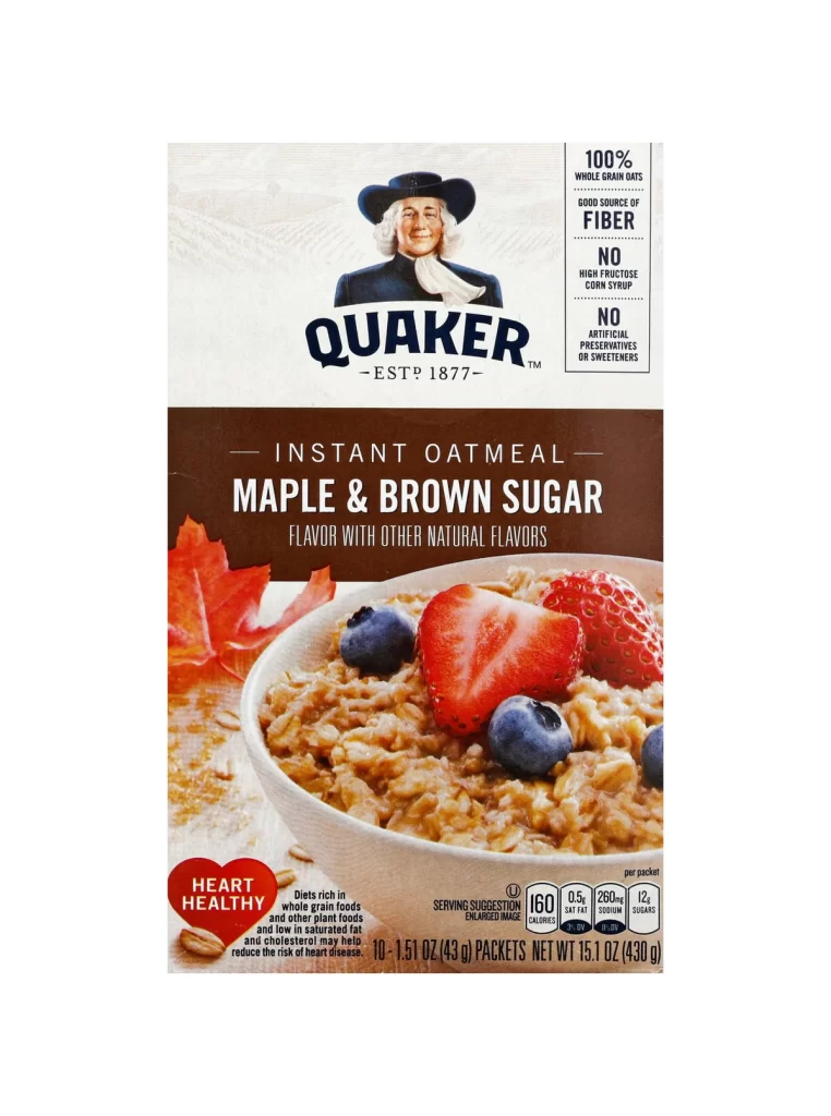
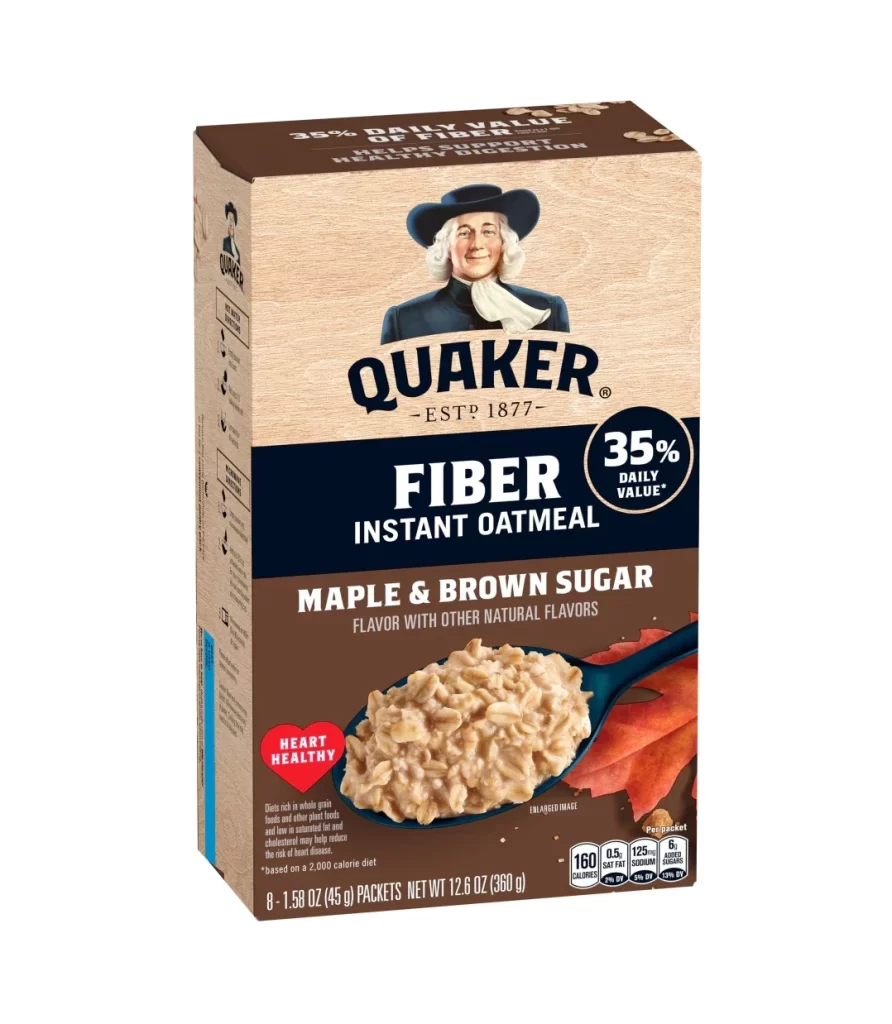
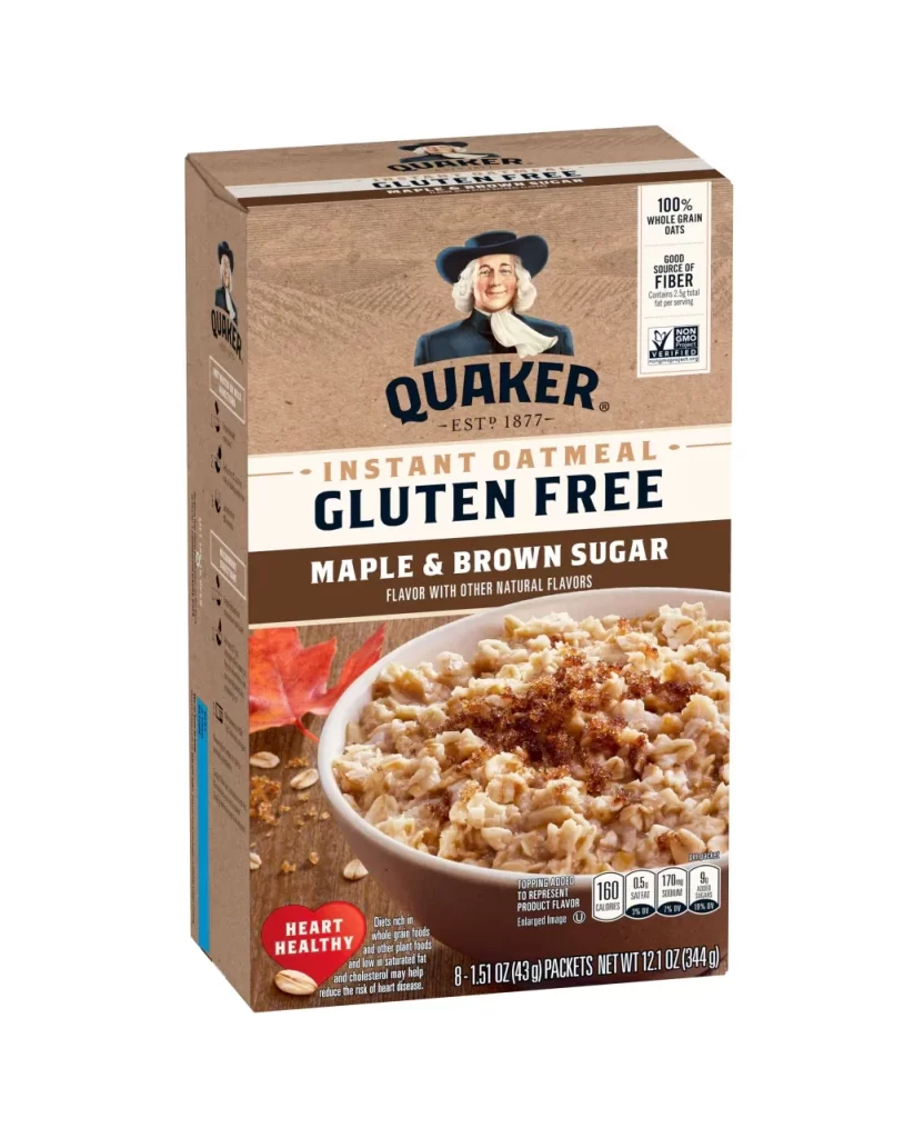
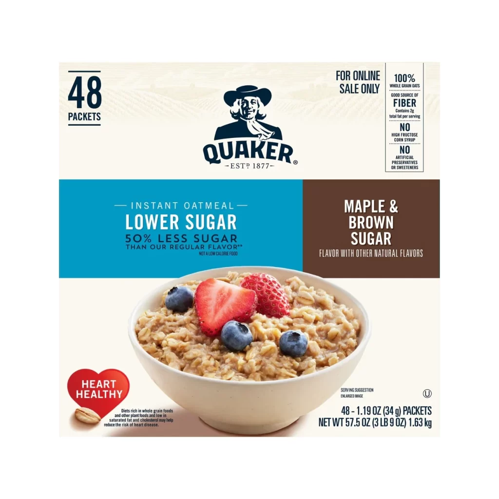
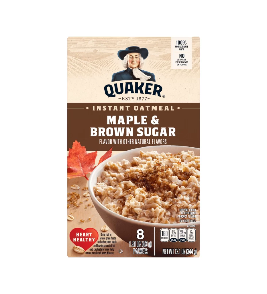
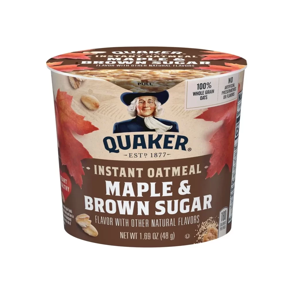
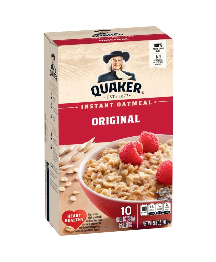
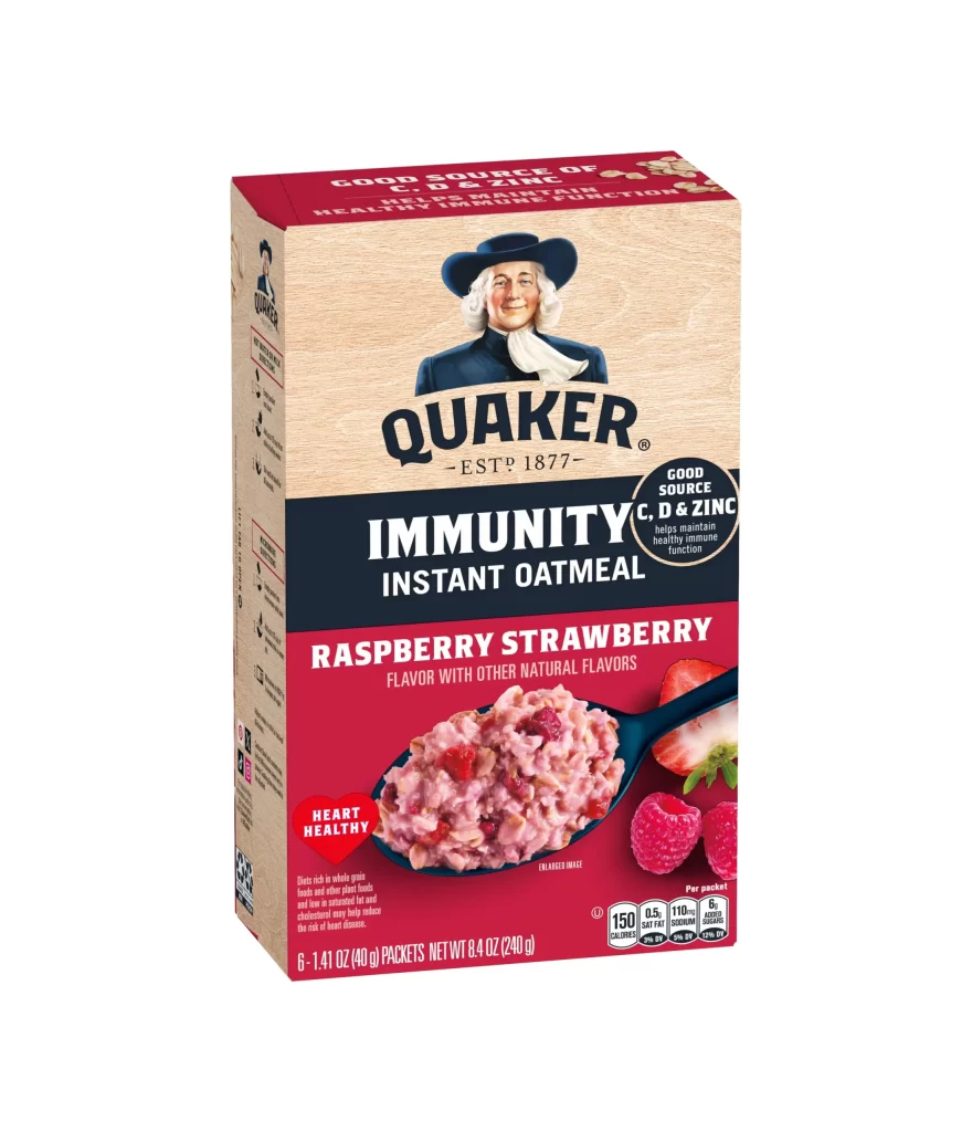
The packaging features the classic Quaker Oats imagery, presenting a single hero shot of the rolled oats. The box is printed in French, prominently displaying the phrase Flocons d Avoine 100 pourcent Naturel. Additionally, the design highlights the ESTP 1877 mark, grounding the product in its long standing historical heritage while maintaining a clean and recognizable visual identity.
This packaging design analysis reveals a masterful use of visual hierarchy. The single hero approach draws immediate attention to the product, ensuring the French language typography remains highly legible. By balancing the traditional Quaker Oats branding with the specific Flocons d Avoine 100 pourcent Naturel text, the layout achieves a cohesive blend of heritage and clarity.
Designers and packaging students need this reference for studying effective visual communication. It serves as an excellent example of how to adapt a global brand for a local market. Creators working on food branding will find inspiration in the single hero layout and the integration of the ESTP 1877 historical element into a modern aesthetic.