Quaker Oats Fruit Summer Fruits Box Packaging
DownloadTopics
Details
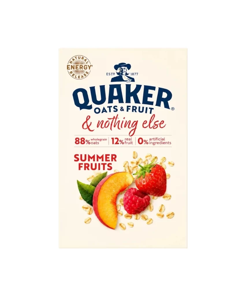
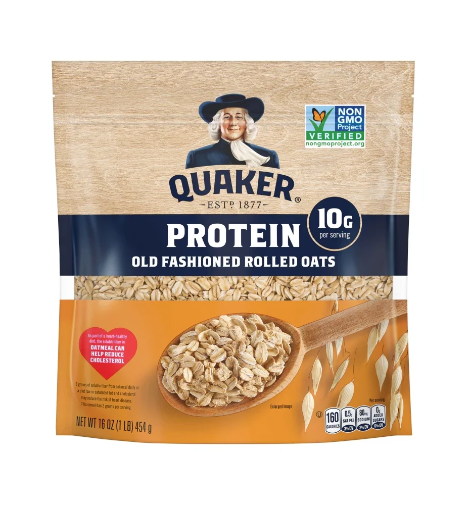
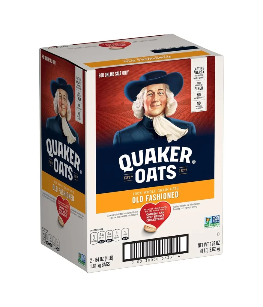
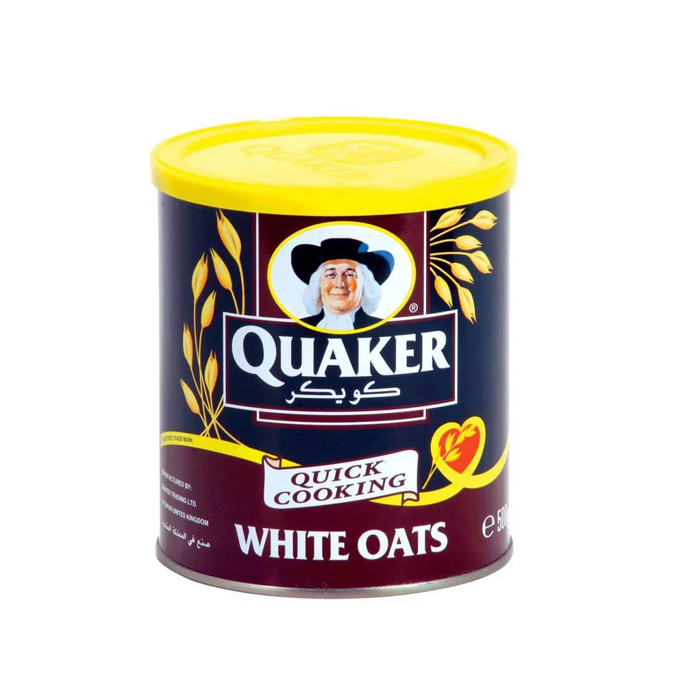
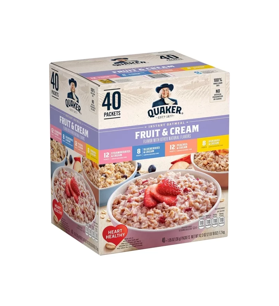
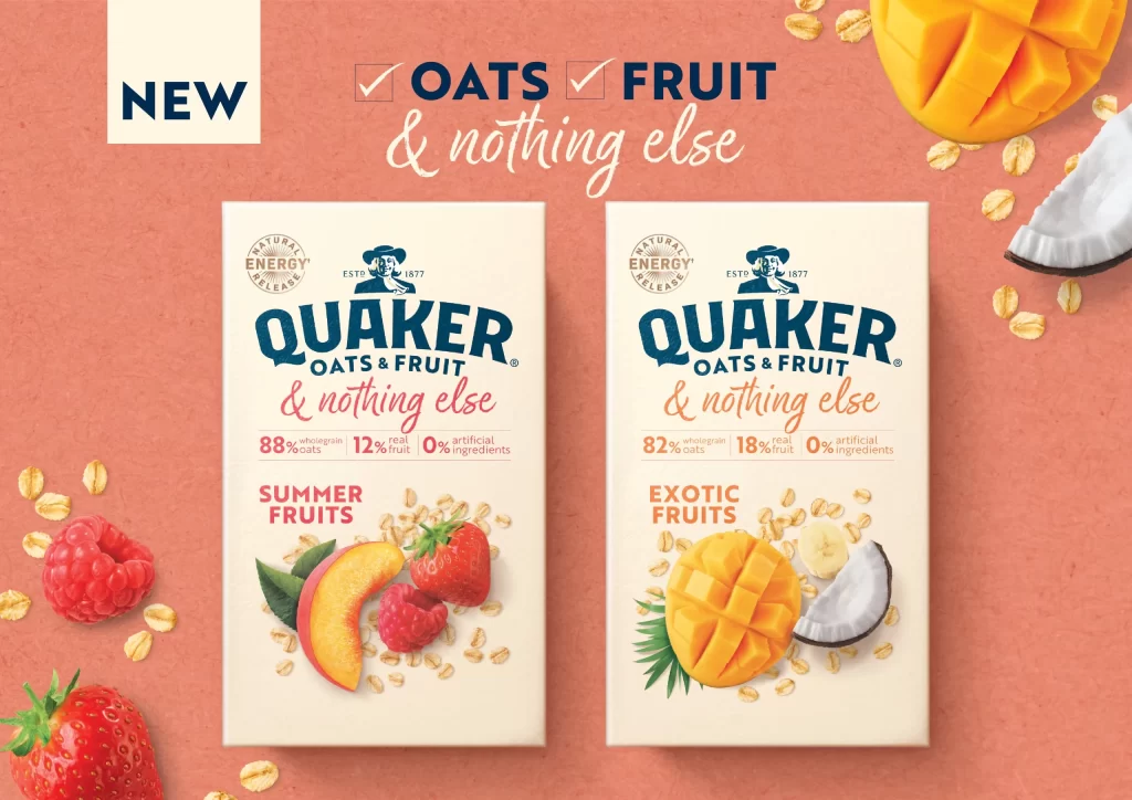
The styled box packaging for QUAKER OATS & FRUIT presents a clean, minimalist white aesthetic. Photorealistic fruit illustrations immediately communicate the SUMMER FRUITS variety. A prominent NEW badge catches the eye, while the bold & nothing else positioning stands out. The design highlights percentage-based ingredient transparency, clearly stating 88% wholegrain oats and 12% real fruit, reinforcing the Natural Energy Re message.
Analyzing the box design reveals a strategic emphasis on simplicity and trust. The QUAKER logo anchors the layout, while the OATS & FRUIT line uses clean typography to enhance readability. The photorealistic fruit visuals create an appetizing contrast against the stark white background. By prominently featuring the 0% artificial ingredients claim, the packaging effectively leverages transparency as a core design principle to attract consumers.
This packaging reference is essential for graphic designers and brand strategists working in the food and beverage industry. It is particularly valuable for those developing minimalist box designs that require clear, percentage-based ingredient transparency. Creators focusing on natural energy products, or anyone needing inspiration for integrating photorealistic illustrations with bold typographic positioning, will find this a highly useful visual resource.