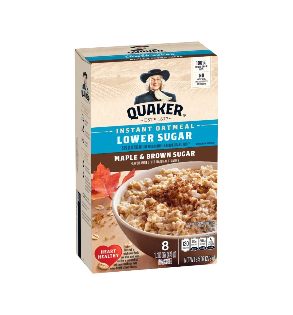
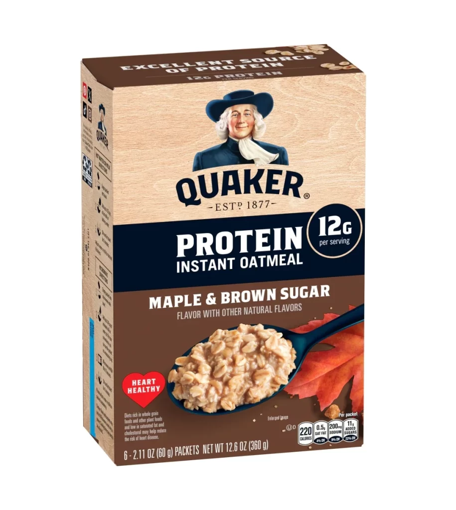
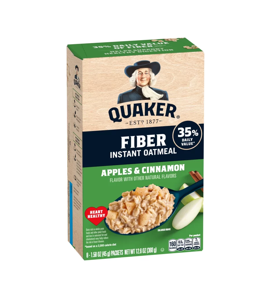
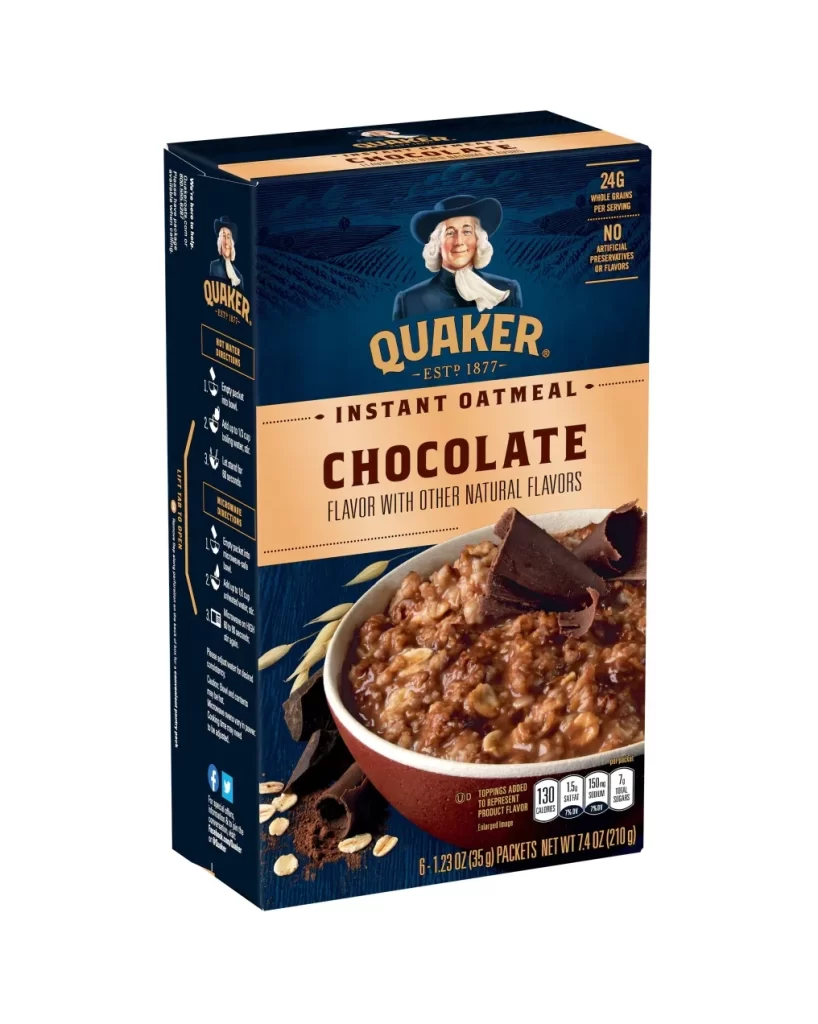
Quaker Oat So Simple Golden Syrup Big Bowl Box Packaging
Topics
Details
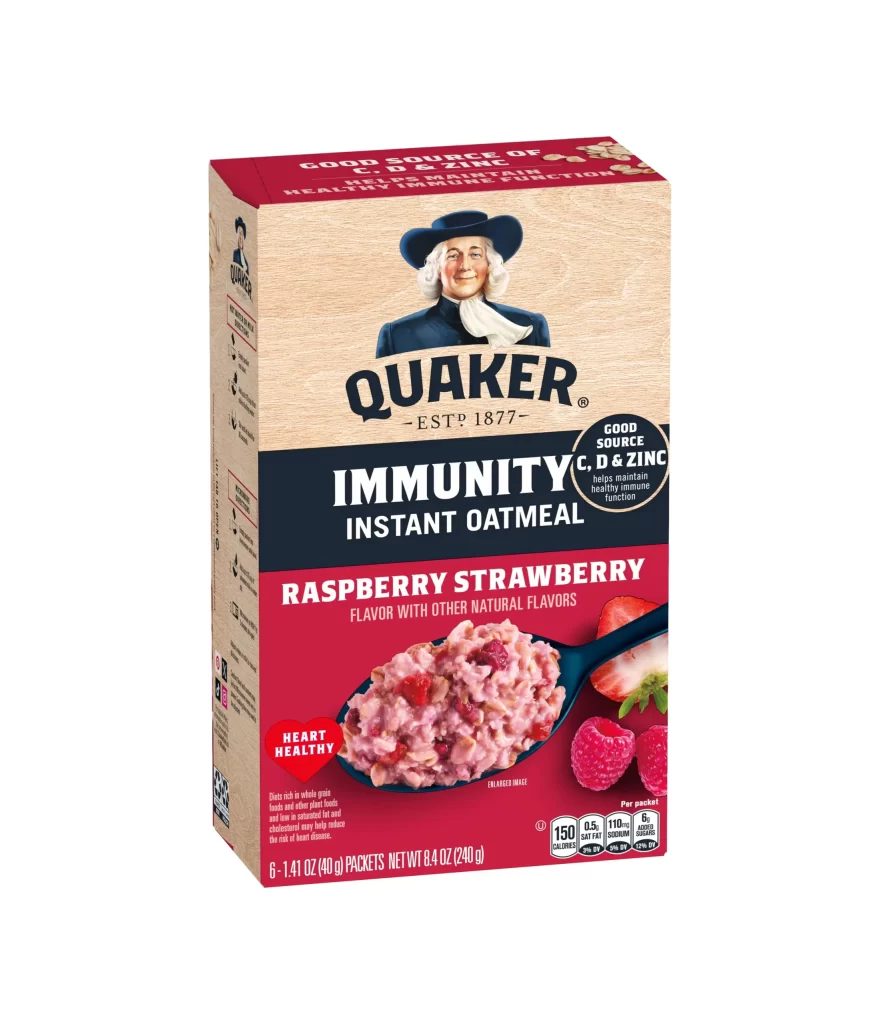
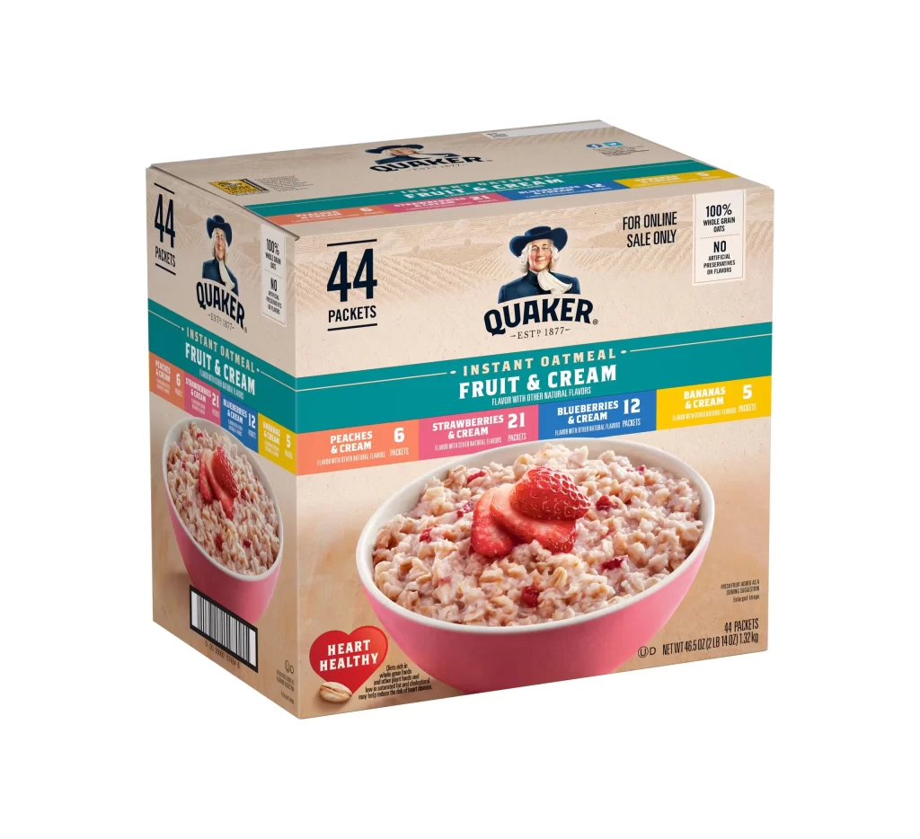
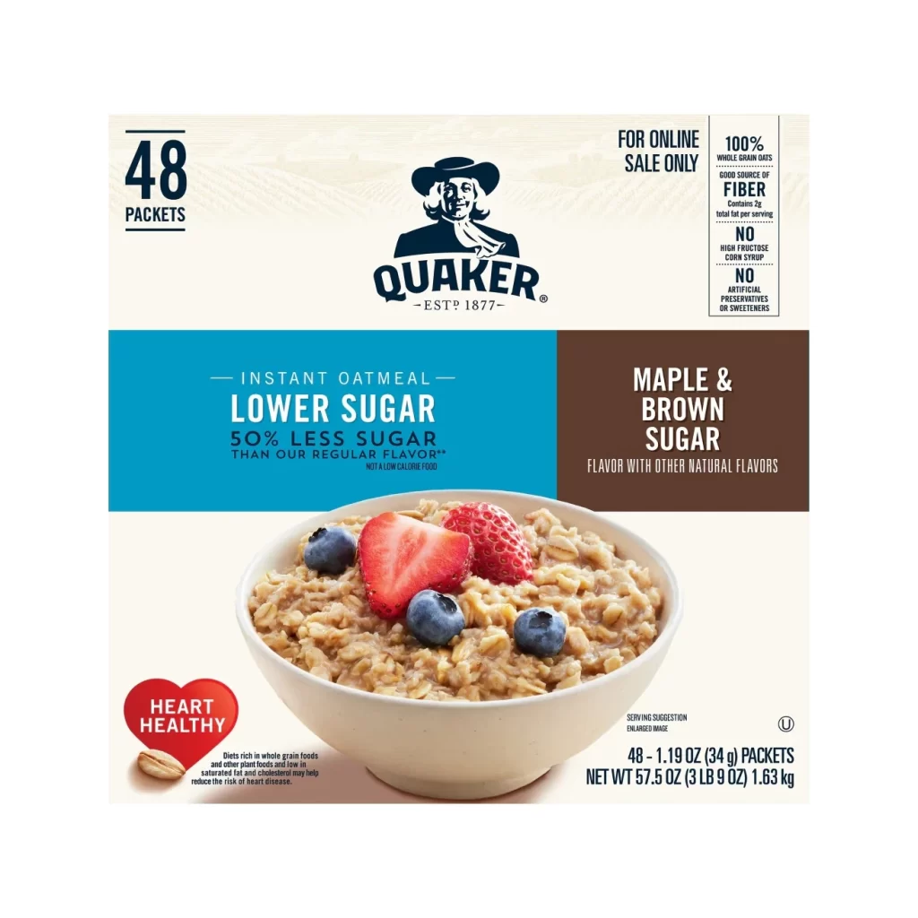
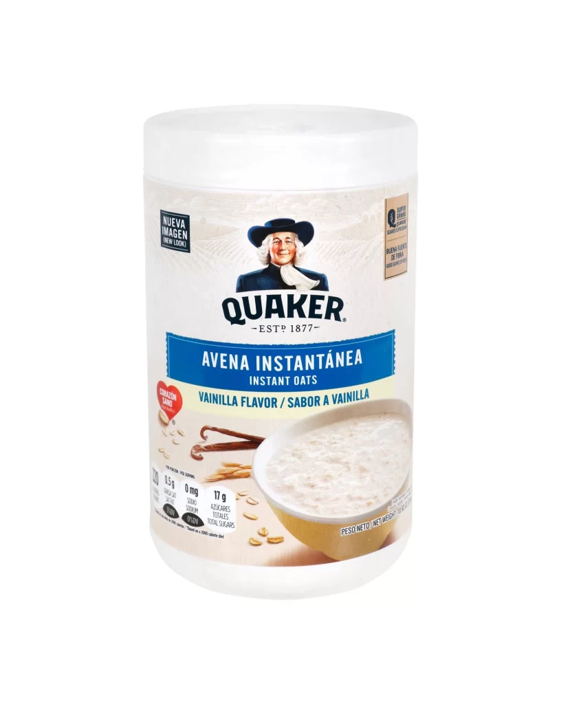
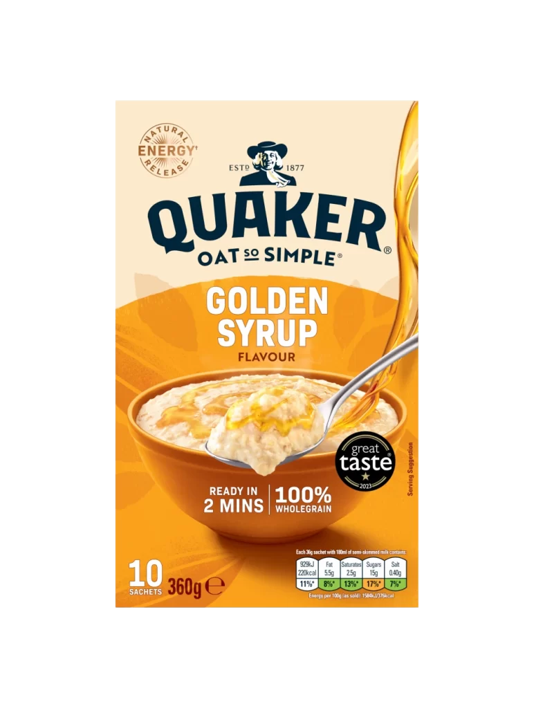
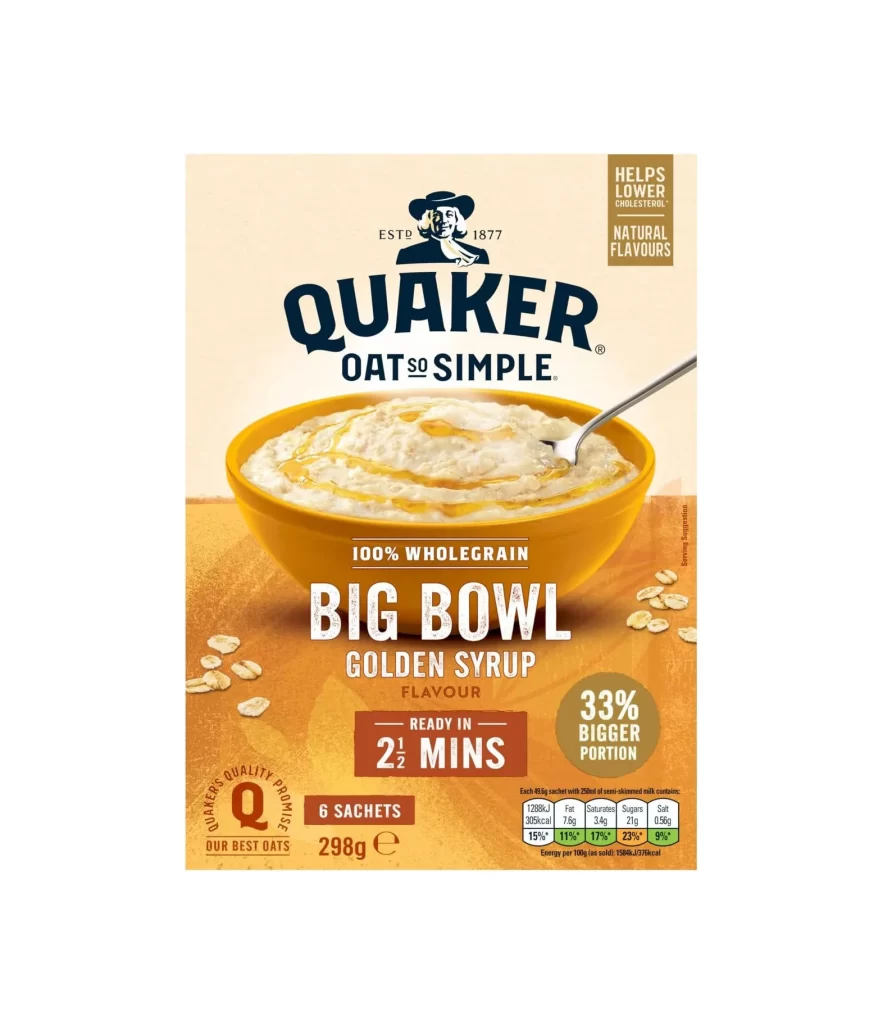
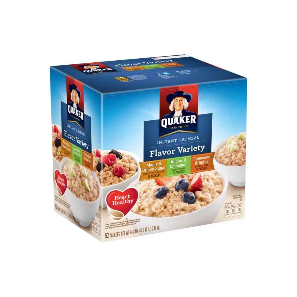
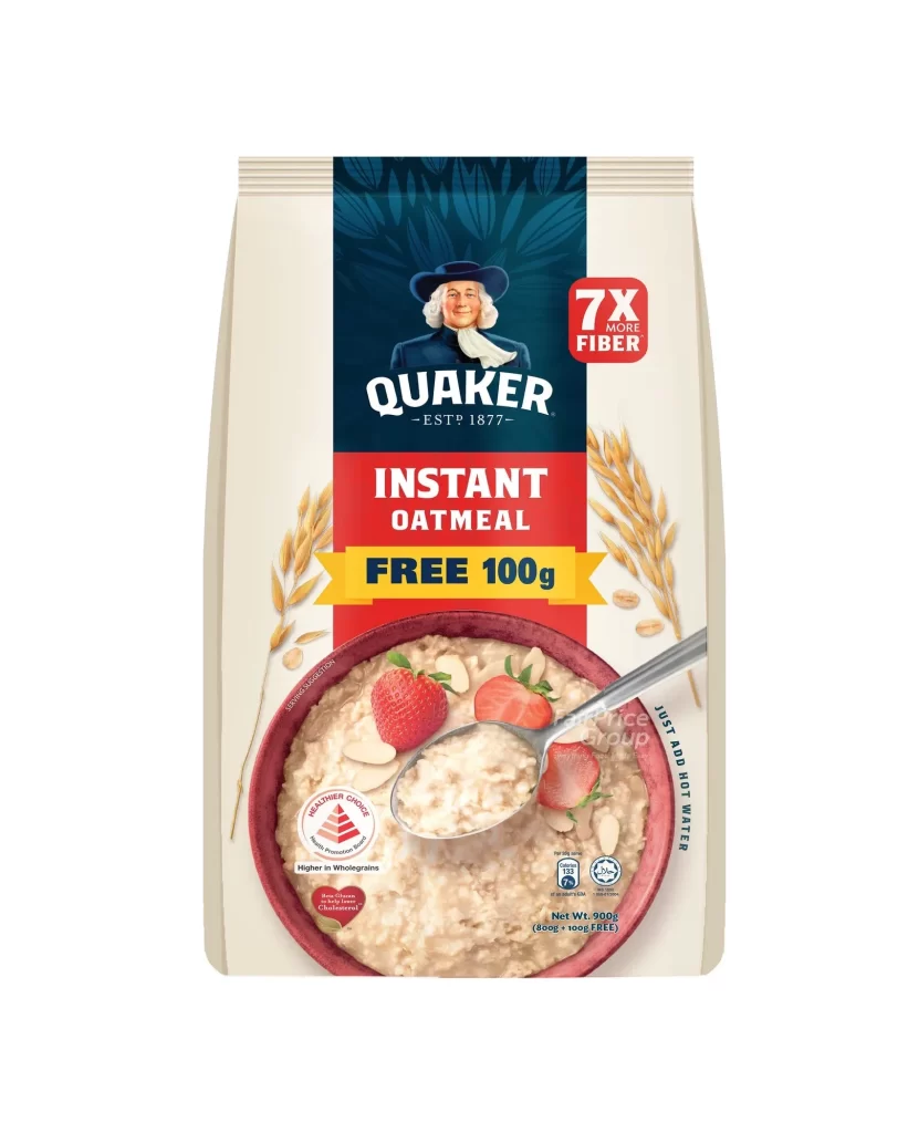
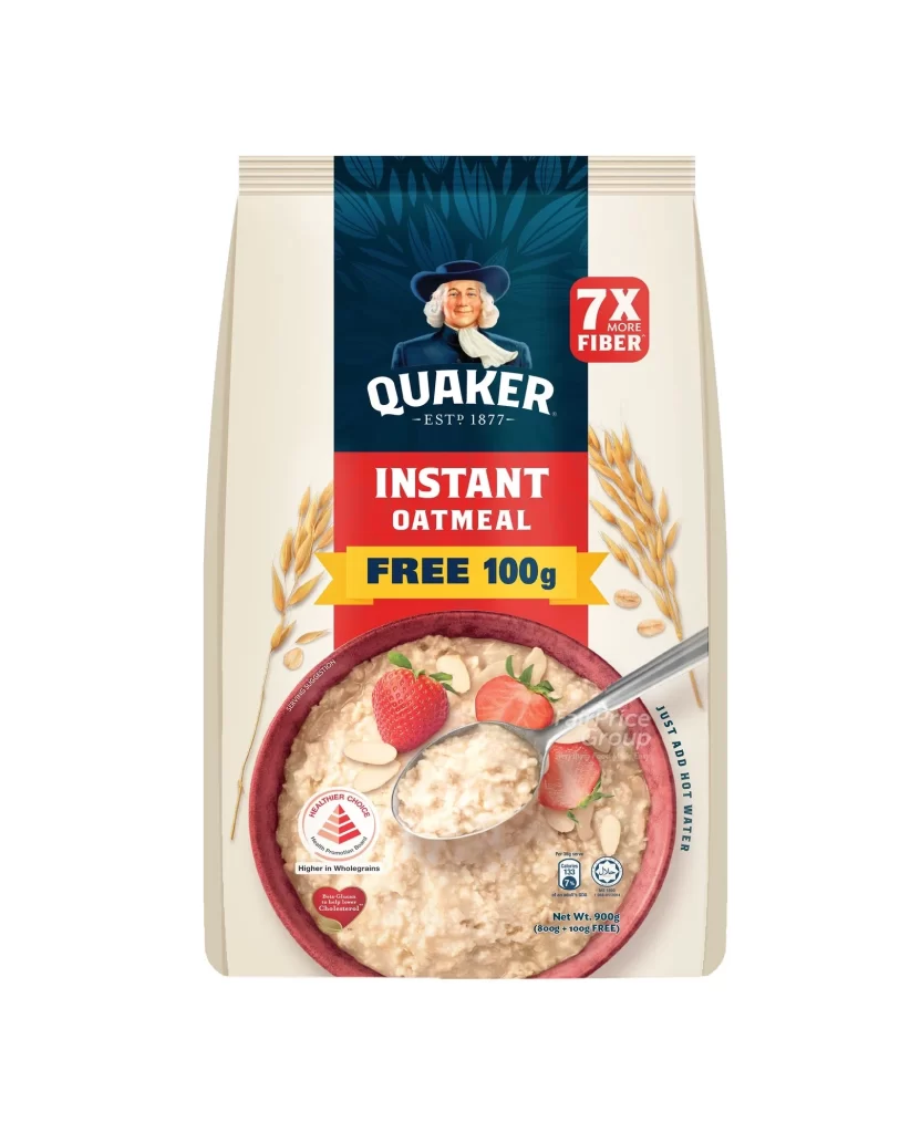
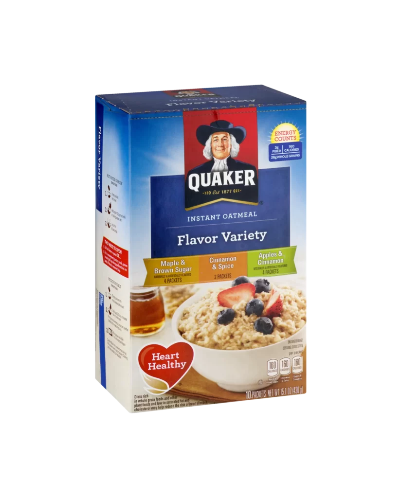
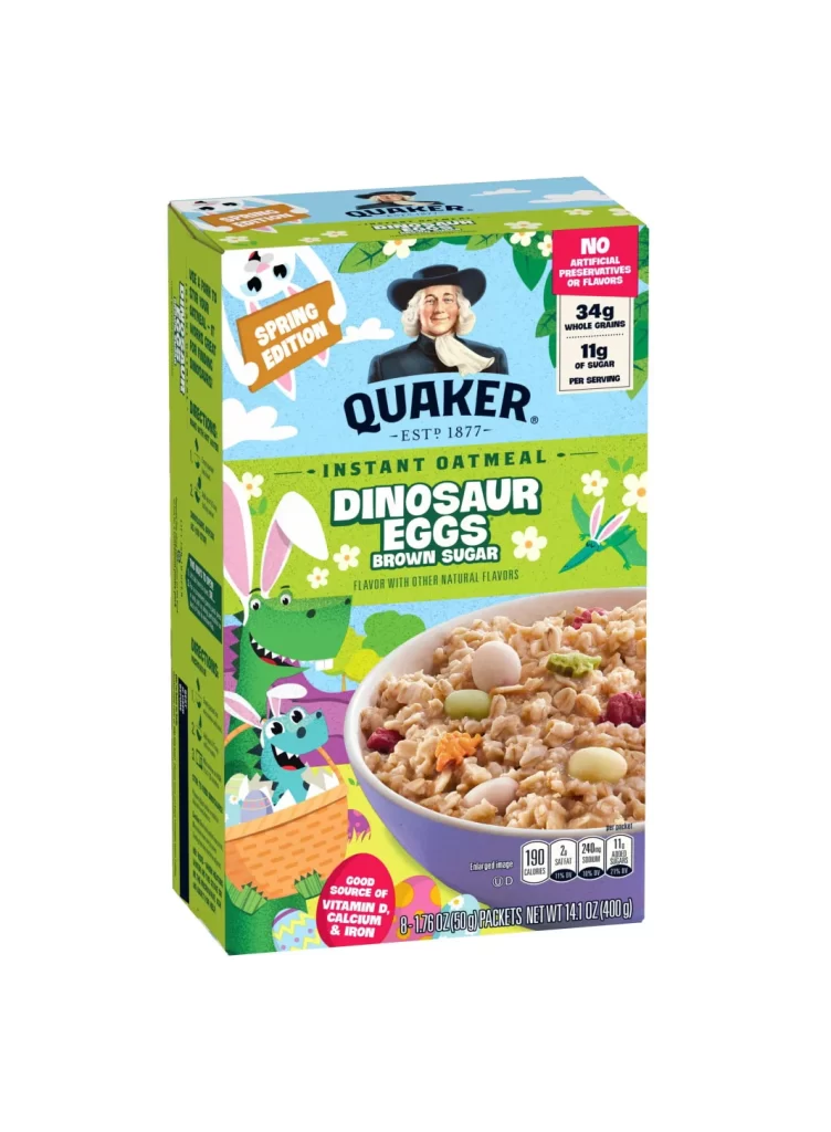
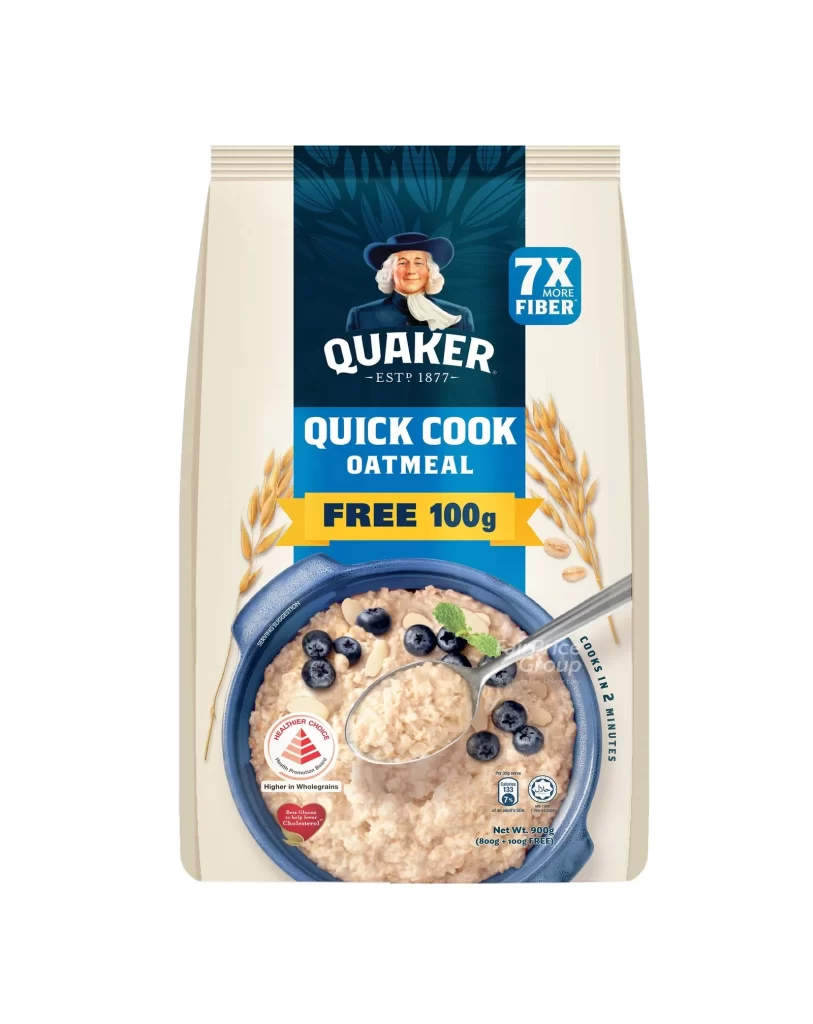
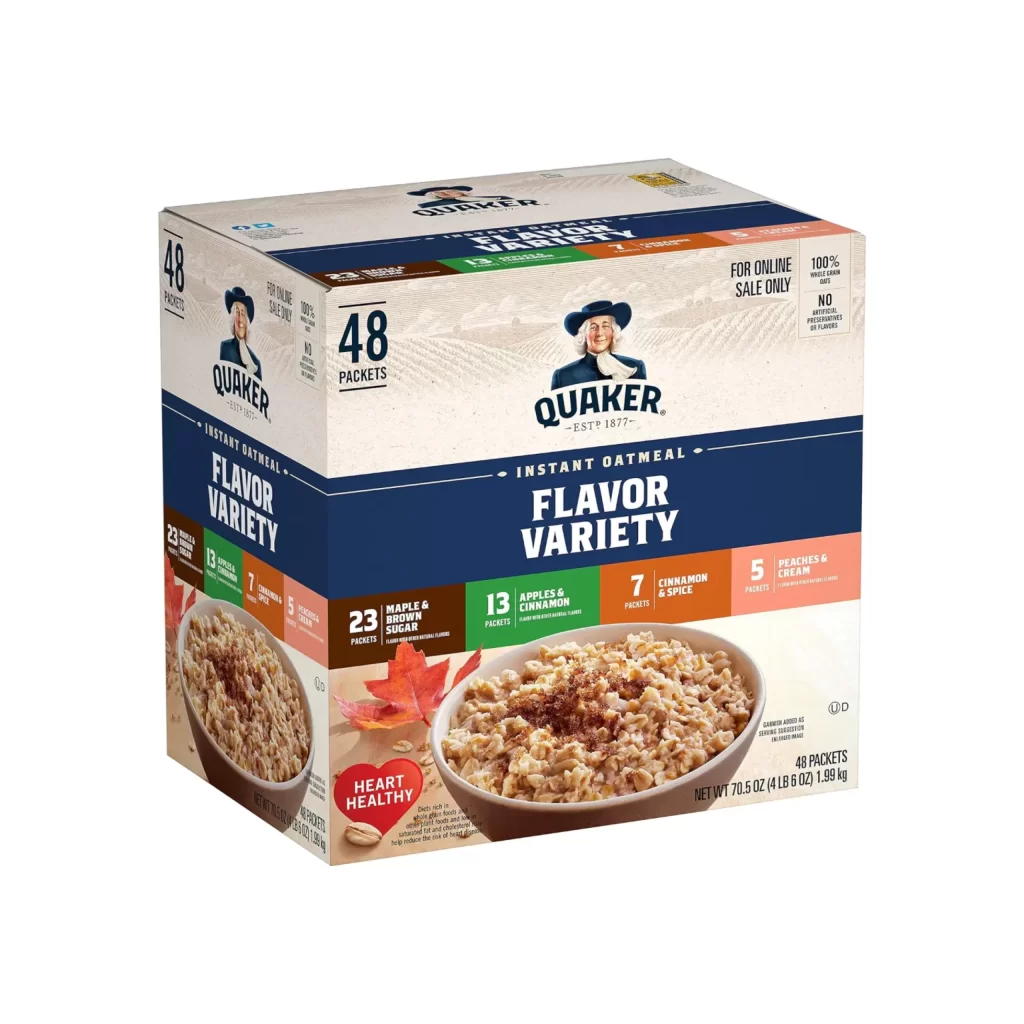
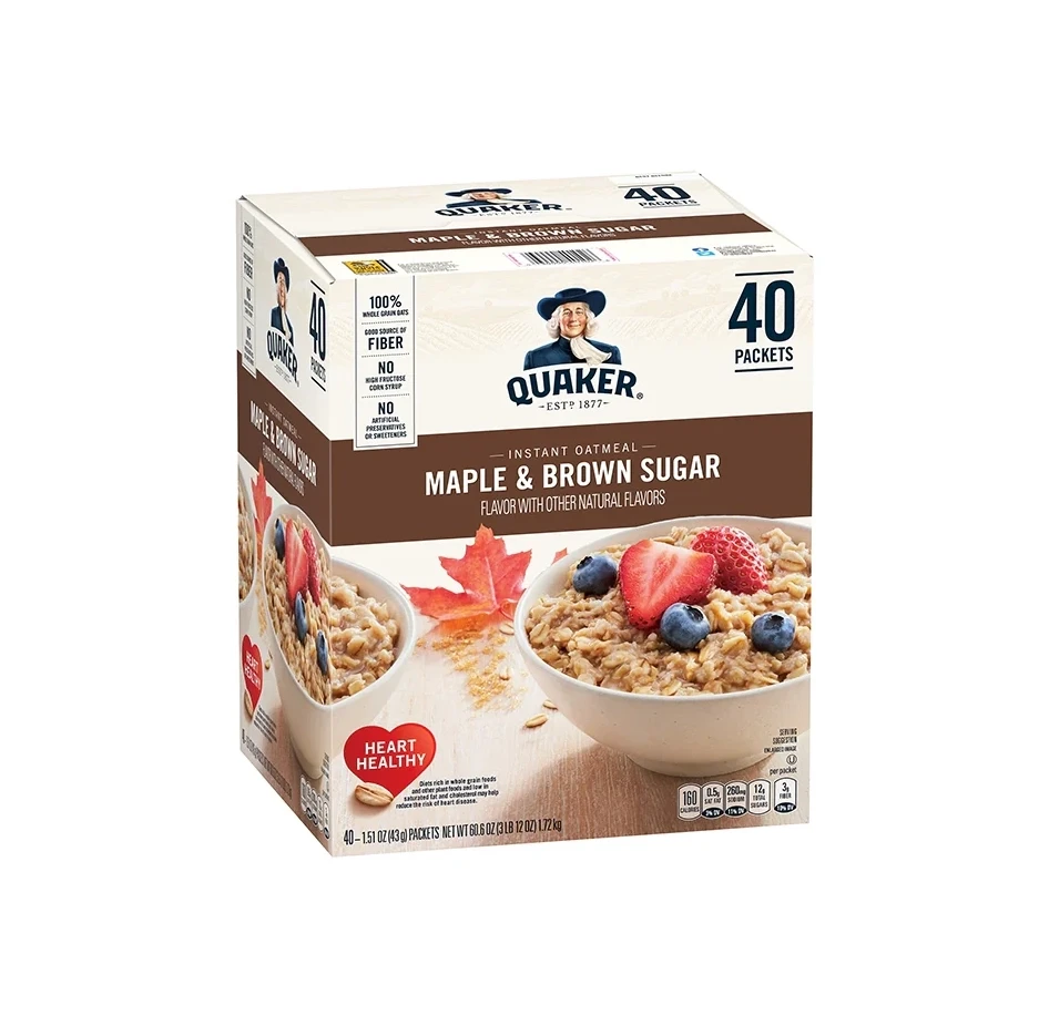
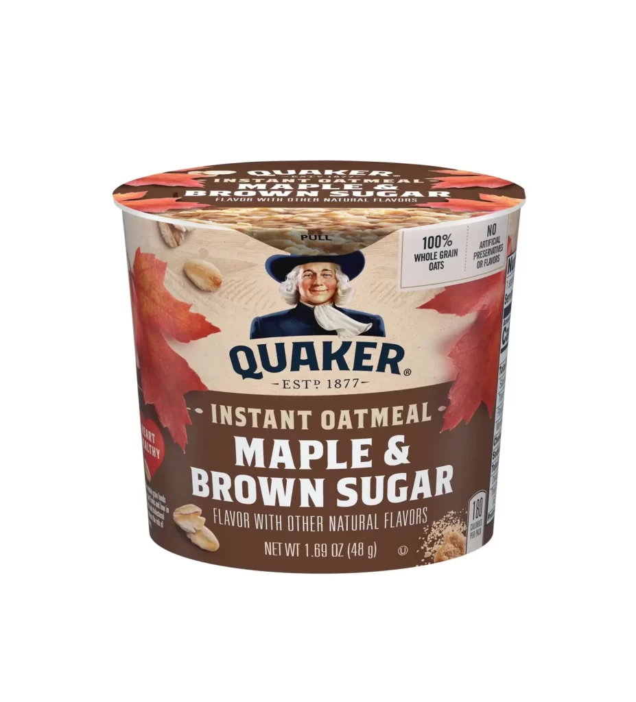
The styled box packaging for Quaker Oat So Simple Golden Syrup features the iconic man in a hat mascot prominently. A bold circular badge immediately catches the eye, proudly declaring a 33% bigger portion. The warm golden syrup imagery complements the 298g e box, while a clear nutritional panel utilizes helpful traffic light color coding alongside the helps lower cholesterol claim.
Analyzing this packaging design reveals a masterful balance of heritage and practical communication. The familiar Quaker logo builds instant brand trust, while the vibrant golden syrup visuals stimulate appetite. Designers will note the effective use of the circular badge to highlight value, and the strategic placement of the traffic light nutritional panel ensures essential health data is seamlessly integrated without cluttering the aesthetic.
This reference is an essential resource for packaging designers and brand strategists working within the food and beverage industry. Students studying commercial graphic design will find excellent examples of regulatory compliance meeting visual appeal. Marketing professionals analyzing breakfast cereal competition, or anyone exploring how to effectively combine heritage mascots with modern health claims on physical boxes, will greatly benefit from studying this.