Quaker Oat So Simple Original Cup Packaging
Topics
Details
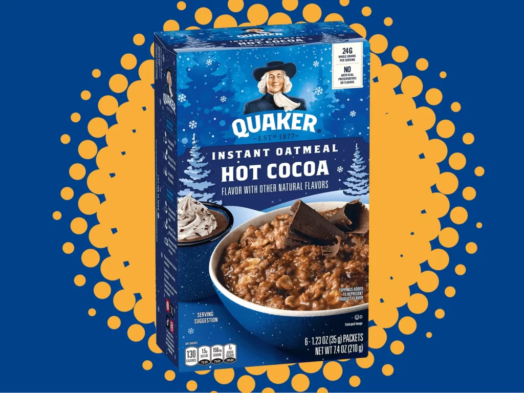
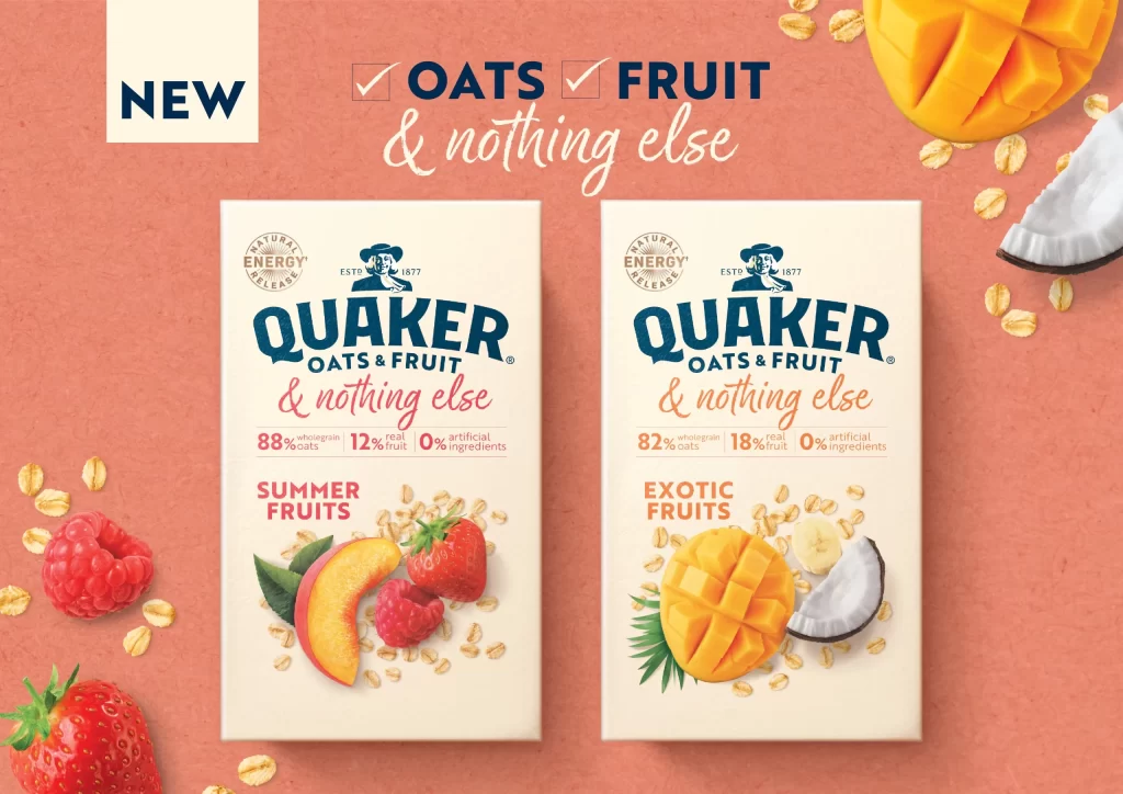
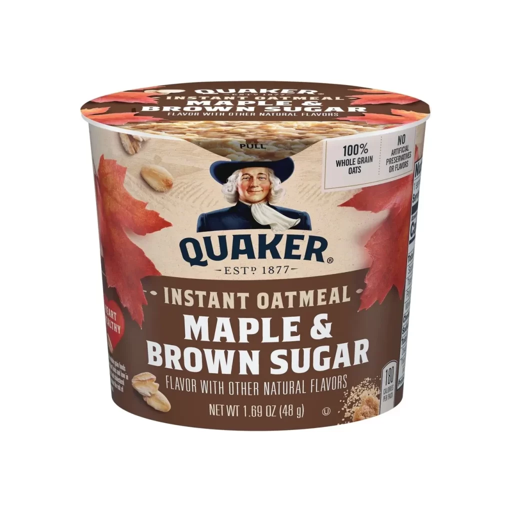
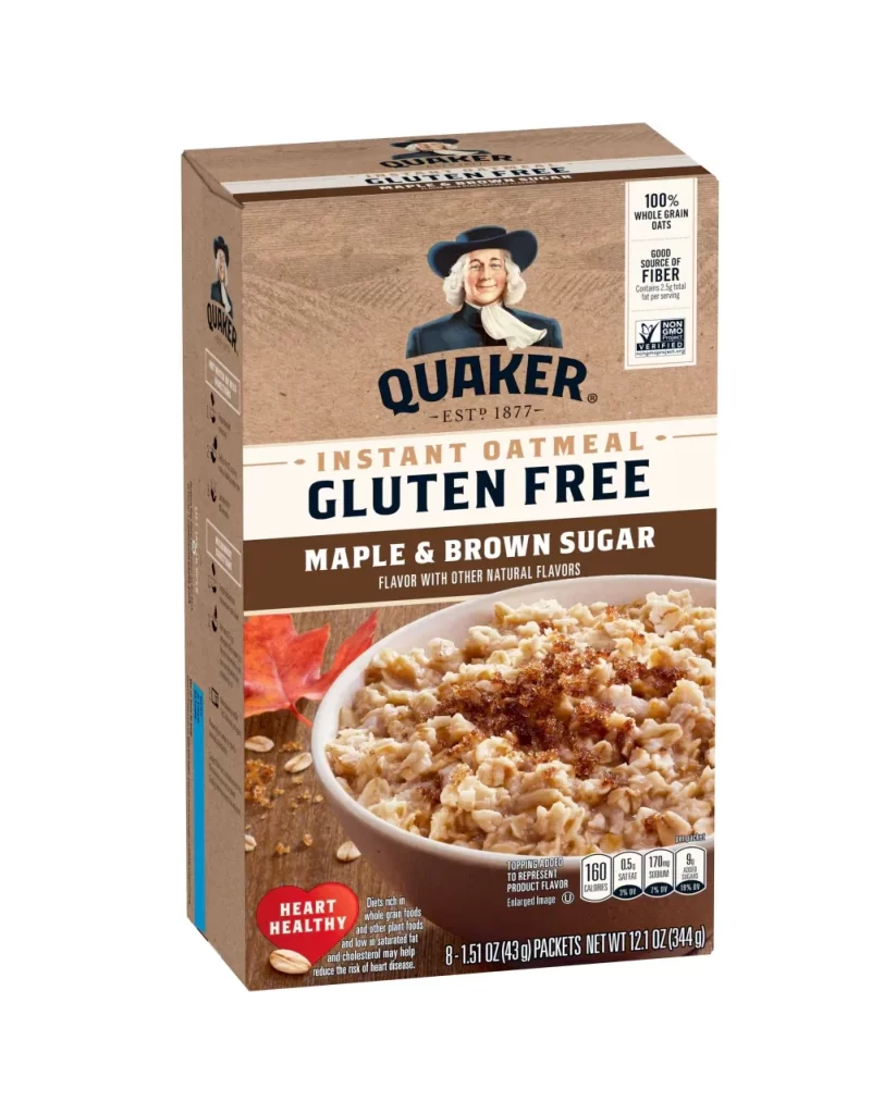
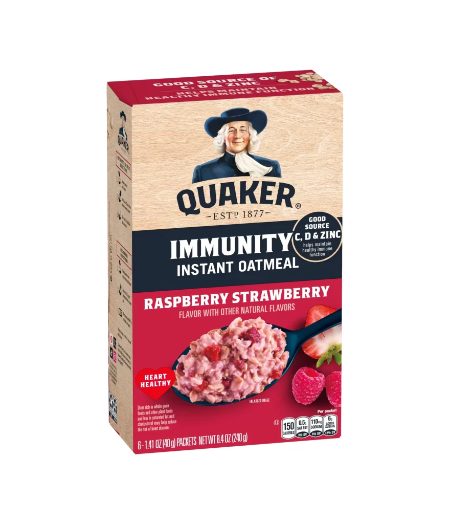
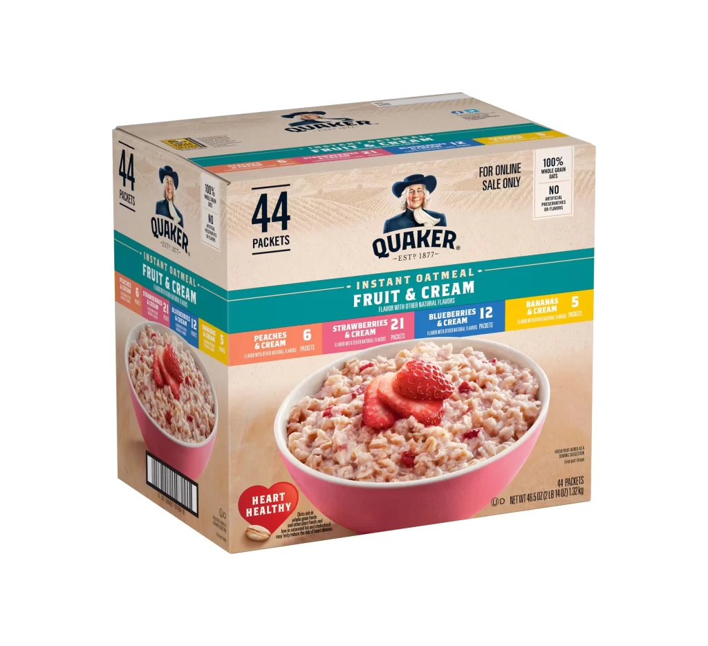
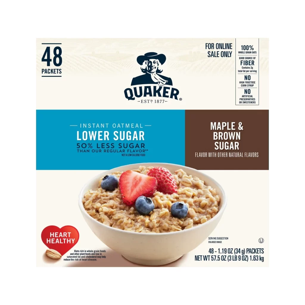
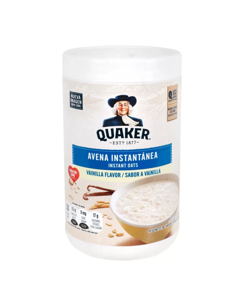
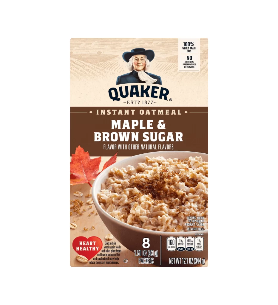
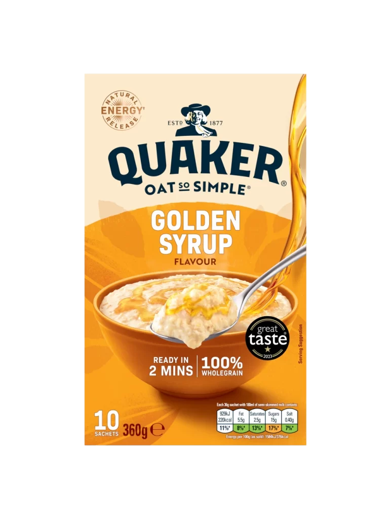
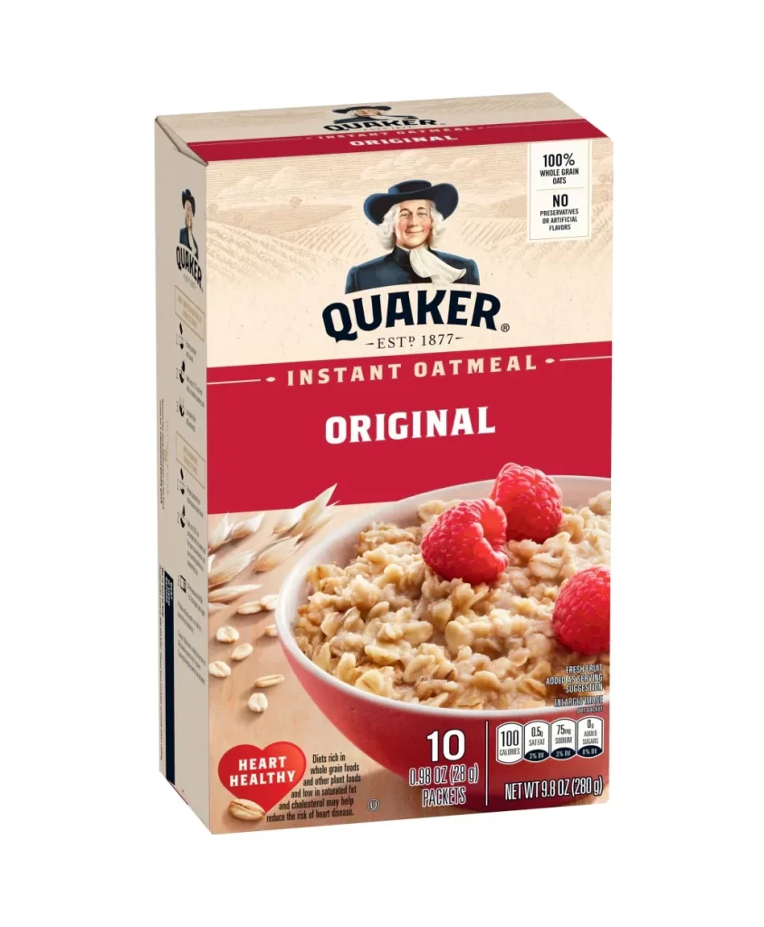
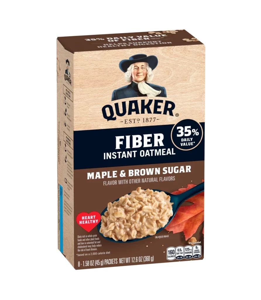
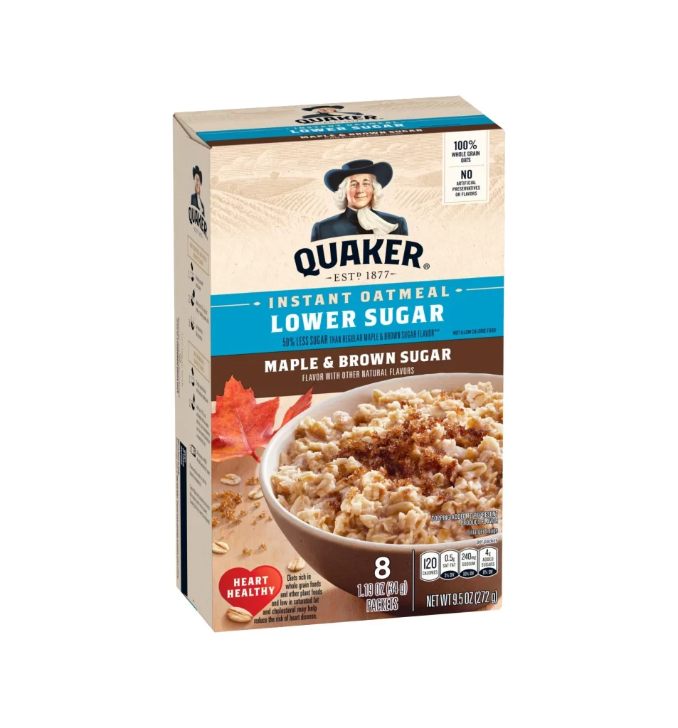
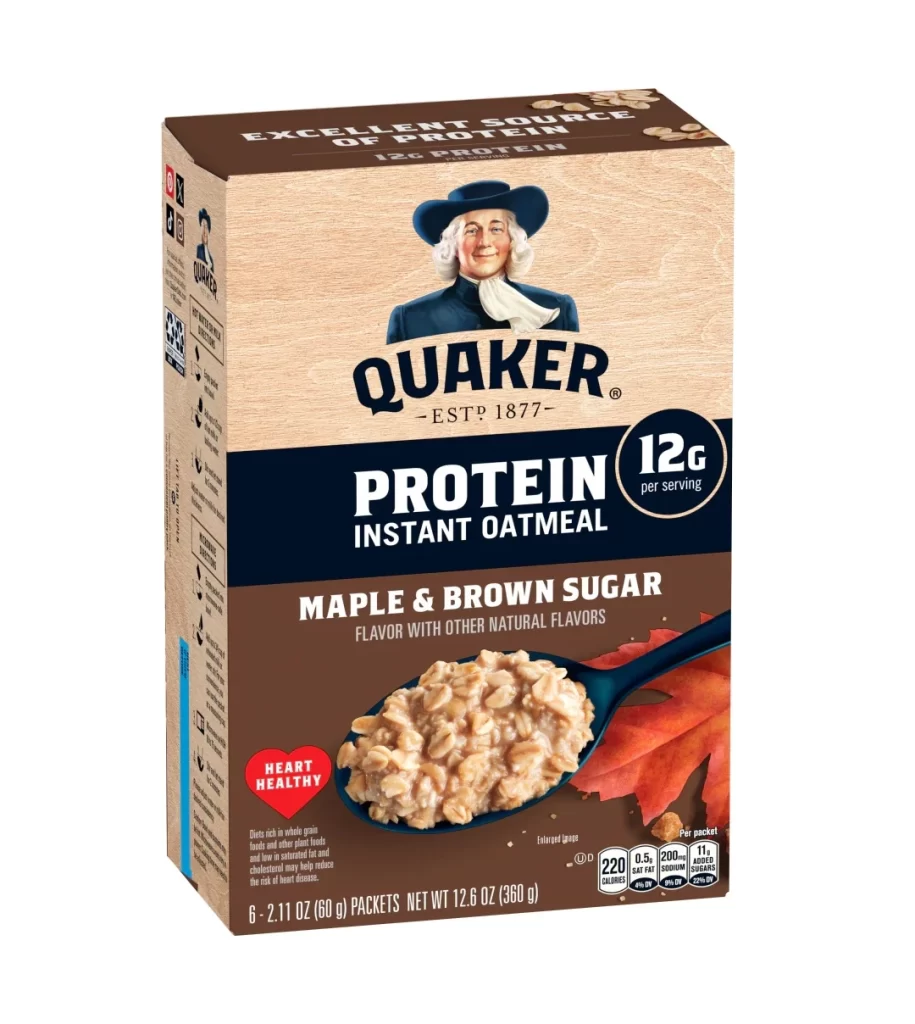
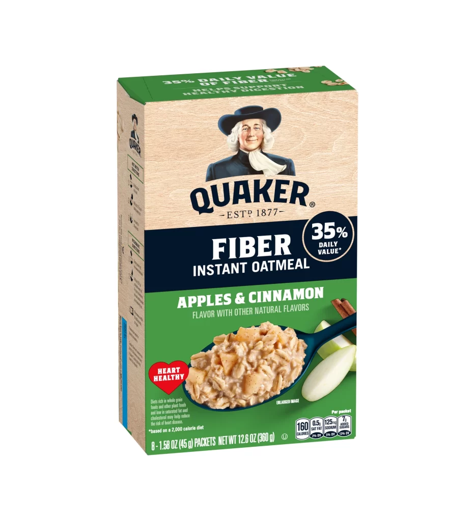
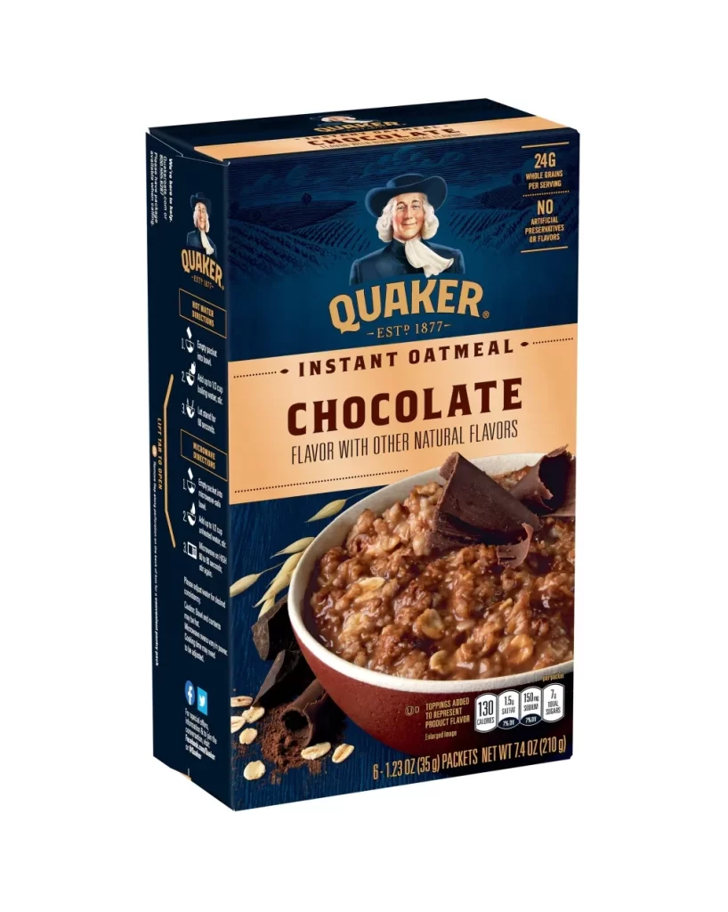
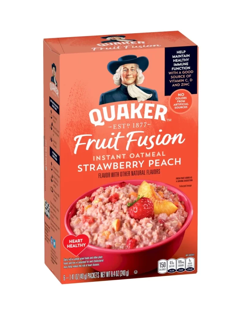
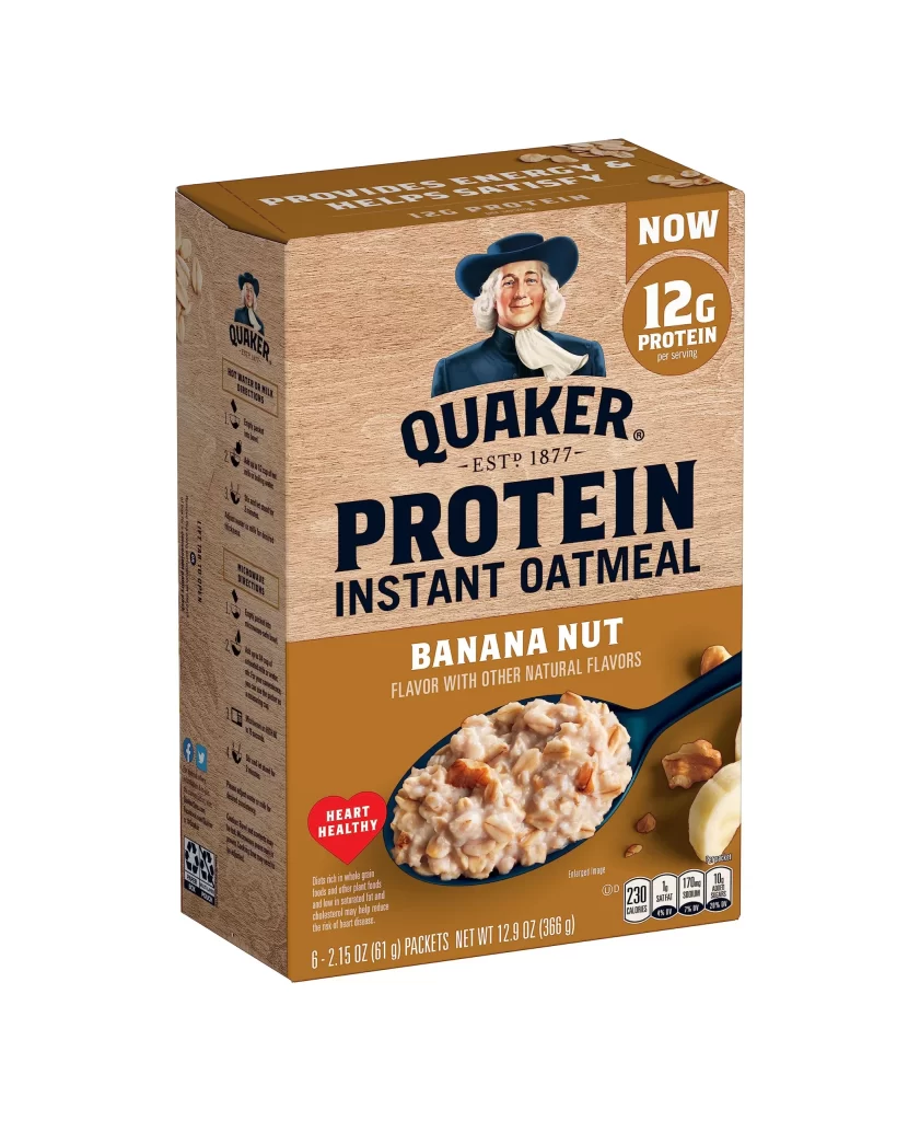
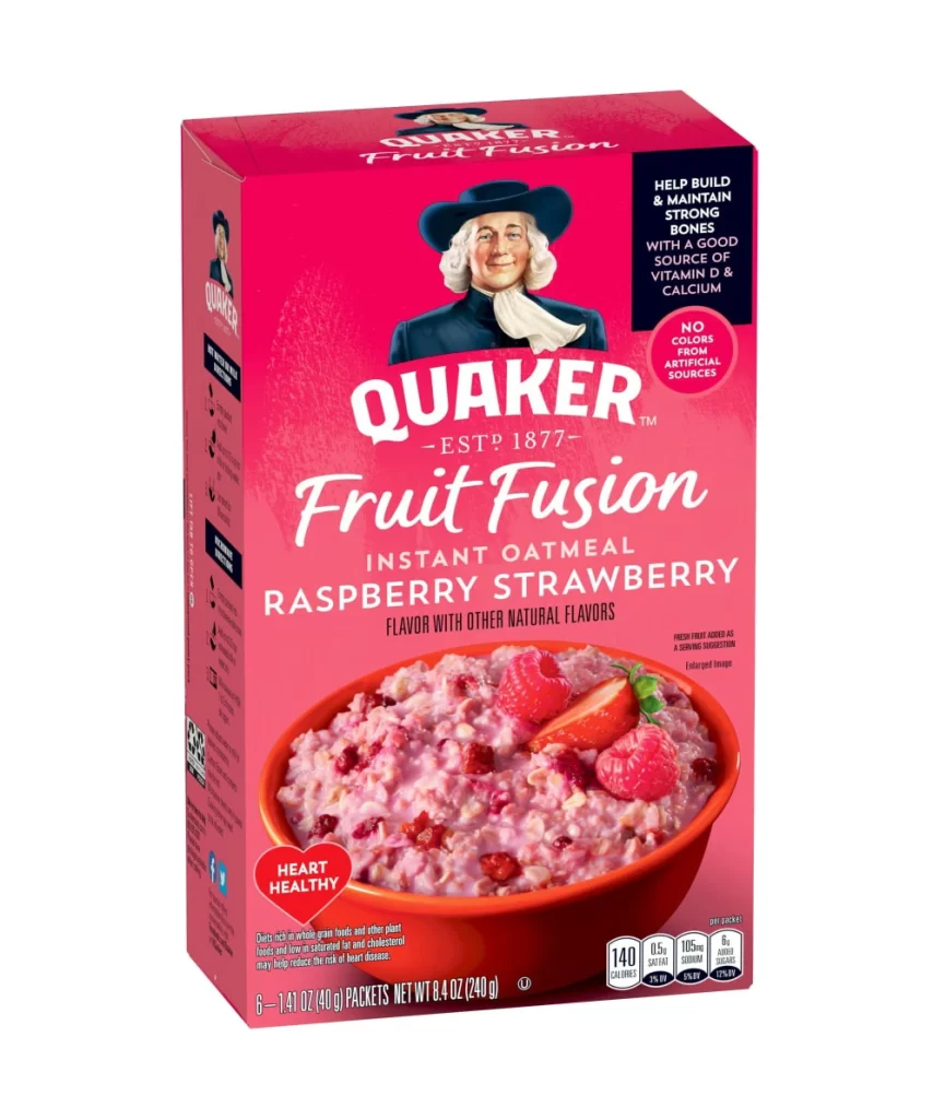
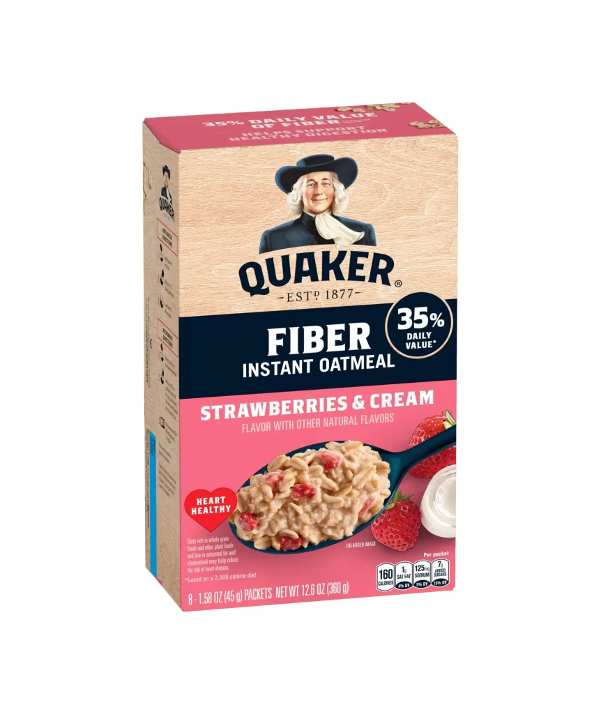
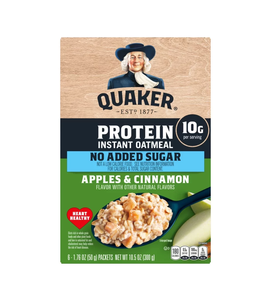
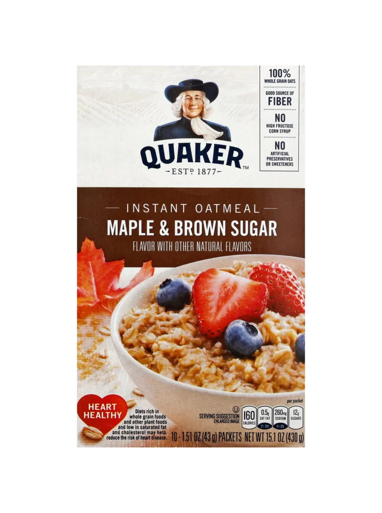
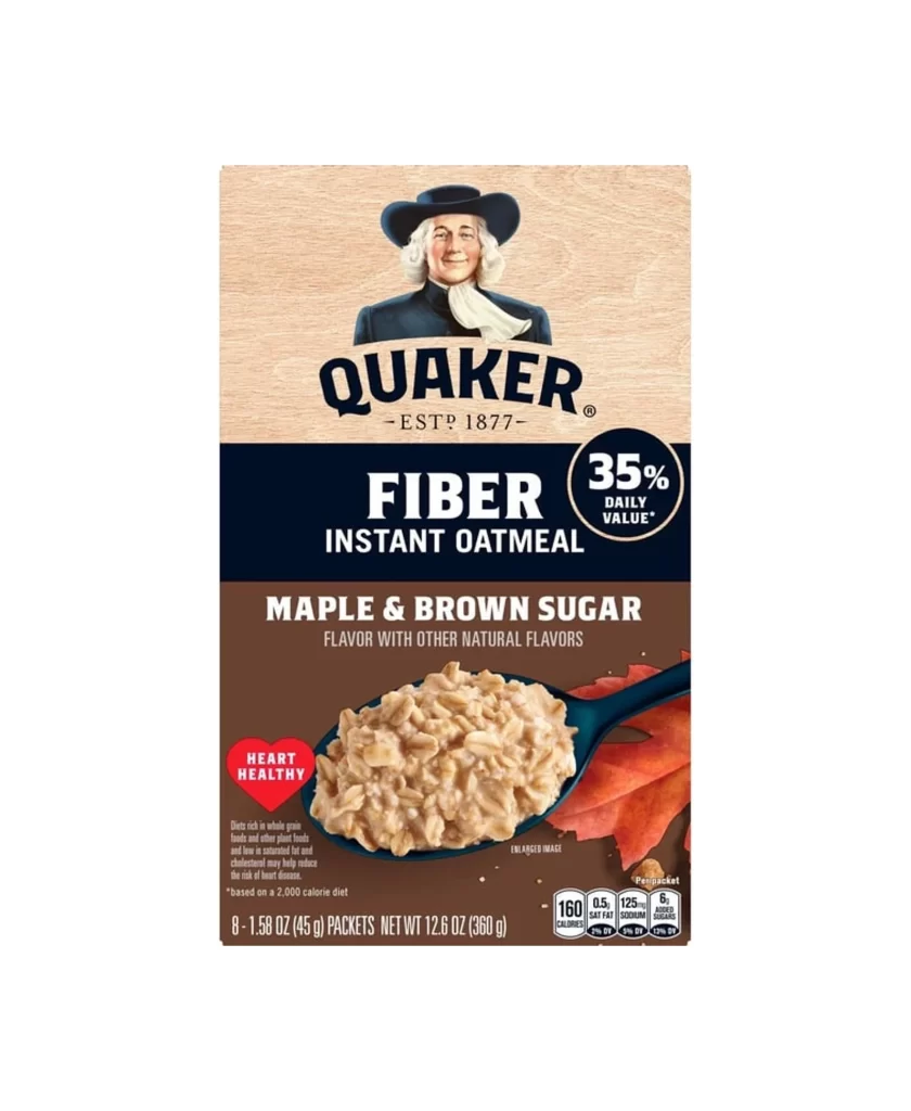
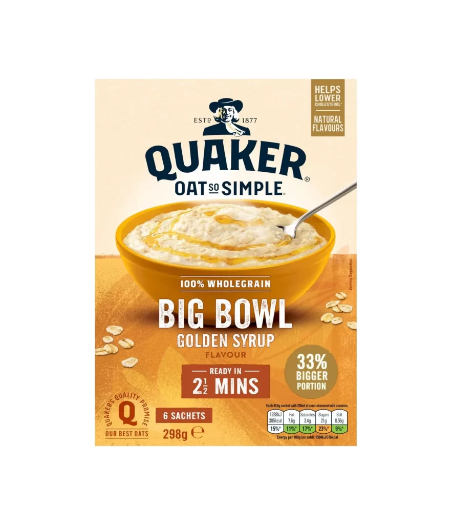
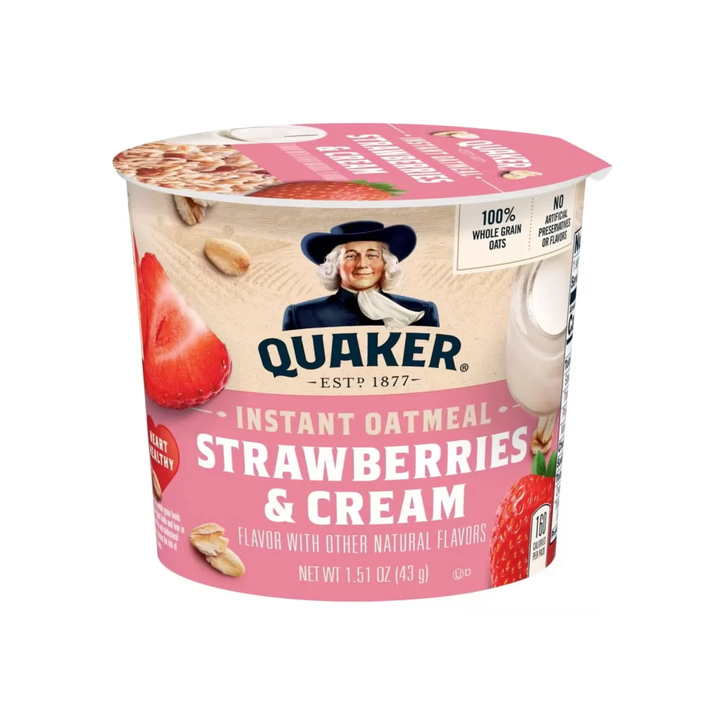
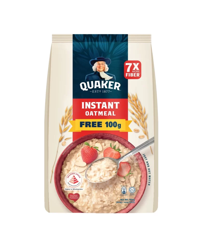
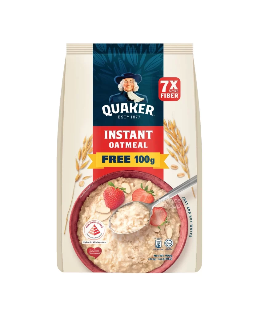
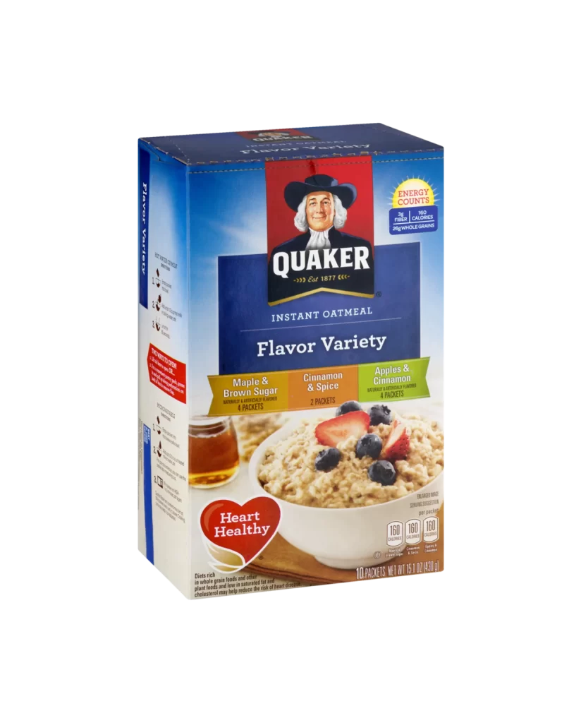
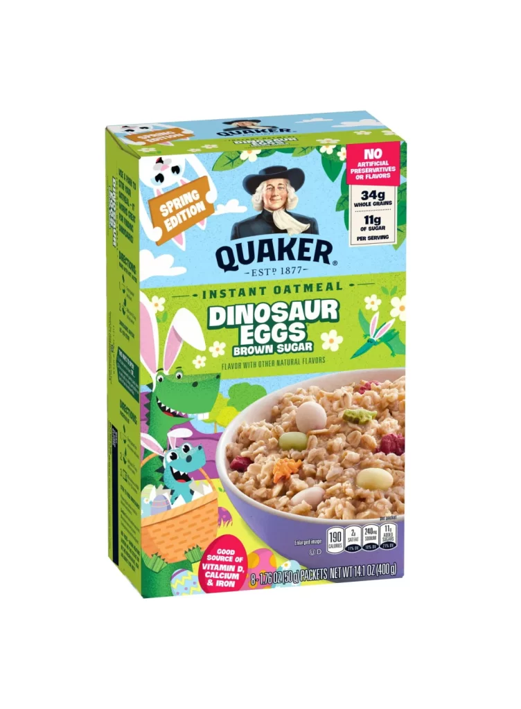
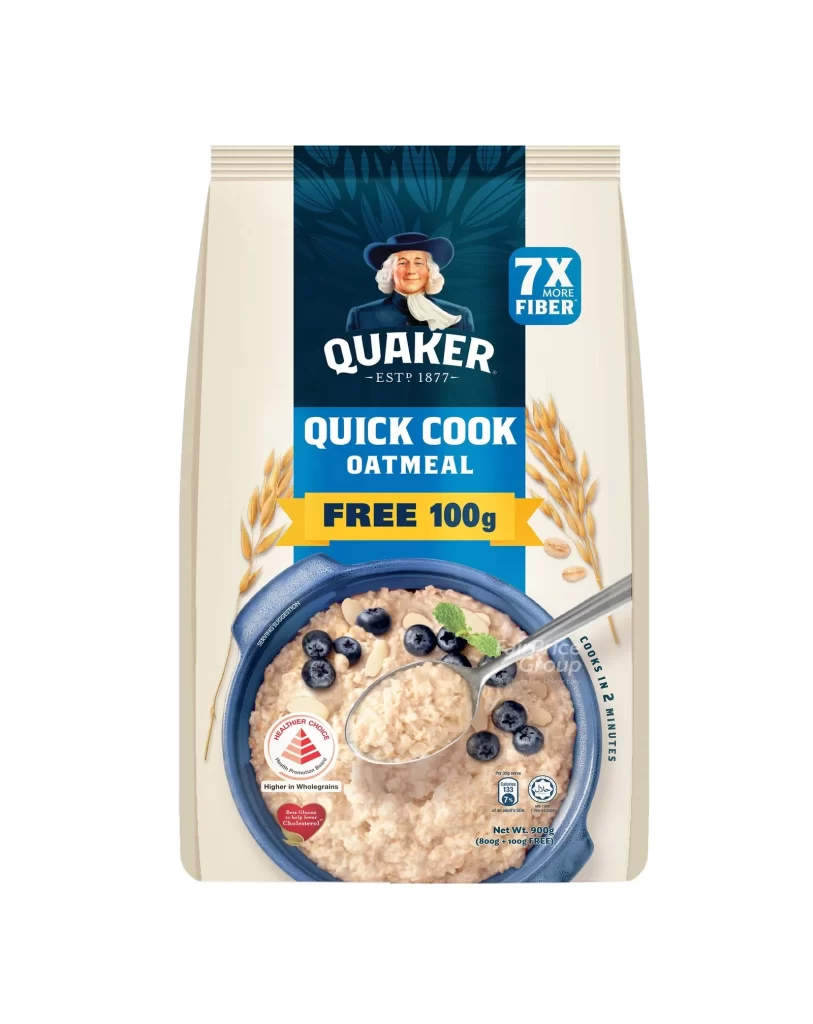
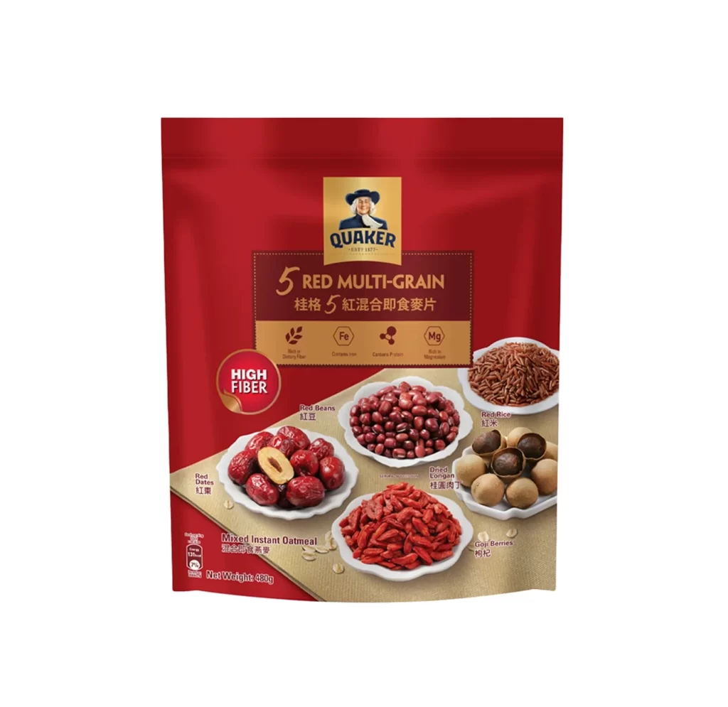
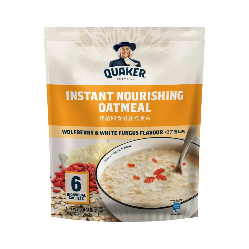
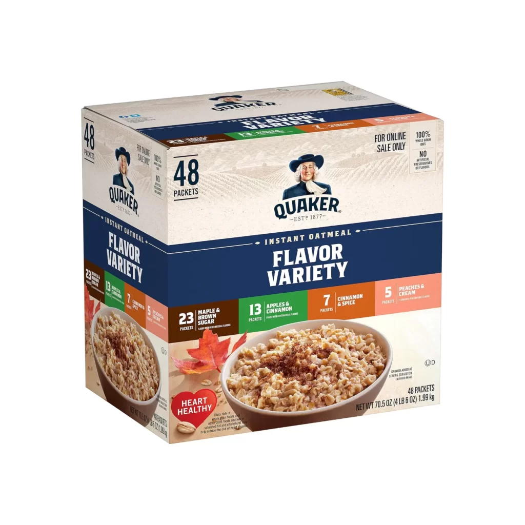
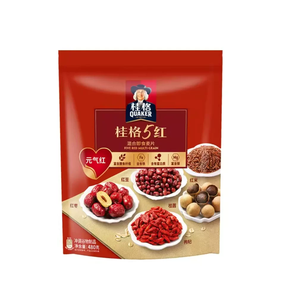
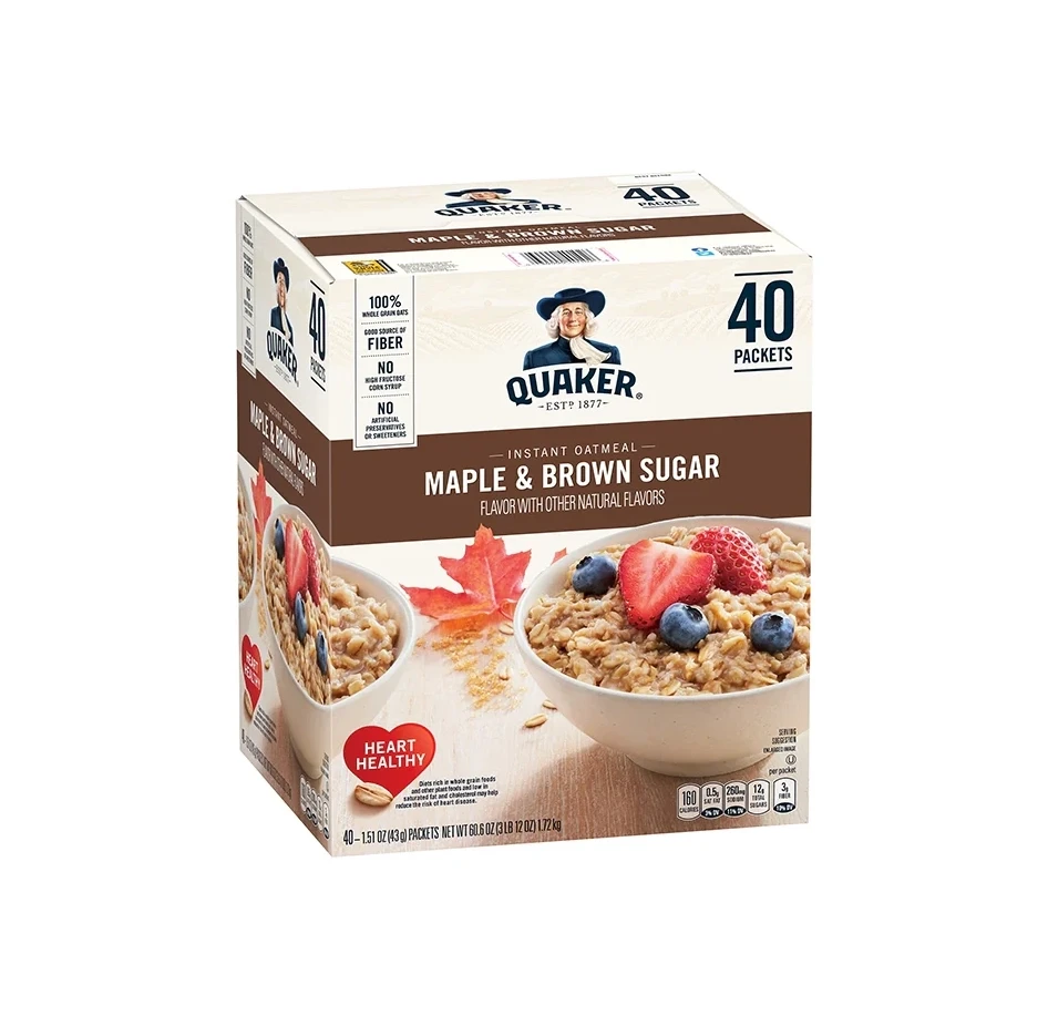
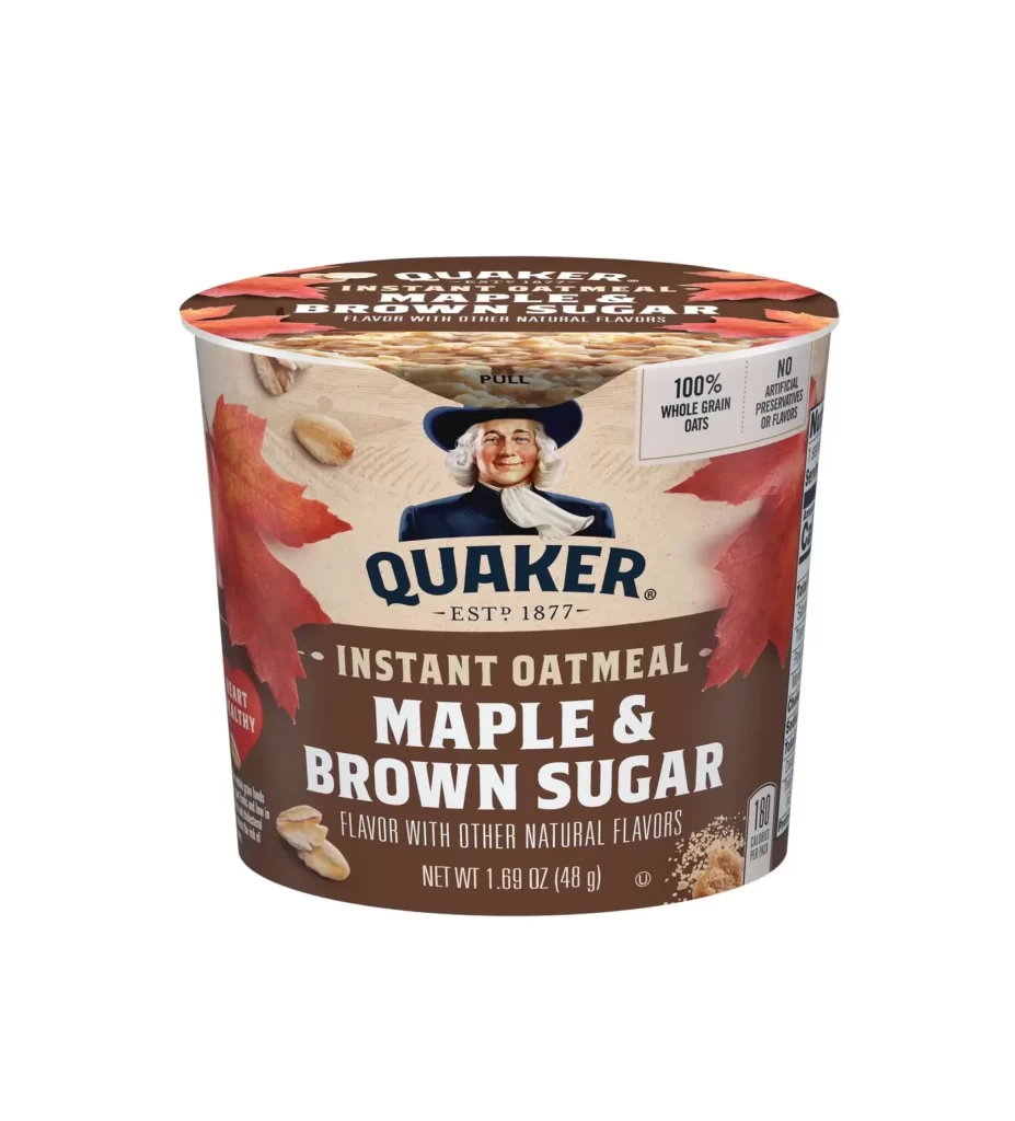
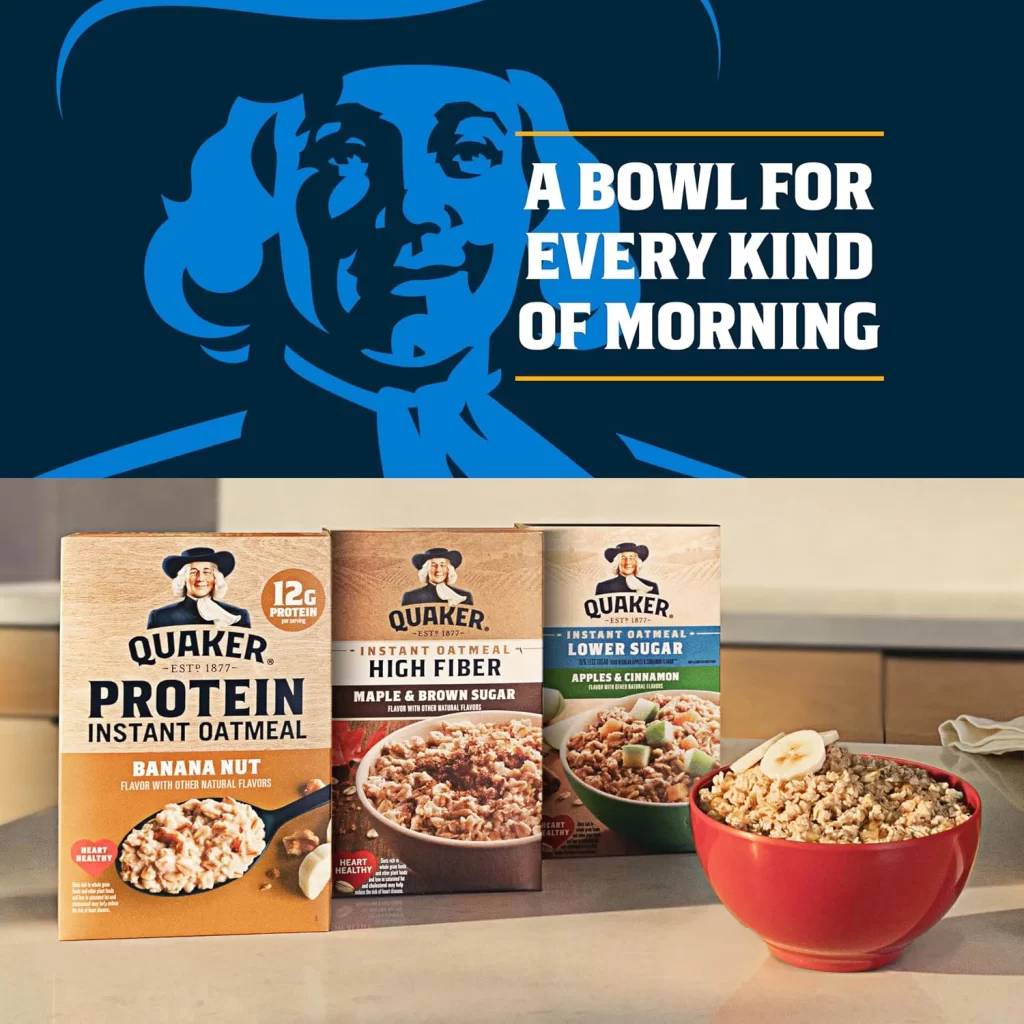
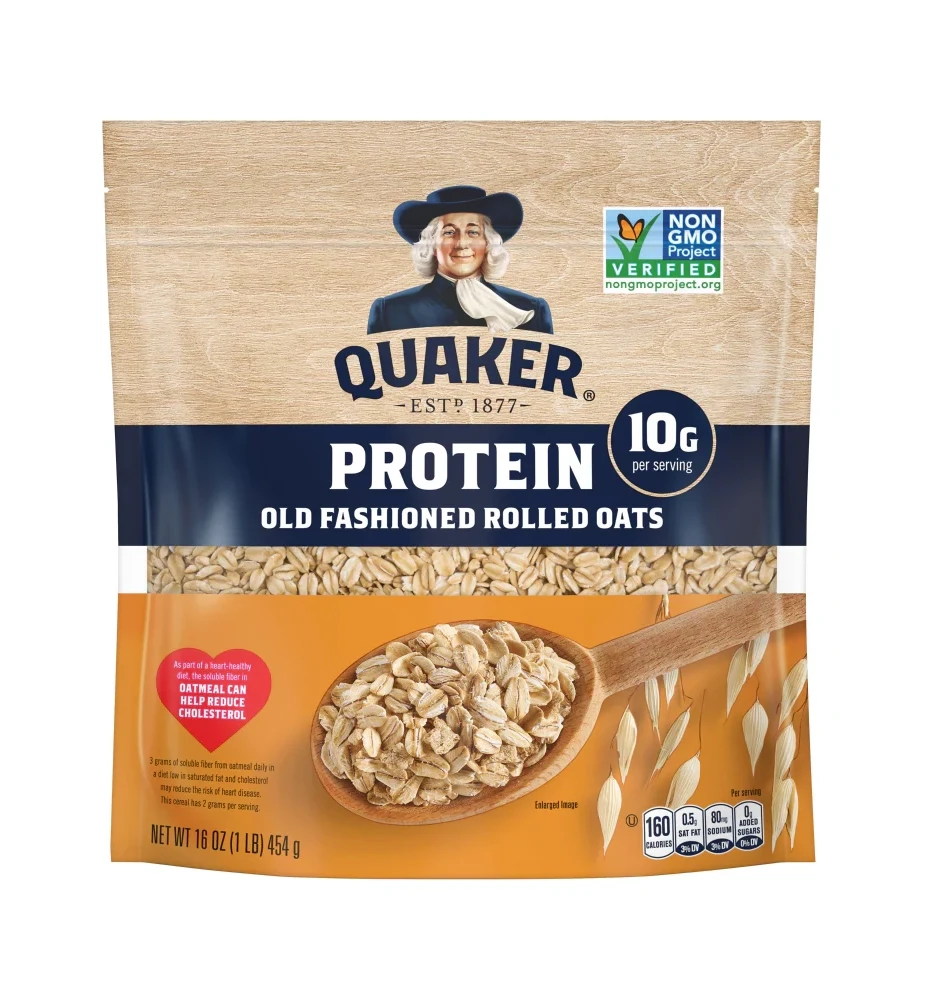
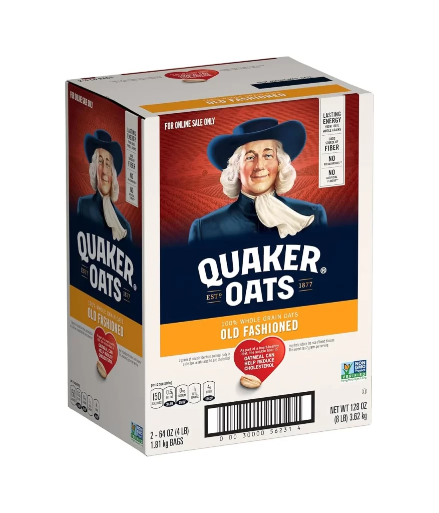
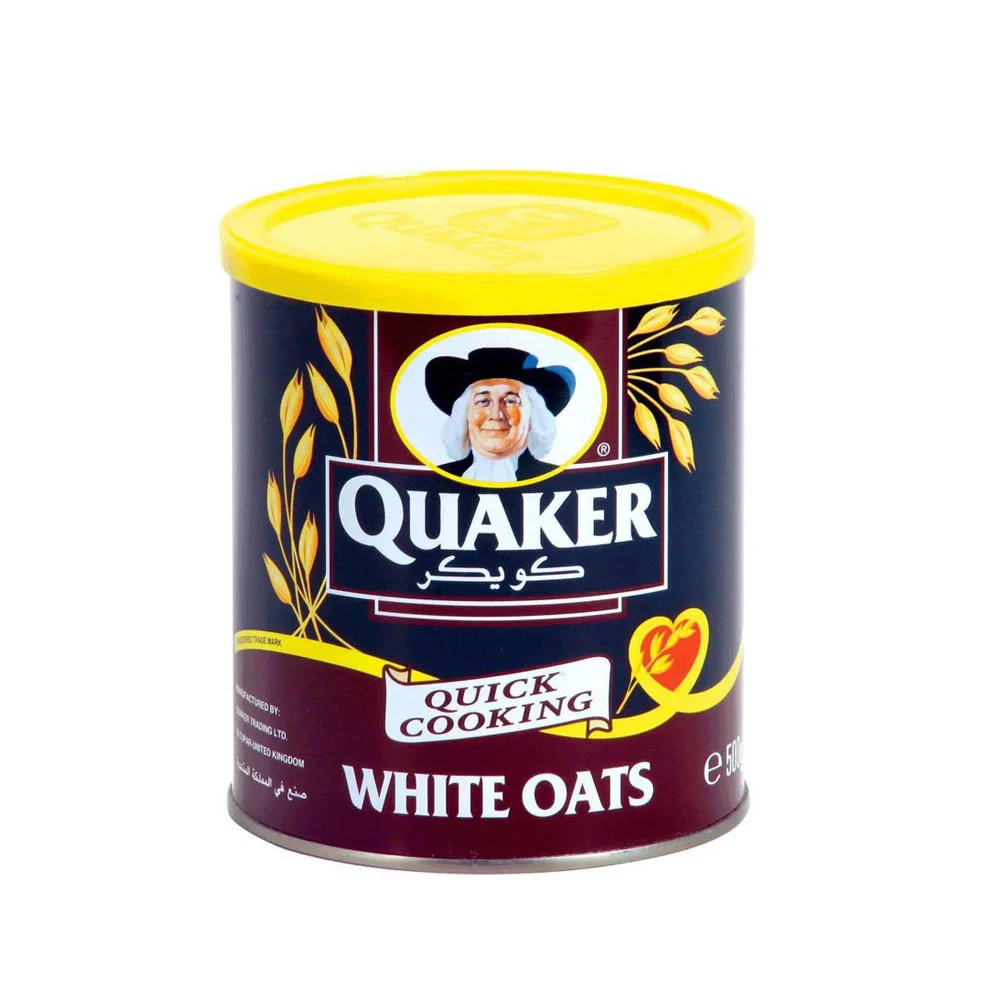
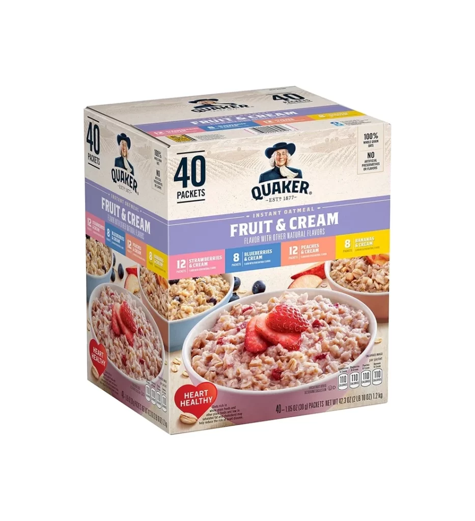
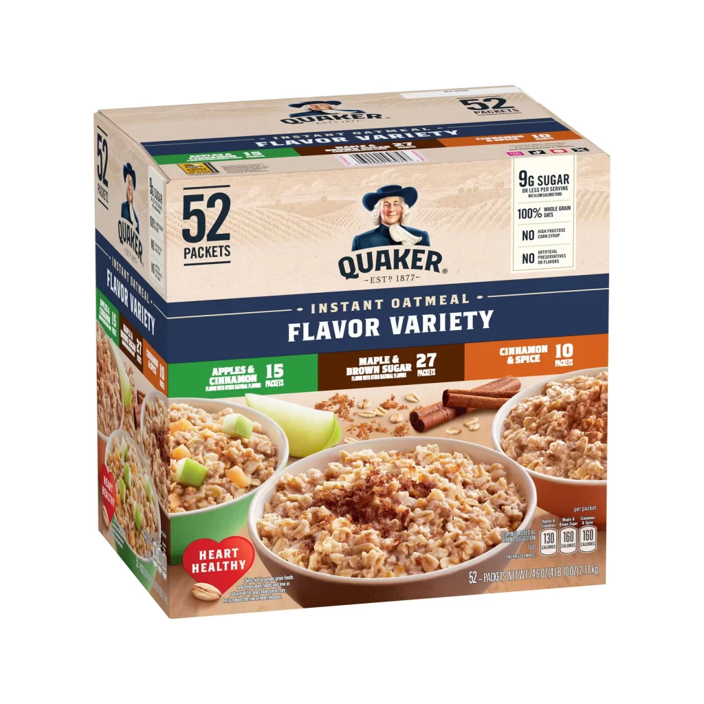
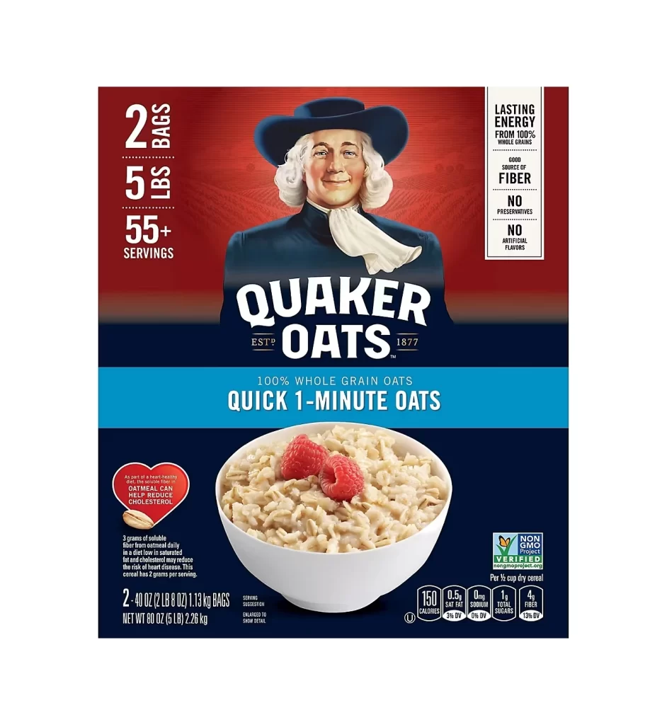
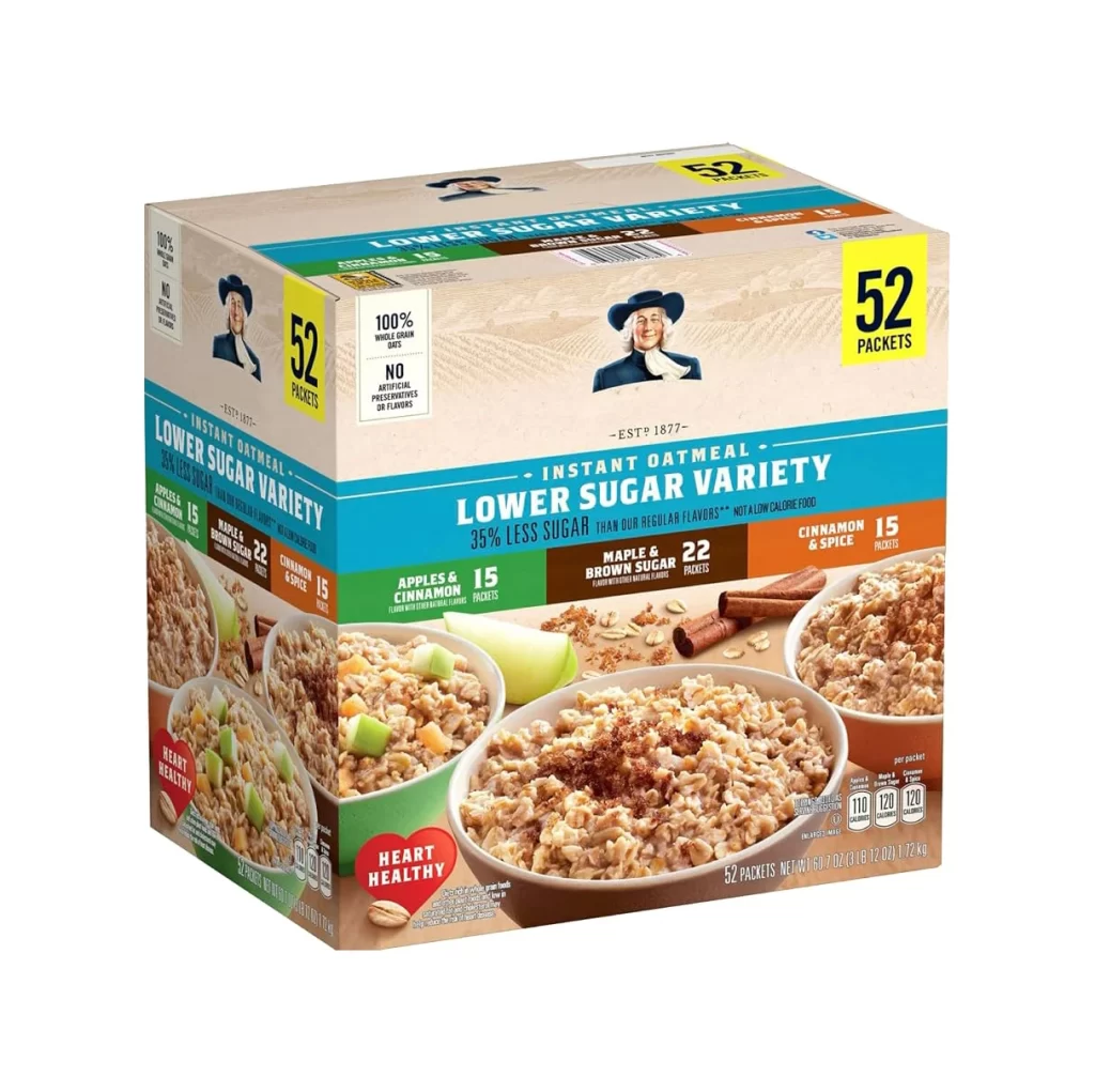
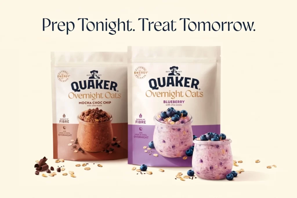
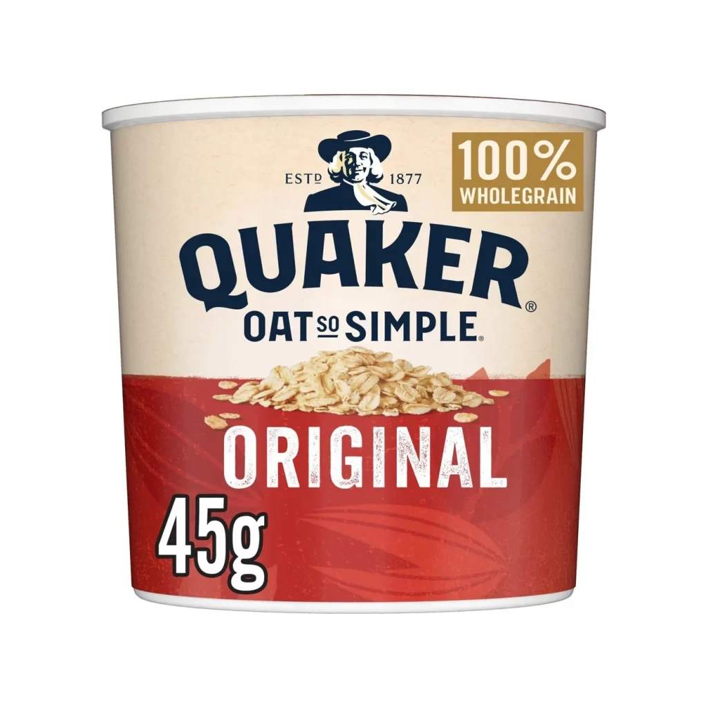
The Quaker Oat So Simple Original cup packaging presents a warm, styled background that highlights the wholesome nature of the product. Prominent oat imagery wraps around the container, reinforcing the key ingredient. The front panel clearly displays the Quaker man mascot logo alongside the ESTD 1877 heritage mark. A bright 100% Wholegrain gold badge immediately catches the eye, communicating the nutritional value of the 45g serving inside.
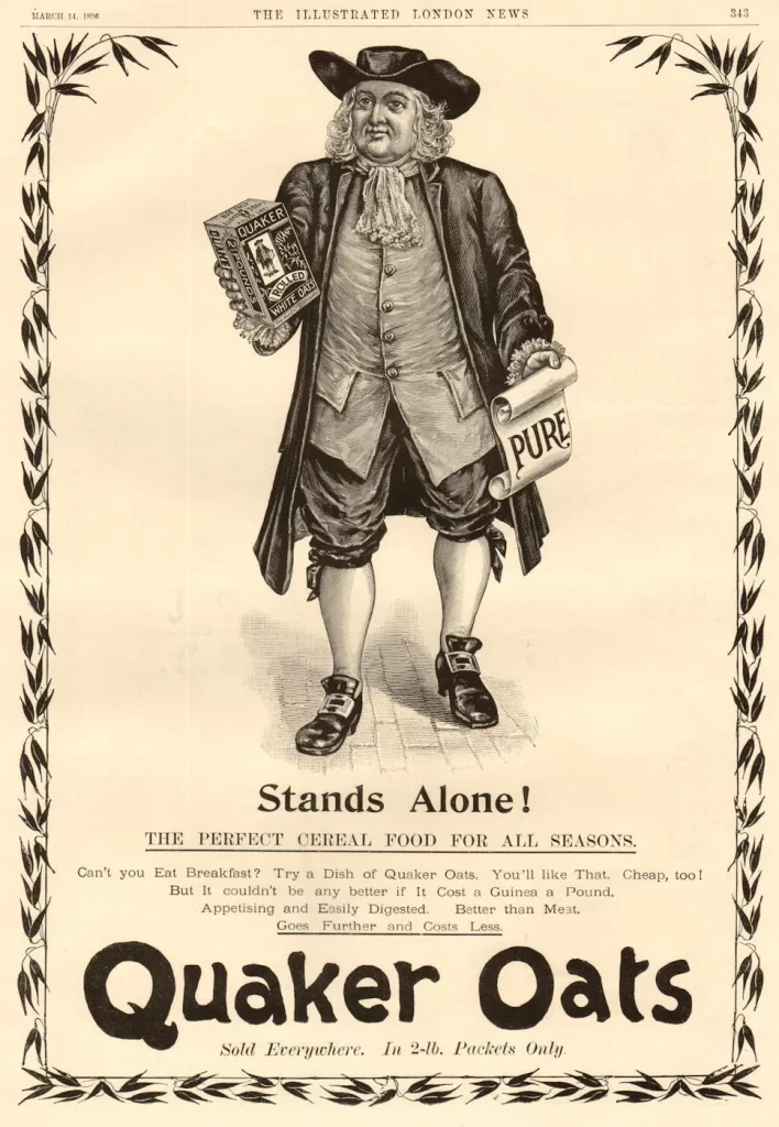
Analyzing the logo and packaging design reveals a balance between trust and modern convenience. The Quaker man mascot anchors the brand in established reliability, while the ESTD 1877 mark reinforces this long history. The styled background and dynamic oat imagery add contemporary freshness. Furthermore, the 100% Wholegrain gold badge serves as an effective visual cue, guiding the consumer to the core health benefits quickly.
This packaging reference is an essential resource for brand designers and packaging students focusing on the food and beverage sector. Professionals analyzing how heritage brands adapt to modern, single-serve formats will find valuable insights here. Marketers studying the visual communication of health claims through badges and mascots can also benefit greatly from examining this specific cup design and its strategic layout.