Quaker Overnight Oats Mocha Choc Chip Pouches Advertisement
Topics
Details
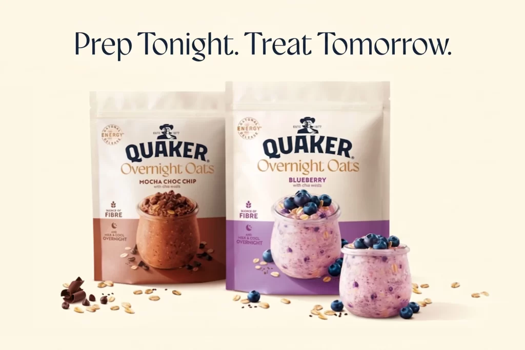
The styled background sets a premium tone for these Quaker Overnight Oats pouches. Prepared product visualization in glass jars sits directly in front of the packaging, showcasing the ready-to-eat texture. The mocha choc chip variant features a rich chocolate brown theme, while the blueberry option uses a distinct purple. Both prominently display the with chia seeds ingredient callout.
The pouch form utilizes bold typography to ensure shelf impact. Color-coded flavor differentiation allows for instant recognition between the mocha choc chip and blueberry variants. The Quaker logo remains a trusted anchor, while the glass jar props reinforce the overnight preparation concept. This clever visual hierarchy guides the eye from the appetizing prepared oats to the chia seeds claim.
Designers working on food packaging campaigns will find this reference invaluable. It perfectly demonstrates how to balance brand identity with flavor-specific color coding. Graphic designers creating flexible pouch layouts, or marketers needing to showcase prepared product alongside retail packaging, can study this composition for effective visual communication strategies.