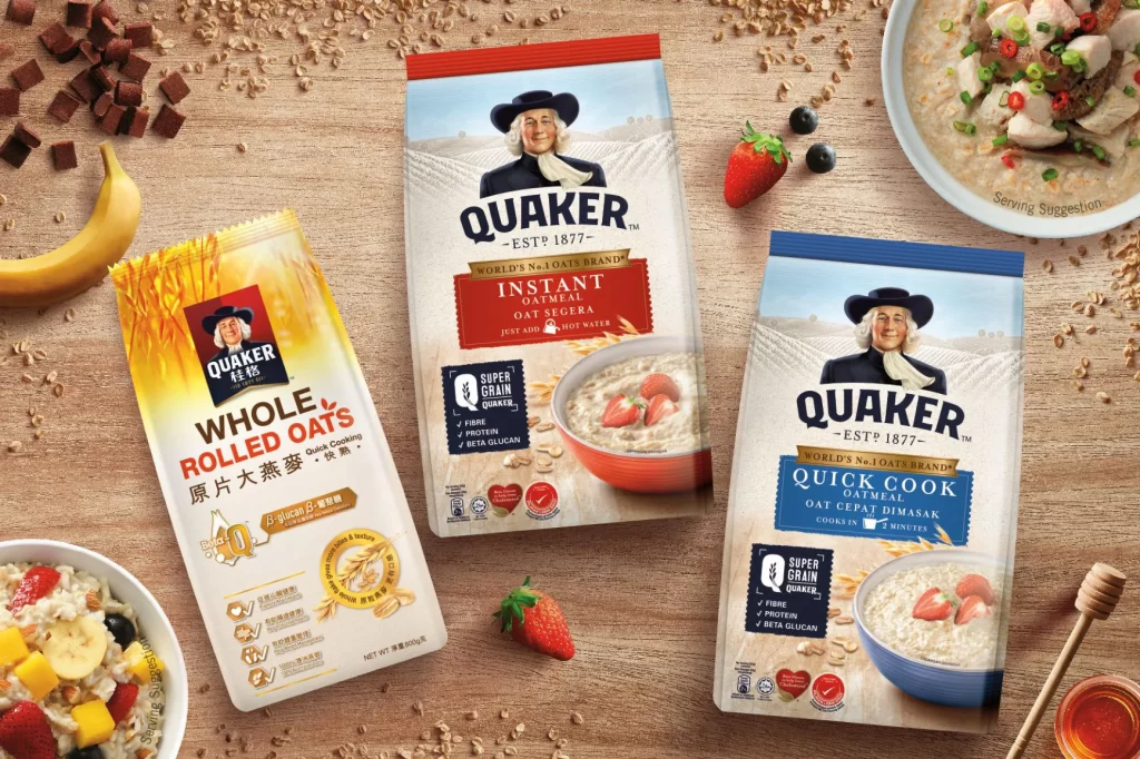
Quaker Oatmeal Texture Varieties Pouches Advertisement
Topics
Details
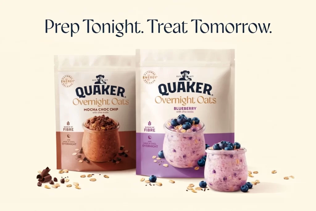
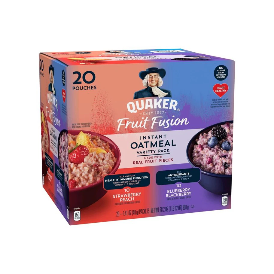
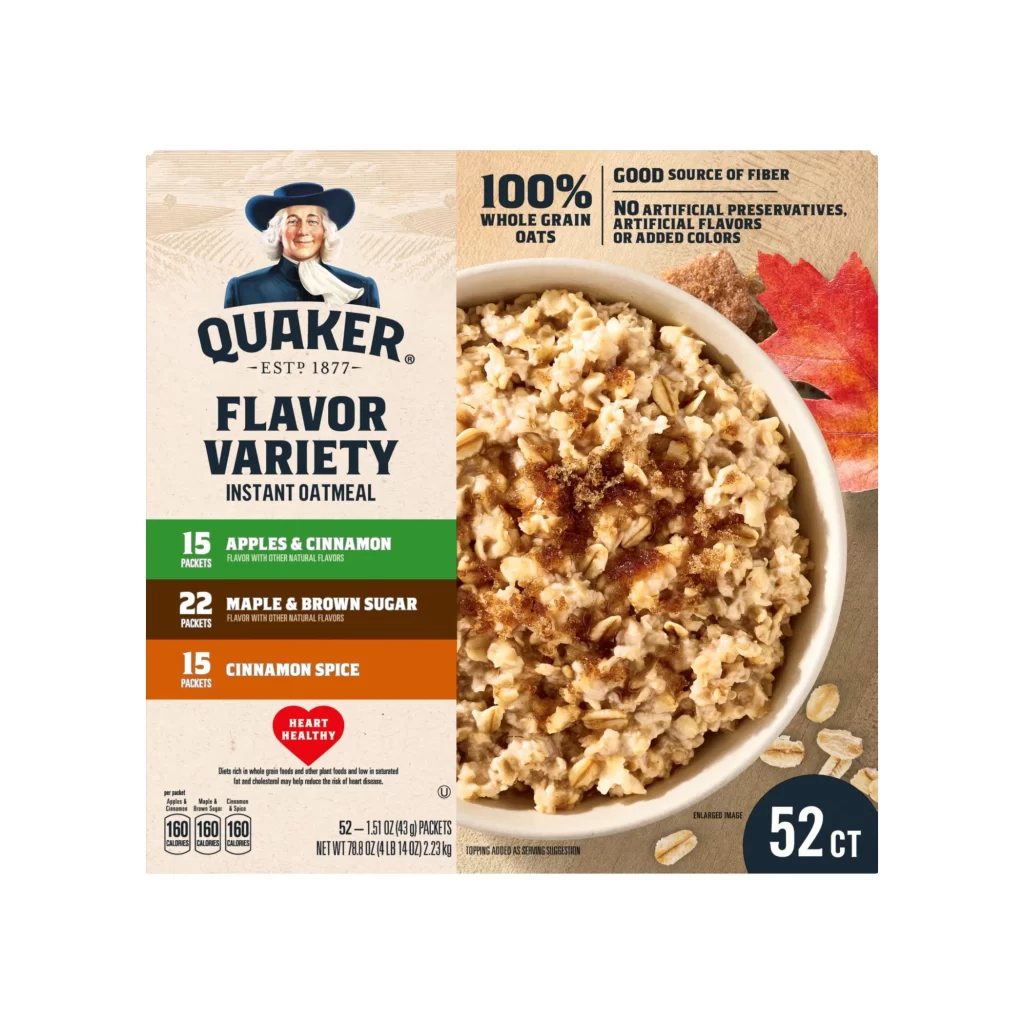
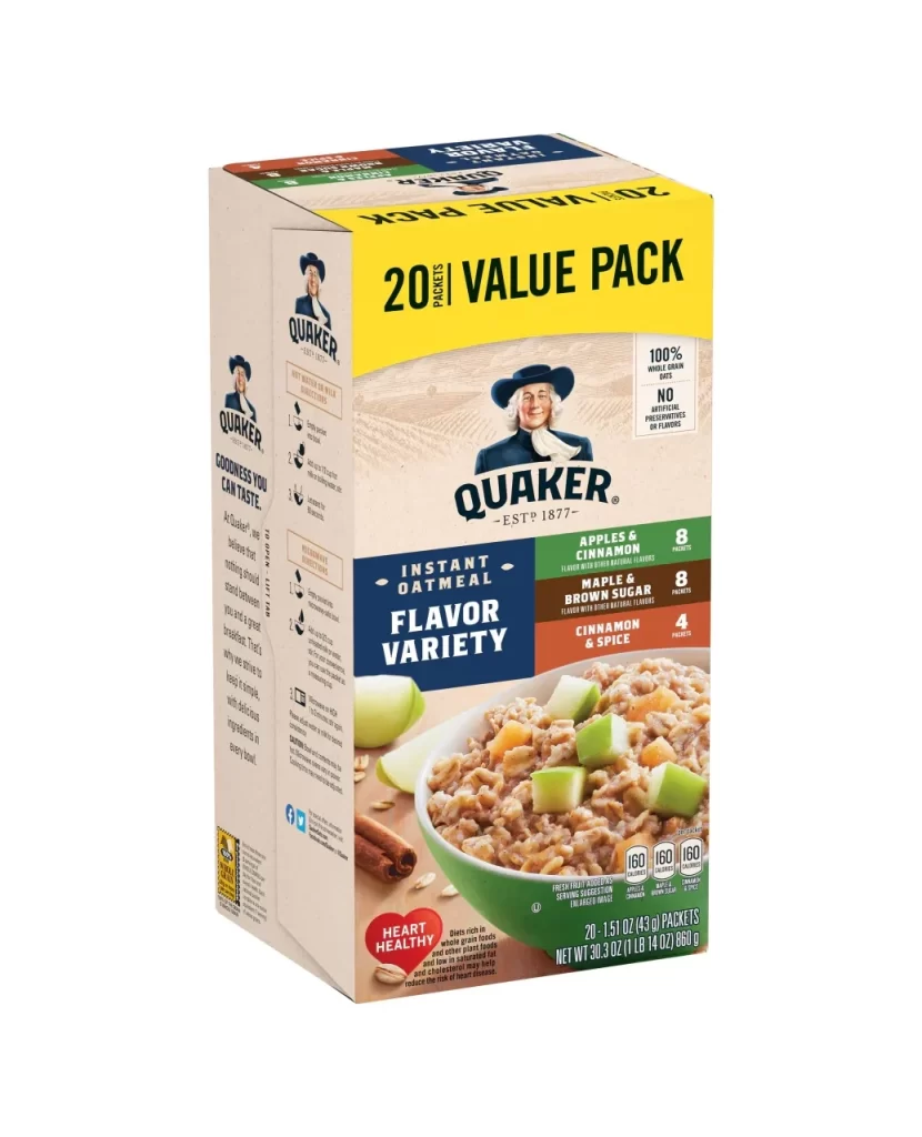
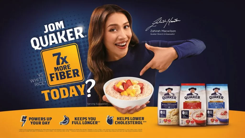
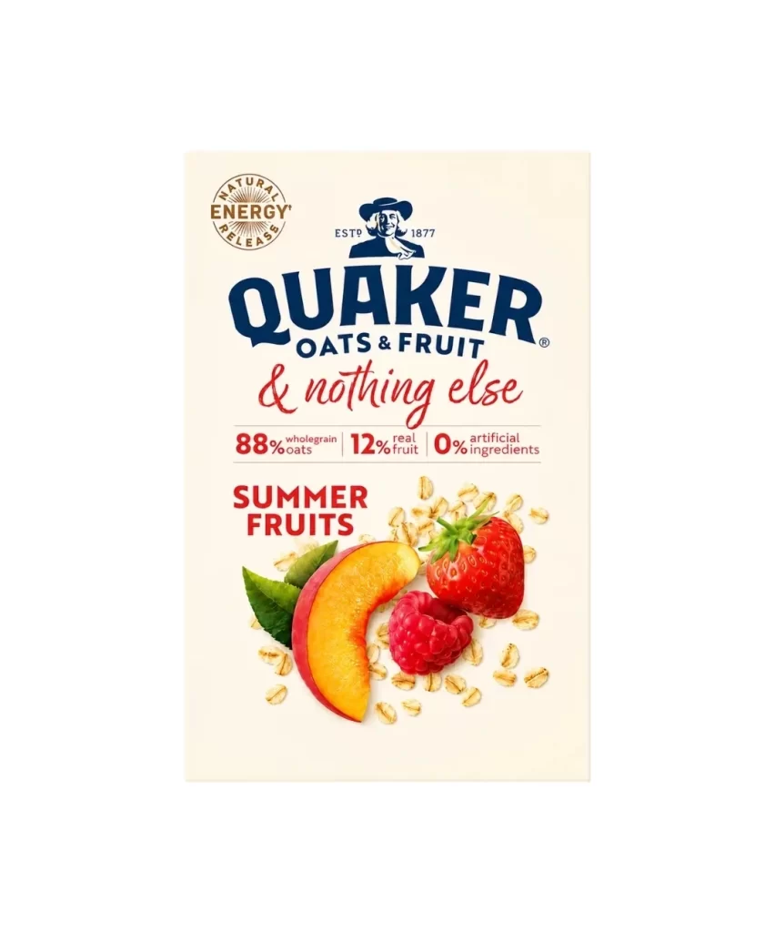
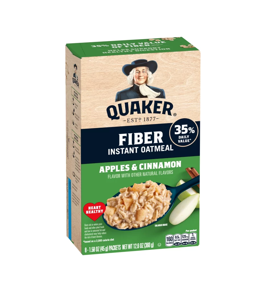
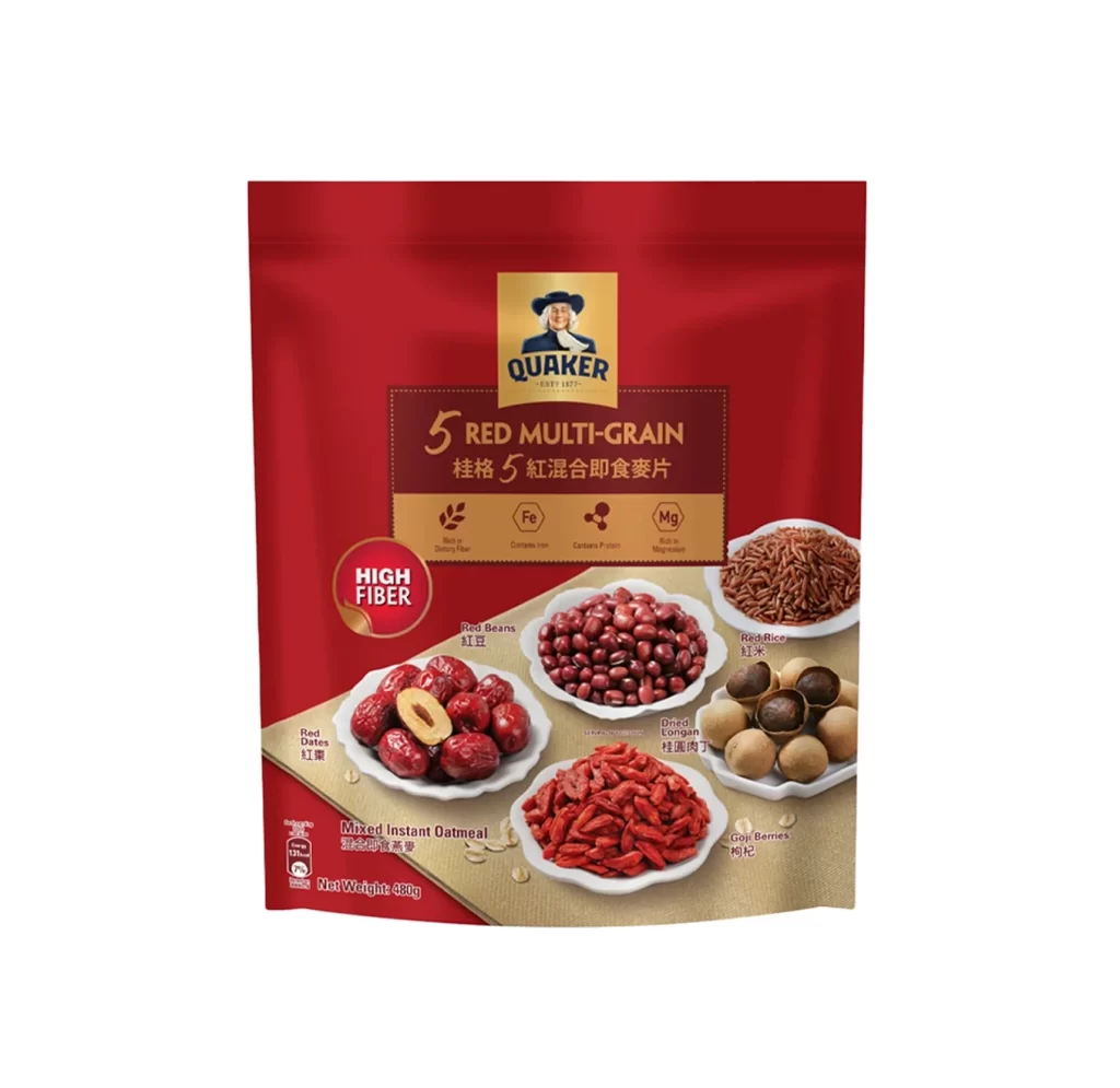
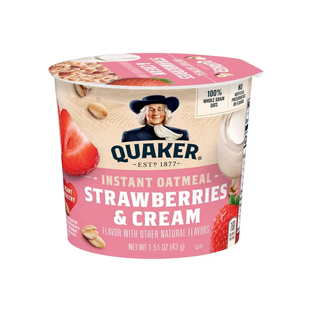
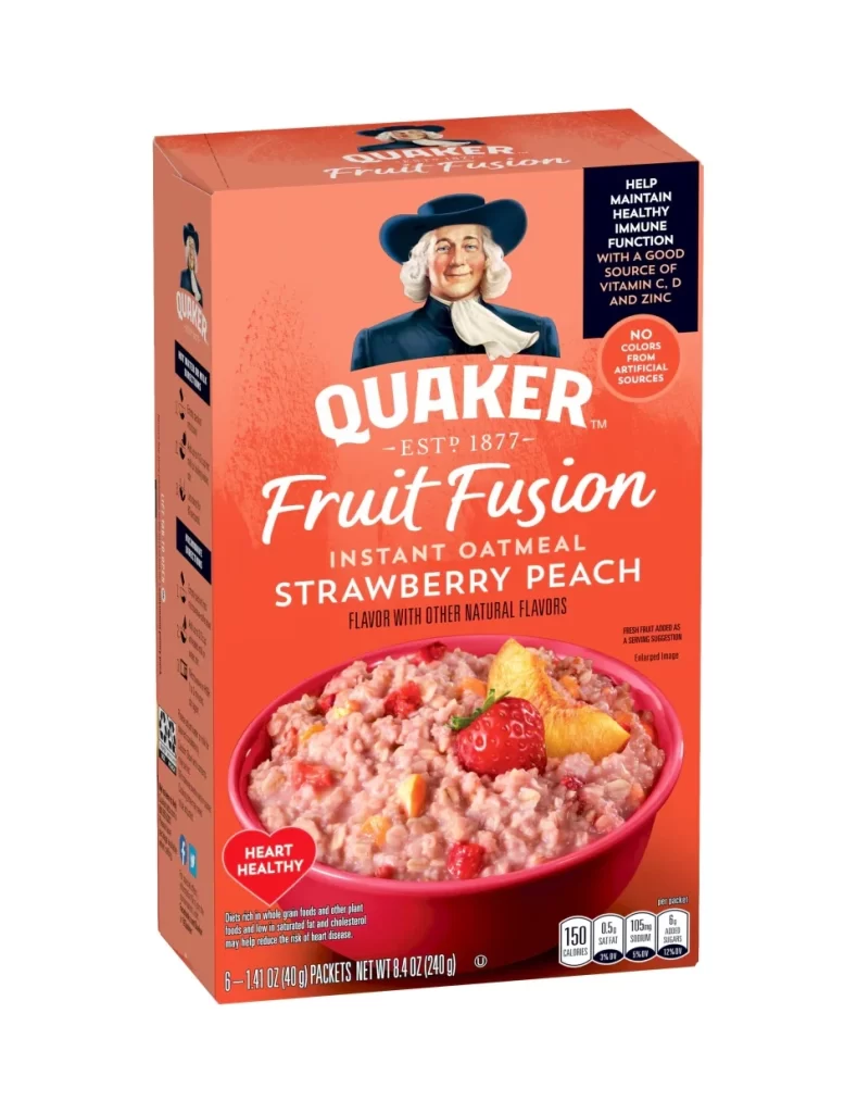
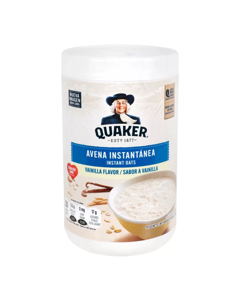
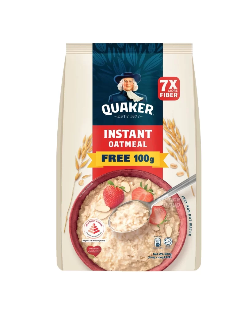
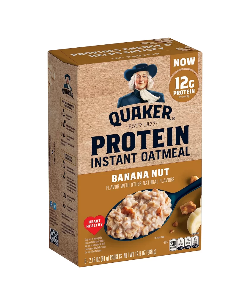
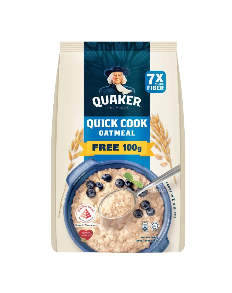
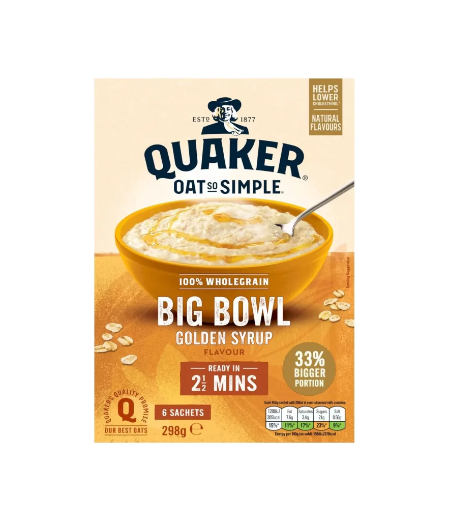
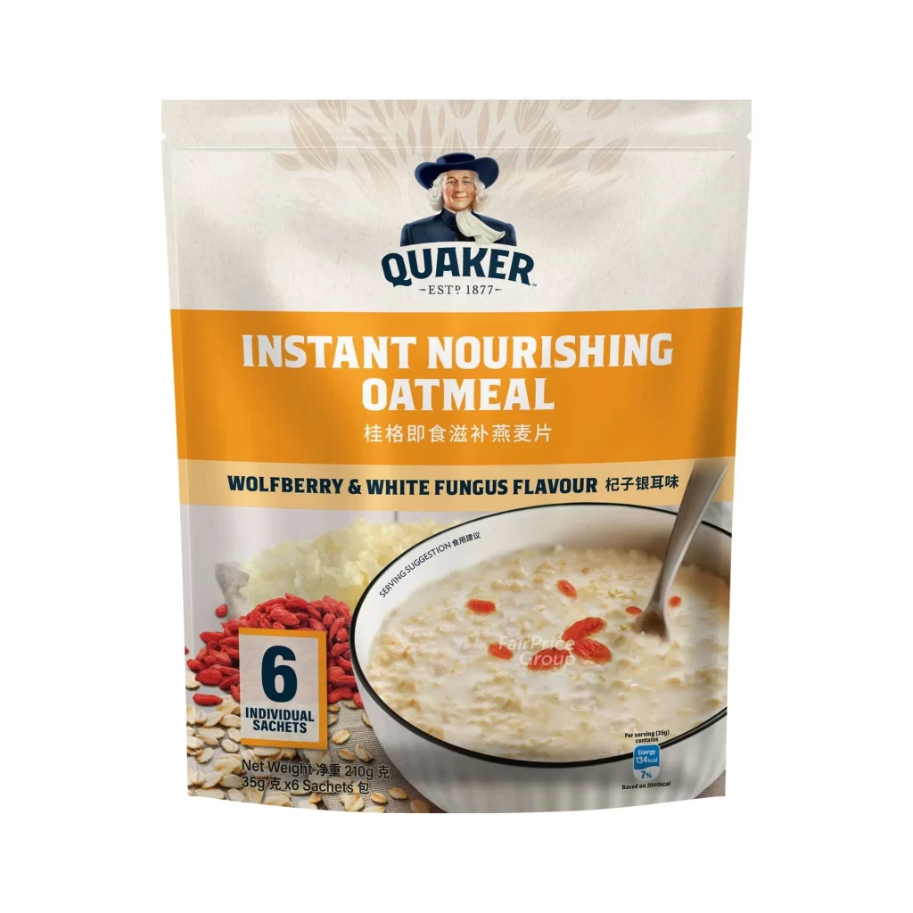
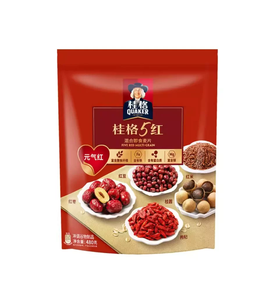
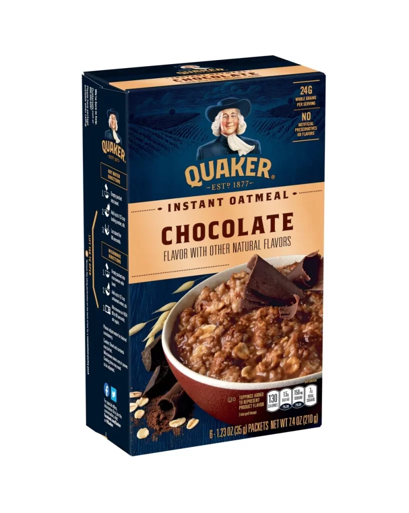
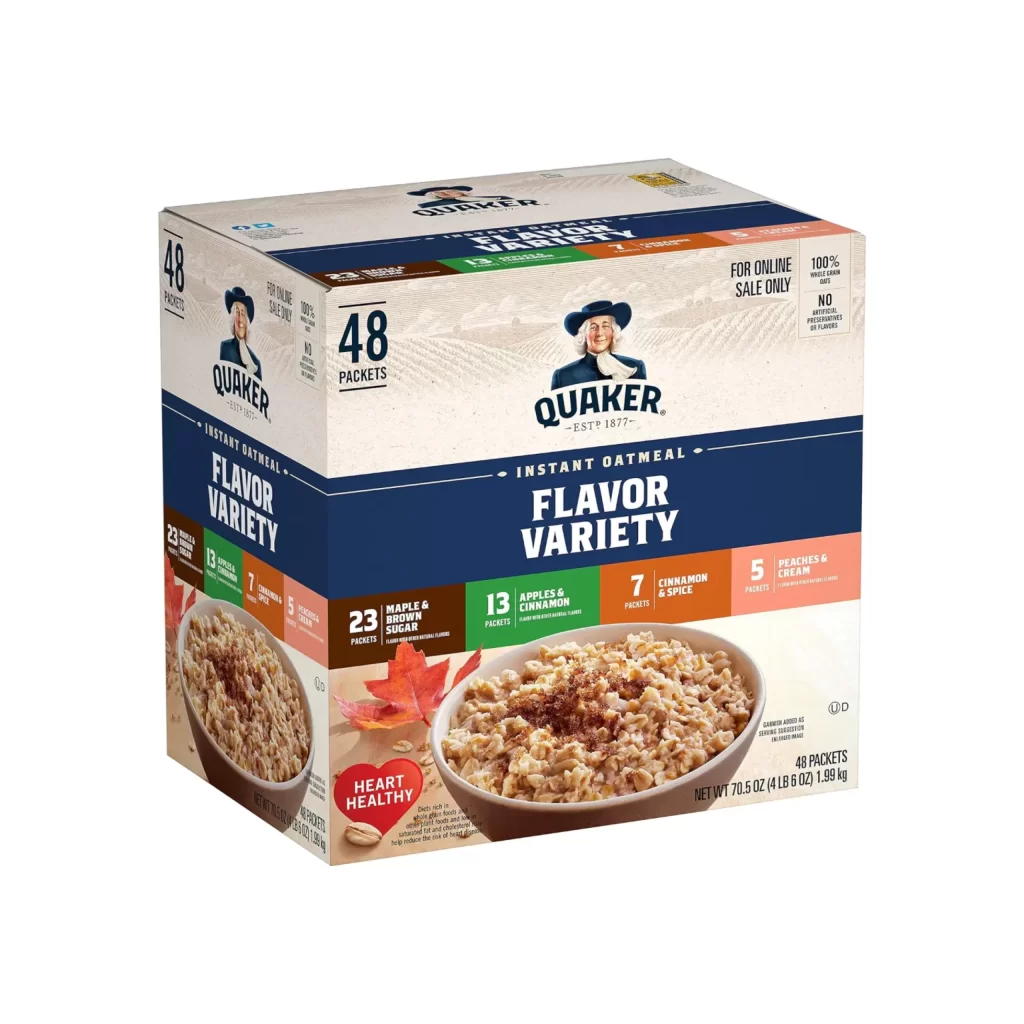
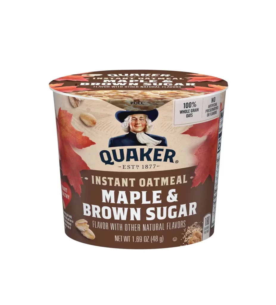
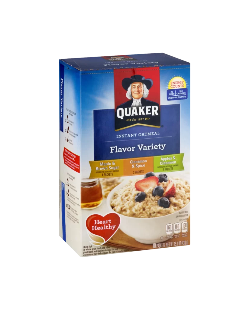
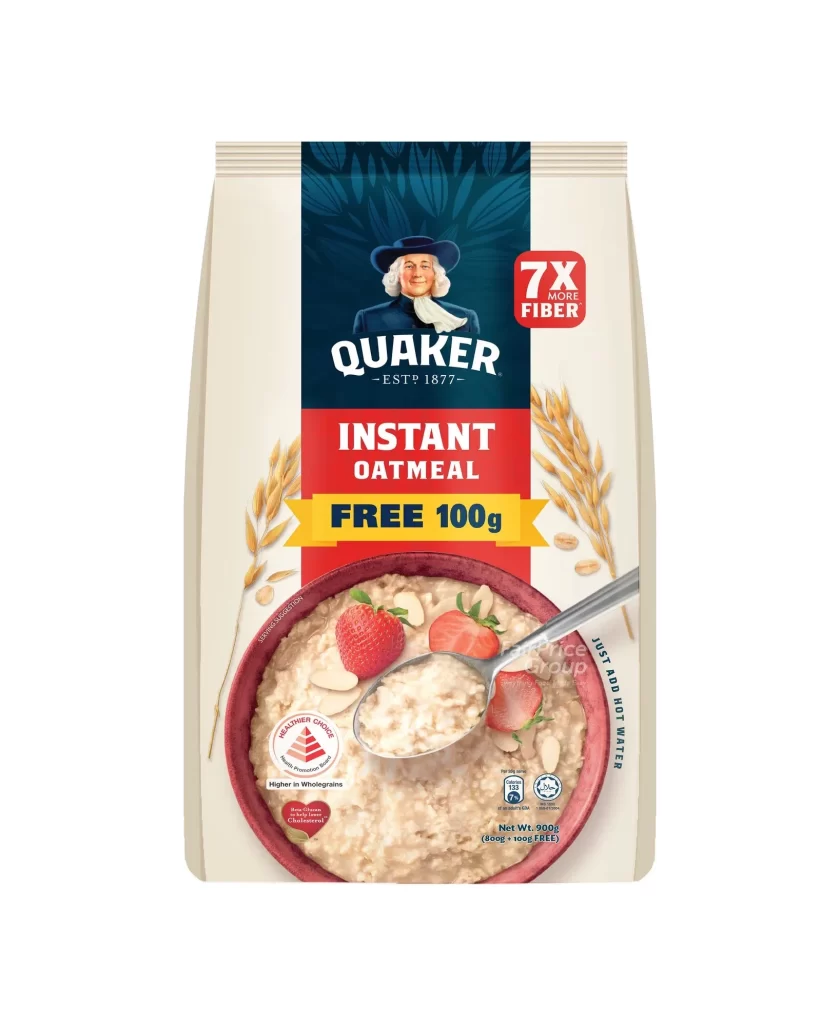
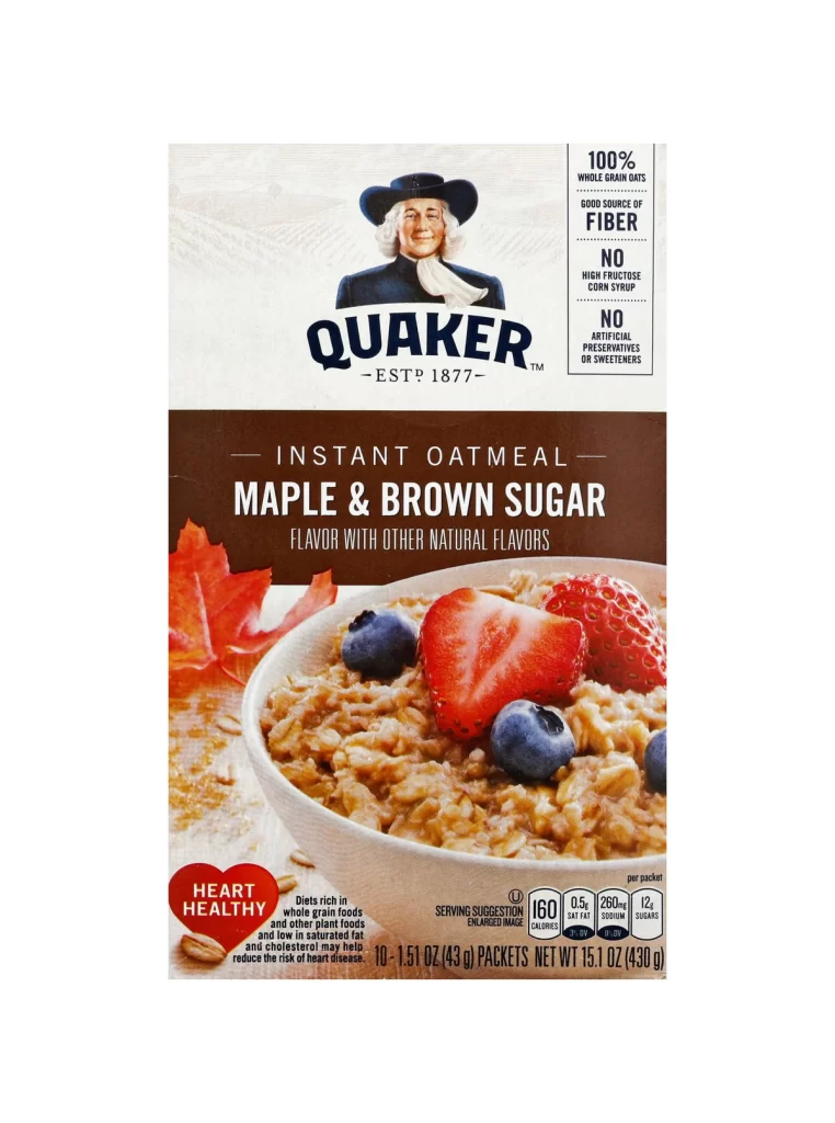
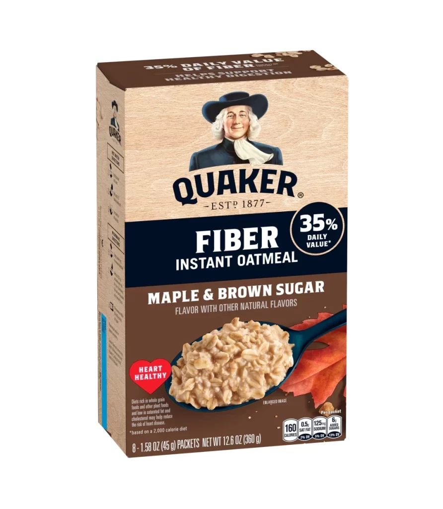
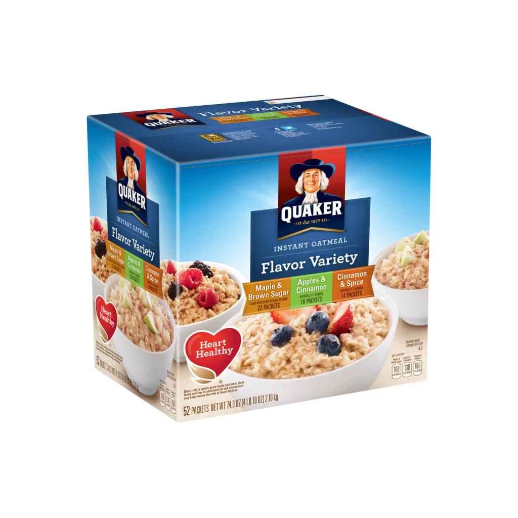
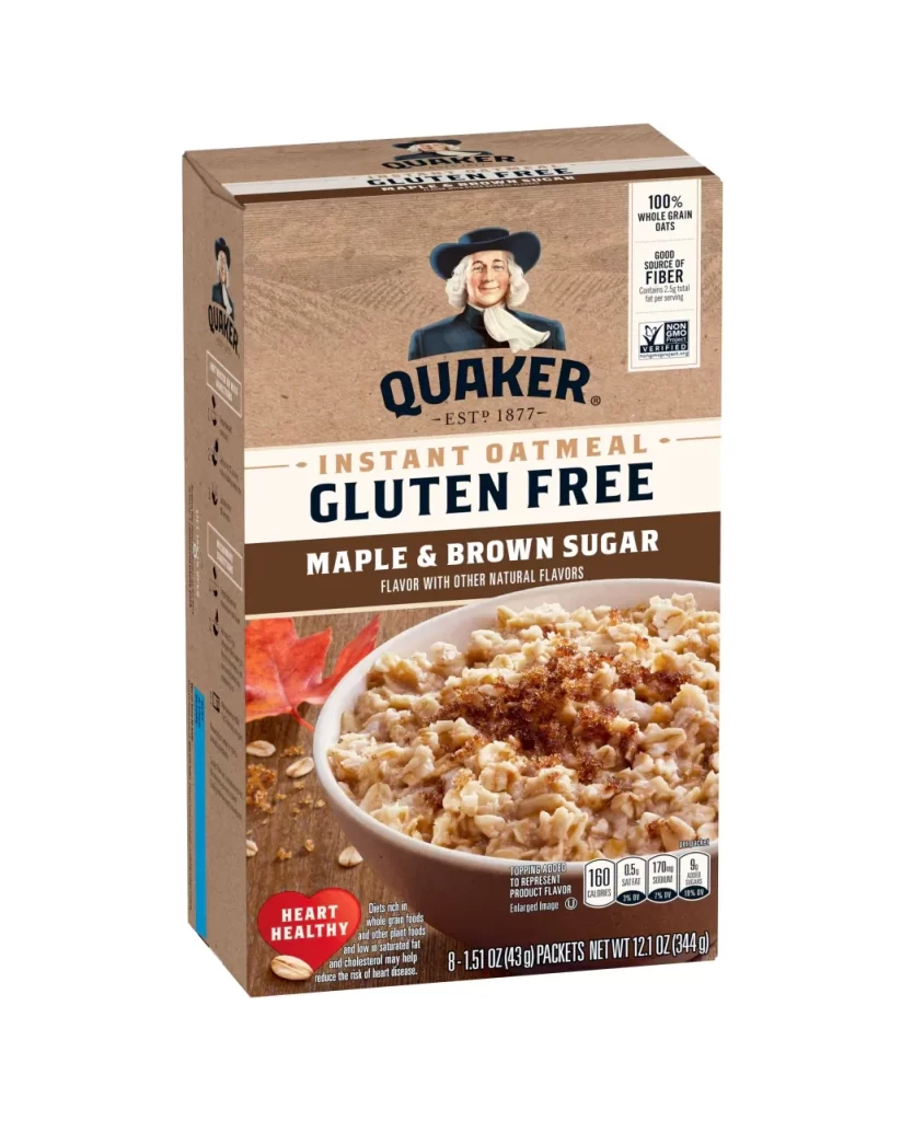
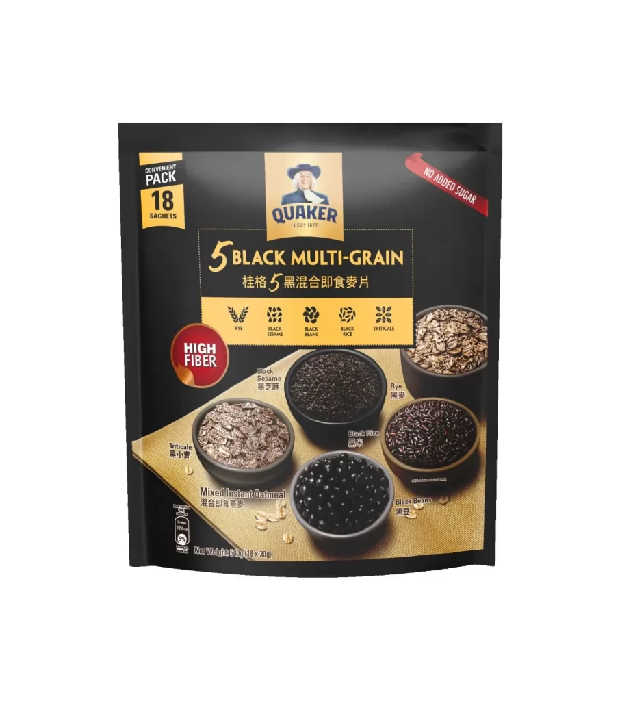
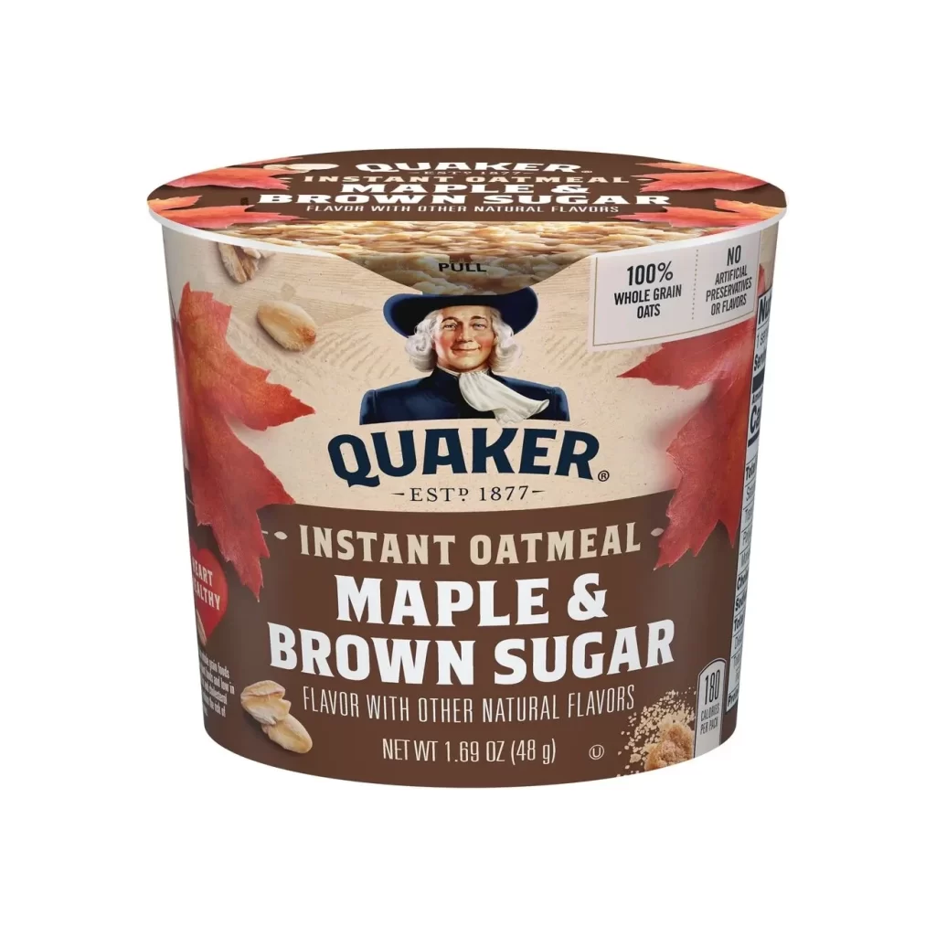
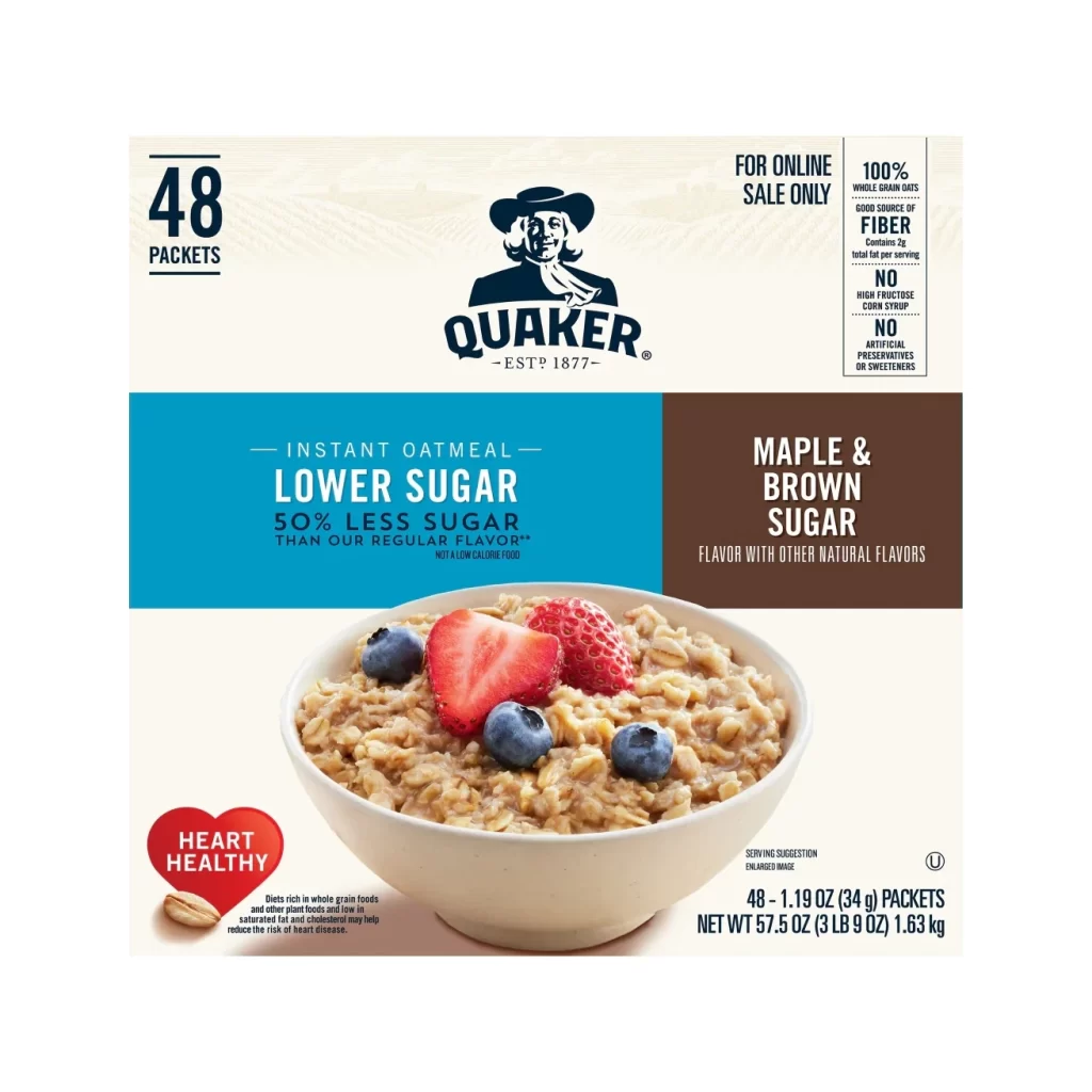
The advertisement showcases a flexible pouch lineup featuring three distinct oat texture variants. Visible on the bilingual packaging are Whole Rolled Oats, Instant Oatmeal, and Quick Cooking options. Each pouch is arranged neatly, allowing the distinct textures to be clearly identified. The visual layout highlights the side-by-side comparison, making it easy for shoppers to immediately spot their preferred breakfast style.
This campaign excels through its clean structural design and smart use of bilingual packaging. By grouping the three textures together, the ad educates consumers on cooking times and consistencies. The pouch lineup creates a cohesive visual rhythm, while the dual-language approach broadens market reach. It is a masterclass in balancing practical product information with strong, unified brand aesthetics.
Design students and packaging professionals will find this reference highly valuable. It is essential for marketers developing bilingual food campaigns or structuring a multi-variant product lineup. Graphic designers working on flexible pouch packaging can study the typography and layout choices here. Anyone needing to communicate distinct product differences visually should save this excellent example.