Quaker Nourishing Oatmeal Wolfberry Pouch Packaging
Topics
Details
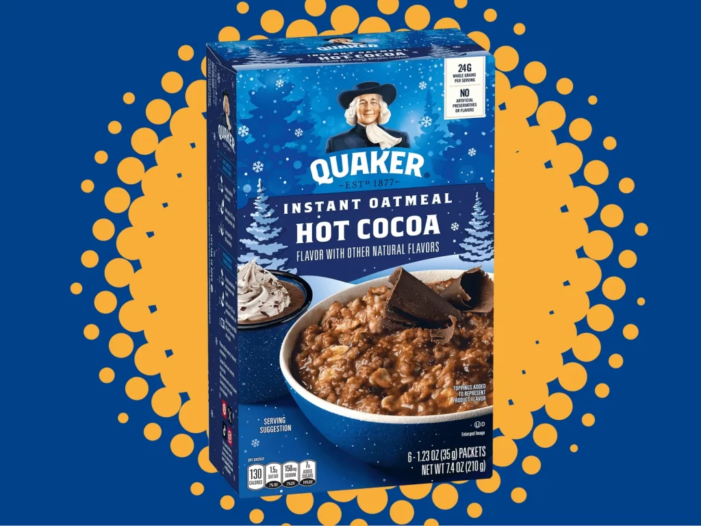
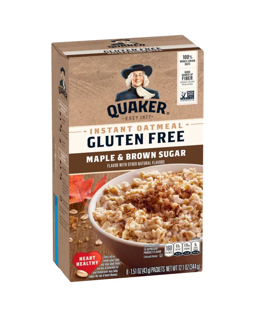
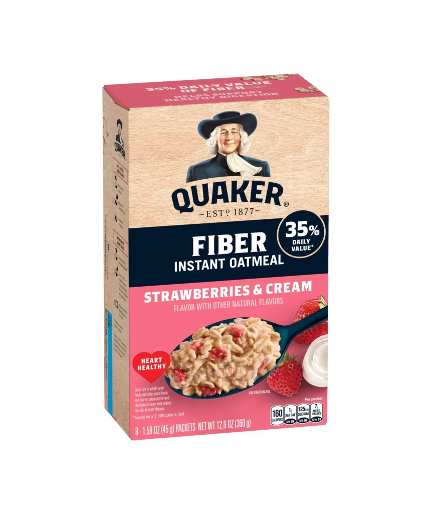
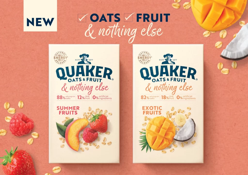
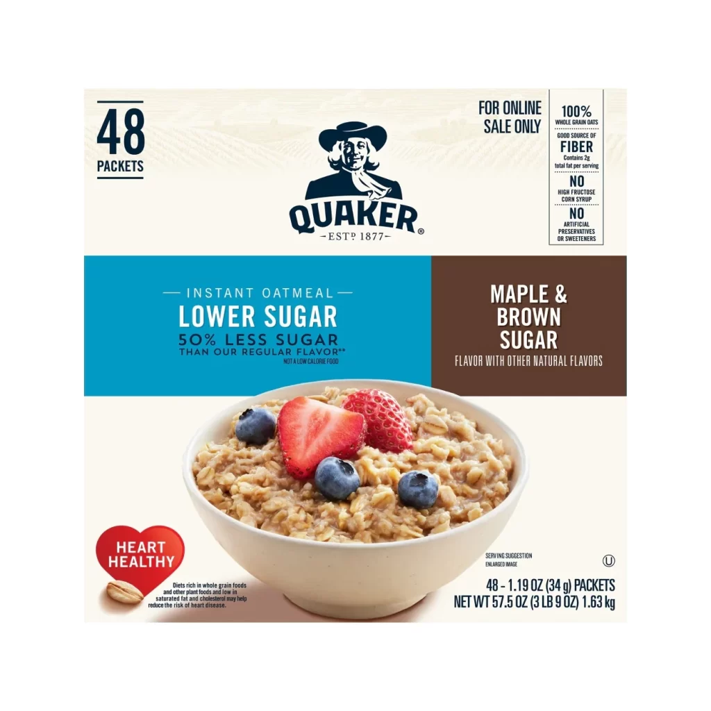
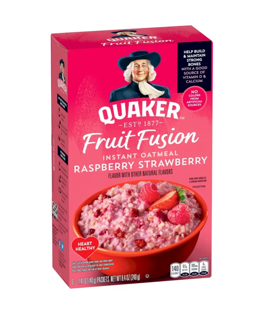
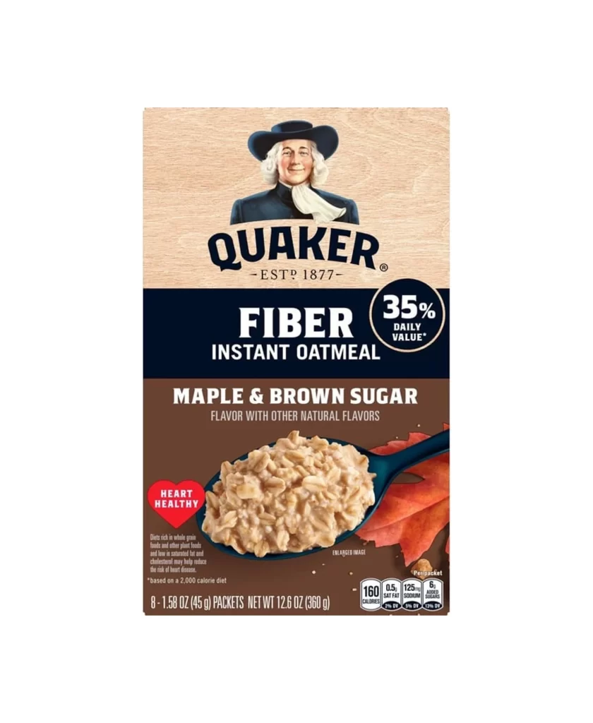
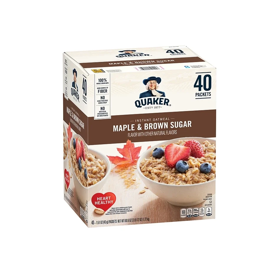
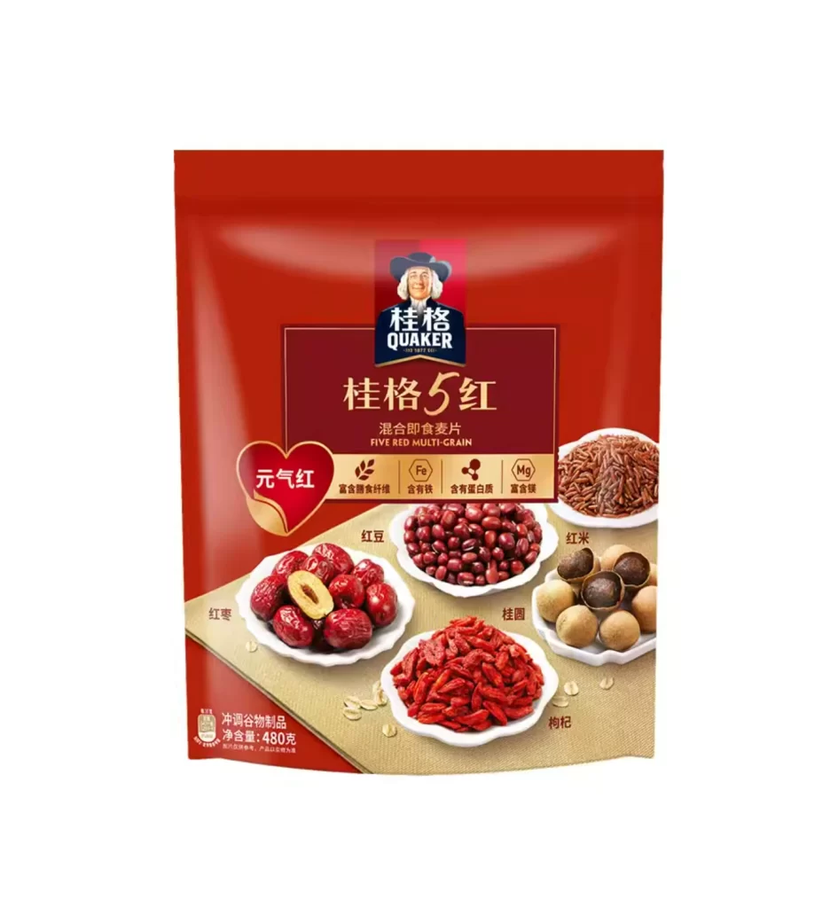
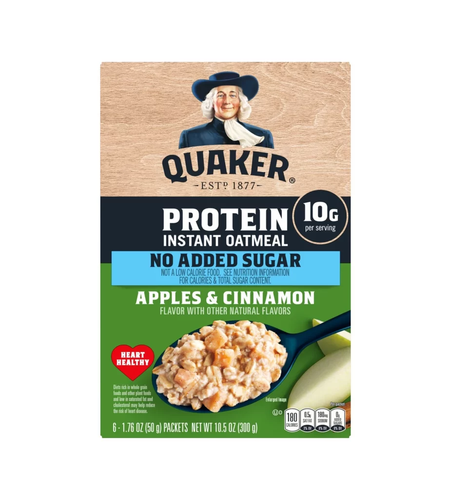
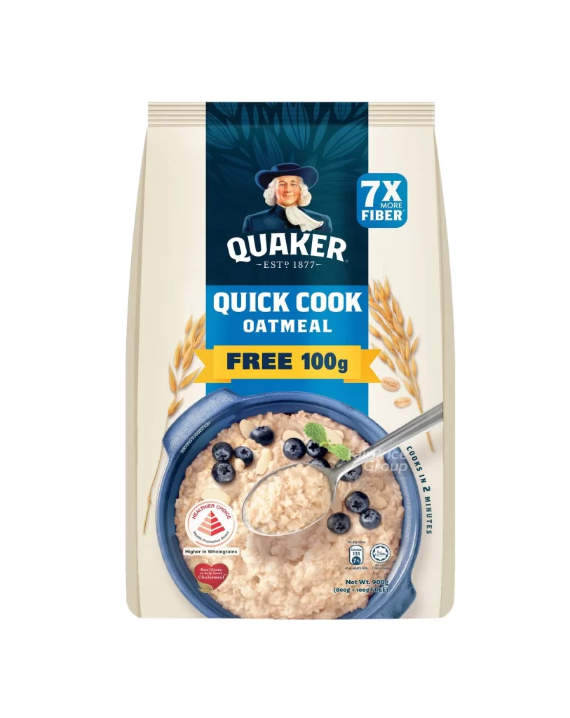
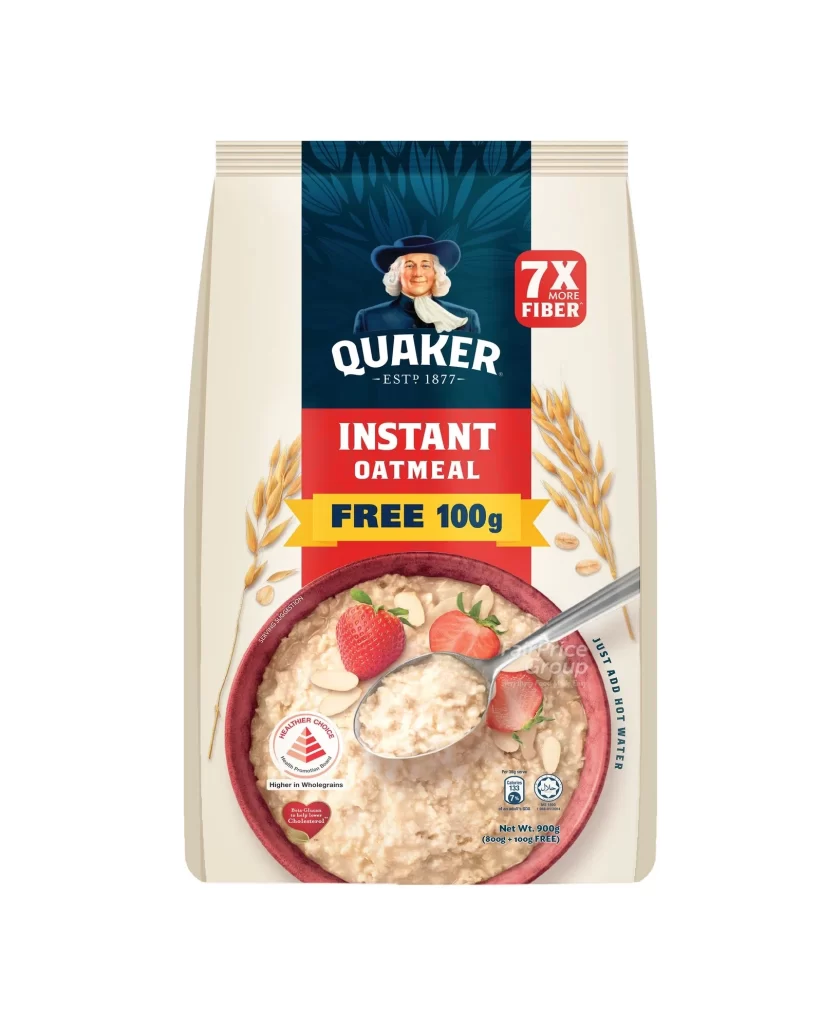
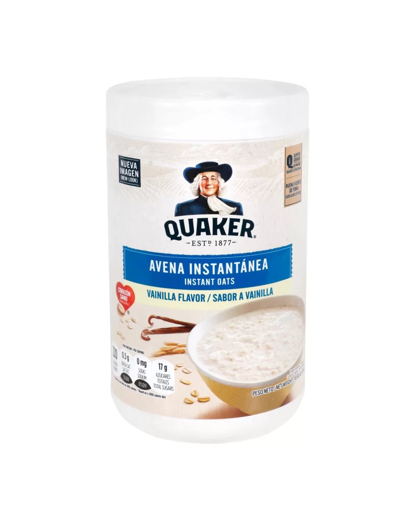
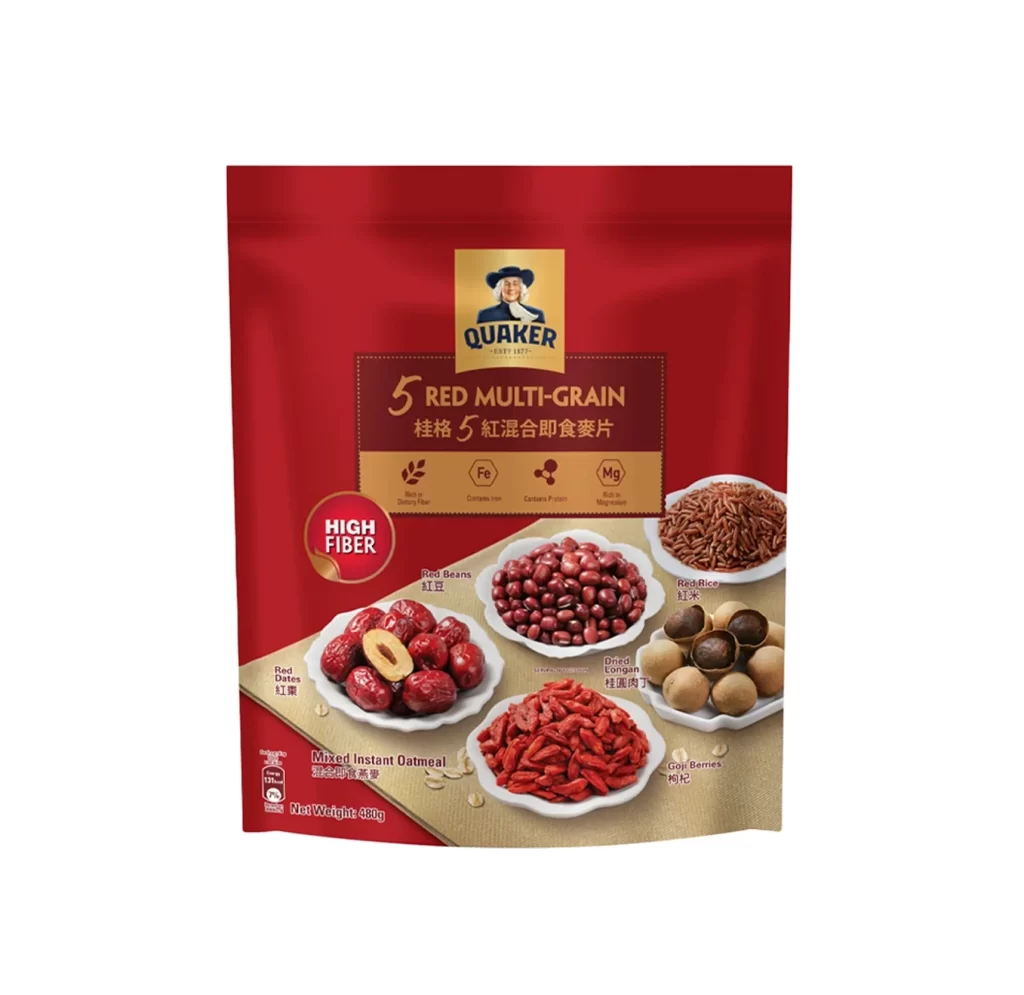
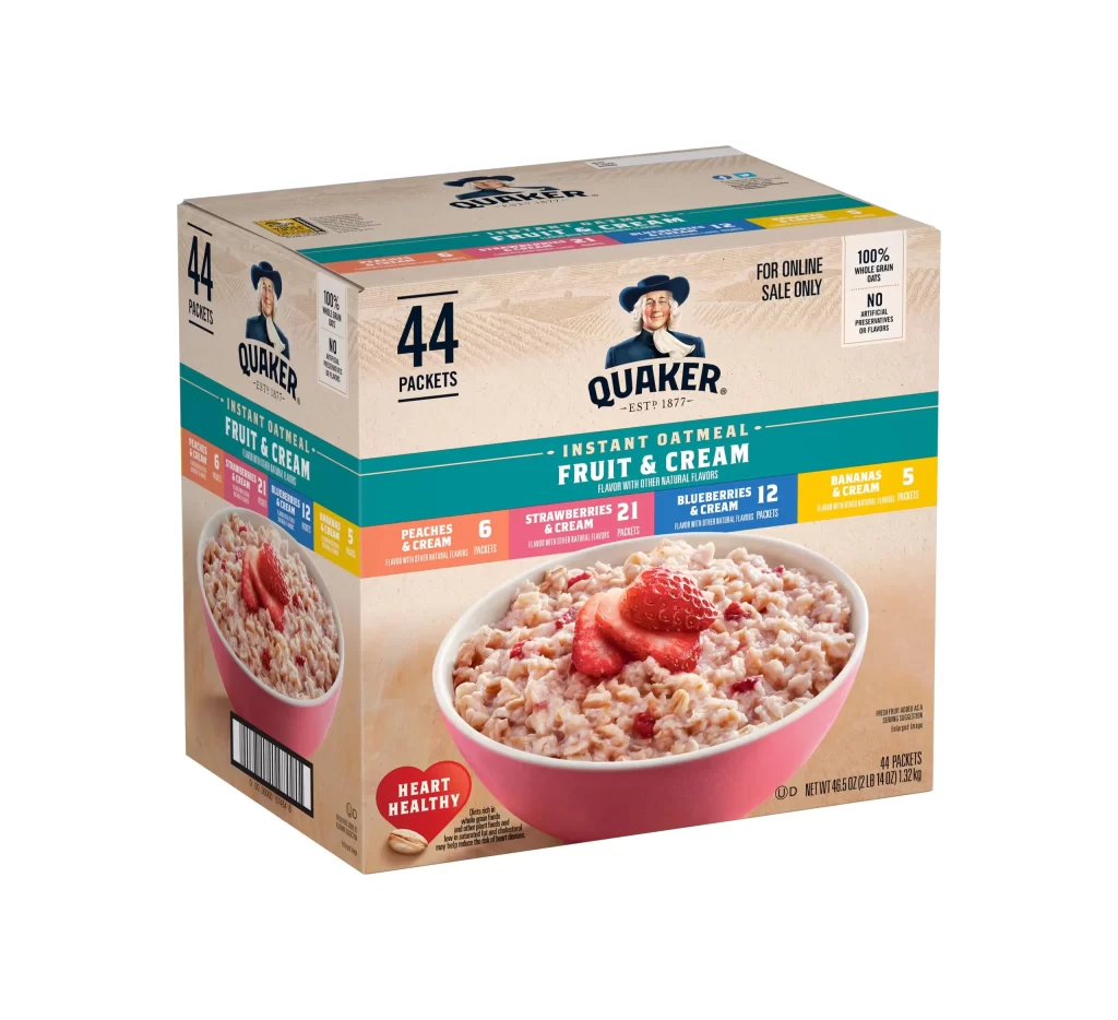
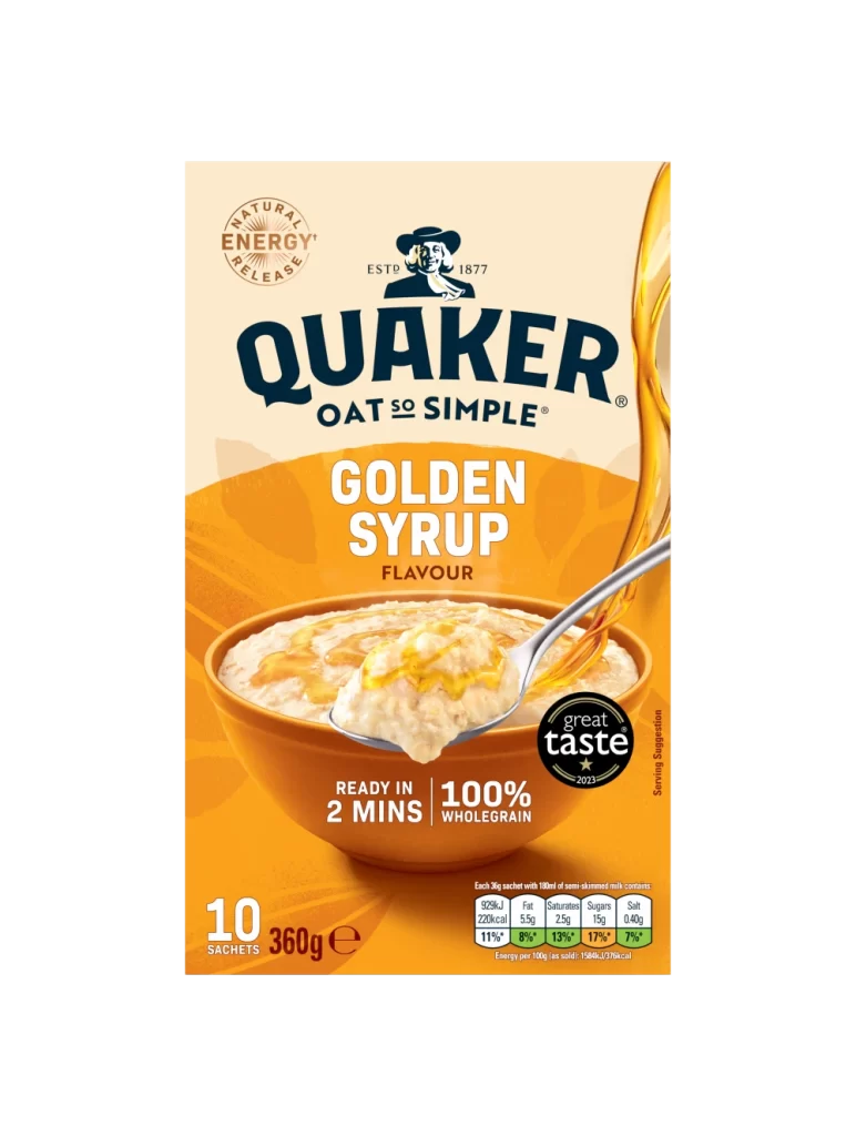
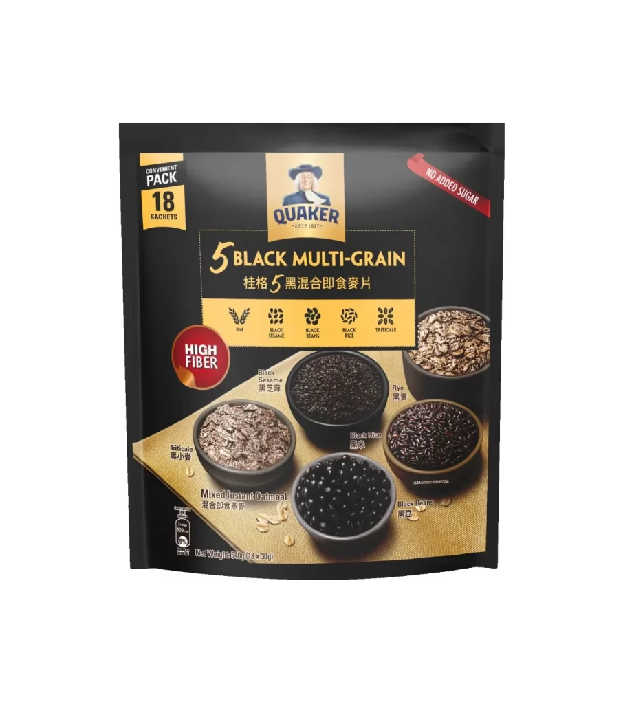
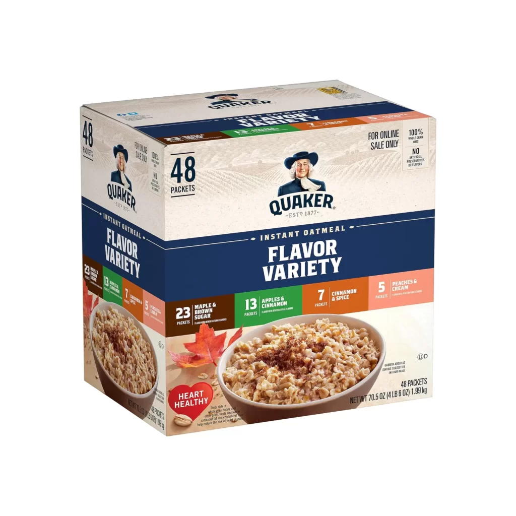
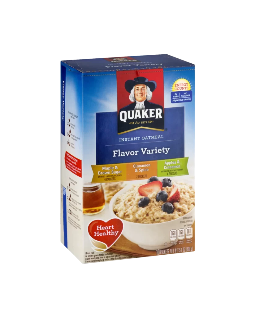
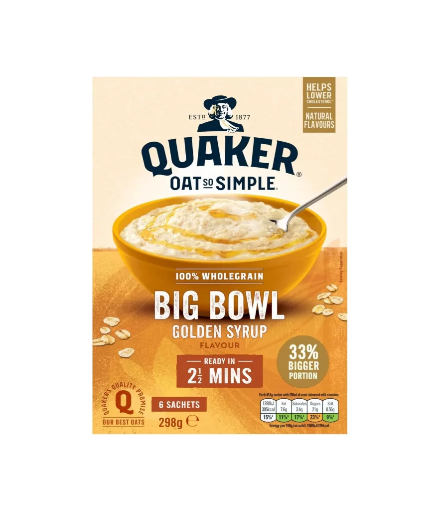
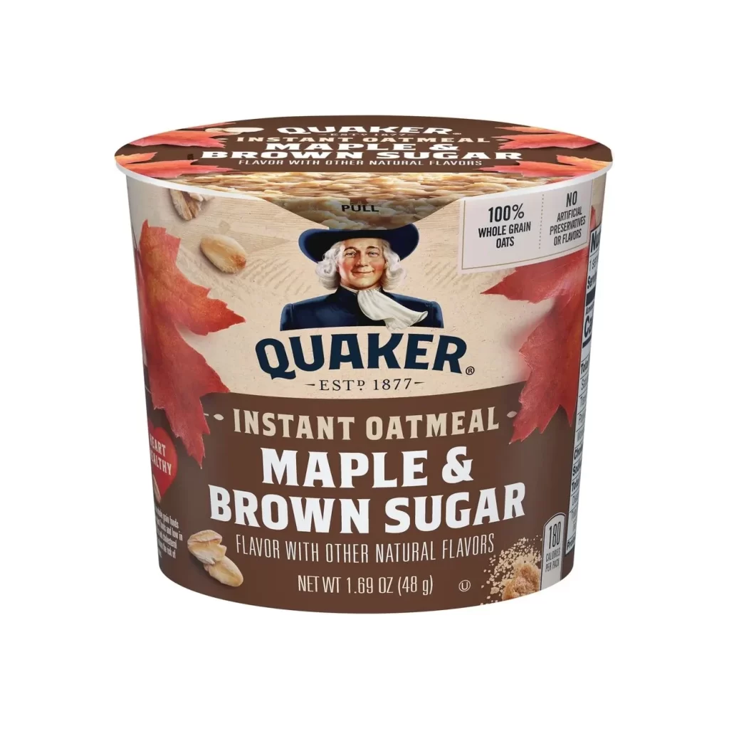
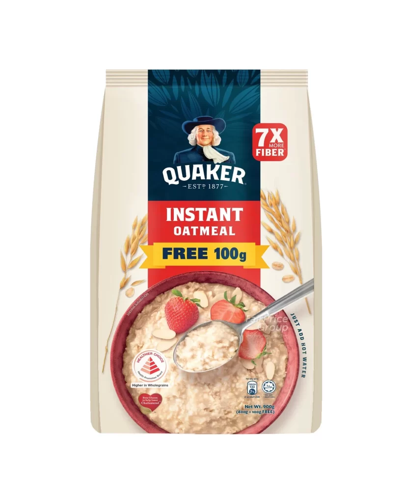
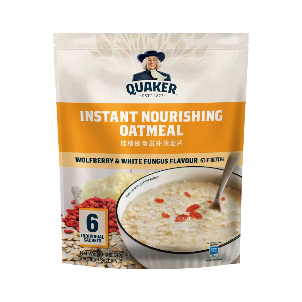
The styled pouch packaging for Quaker features a warm, inviting design. The front prominently displays the classic Quaker mascot portrait, alongside appetizing serving suggestion imagery. A bilingual English-Chinese layout presents the Instant Nourishing Oatmeal branding clearly. The Wolfberry and White Fungus flavor is highlighted, while a FairPrice Group retailer watermark sits neatly. It contains six individual sachets, totaling 210 grams.
The packaging design analysis reveals a strategic blend of heritage and wellness. The Quaker logo establishes brand trust, while the pouch form ensures product freshness. Serving suggestion imagery visually communicates the nourishing aspect of the wolfberry and white fungus flavor. The bilingual presentation broadens market appeal. A styled background unifies the visual elements, creating a cohesive aesthetic that emphasizes both traditional roots and modern convenience.
This packaging reference is essential for brand designers and packaging specialists focusing on food and beverage markets. Creators developing bilingual product packaging or studying styled pouch formats will find immense value here. Marketers analyzing how heritage brands communicate wellness ingredients will also benefit. It serves as a practical guide for balancing corporate identity, regulatory text, and appetizing serving imagery in commercial retail environments.