1 Dark Beer Can
Topics
Details
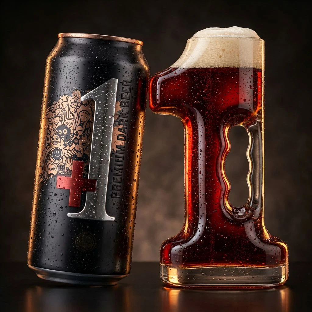
Against a deep, moody brown backdrop that fades into shadow, a matte black aluminum can stands beside a glass vessel shaped precisely like the numeral one. The can features a large metallic silver "1" overlaid with a red cross, surrounded by intricate golden line-art illustrations of whimsical characters, while the vertical text "PREMIUM DARK BEER" runs along its right edge. Condensation beads cling to both surfaces, catching warm directional light that creates bright highlights on the can's textured finish and illuminates the rich amber liquid and creamy white foam head within the transparent glass mug.
What distinguishes this particular composition is the clever typographic integration between packaging and serving vessel, where the number one functions simultaneously as brand identity and physical form. The contrast between the opaque, illustrated metal container and the translucent, handle-equipped glass creates a compelling material dialogue, while the consistent condensation across both objects unifies them as a single chilled system. This dual presentation transforms a standard beverage shot into a cohesive branding statement where form and content mirror each other literally.
Product photographers studying beverage advertising techniques will find valuable lessons in how the lighting sculpts both the metallic sheen and liquid transparency without creating distracting glare. Packaging designers exploring dimensional branding could analyze how the numerical shape of the glass reinforces the can's graphic identity, while 3D artists rendering condensation effects might study the specific way water droplets interact with different surface materials under controlled studio conditions. Marketing teams developing premium dark beer campaigns could also reference this visual strategy for coordinating container design with custom glassware.