Orion Draft Beer Can View
Topics
Details
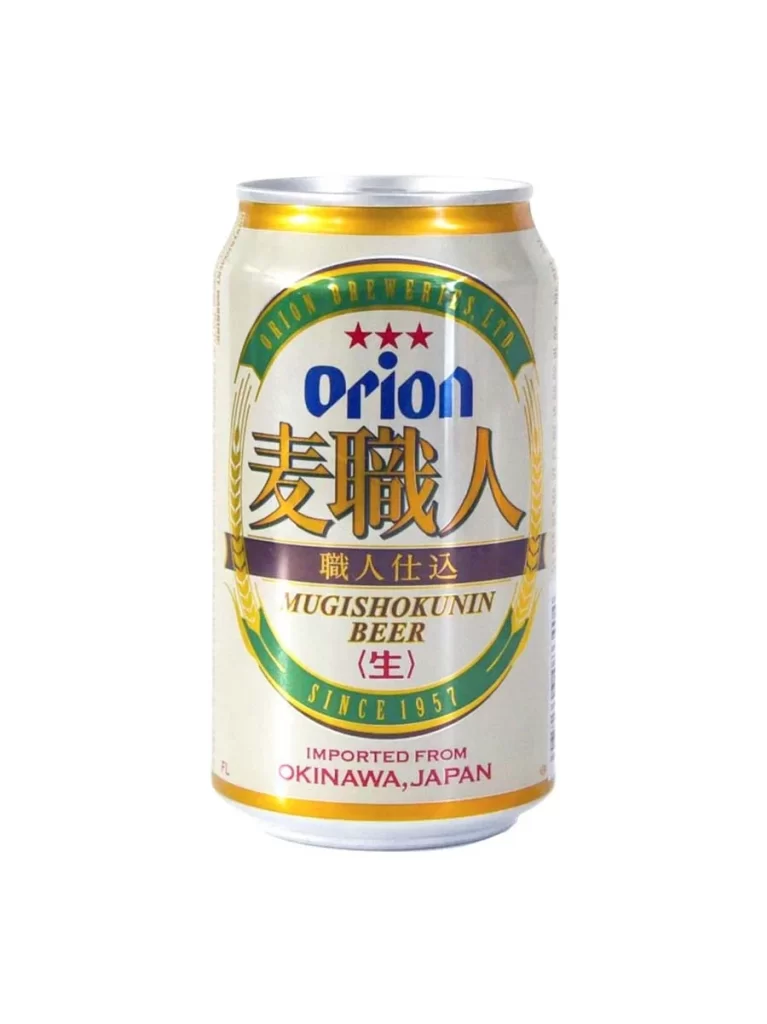
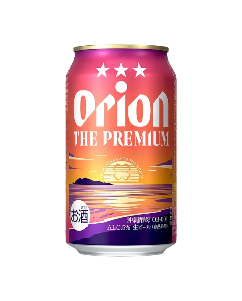
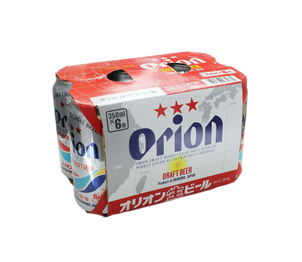
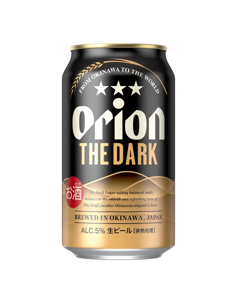
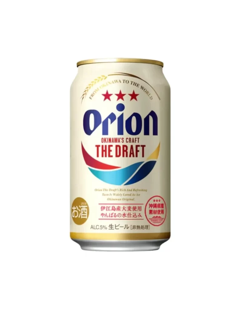
Centered within a sterile white void, the aluminum cylinder presents a study in metallic finishes and graphic layering. A cream-colored body dominates the visual field, capped by a reflective gold rim that catches light along its upper circumference. The typography establishes a clear hierarchy: deep navy 'Orion' lettering anchors the composition, while crimson 'THE DRAFT' text sits beneath a triad of scarlet stars. Below this, a sweeping wave motif transitions from burgundy through cyan to golden yellow, creating a dynamic arc that balances the lower half against the circular gold 'sake' seal positioned at the bottom left.
Visual distinction emerges from the deliberate juxtaposition of Okinawan cultural signifiers with international craft-beer aesthetics. The three-star emblem references regional heritage, yet the clean sans-serif typeface and minimalist wave graphics align with contemporary brewing trends. Notable is the integration of Japanese kanji—specifically the prominent 'お酒' (alcohol) badge—alongside English descriptors like 'OKINAWA'S CRAFT,' creating a bilingual visual dialogue. The color palette deliberately evokes tropical maritime themes through its gradient blues and warm sunset tones, differentiating this from standard industrial lager packaging.
Product photographers studying beverage packaging will find value in analyzing how specular highlights define the can's cylindrical curvature without distracting from surface graphics. Brand strategists examining cross-cultural market positioning could reference the typographic balance between Latin and CJK scripts for export-oriented goods. Industrial designers assessing print-to-metal adhesion techniques might scrutinize how the gold foil elements register against matte cream backgrounds under studio lighting conditions.