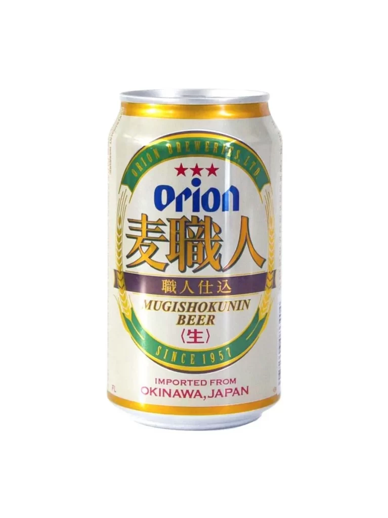
Orion Beer Can
Topics
Details
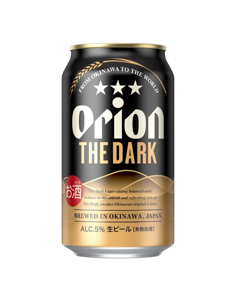
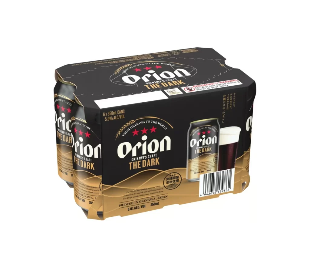
Presented against a seamless white background, a six-pack of Orion Okinawa's Craft The Dark beer sits at a three-quarter angle, revealing both the front face and the left side. The packaging features a stark black upper half that transitions into a warm, metallic gold lower section via a subtle wave pattern. Bold white sans-serif typography spells out the brand name 'Orion' above the product title 'THE DARK,' while three red stars and the tagline 'FROM OKINAWA TO THE WORLD' sit prominently above the logo.
Visual interest is generated through the high-contrast palette of matte black and shimmering gold, which effectively communicates the product's dark stout nature. The composition includes a detailed rendering of an individual 350ml can alongside a glass filled with the dark liquid, providing a clear sense of scale and contents. Japanese text and a pregnancy warning label add authentic regional detail to the commercial design.
Packaging designers might study this reference to understand how color blocking can differentiate craft varieties within an established brand identity. Illustrators requiring accurate depictions of Japanese beverage containers will find the specific typography and regulatory markings useful for realistic renderings. Marketing teams could utilize this visual to analyze how premium positioning is conveyed through minimalist graphic elements and metallic finishes.