Orion Beer Can Detail
Topics
Details
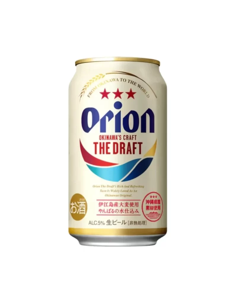
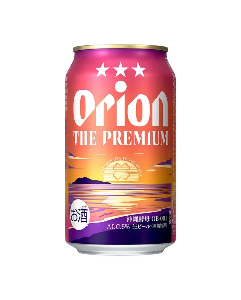
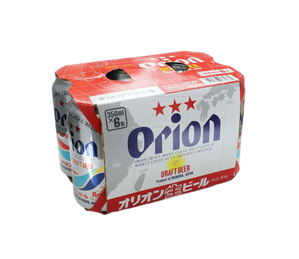
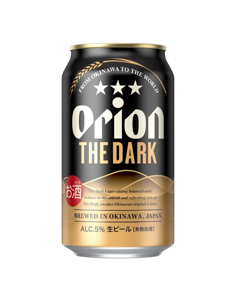
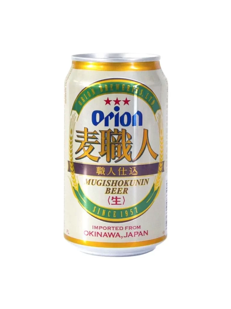
Centered within a seamless white void, a cylindrical aluminum beverage container stands upright, catching light across its metallic silver top and golden rim. The main label features an off-white background dominated by the brand name 'orion' in bold blue lowercase letters, positioned above large, stylized golden Japanese characters that read '麦職人'. Encircling this central text is a dark green arc bearing 'ORION BREWERIES, LTD.' at the top and 'SINCE 1957' at the bottom, while three red stars sit just above the English brand name.
Visual interest stems from the sophisticated interplay between traditional Japanese typography and Western graphic elements, creating a balanced yet culturally rich aesthetic. The inclusion of wheat stalk illustrations flanking the main text adds an organic texture that contrasts with the clean geometric lines of the circular badge. Furthermore, the specific color palette of deep forest green, royal blue, and antique gold evokes a sense of heritage and premium quality distinct from typical mass-market beer packaging.
Product photographers studying beverage packaging layouts will find the typographic hierarchy particularly useful for understanding how to balance multiple languages on a single surface. Illustrators working on retro-themed branding projects can analyze the specific shading techniques used to give the flat can a three-dimensional appearance. Additionally, cultural researchers documenting Okinawan exports might utilize this visual record to track regional design trends in Japanese alcohol marketing.