Orion Beer Can Design
Topics
Details
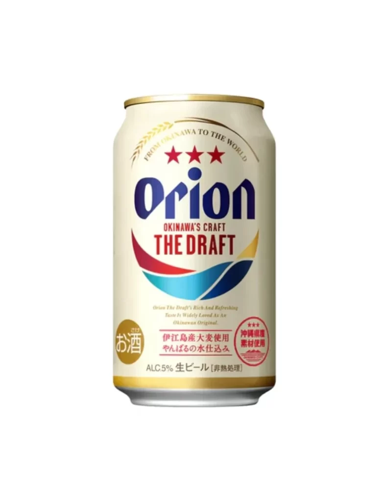
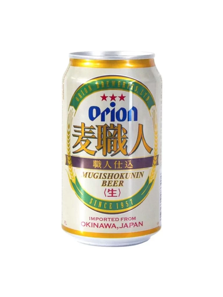
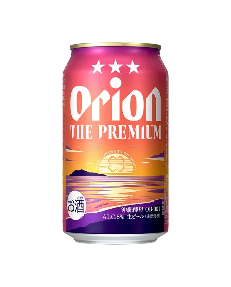
Centered in the frame, a cylindrical aluminum can displays a striking gradient that shifts from deep magenta at the top through a warm orange midsection to a dark purple base. The brand name 'Orion' appears in large white serif lettering beneath three stars, with 'THE PREMIUM' positioned just below it. A scenic illustration of a sunset over water occupies the lower half, featuring a silhouette of distant mountains and a circular emblem containing a four-leaf clover motif. Japanese characters for sake appear inside a white circle on the left side, while technical specifications including 'ALC.5%' and 'OB-001' run along the bottom right edge.
What distinguishes this particular packaging is its sophisticated blend of tropical imagery and premium positioning cues. The sunset palette evokes Okinawan origins while the clover symbol and star trio suggest quality and luck without relying on typical beer visual tropes. Typography choices balance bold display fonts for brand recognition with smaller informational text, creating clear hierarchy across the curved surface. The inclusion of both English and Japanese labeling indicates a product designed for cross-cultural appeal or export markets.
Packaging designers studying beverage branding might analyze how color transitions guide the eye from brand identity to regional storytelling. Illustrators working on landscape compositions could reference the way atmospheric perspective is compressed into a narrow vertical format. Marketing teams developing premium product lines would benefit from examining how traditional symbols integrate with modern sans-serif elements to convey heritage alongside contemporary quality standards.