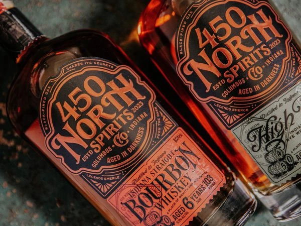
450 North Bourbon Whiskey Bottle
Topics
Details
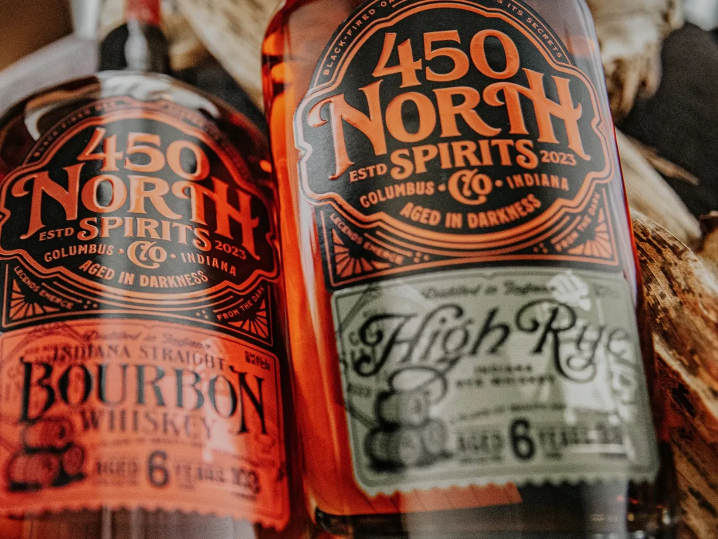
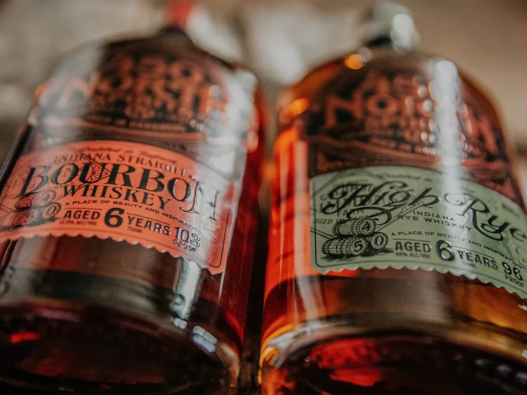
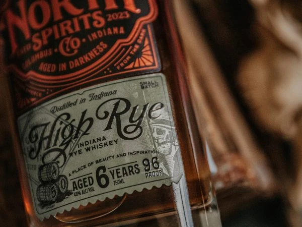
Bathed in a warm, amber glow that highlights the rich copper tones of the liquid within, two glass bottles of 450 North Spirits bourbon sit at a slight angle against a mottled, dark teal surface. The camera looks down from a high perspective, emphasizing the intricate typography on the labels which features a bold, vintage-inspired serif font in burnt orange and black. Visible text includes the brand name '450 North', the location 'Columbus, Indiana', and specific details like 'Aged in Darkness' and 'Aged 6 Years', all framed by ornate, geometric border patterns that give the packaging a distinct, old-world aesthetic.
What sets this particular whiskey packaging apart is its masterful use of contrasting color palettes and layered typographic hierarchy to create a sense of premium craftsmanship. The interplay between the deep black backgrounds of the main shields and the vibrant orange-red accents draws the eye immediately to the brand's identity, while the smaller, delicate script on the secondary labels adds a layer of sophistication and authenticity. This design successfully merges industrial strength with artisanal charm, making the bottle feel like a collectible piece of art rather than just a standard spirit container.
Graphic designers working on beverage branding or vintage-style logos will find the typographic arrangements and border motifs incredibly useful for understanding how to balance dense information with visual appeal. Illustrators looking to practice rendering glass, liquid refraction, or metallic textures can study the way the light catches the curves of the bottle and the subtle reflections on the label surfaces. Even copywriters might utilize this as a prompt for crafting evocative product descriptions that emphasize heritage and traditional aging processes.