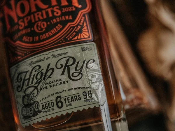
450 North Spirit Label
Topics
Details
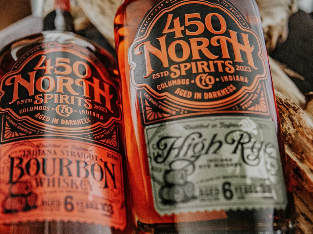
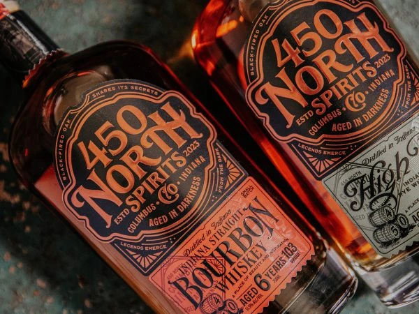
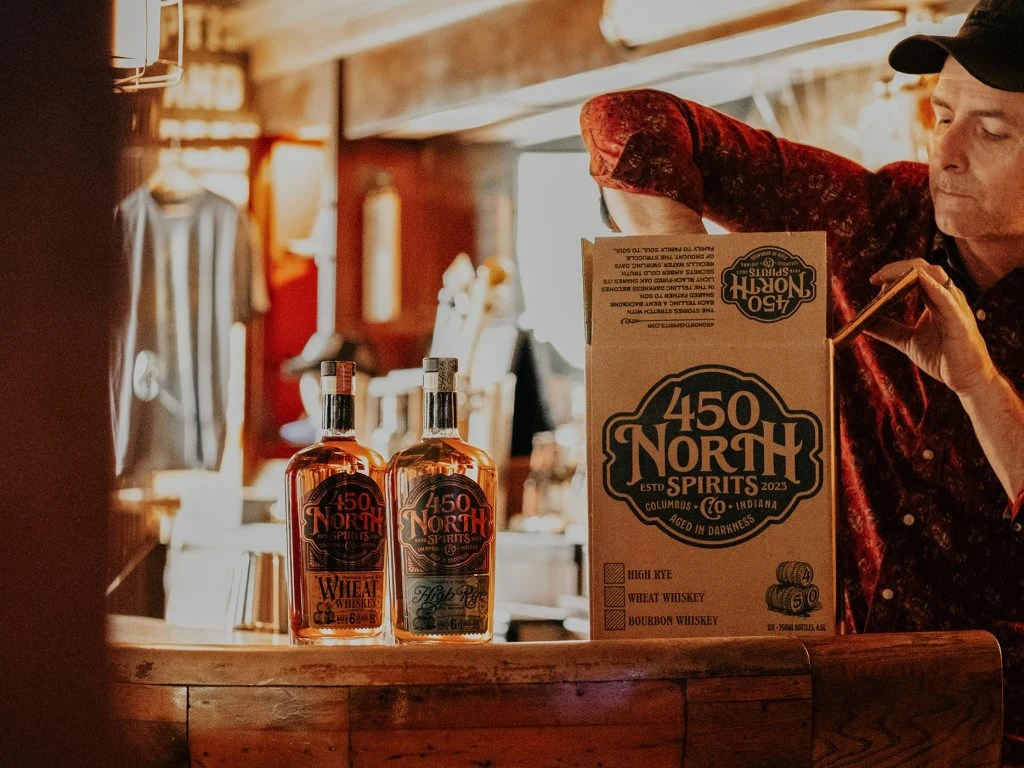
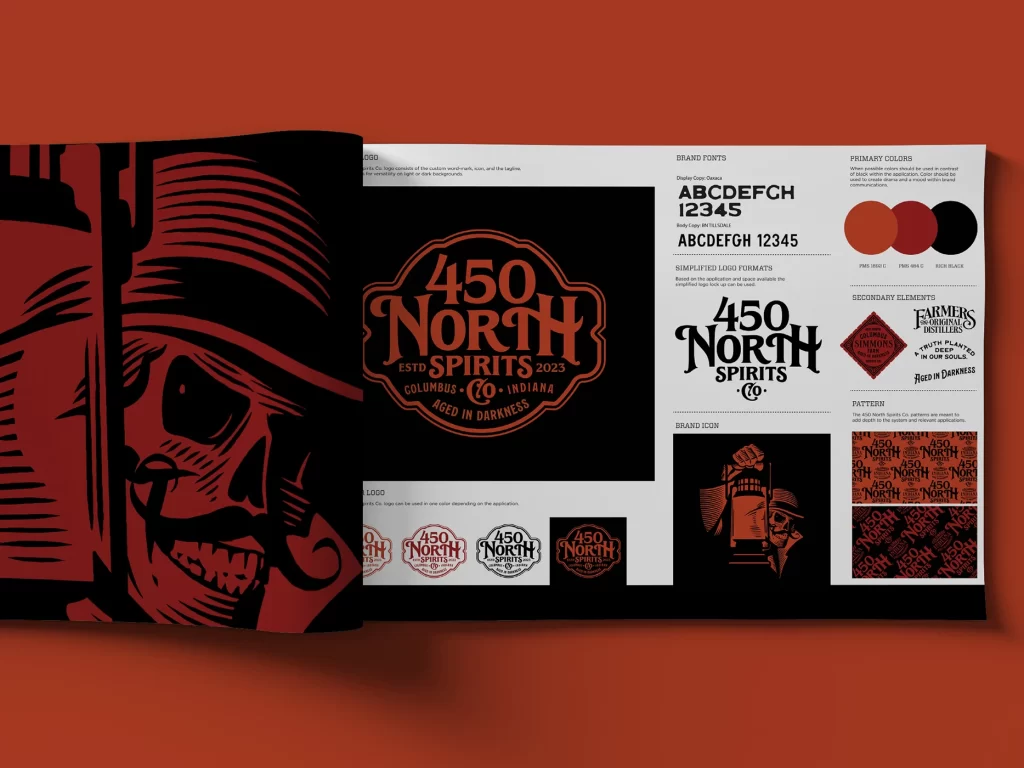
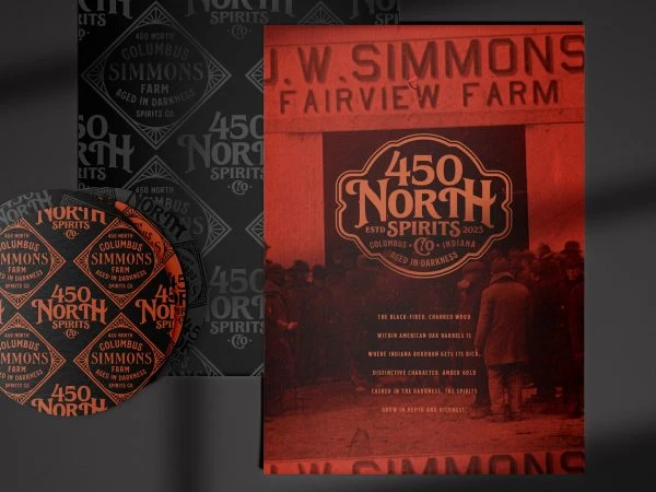
A monochromatic red-orange palette dominates the composition, featuring a rectangular label with rounded corners and a circular seal. The primary text displays 'J.W. SIMMONS FAIRVIEW FARM' in bold sans-serif capitals at the top, while an ornate, vintage-style badge contains '450 NORTH END SPIRITS' and 'COLUMBUS SIMMONS FARM'. Below the central emblem, smaller white text lists product details against a dark background depicting silhouetted figures in period attire. The items rest on a dark surface with soft shadows, photographed from a direct overhead perspective alongside a repeating patterned backdrop.
Visual distinction arises from the interplay between industrial typography and decorative Victorian-era graphic elements within the badge. The high-contrast color scheme creates a striking retro aesthetic that evokes early 20th-century agricultural branding. Layered textures combine the smooth printed surface with the photographic depth of the background imagery, establishing a complex visual hierarchy.
Brand historians analyzing Prohibition-era liquor labeling conventions would find this specimen particularly relevant for typographic research. Packaging designers developing heritage-inspired consumer goods could study the balance between ornamental borders and legible text placement. Museum curators documenting regional distilling traditions might utilize this as comparative material for Midwest spirit production artifacts.