450 North Spirits Co. Spirit Label
Topics
Details
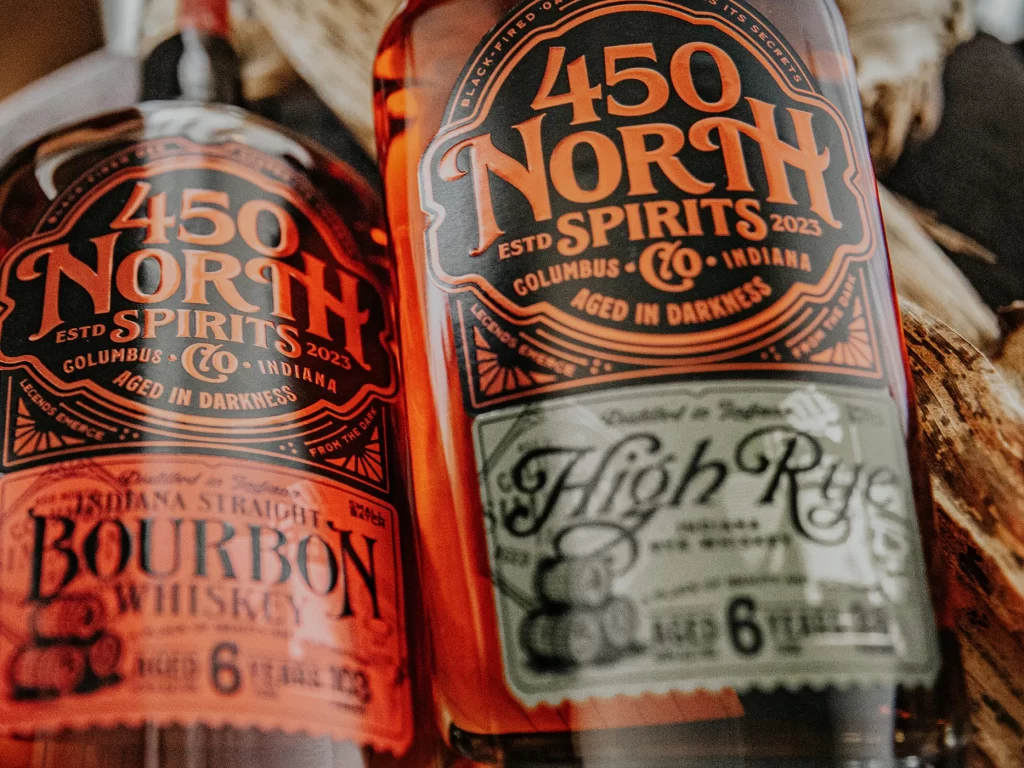
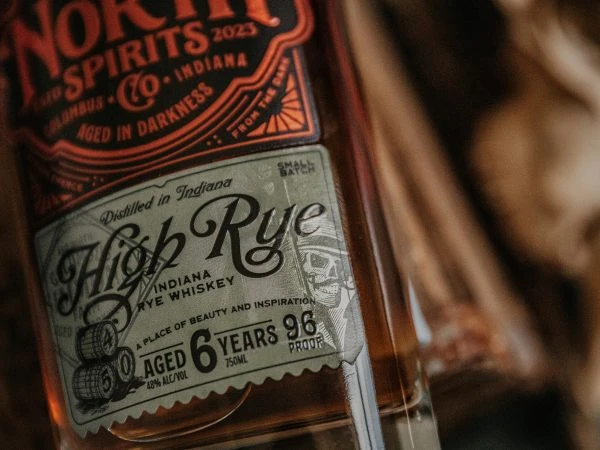
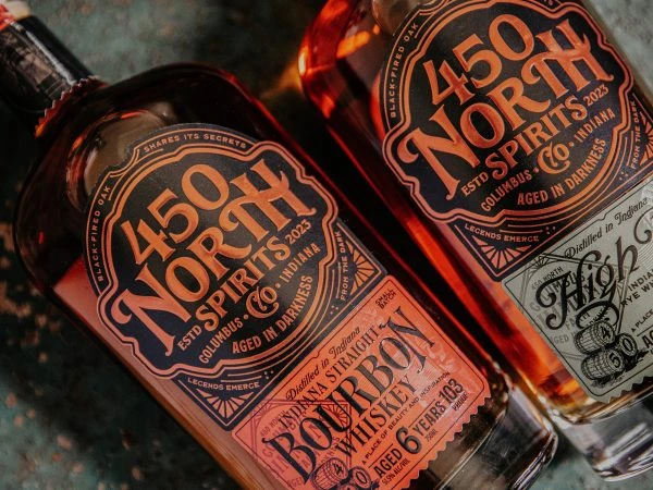
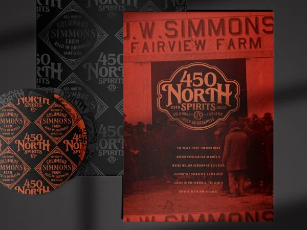
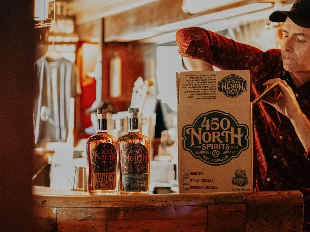
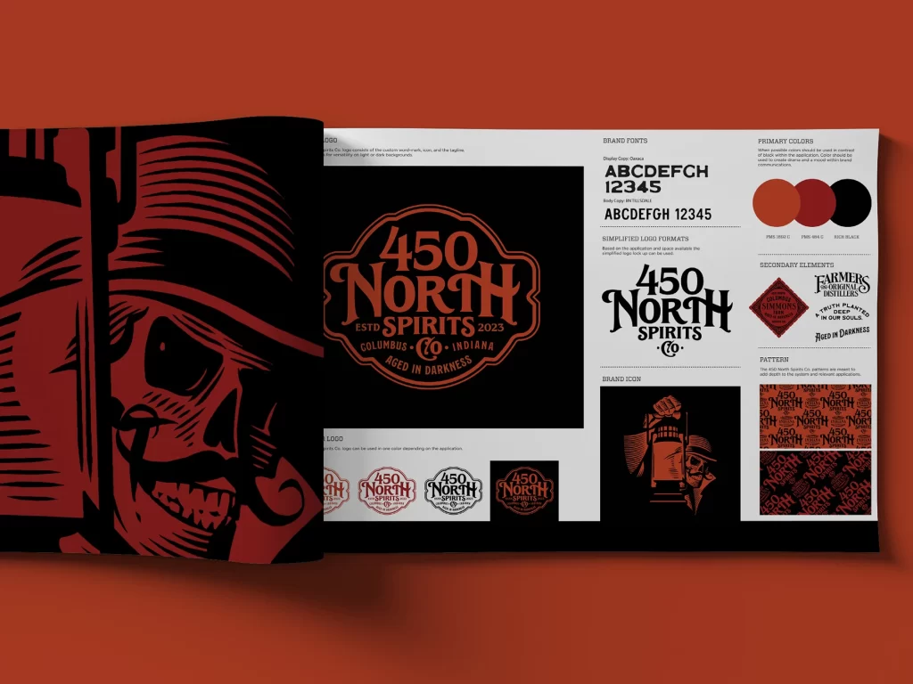
Against a deep terracotta backdrop, a brand identity board for 450 North Spirits Co. unfolds across a mock-open spread, revealing a striking palette of burnt orange, crimson red, and solid black. The left page features a bold, woodcut-style illustration of a skeletal figure in a fedora holding a lantern, while the right side systematically presents the primary badge with its ornate border and 'Aged in Darkness' tagline. Typography samples display both a heavy sans-serif and an elegant serif font, complemented by circular color swatches, a simplified wordmark, and repeating geometric patterns that fill the lower right quadrant.
What distinguishes this particular branding system is its masterful blend of vintage Americana and gothic undertones, creating a visual language that feels both nostalgic and rebellious. The intricate linework on the skull mascot contrasts sharply with the clean, modern layout of the style guide elements, demonstrating how illustrative complexity can coexist with systematic design constraints. By incorporating textural patterns alongside the core logo variations, the presentation offers a comprehensive look at how the brand's mysterious personality translates across different applications.
Art directors developing craft beverage packaging will find this layout particularly useful when establishing visual hierarchies for distillery brands that require a rugged, heritage-driven aesthetic. Freelance illustrators tasked with creating mascot systems can study the interplay between the detailed character art and the more restrained typographic lockups to understand balance in identity design. Marketing teams launching spirits in competitive markets might reference the color psychology and pattern usage here to build cohesive campaigns that feel established rather than startup-like.