4Rote Unspecified Label
Topics
Details
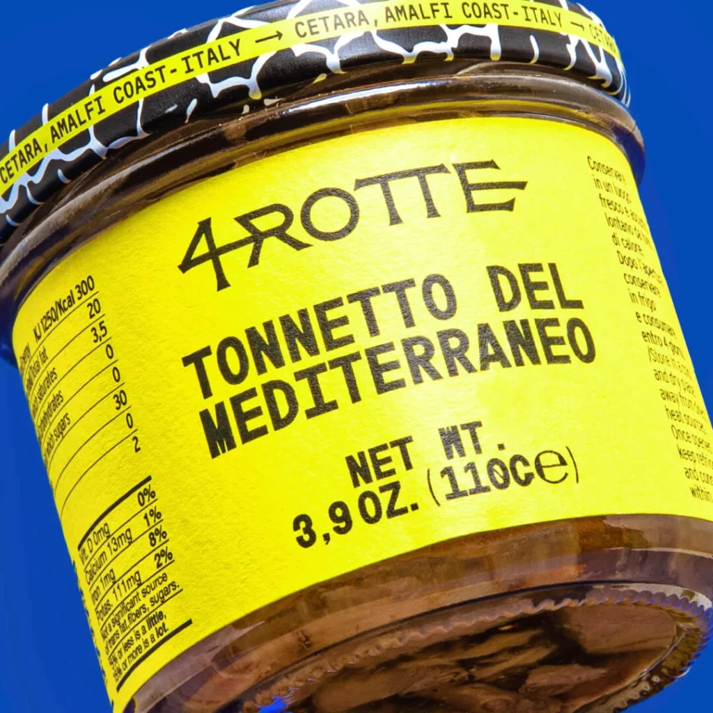
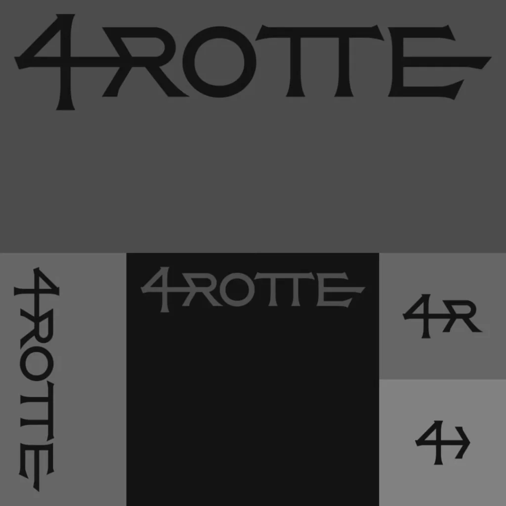
Dark charcoal and black fields form the backdrop for a typographic study featuring the word '4ROTTE' in a custom serif typeface. The composition divides into two zones: an upper area displays the full word in solid black against medium gray, while the lower section presents four variations arranged in a grid. These include a vertical left-aligned version, a centered iteration on pure black, an abbreviated '4R' monogram, and a minimalist arrow-like symbol combining the numeral with a directional stroke.
Visual distinction emerges from the letterforms' sharp terminals and the way the horizontal bar of the numeral four extends into the following characters, creating a sense of connected momentum. The contrast between the heavy weight of the primary text and the lighter gray rendering of the central variant demonstrates how the logo performs across different tonal backgrounds. Each quadrant explores a different aspect of the brand identity, from full textual presence to abstract symbolic reduction, revealing a cohesive yet flexible visual system.
Brand identity architects examining modular logo systems would find this arrangement useful for understanding scalability and orientation options. Motion designers planning animated sequences could reference the arrow variant for kinetic treatments or transition effects. Print production specialists needing to verify color separation values across dark substrates would consult this to ensure legibility at various scales and tonal densities.