4Rote Mediterranean Tuna Jar
Topics
Details
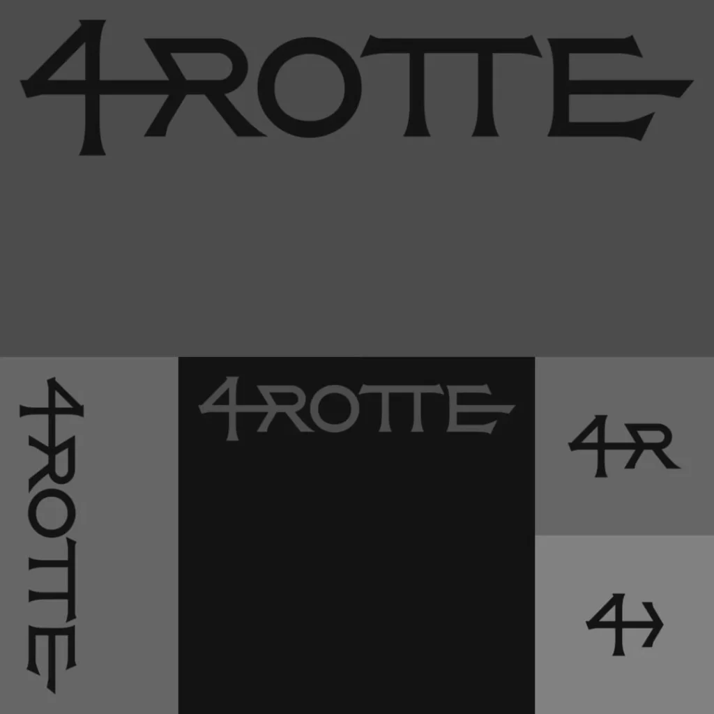
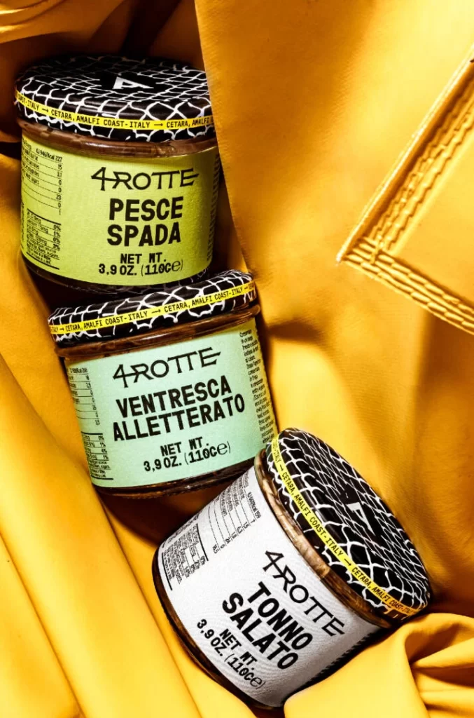
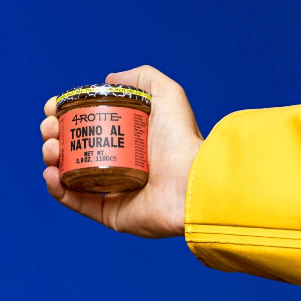
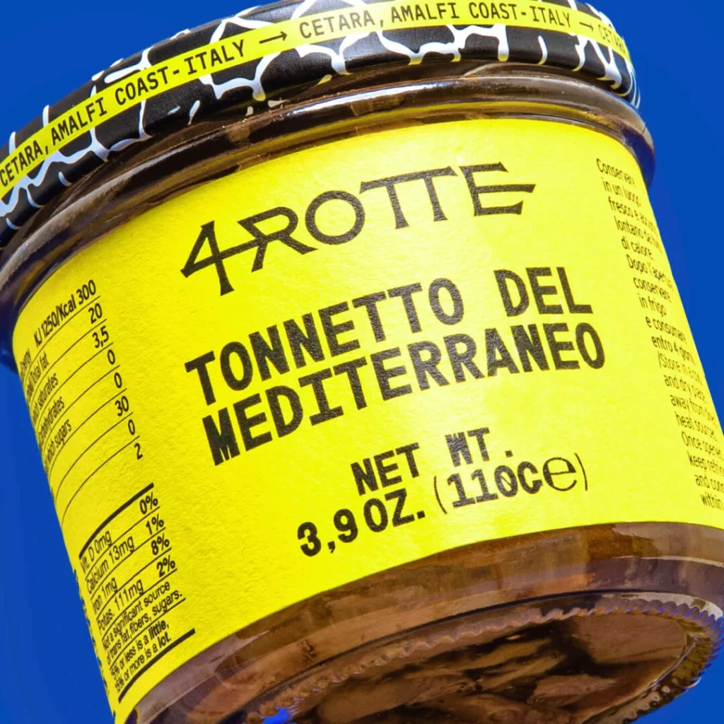
A cylindrical glass jar wrapped in a vibrant yellow label dominates the frame, its surface displaying bold black typography that reads '4ROTTE' and 'TONNETTO DEL MEDITERRANEO' above nutritional data and a 3.9 oz net weight. The container is sealed with a black lid featuring white abstract patterns and the text 'CETARA, AMALFI COAST-ITALY', while bright lighting illuminates the glossy label and reveals dark preserved tuna visible through the glass base, all captured from a slightly tilted angle against a solid blue background.
What sets this packaging apart is its aggressive use of high-contrast color blocking combined with raw, almost screen-printed typography that feels handmade rather than mass-produced. The choice to orient the nutritional information sideways creates a dynamic visual rhythm that breaks standard label conventions, while the textured yellow surface suggests a matte, tactile finish that absorbs light rather than reflecting it. This aesthetic balances industrial utility with artisanal charm, making the product feel both premium and authentically rustic.
Packaging designers studying bold typographic hierarchies will find the label’s layout particularly useful for understanding how to organize complex information without sacrificing visual impact. Brand strategists working on gourmet food products could reference this color palette when aiming for shelf presence that feels both traditional and contemporary. Illustrators needing to practice rendering glass transparency and metallic lid reflections under studio lighting conditions would benefit from analyzing how the light interacts with the curved surfaces and dark interior contents.