Rica Solid Light Tuna Can
Topics
Details
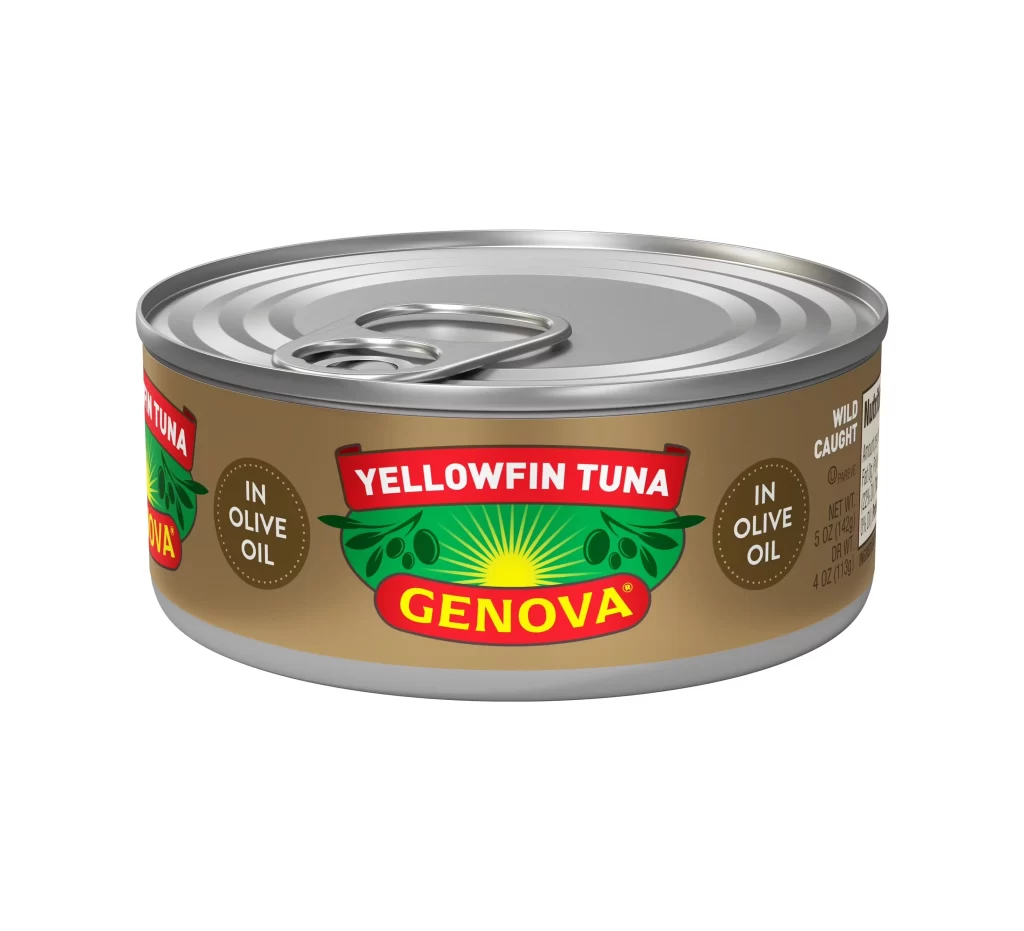
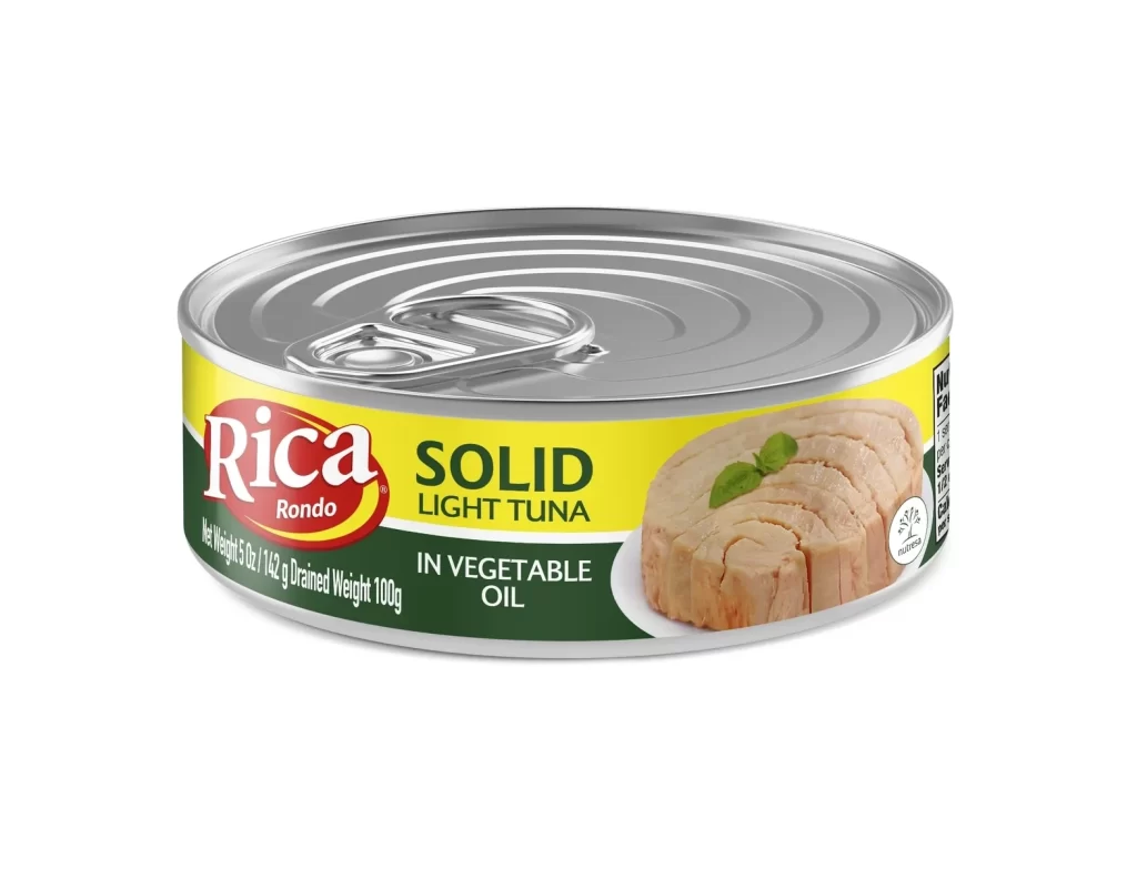
Centered within a seamless white void, a cylindrical metal can of Rica Rondo tuna presents itself with crisp studio lighting that highlights the concentric ridges on its silver pull-tab lid. The label wraps around the body in distinct horizontal bands, featuring a bright yellow upper section where the brand name appears in bold red serif lettering inside an oval. Below this, a deep forest green band contains the product description in clean white sans-serif text, while the right side displays a photographic illustration of solid light meat garnished with fresh basil leaves.
Visual interest arises from the high-contrast color blocking between the sunny yellow and rich green fields, creating immediate shelf-presence even in a digital context. The typography hierarchy skillfully guides the eye from the prominent red logo down to the specific product details, while the realistic food photography adds tactile appeal through visible texture and natural coloring. Such packaging demonstrates effective use of limited real estate to communicate weight information and nutritional data without cluttering the primary branding elements.
Product photographers studying commercial food styling will find value in analyzing how the lighting eliminates harsh shadows while maintaining metallic reflections on the lid surface. Packaging designers examining canned goods layouts can reference the balance between imagery and typographic elements when planning their own label compositions. Illustrators requiring accurate depictions of supermarket staples for editorial or advertising work benefit from observing the precise color values and spatial relationships present in this specimen.