Pasta Seafood Packaging Brown Yellow Red Green Purple
DownloadTopics
Details
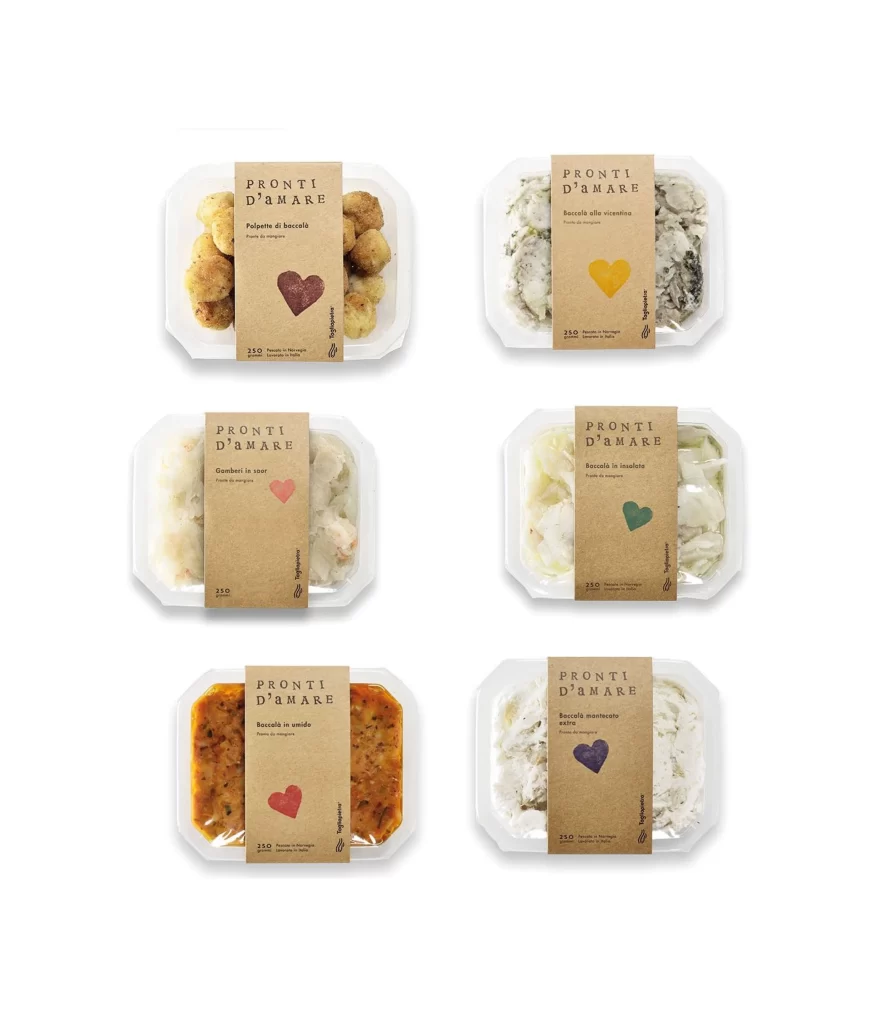
Six clear plastic food containers sit in a two-by-three grid, each wrapped with a kraft paper band bearing the brand name PRONTI D'AMARE in a clean serif typeface. The packaging features distinct heart-shaped icons in burgundy, golden yellow, coral pink, teal, crimson, and deep violet, corresponding to different seafood preparations visible through the transparent trays. Soft, even lighting illuminates the arrangement from directly above against a neutral white surface, revealing textural details of the breaded items, herb-flecked creams, and sauced dishes within.
The visual system relies on a consistent material palette of unbleached cardboard and translucent polymer, creating an artisanal yet modern aesthetic that feels both rustic and hygienic. Color-coded hearts provide immediate product differentiation while maintaining brand cohesion across the line, turning functional labeling into a playful graphic element. Designers studying this layout will appreciate how the earthy brown tones anchor the composition while allowing the vibrant accent colors to pop without overwhelming the natural food photography.
Packaging professionals developing ready-to-eat seafood lines could adapt this banded-label approach for retail or e-commerce presentations requiring clear product visibility. Brand identity teams working on Mediterranean or coastal food concepts might reference the typographic hierarchy and color-coding strategy for their own SKU systems. Anyone needing detailed visuals of sustainable food packaging can access the full-resolution file at no cost to examine print finishes and structural details closely.