Sea Tales Solid Light Skipjack Wild Tuna Can
DownloadTopics
Details
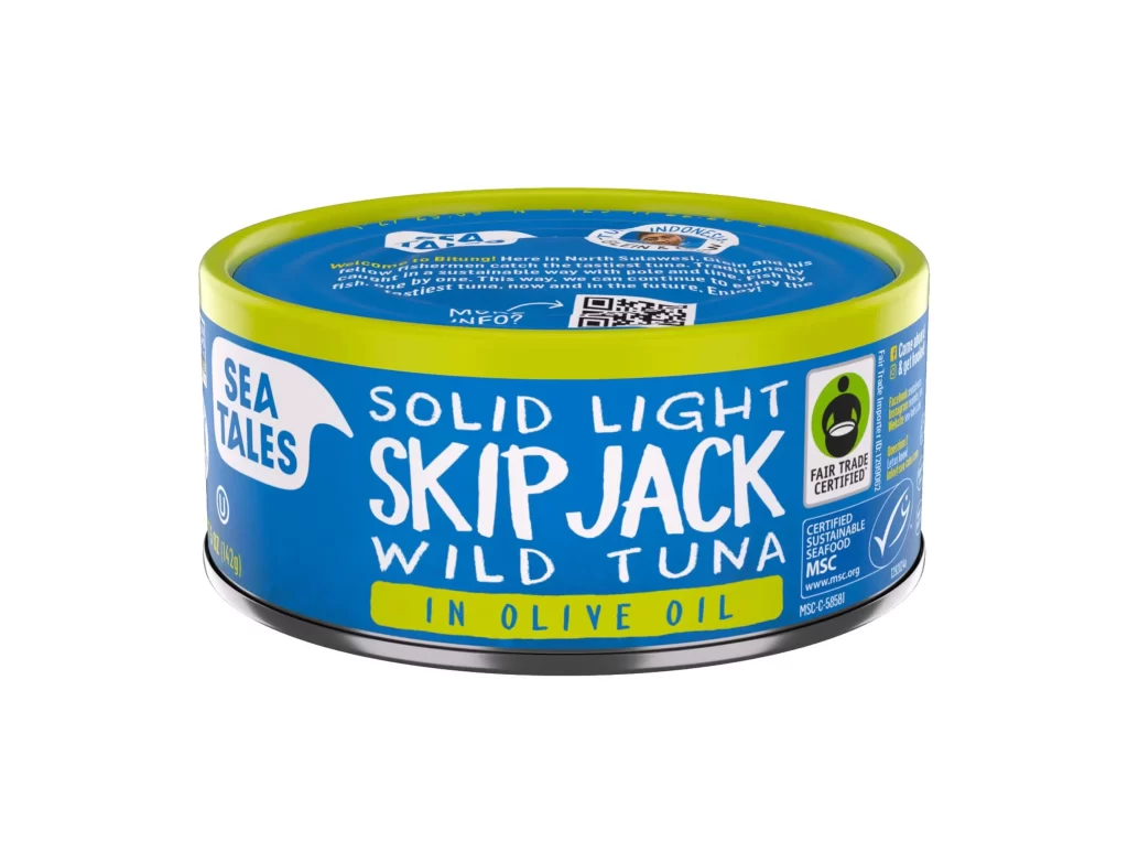
Vibrant blue and lime green packaging wraps around this metal tuna can, with bold white lettering announcing 'SOLID LIGHT SKIPJACK WILD TUNA' across the front. A bright yellow band highlights the 'IN OLIVE OIL' preparation, while certification logos for Fair Trade and sustainable seafood occupy the right side. The cylindrical container sits at a slight three-quarter angle under even studio lighting, revealing text on the lid that describes the product's Indonesian origins.
Vibrant color blocking between the electric yellow-green rim and saturated cyan-blue body creates immediate visual separation that draws attention to the product name area. The contrast between the playful, irregular letterforms of the product title and the clean geometric shapes of the certification badges establishes a clear visual hierarchy that balances artisanal branding with institutional trust signals. Designers studying packaging can grab the full-resolution file for free download to examine how these competing typographic styles coexist without cluttering the composition.
Packaging designers analyzing sustainable food branding would reference this image to study how fair-trade and environmental certifications integrate into premium seafood labeling without overwhelming the primary product identity. 3D artists requiring accurate material references for metallic cans with printed labels could use this shot to understand specular highlights on curved surfaces and how text wraps around cylindrical forms. Marketing teams developing eco-conscious product lines might examine the specific placement of origin stories and QR codes on the lid versus the main label face.