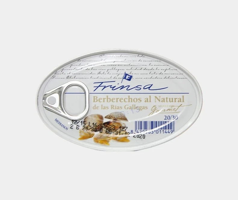
Frinsa Berberechos al Natural Can
Topics
Details
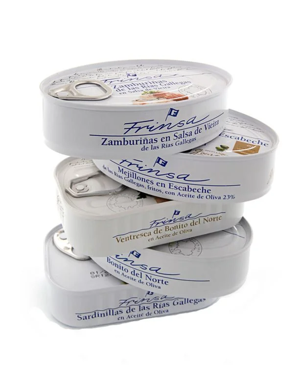
Against a sterile white backdrop, an oval tin of Frinsa Berberechos al Natural sits centered, its metallic surface reflecting soft, even light that eliminates harsh shadows. The container features a silver pull-tab on the left, while the label displays a sophisticated palette of deep navy script for the brand name and muted gold serif text identifying the contents as cockles from the Rias Gallegas. Faint cursive handwriting patterns the upper background behind the primary typography, and a small blue flag icon punctuates the brand signature above photographic images of the shellfish nestled at the bottom edge.
Visual hierarchy emerges through the deliberate contrast between the fluid, handwritten-style 'Frinsa' logo and the rigid, authoritative block lettering of the product description. The inclusion of handwritten script in the background layer adds a tactile, artisanal quality that distinguishes this gourmet packaging from standard industrial canned goods. Furthermore, the specific placement of the barcode and production codes alongside the 'Gourmet' designation creates a balanced composition that merges utilitarian data with premium branding elements.
Product photographers studying food packaging will find value in how this object demonstrates lighting techniques for reflective metal surfaces without losing legibility of printed text. Graphic designers analyzing typographic systems can examine the interplay between script and serif fonts within a constrained oval format. Additionally, 3D modelers requiring accurate texture maps for consumer goods might study the specific wear patterns on the pull-tab and the subtle gradients across the curved lid.