Frinsa Natural Protein Can
Topics
Details
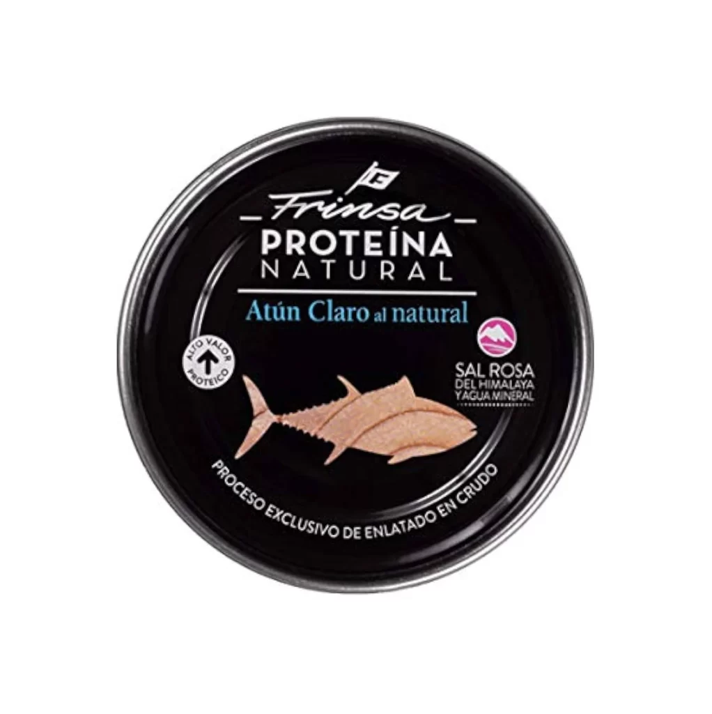
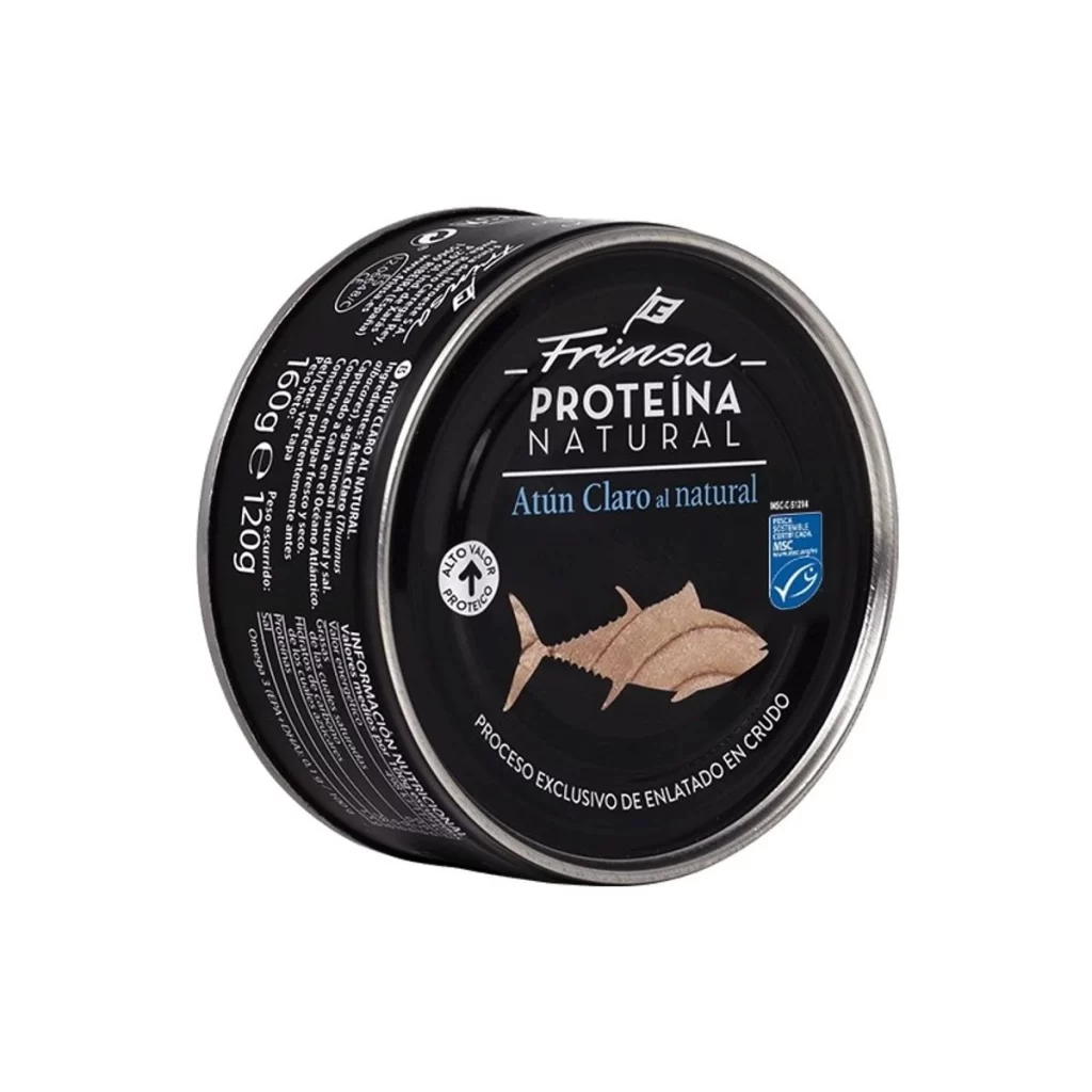
Presented at a slight three-quarter angle, this cylindrical metal can features a matte black label with crisp white and light blue typography. The silver rim catches the studio lighting, highlighting the round form of the container, which sits isolated on a pure white background. Visible text includes the brand name 'Frinsa' in a flowing script above the bold sans-serif 'PROTEÍNA NATURAL', while an illustration of a pale tuna fish anchors the lower center of the design.
Dark packaging creates a sophisticated contrast against the metallic silver edge, making the product feel premium rather than utilitarian. The combination of elegant cursive lettering for the brand name alongside clean, modern type for the product category establishes a clear visual hierarchy that guides the eye downward. A small blue MSC certification badge adds a subtle pop of color that breaks up the monochrome palette without overwhelming the minimalist aesthetic.
Packaging designers studying premium food branding will find the typographic pairing particularly useful for understanding how script fonts interact with geometric sans-serifs. Illustrators working on realistic fish depictions can examine how the tuna graphic is simplified yet recognizable within a constrained circular layout. Anyone developing labeling systems for health-focused products might reference how nutritional claims like 'Alto Valor Proteico' are integrated into the overall composition without cluttering the primary messaging.