Frinsa Natural Protein Can View
Topics
Details
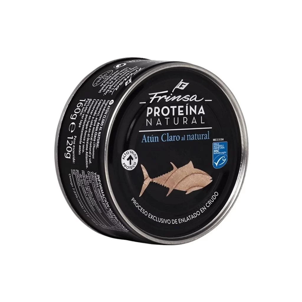
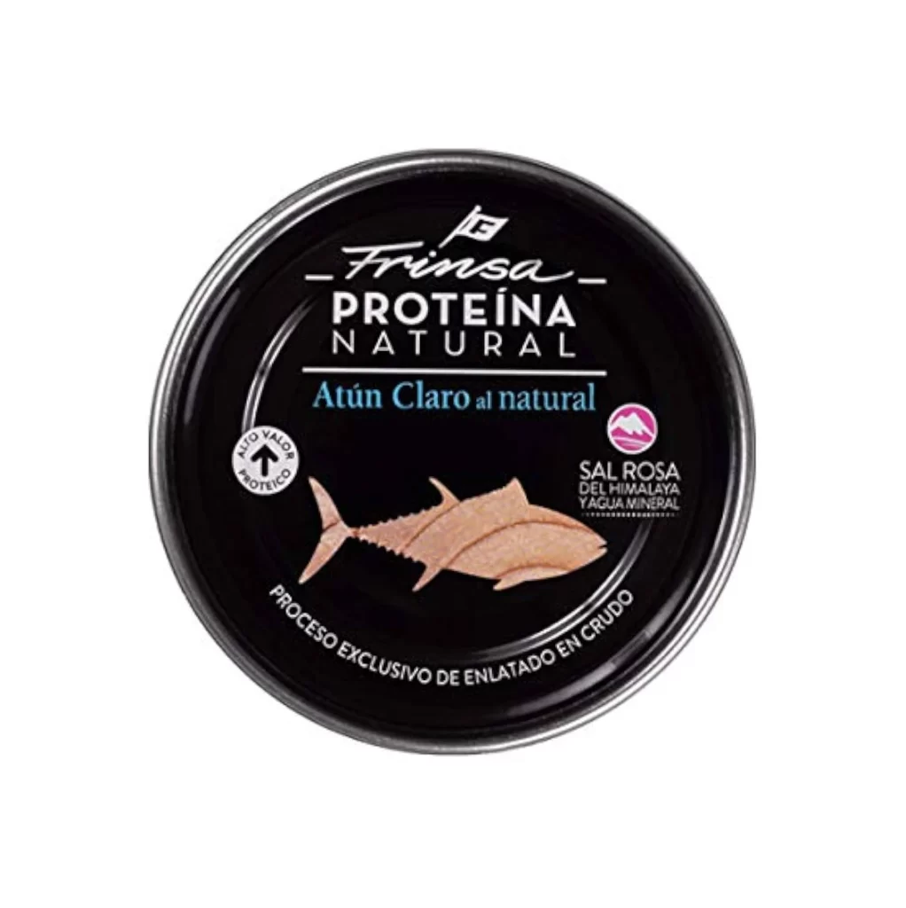
Centered within a seamless white void, a circular black tin presents its lid as the sole focal point, captured from a direct overhead perspective that eliminates all shadow and distortion. The matte black surface serves as a dramatic canvas for crisp white typography, including the stylized 'Frinsa' script logo positioned above the bold sans-serif 'PROTEÍNA NATURAL' lettering. Below this header, vibrant cyan text announces 'Atún Claro al natural' while a realistic illustration of raw tuna flesh occupies the lower center, flanked by certification badges indicating 'ALTO VALOR PROTEICO' and 'SAL ROSA DEL HIMALAYA Y AGUA MINERAL'.
Visual hierarchy emerges through the strategic contrast between the deep obsidian background and the varied typographic weights, where the elegant cursive brand mark immediately draws the eye before guiding it downward to the product specifics. The inclusion of an anatomically detailed fish illustration adds organic texture that breaks up the geometric rigidity of the circular container, while the magenta Himalayan salt icon introduces a singular pop of unexpected color. Such careful calibration of negative space against dense informational elements creates a premium aesthetic that balances clinical precision with artisanal appeal.
Packaging designers examining canned seafood branding will find this composition particularly useful for studying how monochromatic schemes can be effectively disrupted by selective color accents. Food photographers might reference the lighting setup to understand how to eliminate reflective glare on metallic surfaces while maintaining legibility of fine print details. Marketing teams developing health-focused product lines could analyze the spatial arrangement to determine optimal placement for nutritional claims and origin certifications on circular packaging formats.