Genova Yellowfin Tuna Can
DownloadTopics
Details
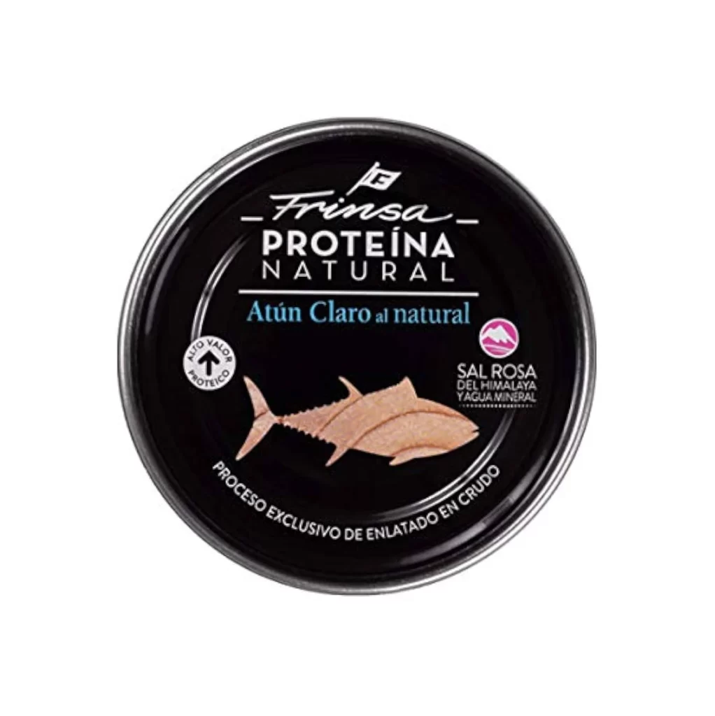
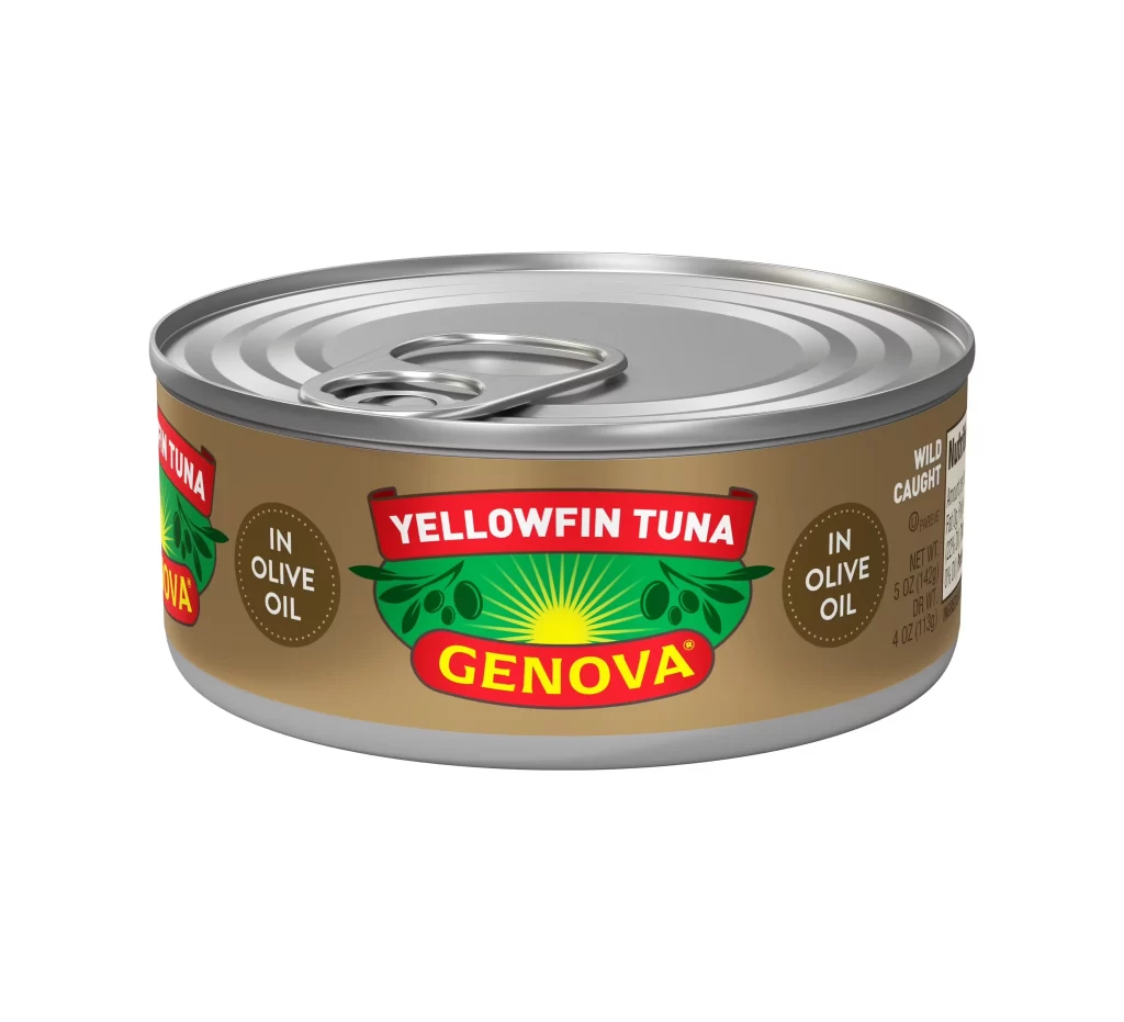
Centered within a seamless white void, a cylindrical metal can of Genova Yellowfin Tuna presents itself from a slightly elevated three-quarter perspective. The container features a silver, ridged pull-tab lid resting atop a tan label dominated by bold red and green graphic elements. White sans-serif typography announces the product name above the brand's signature sunburst logo, while circular callouts on either side specify that the fish is packed in olive oil.
Visual hierarchy is established through the stark contrast between the earthy brown background of the wrapper and the saturated primary colors of the central branding. The symmetrical layout balances the prominent red banners against organic green leaf motifs, creating a cohesive look typical of mid-century commercial packaging. Designers can access the full-resolution file for free to study these specific color interactions and typographic choices.
Product photographers might utilize this asset to understand standard lighting setups for reflective metallic surfaces and curved labels. 3D texture artists could employ the image as a base for creating realistic canned goods in digital environments. Marketing teams reviewing vintage branding strategies would find the composition useful for analyzing how traditional food packaging conveys quality through specific visual cues.