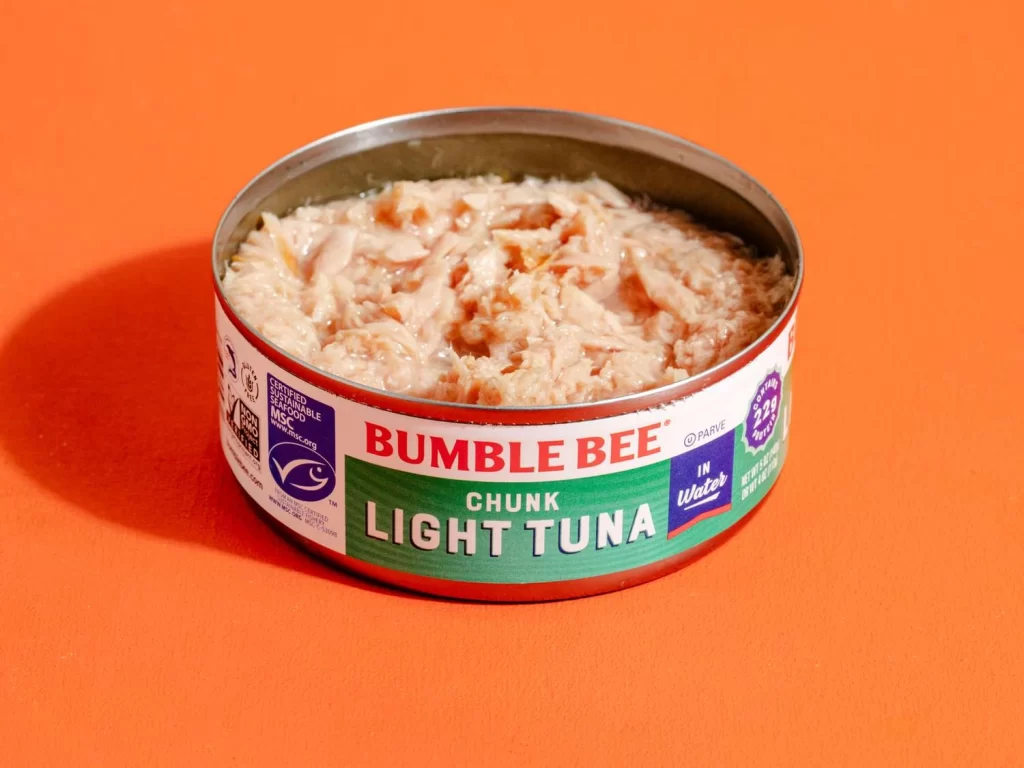
Bumble Bee Chunk Light Tuna Can
Topics
Details
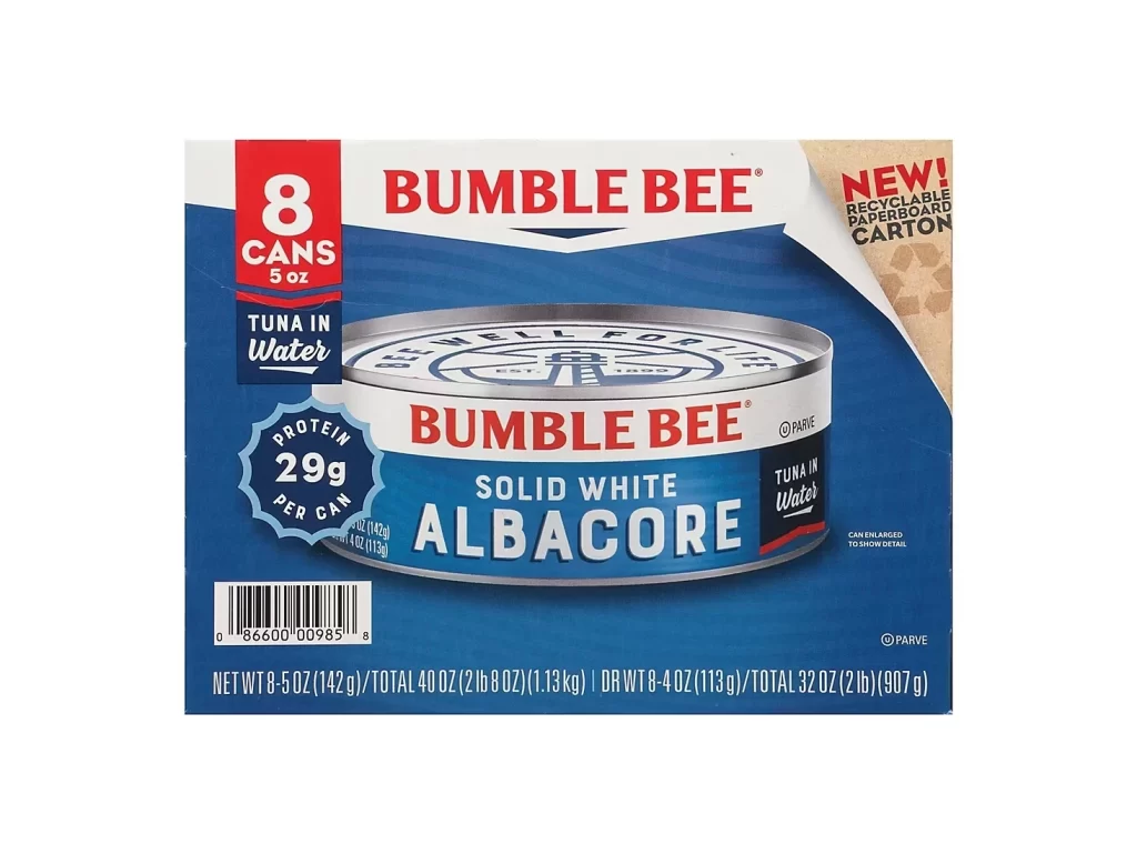
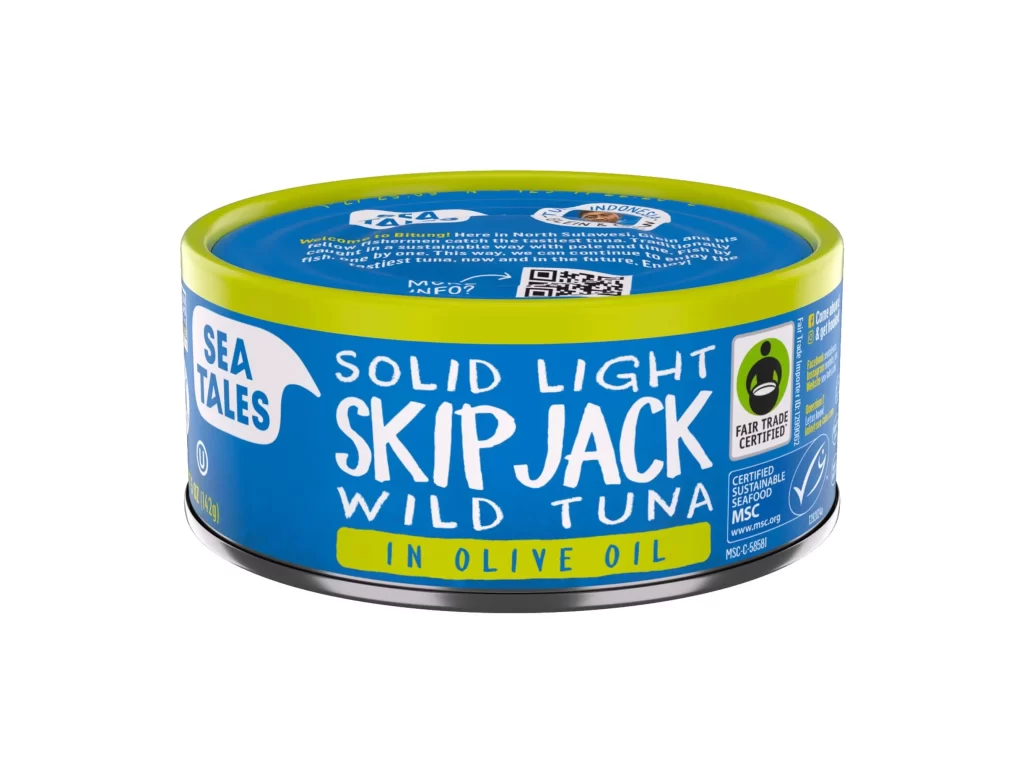
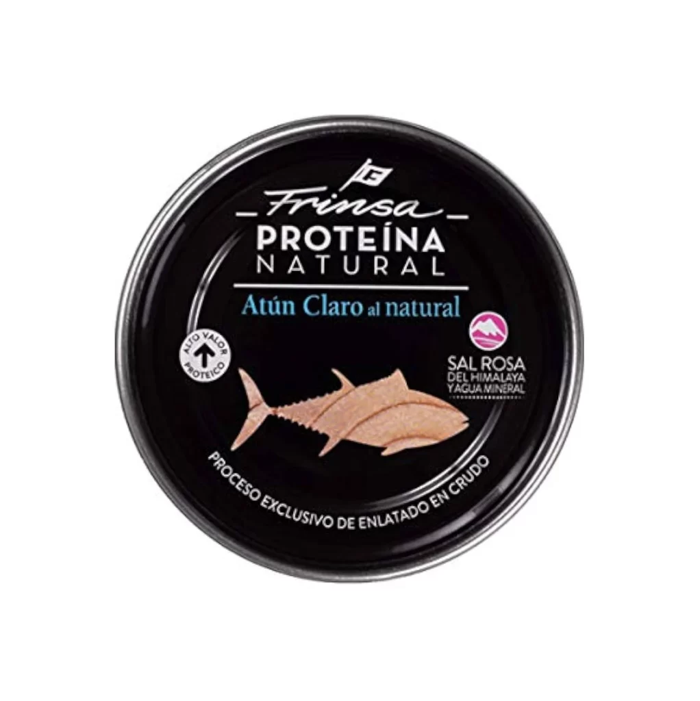
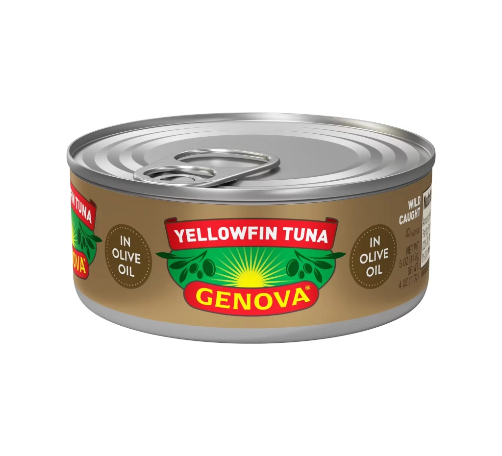
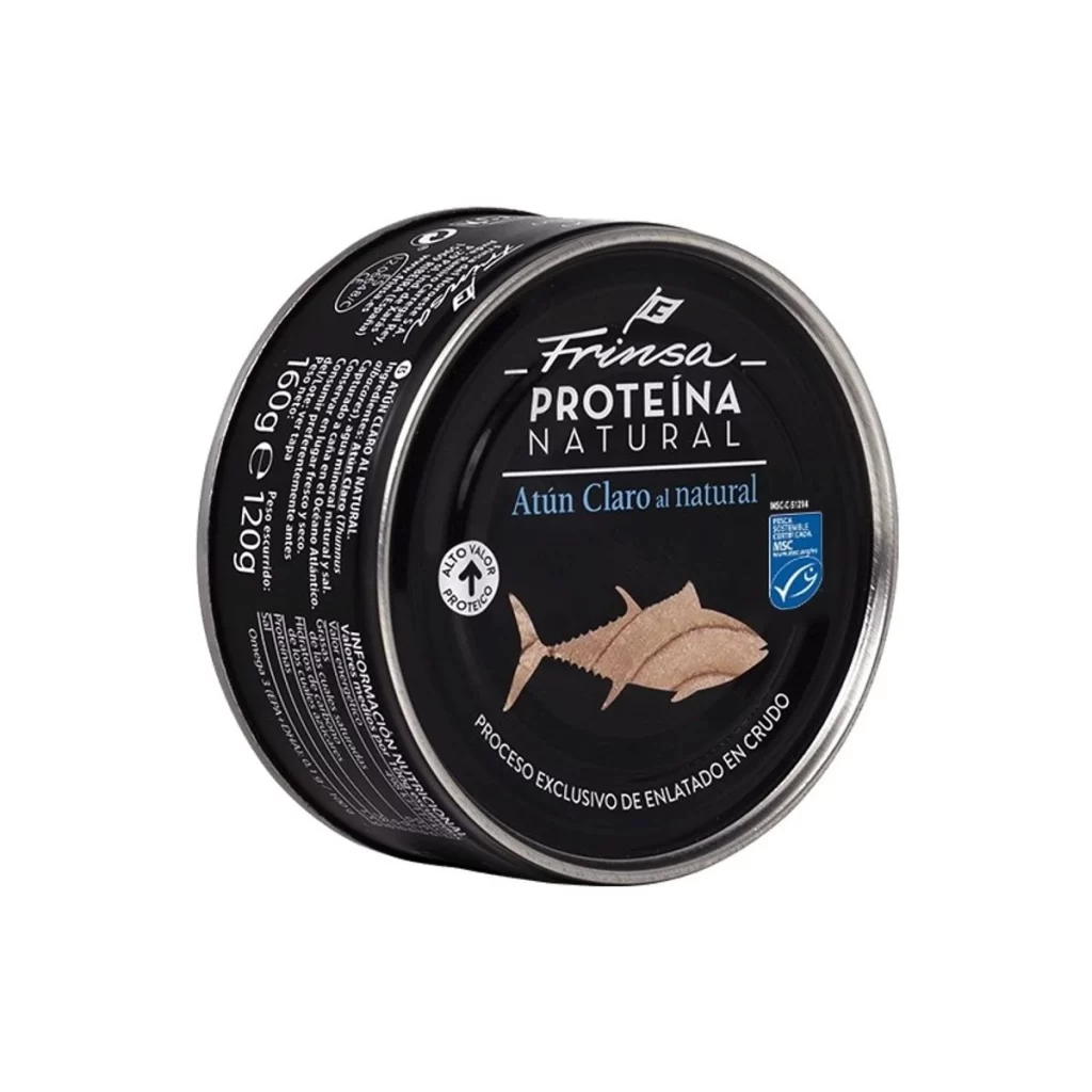
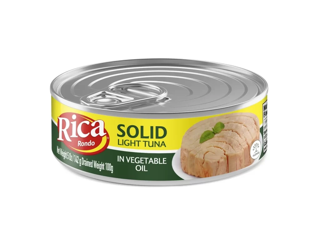
An open cylindrical metal can of Bumble Bee Chunk Light Tuna in water sits on a vibrant orange surface, its contents revealing pale, flaky fish packed tightly inside. The label wraps around the tin with bold red lettering for the brand name above a green band displaying the product type in white text, while blue certification badges and nutritional information appear along the left and right edges. Soft directional lighting from the upper left casts a gentle shadow to the right, highlighting the metallic rim and the moist texture of the tuna chunks within.
Visual distinction emerges from the high-contrast color blocking between the crimson, emerald, and navy label elements against the neutral silver rim and organic pinkish-white tuna texture. The composition emphasizes the product’s physical state—moist, flaky, and densely packed—while the MSC certification logo and nutritional callouts provide additional graphic details for those studying packaging typography or food photography lighting techniques. This particular presentation highlights the interplay between industrial metal surfaces and raw protein textures.
Food photographers might study this shot to understand how to style canned seafood without artificial enhancement, noting how the natural sheen of the packed-in-water variety creates visual interest. Packaging designers could reference the label hierarchy and color coding when developing their own canned goods branding systems. Illustrators working on realistic still-life compositions would find value in observing the way light interacts with both the reflective tin edges and the matte, irregular surface of the chunked fish.