4rotte Tuna Jar
Topics
Details
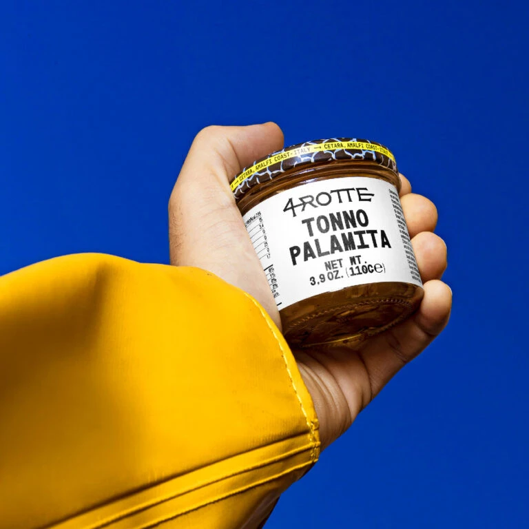
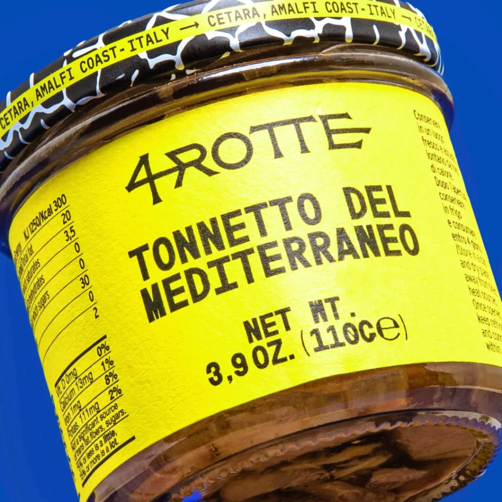
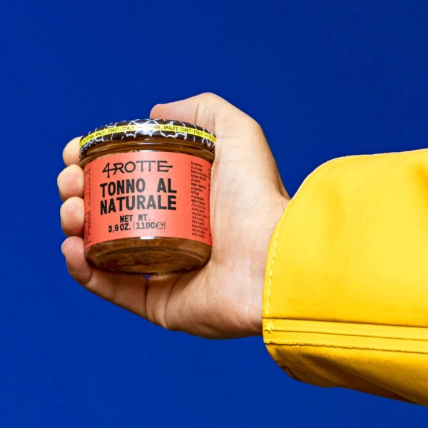
Against a deep, saturated blue backdrop, a hand emerges from a bright yellow sleeve to grip a small glass jar of 4rotte Tonna al Naturale. The container features a bold salmon-pink label with black typography, topped by a metal lid decorated with yellow and black hazard-style stripes. Natural light catches the curvature of the glass and the texture of the skin, while the camera maintains a straight-on perspective that emphasizes the product's compact cylindrical form.
Visual tension arises from the unexpected pairing of industrial warning aesthetics on the lid with the clean, minimalist branding of the main label. That vivid yellow sleeve creates a powerful complementary contrast against the blue background, drawing immediate focus to the human element holding the product. Such deliberate color blocking transforms an ordinary food container into a striking study of how packaging can command attention through simple yet bold graphic choices.
Product photographers might study this composition to understand how wardrobe colors can enhance or clash with background tones in commercial shoots. Branding specialists could analyze the label hierarchy and typography placement when developing their own packaging systems. Anyone working on e-commerce visuals would benefit from noting how the hand positioning suggests scale without obscuring critical product information.