4rotte Tomatoe Can
Topics
Details
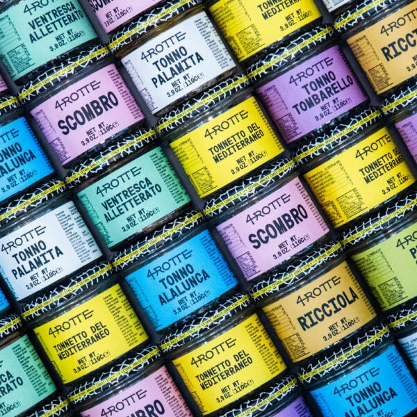
Arranged in a tight, diagonal grid that fills the frame from corner to corner, these cylindrical tins display a kaleidoscope of pastel labels—mint green, lavender, powder blue, canary yellow, and peach—each wrapped around dark metal bodies with distinctive black-and-yellow striped bands at the rims. Bold sans-serif typography dominates every surface, featuring Italian seafood varieties like Scombro, Tonno Palamita, Tonno Allunca, and Ricciola alongside the recurring brand name 4ROTTE and net weight specifications of 9.02oz (110g). Shot from a direct overhead perspective under even, shadowless lighting, the composition creates a rhythmic pattern where the slight variations in label alignment add an organic quality to the otherwise geometric arrangement.
What distinguishes this particular packaging system is its deliberate rejection of traditional maritime color palettes in favor of a soft, almost confectionery spectrum that feels unexpectedly contemporary for preserved fish products. The high-contrast interplay between the muted background hues and the stark black lettering ensures legibility while the consistent typographic hierarchy—brand name above product type above weight—maintains visual order across the diverse color options. Those graphic zigzag stripes serve as a unifying industrial element that bridges the gap between artisanal food branding and modernist design language.
Brand strategists developing premium grocery lines could study this grid to understand how color coding aids consumer navigation across product variants without sacrificing shelf cohesion. Packaging designers tasked with updating heritage food brands might reference the way these tins balance playful aesthetics with clear information architecture. Even illustrators seeking authentic surface textures for still life compositions would find value in observing how light interacts with the glossy label finishes against the matte metal containers.