4Rotta Tonno Alalunca Jar
Topics
Details
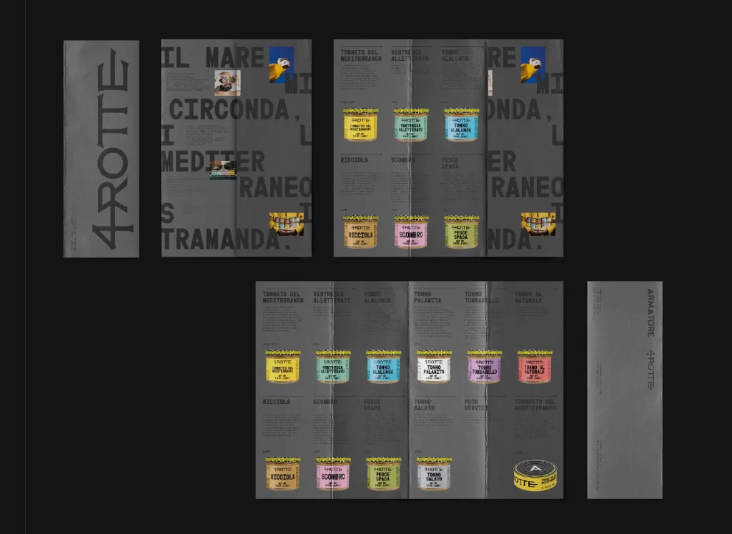
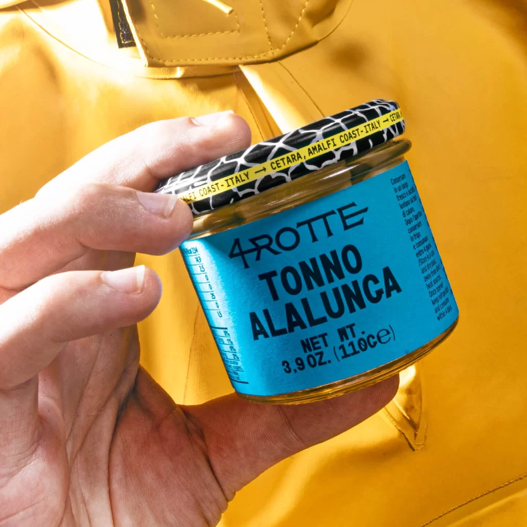
Against a saturated mustard-yellow fabric backdrop, a hand grips a glass jar of 4Rotta Tonno Alalunca, tilting it toward the viewer at a slight three-quarter angle. The container features a vibrant cyan-blue label with bold, black sans-serif typography announcing the brand and product name, while the lid displays a striking black-and-white organic pattern reminiscent of cellular structures or animal print. Natural light catches the curved glass surface and the subject's fingers, creating subtle highlights that emphasize the physical texture of both the packaging and the human element in the composition.
Visual tension emerges from the deliberate clash between the electric blue label and the warm golden background, creating a complementary color scheme that demands attention. The typographic hierarchy on the label demonstrates confident use of scale and weight, with the product name dominating the central field while nutritional information and origin details—specifically mentioning Cetara on the Amalfi Coast—occupy secondary positions. That patterned lid introduces an unexpected textural contrast to the otherwise smooth cylindrical form, suggesting a brand identity that balances traditional Italian craftsmanship with contemporary graphic sensibilities.
Product photographers studying food packaging will find this composition particularly useful for understanding how human interaction with containers adds scale and relatability to commercial shots. Brand designers analyzing premium seafood labeling can examine how color blocking and font selection communicate regional authenticity and quality positioning. Art directors planning lifestyle campaigns might reference this image when conceptualizing ways to integrate apparel textures with gourmet food products in a single cohesive frame.