4Rotta Tomato Sauce Jar
Topics
Details
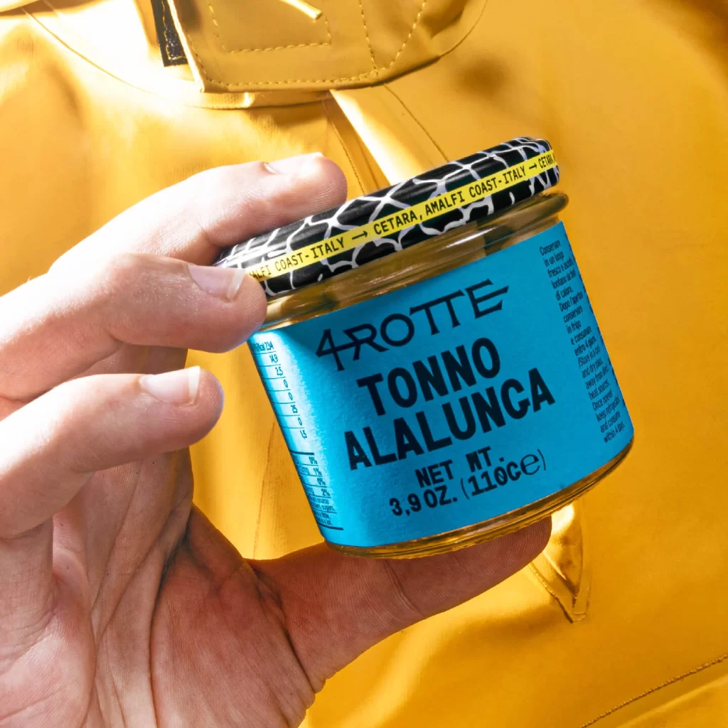
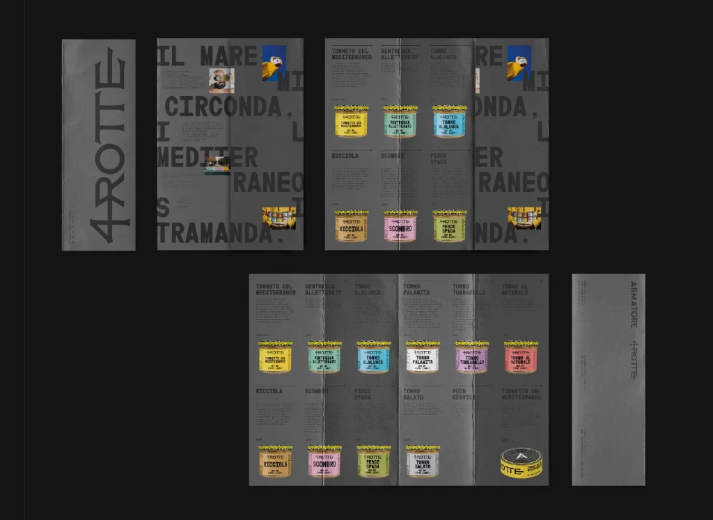
Charcoal gray panels display the 4Rotta brand identity through bold sans-serif typography and vibrant product photography. The layout features multiple fold-out spreads showcasing colorful tomato sauce jars in yellow, turquoise, pink, and green, each labeled with Italian varieties like Tonno del Mediterraneo and Ventresca All'Arrabbiata. Matte paper textures contrast with glossy jar imagery, while vertical orientation emphasizes the elongated format of this culinary brochure design.
Visual hierarchy is established through the dramatic contrast between the monochromatic background and the saturated product photography, creating a modern editorial aesthetic. The deliberate use of negative space around the text blocks allows the colorful jars to dominate the viewer’s attention, while the consistent vertical orientation of the brand name ‘4ROTTE’ on the outer panels reinforces structural cohesion. This particular arrangement balances informational density with breathable margins, making complex product categorization feel accessible rather than cluttered.
Brand strategists developing premium food packaging systems will find this layout particularly useful for understanding how to organize extensive SKU ranges within limited print real estate. Print production teams can reference the specific color separations and fold-line placements when planning similar multi-panel brochures for gourmet conservas or specialty pantry items. Art directors tasked with creating cohesive visual identities for Mediterranean culinary brands might study the interplay between typographic scale and photographic elements to achieve comparable sophistication in their own collateral.