Knorr Pasta Side Pouch View
Topics
Details
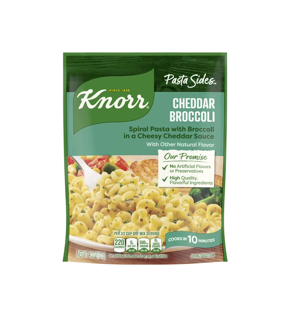
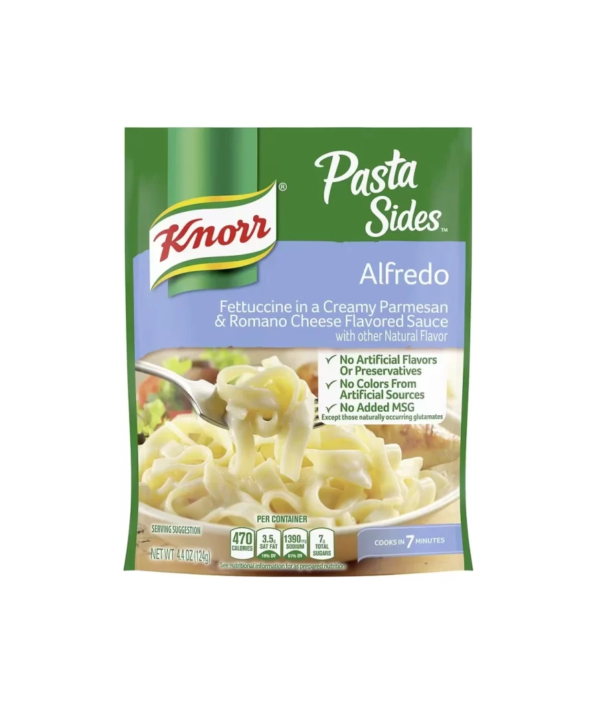
A rectangular green and blue pouch dominates the frame, featuring the Knorr logo in red script against a white oval with yellow-green borders. The upper half displays 'Pasta Sides' in white cursive above the bold white text 'Alfredo,' while a central photographic window reveals pale fettuccine noodles coated in creamy sauce, lifted by a silver fork. Nutritional data appears in small boxes at the bottom alongside a blue badge indicating a seven-minute cook time, all set against a stark white background with even frontal lighting.
Visual hierarchy relies on the contrast between deep forest green headers and periwinkle blue product description zones, creating clear segmentation between brand identity and flavor specifics. The checkmark list format for additive-free claims provides scannable trust signals without cluttering the primary food photography. Typography shifts from elegant script for the category name to utilitarian sans-serif for nutritional facts, balancing appetite appeal with regulatory information.
Packaging analysts might examine this composition to study how CPG brands allocate real estate between imagery and mandatory labeling requirements. Food photographers could reference the fork-lift technique for demonstrating sauce viscosity and noodle texture in static shots. Brand managers reviewing competitive sets would note the specific color palette choices that distinguish Alfredo variants from other flavors within the same product line.