Knorr Bolognese Can
Topics
Details
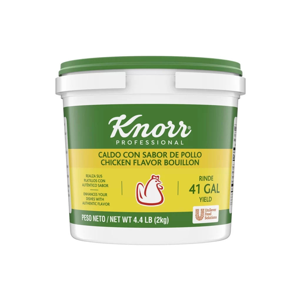
Knorr Italian-Style Beef Flavored Bolognese appears on a dark forest green cylindrical cup with a white plastic rim, featuring the brand's white script logo inside a bright green leaf-shaped badge at upper left, a bold red oval containing the product name in white sans-serif type at center right, and a large circular photograph of ribbon pasta in reddish-brown sauce dominating the lower half, accented by small illustrations of a red tomato and orange carrot slices against the matte green background under even studio lighting.
Visual hierarchy plays a crucial role here, as the deep green base creates sophisticated contrast against both the vibrant red flavor callout and the appetizing pasta photography. The combination of organic shapes—the leaf logo, oval text container, and round product image—softens the industrial cup form, while the strategic placement of raw vegetables reinforces the dish’s authenticity. This particular execution balances corporate branding with home-cooked appeal through its careful color blocking and typographic weight distribution.
Food photographers might study this composition to understand how studio lighting enhances sauce texture without creating harsh reflections on glossy packaging surfaces. Packaging designers could analyze the spatial relationships between logo placement and appetite appeal elements when developing their own ready-meal concepts. Marketing teams reviewing competitive positioning would benefit from examining how color psychology—green for trust, red for appetite stimulation—works together within this constrained cylindrical canvas.