Knorr Chicken Flavor Bouillon Powder Can Design
Topics
Details
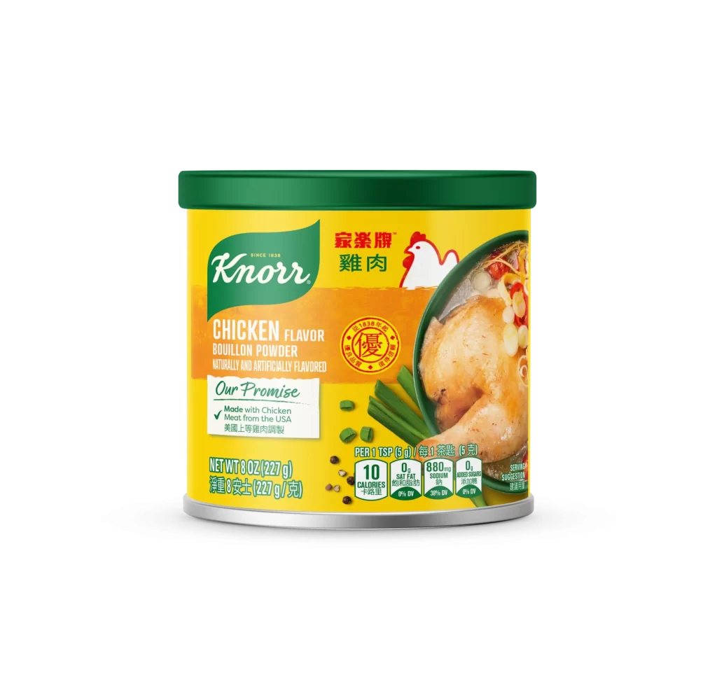
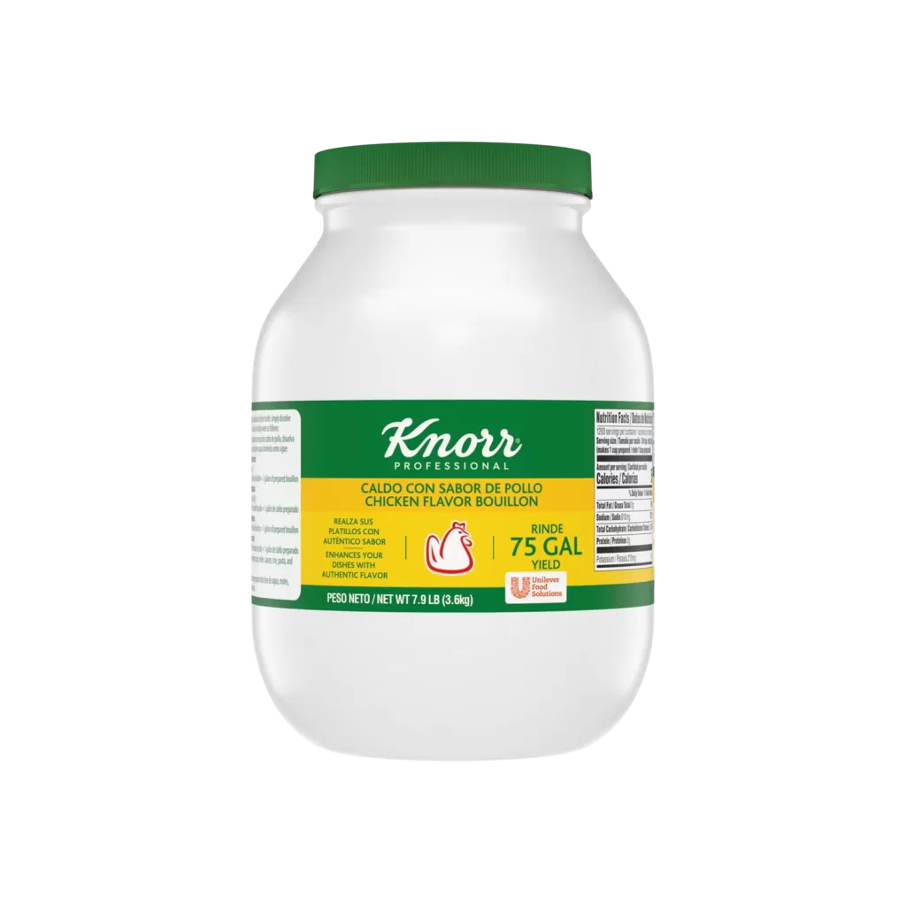
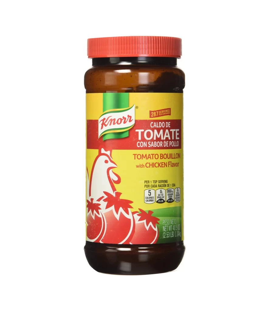
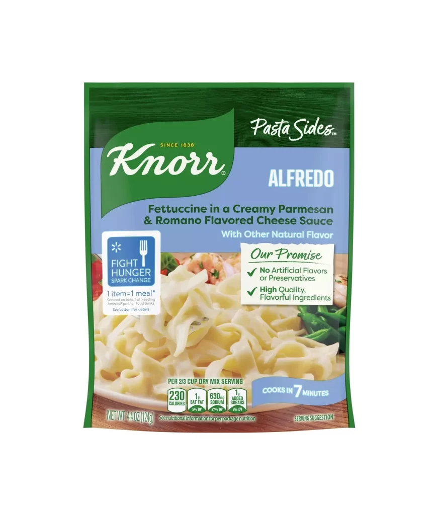
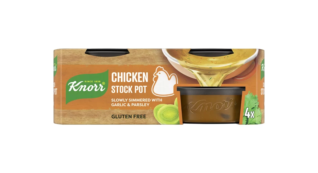
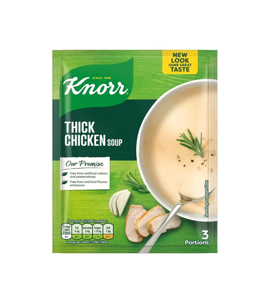
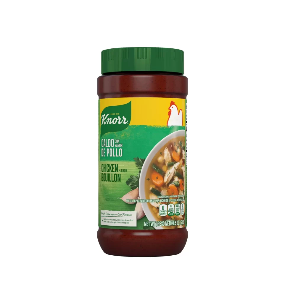
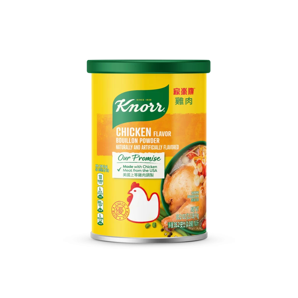
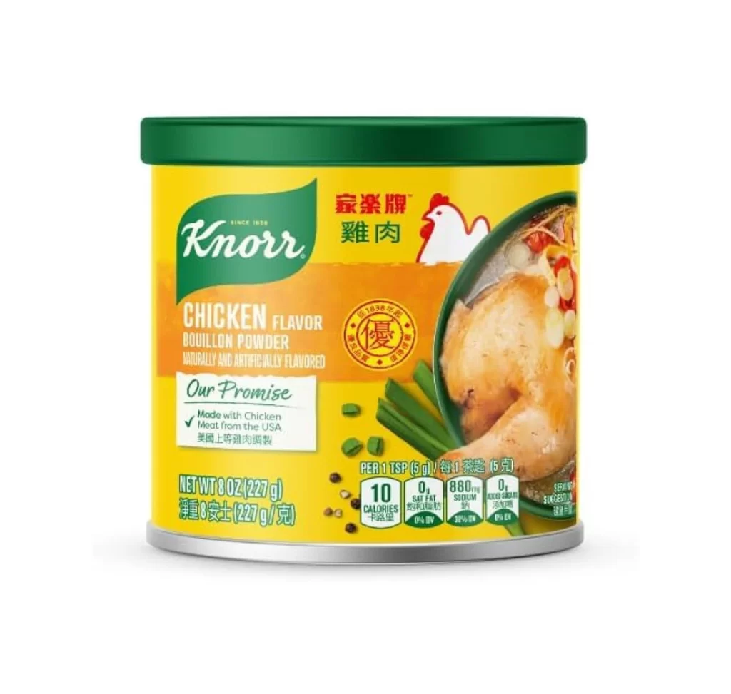
A cylindrical metal container dominates the frame, capped with a deep forest green lid that contrasts sharply against a vibrant, saturated yellow body. The composition centers the product against a sterile white void, utilizing soft, diffused studio lighting that eliminates harsh shadows and emphasizes the glossy finish of the packaging. Visible text includes the iconic green Knorr logo alongside red Chinese characters for chicken meat, while the right side features a high-resolution photographic inset of a roasted poultry leg nestled among green onions and chili peppers.
Visual hierarchy is established through a strategic layering of typographic styles and color zones, transitioning from the brand-heavy green header into an orange informational band before settling into the nutritional data field. The inclusion of bilingual labeling—specifically the prominent red seal containing traditional Chinese script—signals a targeted demographic approach that distinguishes this variant from standard Western market versions. Furthermore, the juxtaposition of the realistic food photography against the flat, graphic background colors creates a tactile appeal designed to trigger sensory associations with home cooking.
Packaging analysts and brand strategists might examine this artifact to understand how multinational corporations adapt visual identities for specific ethnic demographics without losing core brand recognition. Industrial designers could utilize the color palette and spatial arrangement as a case study in balancing regulatory nutritional information with appetizing imagery. Additionally, marketing teams focused on cross-cultural product launches would find value in dissecting how the layout accommodates multiple languages while maintaining a clean, uncluttered aesthetic.