Knorr Tomato Bouillon with Chicken Flavor Jar View
Topics
Details
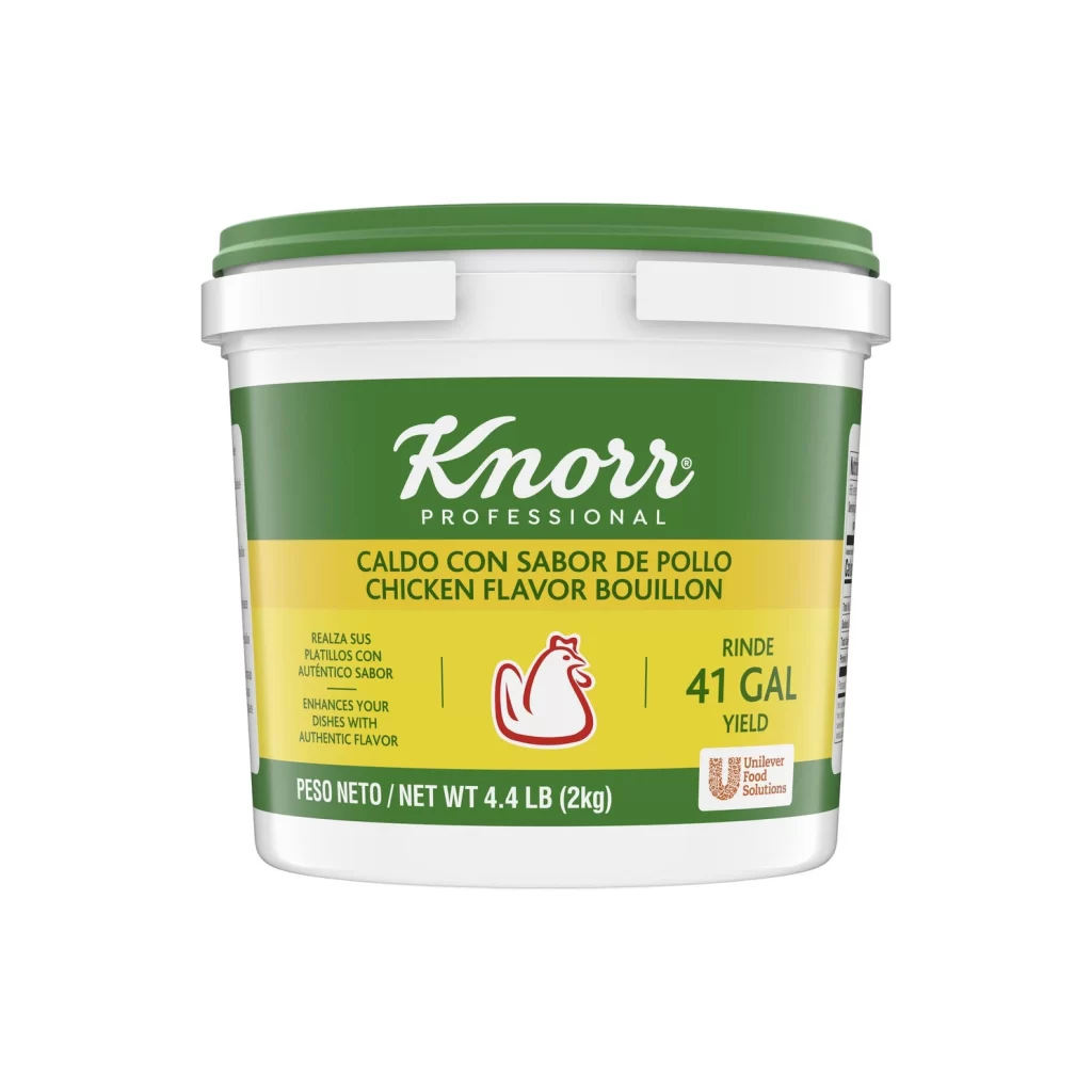
Centered in the frame, a dark brown plastic jar of Knorr Tomato Bouillon with Chicken Flavor stands capped by a bright red ribbed lid. The label wraps the container with a vivid palette: a yellow upper band holds the green Knorr logo and a white chicken silhouette, while a red middle section displays 'CALDO DE TOMATE CON SABOR DE POLLO' in bold magenta lettering. Below this, a green field contains the English product name alongside a circular inset photograph showing a finished rice dish mixed with vegetables. The entire object is isolated on a pure white background under even studio lighting that eliminates shadows.
Visual interest here stems from the bilingual packaging layout and the specific color blocking used to separate language regions. The contrast between the deep maroon jar body and the saturated primary colors of the label creates strong shelf presence, while the inclusion of a prepared food image provides immediate context for the bouillon's application. Typography varies significantly across the design, mixing the classic Knorr script with heavy sans-serif headers and smaller nutritional text along the right edge.
Packaging designers studying condiment or spice container aesthetics would find this useful for analyzing how international brands balance multiple languages within limited label real estate. Food photographers might reference the lighting setup and composition when planning similar product shots requiring clean isolation. Illustrators working on grocery store scenes could utilize the specific proportions and color values to accurately render pantry items without relying on generic placeholders.