Pasta Knorr Green Yellow Red
DownloadTopics
Details
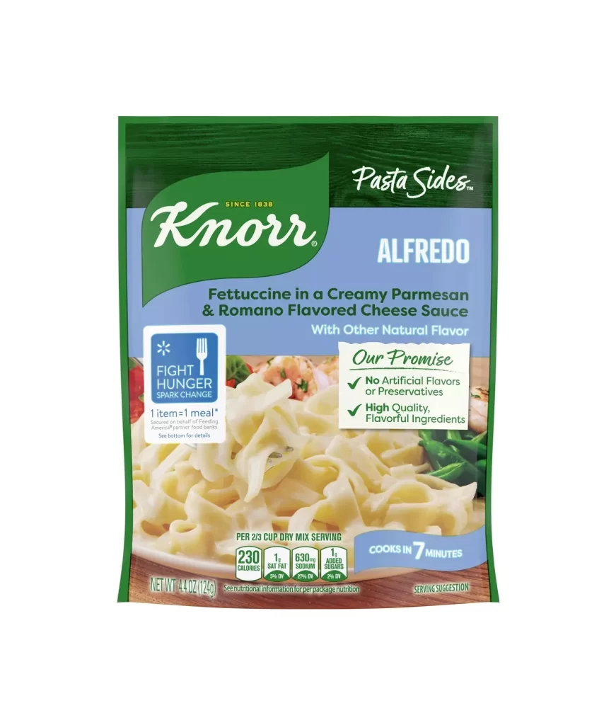
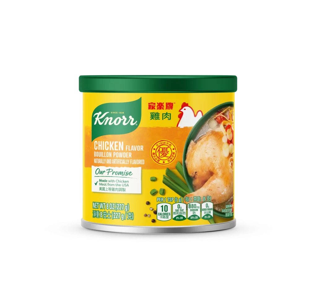
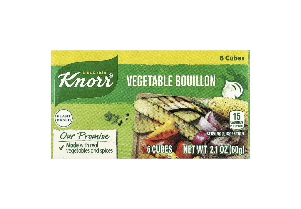
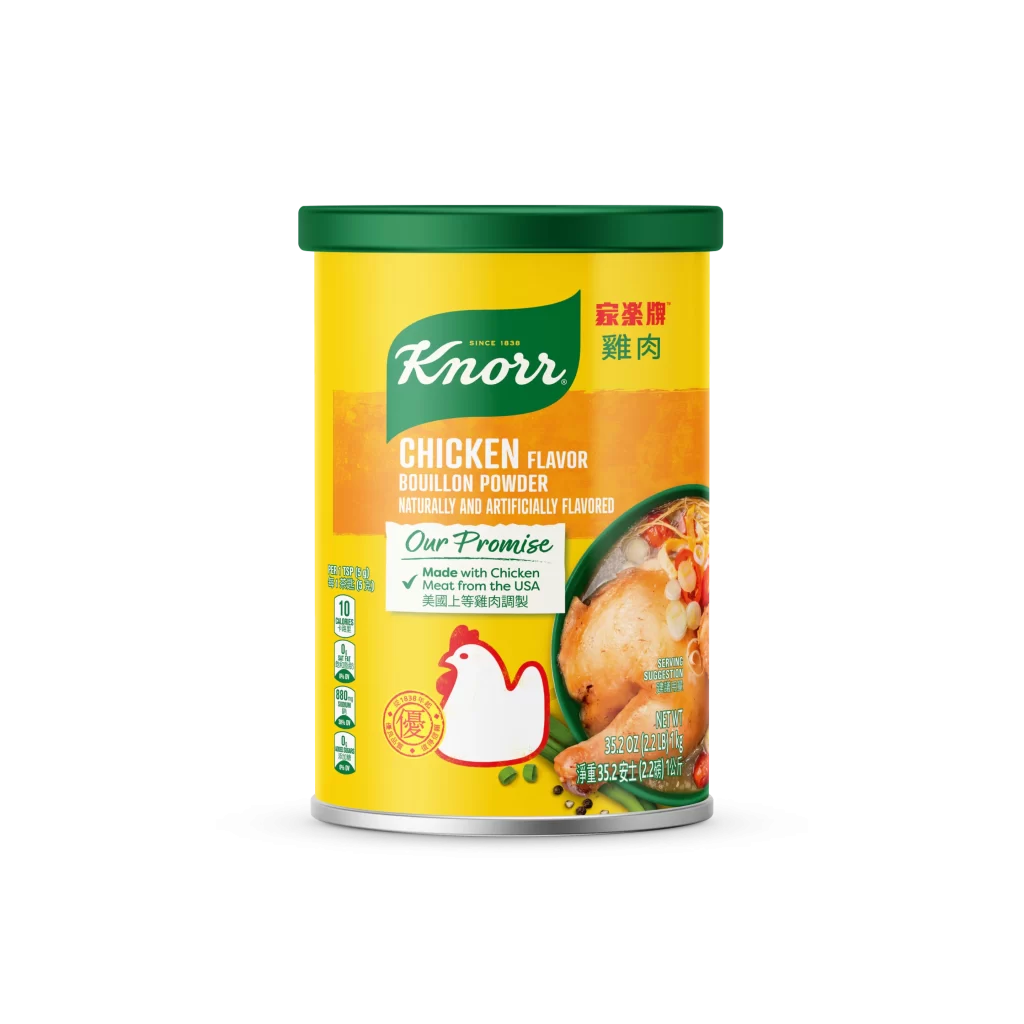
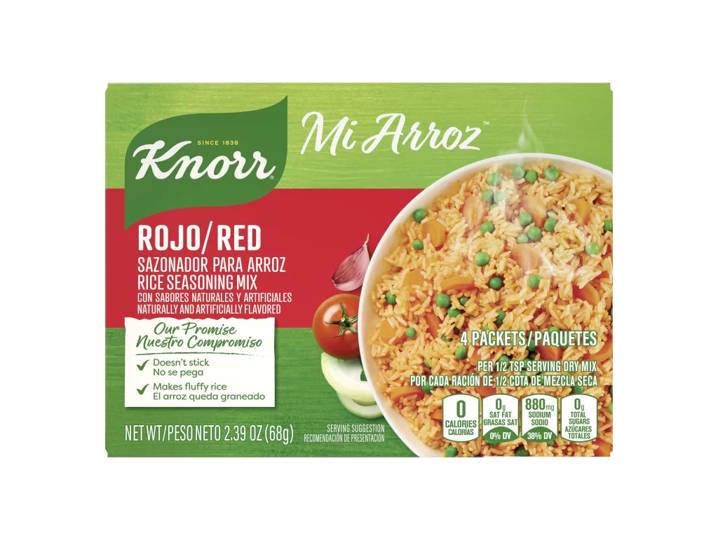
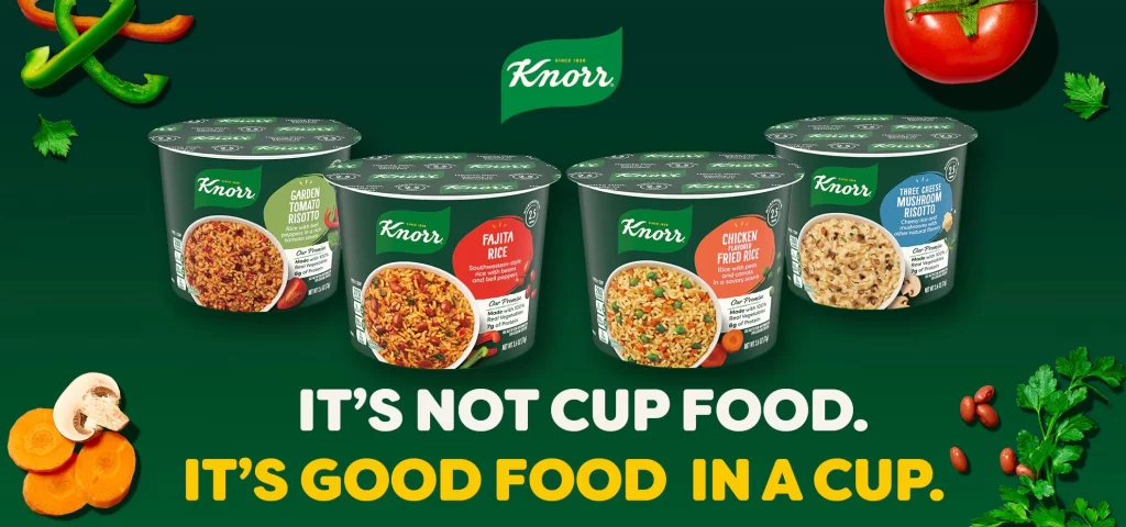
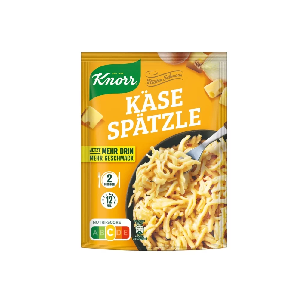
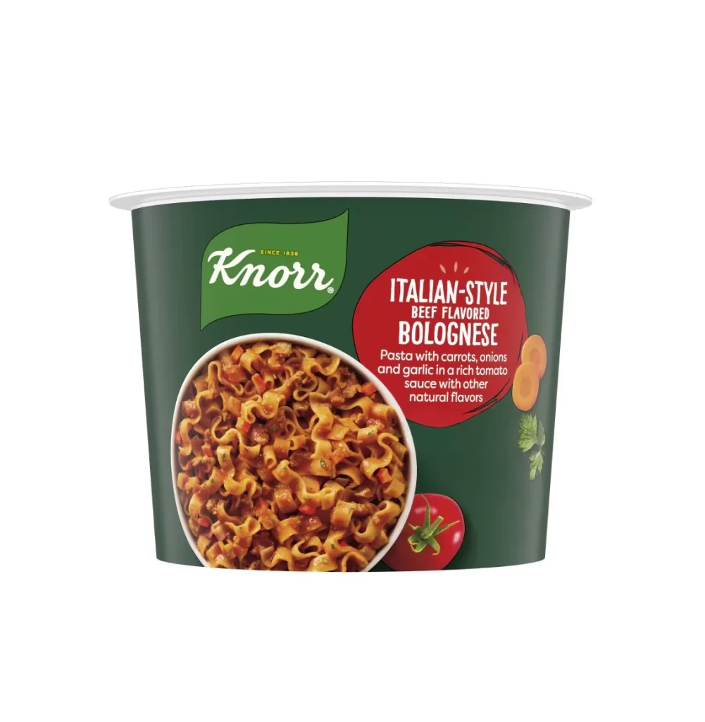
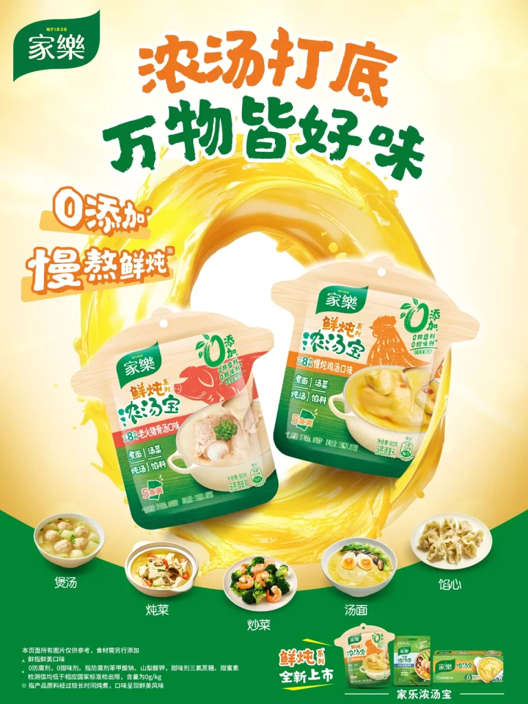
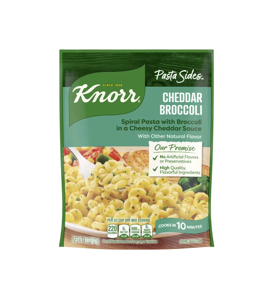
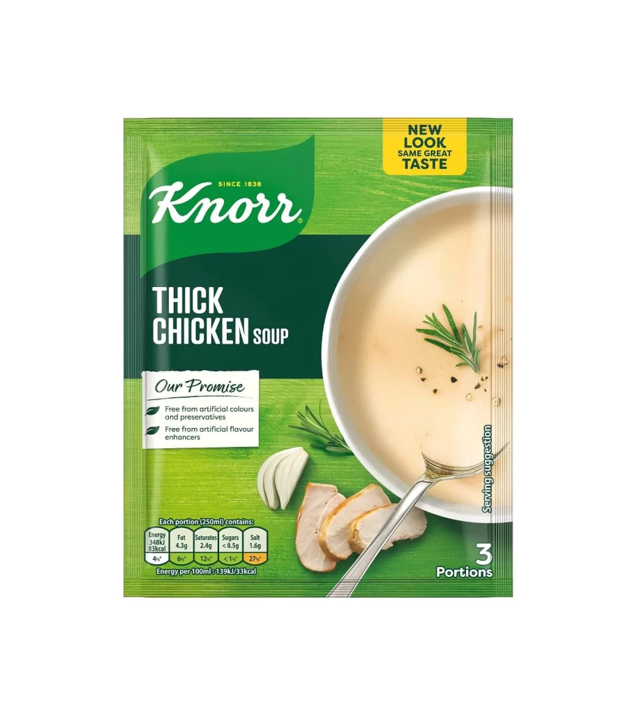
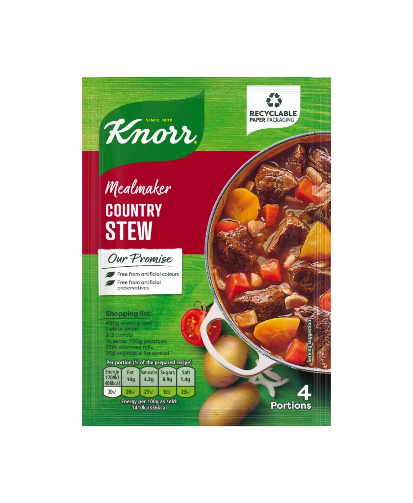
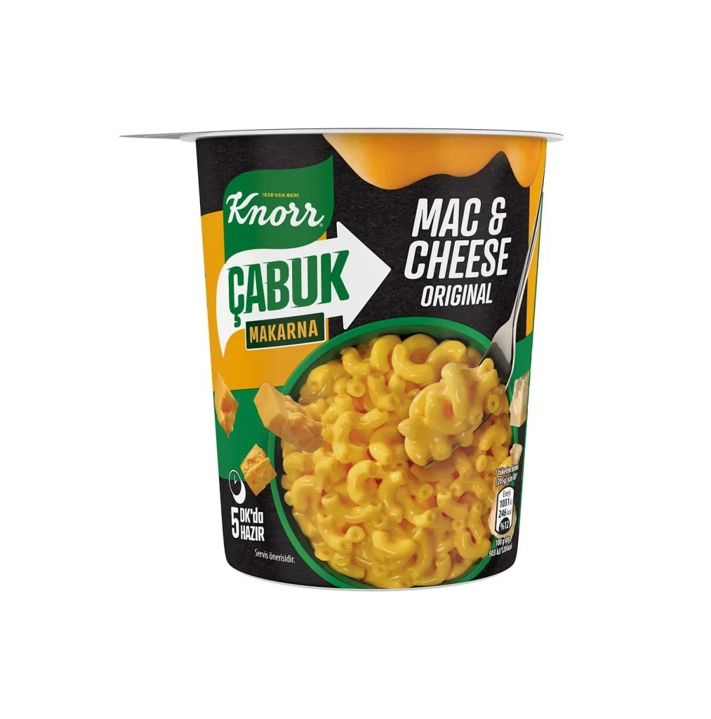
Three Knorr pasta packages rest on a dark green wooden surface, each displaying distinct color-coded branding. The left package features deep green packaging with a red band labeling 'FUSILLI GRANO DURO' and '100% TRIGO DURUM' text near wheat stalk graphics. The center bag shows an orange-yellow stripe reading 'PENA COM OVOS' over penne imagery, while the rightmost slim box displays olive-green tones with 'ESPAGUETE INTEGRAL' in white lettering. Overhead lighting casts soft shadows beneath the crinkled plastic and cardboard materials, emphasizing the glossy food photography within circular windows on each item.
Color differentiation creates immediate product recognition across the line, with each variety claiming its own hue—crimson for standard fusilli, amber for egg-enriched penne, and forest tones for whole-grain spaghetti. The consistent placement of the red-and-white Knorr logo anchors the visual system while allowing flavor-specific elements like tomato slices or egg illustrations to communicate ingredients at a glance. Designers studying this composition will note how the diagonal arrangement guides the eye naturally from left to right across varying package formats.
Packaging professionals might analyze the typographic hierarchy and color psychology employed to distinguish wheat varieties without breaking brand cohesion. Food photographers could reference the styling choices for prepared dish presentations, particularly how garnishes are positioned within the circular frame cutouts. Anyone needing detailed texture references for crinkled film substrates or matte cardboard finishes can access the full-resolution file directly from the resource library.