Knorr Instant Rice Meal
Topics
Details
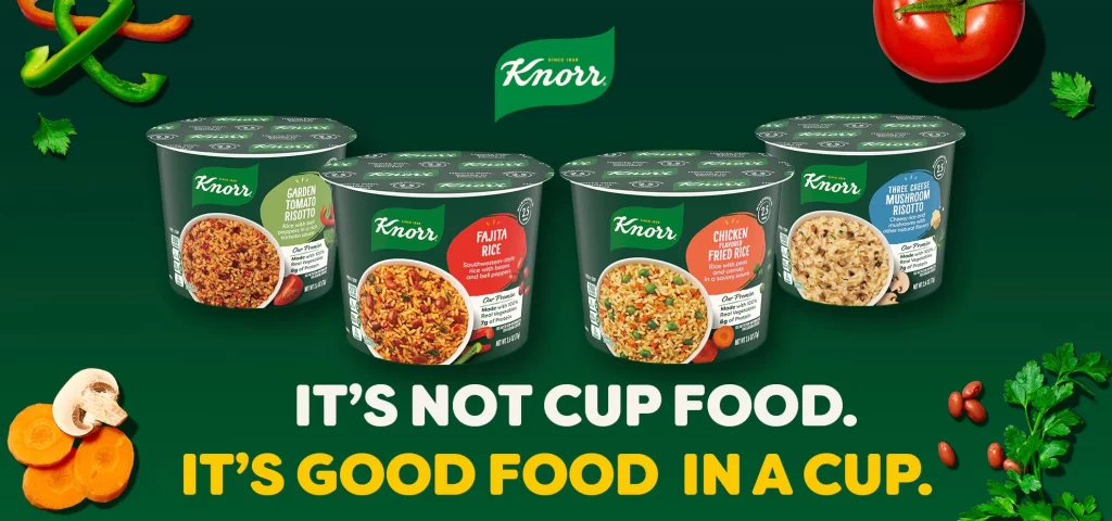
Against a deep emerald backdrop, four dark charcoal cups of Knorr instant rice line up in a gentle arc, each crowned with a patterned lid. The packaging features vibrant flavor callouts—sage green for Garden Tomato Risotto, crimson for Fajita Rice, coral for Chicken Fried Rice, and azure for Three Cheese Mushroom Risotto—with the iconic white Knorr script logo anchoring every container. Fresh ingredients frame the composition: sliced carrots, a whole mushroom, scarlet kidney beans, parsley sprigs, a ripe tomato, and curled bell pepper strips create an organic border around the product display.
Visual hierarchy drives this layout through strategic color blocking that differentiates each variety while maintaining brand cohesion across the range. Bold sans-serif typography dominates the lower third with the provocative tagline "IT'S NOT CUP FOOD. IT'S GOOD FOOD IN A CUP," rendered in stark white and golden yellow to command attention. The photographic styling balances appetizing food photography on each cup's label against the raw ingredient props, creating a narrative bridge between convenience and culinary authenticity.
Marketing teams analyzing competitive positioning in the shelf-stable meal category would examine how this campaign reframes instant products through premium visual language. Packaging designers could study the color-coding system and typographic scale to understand how flavor differentiation works within a unified brand architecture. Food stylists might reference the prop arrangement and lighting setup when planning similar product photography shoots that require fresh produce accents around prepared meals.