Knorr Sauce Mix Can
Topics
Details
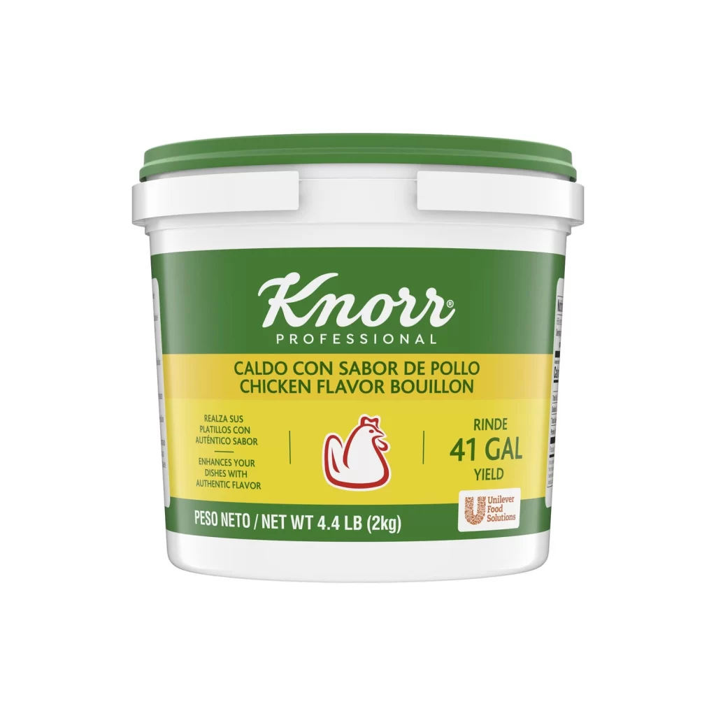
A square plastic tub with a vibrant green lid sits centered in the frame, its body wrapped in a label dominated by deep forest green and a bold red horizontal band. The white cursive 'Knorr Professional' logo stands out prominently above the product name, which appears in both English and Spanish as 'Demi-Glace Sauce Mix' and 'Mezcla Para Salsa'. To the right, a circular inset reveals the rich brown color of the prepared sauce, while nutritional details and a gluten-free badge occupy the lower silver-toned section of the packaging.
What makes this particular container visually compelling is the way it balances professional culinary branding with clear, functional information. The high-contrast color palette of green, red, and white creates immediate visual hierarchy, guiding the eye from brand identity to product specifics. Additionally, the inclusion of bilingual text alongside the realistic food photography makes it an excellent example of how commercial packaging communicates across different markets while maintaining a cohesive aesthetic.
Product photographers and packaging designers might study this image to understand how lighting interacts with glossy plastic surfaces and printed labels. 3D artists creating grocery store environments could use this as a texture or modeling reference for condiment containers. Marketing teams analyzing competitor branding would also find value in examining the typographic choices and color psychology employed here for professional food service products.