Knorr K sesp tzle Pouch
Topics
Details
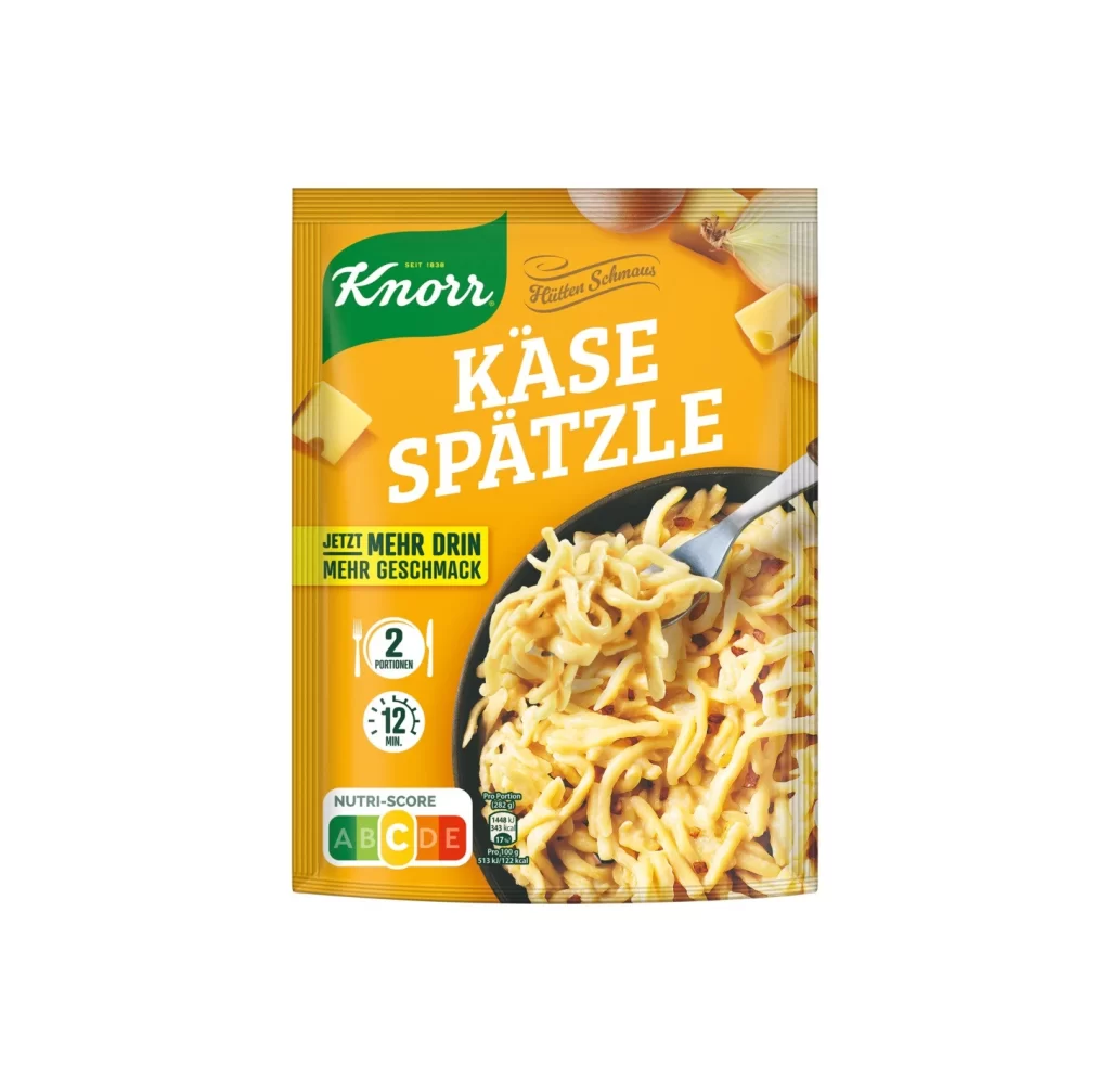
A vibrant orange background dominates the composition, serving as the canvas for a Knorr cheese spaetzle pouch. The packaging features the brand's signature green logo in the upper left corner, while bold white typography spells out 'KÄSE SPÄTZLE' across the center. A photographic image of creamy pasta in a black skillet occupies the lower right quadrant, accompanied by scattered ingredients like onion slices and cheese wedges that frame the main product shot.
Visual hierarchy is established through contrasting color blocks and varied font weights, drawing immediate attention to the yield and preparation time icons. The inclusion of the Nutri-Score label in the bottom left corner reflects modern European packaging standards, integrating regulatory information without disrupting the appetizing food photography. Yellow accent banners provide promotional context, creating a sense of urgency and value within the overall layout.
Packaging designers studying German market conventions would find this specimen useful for analyzing typographic treatment of umlauts and nutritional labeling placement. Food photographers might reference the lighting setup used to highlight the pasta's texture and sauce consistency. Marketing teams could examine how the brand balances heritage elements with contemporary health-conscious indicators to appeal to diverse consumer segments.