Knorr Rice Seasoning Mix Box
DownloadTopics
Details
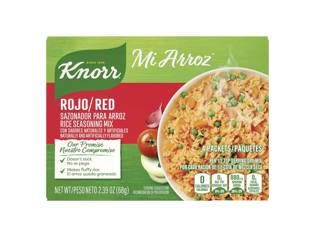
A vibrant green and red rectangular package dominates the frame, featuring the iconic Knorr leaf logo in the upper left corner against a textured, wood-grain background. The central composition is split between bold white typography on a crimson field—identifying the product as 'ROJO/RED' seasoning mix—and a large, circular photographic inset on the right showing fluffy yellow rice mixed with green peas and orange carrot pieces. Fresh ingredients like a whole tomato, garlic clove, and onion slice are artfully arranged along the left edge of the food photography, while nutritional data boxes anchor the bottom right corner in clean white containers.
Visual hierarchy is established through the strategic use of the brand's signature color blocking, where the deep red band creates immediate contrast against the organic green header and footer sections. The circular crop of the prepared dish breaks the rigid geometry of the box, drawing the eye toward the appetizing texture of the seasoned grains while the bilingual text layout accommodates both English and Spanish markets seamlessly. Designers studying packaging architecture will appreciate how the 'Nuestro Compromiso' promise badge integrates functional claims without disrupting the primary brand narrative.
Food photographers and packaging analysts might utilize this reference to study the interplay between studio lighting on matte paper stock versus the glossy finish of printed vegetable imagery. Marketing teams developing multicultural product lines could examine the typographic balance required for dual-language labeling across different demographic segments. Anyone needing to analyze the specific color values or layout proportions can access the full-resolution file directly from the resource library for detailed inspection.