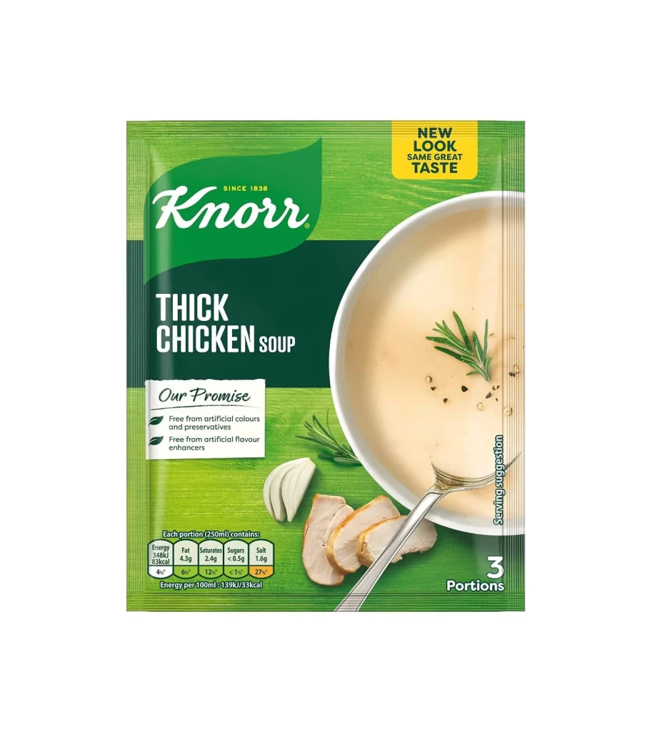
Knorr Thick Chicken Soup Pouch
Topics
Details
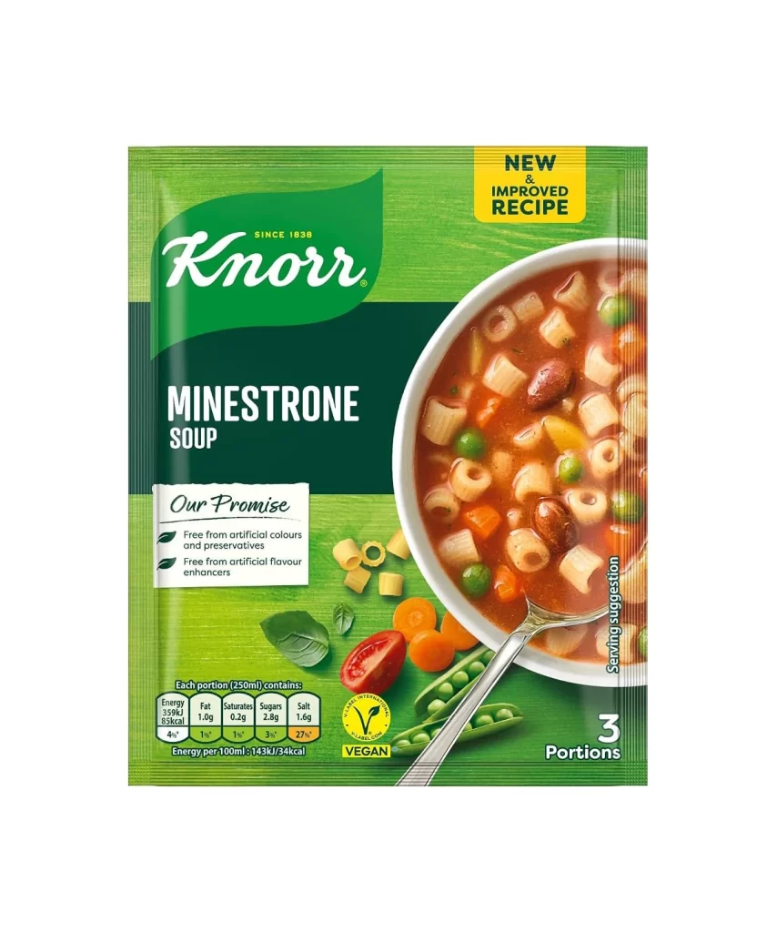
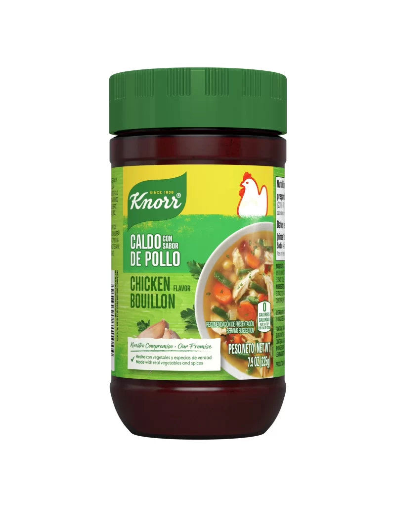
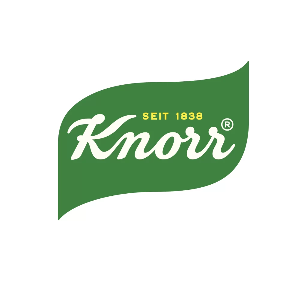
Knorr Thick Chicken Soup is presented in a rectangular green pouch featuring a vibrant lime and forest green color scheme with a prominent white bowl of creamy soup on the right side. The packaging displays the Knorr logo in white script against a dark green leaf-shaped background, with bold white text announcing the product name below. A yellow badge in the upper right corner proclaims 'NEW LOOK SAME GREAT TASTE', while sliced chicken breast, garlic cloves, and rosemary sprigs are artfully arranged at the bottom of the composition.
Visual hierarchy plays a crucial role in this design’s effectiveness, with the yellow ‘NEW LOOK’ badge creating immediate contrast against the green background to signal product updates without disrupting brand recognition. The nutritional information table employs a clean grid system with color-coded percentages that guide the eye efficiently, while the ‘Our Promise’ box uses subtle leaf icons to reinforce the natural positioning. Compositionally, the diagonal placement of the spoon creates dynamic movement that draws attention toward the appetizing food photography, balancing the static text elements on the left.
Packaging designers studying FMCG branding would find this reference valuable for analyzing how established brands maintain identity while refreshing visual systems for contemporary retail environments. Food photographers might examine the lighting techniques used to achieve that specific creamy texture and appetizing sheen on the liquid surface without harsh reflections. Marketing teams could utilize this case study when developing campaigns that emphasize ingredient transparency and health-conscious messaging through strategic placement of promise statements and nutritional data.