Knorr Mexican Tomato Corn Soup Pouch
Topics
Details
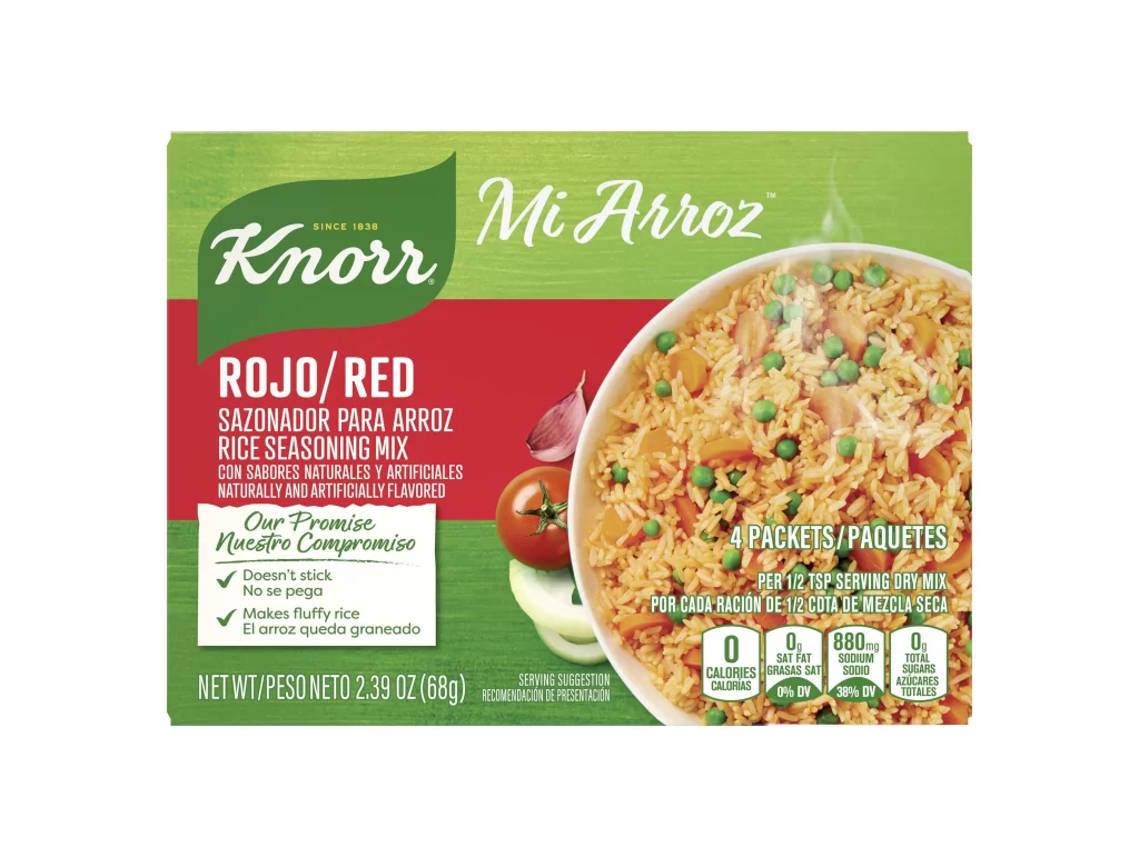
Centered within a stark white void, the rectangular Knorr pouch presents a layered color field of deep forest green and saturated orange-red. The brand's signature white script logo anchors the upper quadrant, while the product name 'International Mexican Tomato Corn Soup' occupies the central band in clean sans-serif typography. A photographic inset dominates the right side, depicting a ceramic bowl filled with amber broth, yellow corn kernels, and a submerged spoon, flanked by a whole red tomato and an ear of corn at the bottom edge.
Visual hierarchy here relies on the stark contrast between the organic green header and the warm orange mid-section, creating immediate flavor-cue associations. The photographic element employs shallow depth-of-field to emphasize the soup's texture while maintaining legibility of the surrounding text elements. Small typographic details like the 'Since 1838' heritage marker and the 'Our Promise' iconography add layers of brand authority without cluttering the primary visual message.
Packaging designers studying FMCG layouts would examine this composition for its balance between appetite appeal photography and mandatory regulatory information placement. Food stylists might reference the specific lighting setup used to make the broth appear translucent and inviting. Marketing teams could analyze how the color blocking strategy differentiates this international variant from domestic product lines.